
1.3 Beginnings
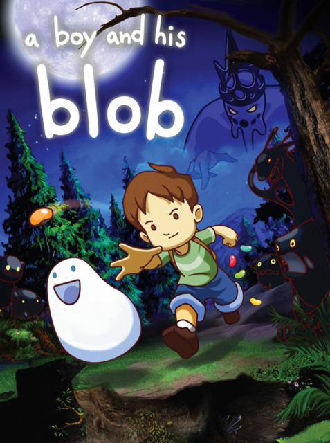
One of the first images ever drawn for the Wii Blob was a quick “napkin sketch” of the Boy and the Blob hugging, surrounded by darkness. I thought that the “us against the world” theme would be a good backdrop. The Boy was little more than a stick figure, inspired by the Pitfall!-esque Boy from the NES game. We knew we should emphasize the Boy-Blob relationship, since that is the hook of the game.
Initially, there were some new jellybean ideas like pineapple grenade, or cream whip; violent transformations you could use to obliterate your enemies.
However, the themes of the game really congealed when we found our Boy. It was Marc Gomez (art director) that really brought it together by sketching out some initial Boy drawings. The Boy was younger, rounder, softer. The new boy looked like he needed a Blob to help him, because he couldn’t do it on his own. The Blob got his own facelift; he was sized down, made to look smaller and cuter. We ditched the nose and other extra stuff since it seemed a little creepy.
After that, I threw together a shot of the Boy and Blob staring up at the moon, which is the basis for a lot of the promo shots that have been released.
The last piece of the puzzle was an initial credits sequence. It was kind of a weird idea but I think it really worked. Basically, I thought that if we stubbed out the end credits of the game first, we could work toward a vision that would fit that ending. The video used the song “When She Loved Me” by Sarah McLachlan, and featured Gomez’ drawings in sepia tone along with the names of the people on the project. This type of ending is not unique; I’ve seen similar things in Mickey’s Christmas Carol and The Secret of Nimh. But, it tugged on the heartstrings, made people feel like they already knew the characters. It was important to buy-in on the concept. So the overarching themes and feel were settled, but even with all those pieces in place, the game itself was not designed.
http://blogs.ign.com/MAJ_BoyandHisBlob/2009/06/18/123260/
I can't wait for this, it sounds so much better than the original.

Log in to comment