Something went wrong. Try again later
    Follow

    Battlefield 3

    Game » consists of 15 releases. Released Oct 25, 2011

    Battlefield 3 is DICE's third numerical installment in the Battlefield franchise. It features a single player and co-operative campaign, as well as an extensive multiplayer component.

    Battlefield UI Gripes part 1: The chat box

    Avatar image for vonflampanker
    vonFlampanker

    352

    Forum Posts

    10

    Wiki Points

    0

    Followers

    Reviews: 0

    User Lists: 4

    Edited By vonFlampanker

    EDIT: I couldn't be happier that this post is now obsolete. They did a great job fixing these problems.

    DICE did what DICE always does: they gave us a fantastic, immersive shooter that's hobbled by some terrible, seemingly obvious UI decisions. I maintain the most irritating of these numerous BF3 UI gripes is that the in-game chat window is a complete failure.

    My argument has three points:

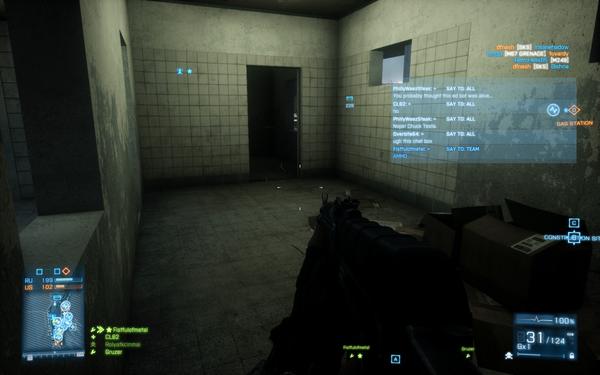
    1. It's too brightly colored / opaque. BF3 contains mostly earth tones dark shadows, making even the [what appears to be around] 50% opaque and 50% desaturated blue box too colorful and in a game where that 3x3 square of pixels in the distance may be a guy who's about to shoot you in the head, it's unacceptable.

    2. It's too wide. Check out this screenshot (kindly provided by GB user CL60). Easily half of the width of the box is wasted space in this current state. I know the space is anticipating more text but in my experience (~30 hours so far) the in-game text rarely gets long enough to fill this space.
    No Caption Provided

    Now consider that it's also frequently appearing and disappearing every time a server message or user-typed message is received. The effect is hard to describe, but if you consider that the human eye is only good at focusing on one thing at a time, and that in most cases while playing this game your eye is focused on an area around the crosshair, you might begin to see how this is a problem:
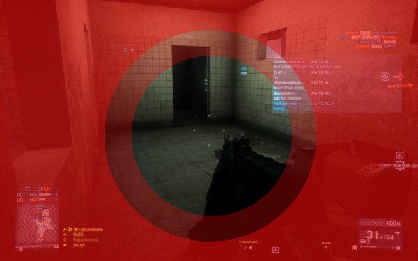
    Again: CL60's image, my totally non-scientific edits.
    Again: CL60's image, my totally non-scientific edits.

    My eye is usually really focused on an area about the size of the center circle, with the middle circle being the "grey area" marking the edge of concentration. The outside area is, in effect, peripheral vision. The proximity of the bottom left corner to the crosshair is the key problem here. It not only obscures a critical area within the circle you're concentrating in, but it also puts something that's moving and heavy emphasis into your peripheral vision, where the blinking on and off is likely to divert your attention.

    This phenomenon is much, much worse for those still using a 4:3 monitor instead of a 16:9 monitor. I've done both.

    3. It doesn't do its job anyway. The window is very difficult to glean information from while in-game. There's no color-coding to indicate the source so you can easily filter information. [edit: it slipped my mind that it does color code messages from squadmates to other squadmates.] The window disappears very quickly without a method to call it back (besides typing something).

    Interestingly enough, all of these detriments were added very late in the development cycle with probably very little chance to test the changes with a wide audience. Check out how the chat window looked in the Beta:
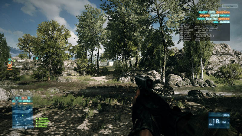
    What was wrong with this?
    What was wrong with this?

    So what's to be done?

    0.Just roll back to the Beta chat window. Easy enough.

    1. Halve the size of the window to about 1.5x the width of the map box. Why does the least-essential element of the HUD have the most prominent place in the hierarchy?

    2. Reduce the font size by a point or two. This would bring the BF3 chat box into a consistent place with previous BF games.

    3. Desaturate the color and reduce the opacity by another 25%. Check the background of the "points captured" indicator on the bottom left for what I'd be happier with.

    4. Reposition it to the top left. Get it away from the circle of focus at the center of the screen. Again, something that previous Battlefield games have done.

    5. Most importantly, give us the option to turn the damn thing off. This is 2011. We've had the option to alter and turn off pieces of the HUD since at least the days of Unreal Tournament (and probably even earlier though that was the first time I remember being able to do it). If not an option in the game options, at least give us a console command or an .ini to edit.
    Avatar image for vonflampanker
    vonFlampanker

    352

    Forum Posts

    10

    Wiki Points

    0

    Followers

    Reviews: 0

    User Lists: 4

    #1  Edited By vonFlampanker

    EDIT: I couldn't be happier that this post is now obsolete. They did a great job fixing these problems.

    DICE did what DICE always does: they gave us a fantastic, immersive shooter that's hobbled by some terrible, seemingly obvious UI decisions. I maintain the most irritating of these numerous BF3 UI gripes is that the in-game chat window is a complete failure.

    My argument has three points:

    1. It's too brightly colored / opaque. BF3 contains mostly earth tones dark shadows, making even the [what appears to be around] 50% opaque and 50% desaturated blue box too colorful and in a game where that 3x3 square of pixels in the distance may be a guy who's about to shoot you in the head, it's unacceptable.

    2. It's too wide. Check out this screenshot (kindly provided by GB user CL60). Easily half of the width of the box is wasted space in this current state. I know the space is anticipating more text but in my experience (~30 hours so far) the in-game text rarely gets long enough to fill this space.

    No Caption Provided

    Now consider that it's also frequently appearing and disappearing every time a server message or user-typed message is received. The effect is hard to describe, but if you consider that the human eye is only good at focusing on one thing at a time, and that in most cases while playing this game your eye is focused on an area around the crosshair, you might begin to see how this is a problem:

    Again: CL60's image, my totally non-scientific edits.
    Again: CL60's image, my totally non-scientific edits.

    My eye is usually really focused on an area about the size of the center circle, with the middle circle being the "grey area" marking the edge of concentration. The outside area is, in effect, peripheral vision. The proximity of the bottom left corner to the crosshair is the key problem here. It not only obscures a critical area within the circle you're concentrating in, but it also puts something that's moving and heavy emphasis into your peripheral vision, where the blinking on and off is likely to divert your attention.

    This phenomenon is much, much worse for those still using a 4:3 monitor instead of a 16:9 monitor. I've done both.

    3. It doesn't do its job anyway. The window is very difficult to glean information from while in-game. There's no color-coding to indicate the source so you can easily filter information. [edit: it slipped my mind that it does color code messages from squadmates to other squadmates.] The window disappears very quickly without a method to call it back (besides typing something).

    Interestingly enough, all of these detriments were added very late in the development cycle with probably very little chance to test the changes with a wide audience. Check out how the chat window looked in the Beta:

    What was wrong with this?
    What was wrong with this?

    So what's to be done?

    0.Just roll back to the Beta chat window. Easy enough.

    1. Halve the size of the window to about 1.5x the width of the map box. Why does the least-essential element of the HUD have the most prominent place in the hierarchy?

    2. Reduce the font size by a point or two. This would bring the BF3 chat box into a consistent place with previous BF games.

    3. Desaturate the color and reduce the opacity by another 25%. Check the background of the "points captured" indicator on the bottom left for what I'd be happier with.

    4. Reposition it to the top left. Get it away from the circle of focus at the center of the screen. Again, something that previous Battlefield games have done.

    5. Most importantly, give us the option to turn the damn thing off. This is 2011. We've had the option to alter and turn off pieces of the HUD since at least the days of Unreal Tournament (and probably even earlier though that was the first time I remember being able to do it). If not an option in the game options, at least give us a console command or an .ini to edit.

    Avatar image for cl60
    CL60

    17117

    Forum Posts

    -1

    Wiki Points

    0

    Followers

    Reviews: 0

    User Lists: 5

    #2  Edited By CL60

    I change my position. It could definitely be a little smaller. It doesn't bother me personally, but I can see how it would bother others.

    Avatar image for vonflampanker
    vonFlampanker

    352

    Forum Posts

    10

    Wiki Points

    0

    Followers

    Reviews: 0

    User Lists: 4

    #3  Edited By vonFlampanker

    @CL60:Like I mentioned, I'm glad it doesn't bother everyone. I'd be curious to know if there are any aspects to the UI that you find irritating.

    I think for the most part the rest of the in-game HUD works pretty well. I'd change up some minor stuff like not putting the "neutralizing/capturing flag" counter directly in the center of view when you get close to a flag in Conquest. I'd also add letters to the "points captured" status in the bottom left just for quicker reference. Really not enough to constitute a full blog post. I think the second part is going to be covering the mess they made of loadout selection.

    Avatar image for jakob187
    jakob187

    22970

    Forum Posts

    10045

    Wiki Points

    0

    Followers

    Reviews: 8

    User Lists: 9

    #4  Edited By jakob187

    I personally hate the shit out of that chat window. The first day I saw it, I wanted to smash a monitor. All this time to design that thing, and they seriously wasted that much space to put it in my line of sight in any way? Then again, I also hated the shit at the top of the screen in BF2 that showed the deaths in the game...as well as the chat window in it. Honestly, fuck the chat window. Get rid of it completely. Anyone playing BF on a fucking PC should be using a mic already. If not, then oh goddamn well.

    Avatar image for branthog
    Branthog

    5777

    Forum Posts

    1014

    Wiki Points

    0

    Followers

    Reviews: 2

    User Lists: 0

    #5  Edited By Branthog

    Agreed.

    Frankly, the chat window is perfect, except that it's in the upper right instead of lower left, every message takes up two lines (a separate line just to present who said it and to what channel, even though channel messages are already color coded), can't have the text or window size adjusted, can't have opacity adjusted, can't be brought up and only displays when a message comes to it and only for a preset period of time. Basically, Dice said "let's do the opposite of what every game on the PC has done with the chat window in the last fifteen years".

    Avatar image for blackout62
    Blackout62

    2241

    Forum Posts

    84

    Wiki Points

    0

    Followers

    Reviews: 0

    User Lists: 11

    #6  Edited By Blackout62

    I see your using a very high definition screenshot of the game. Yeah I run in 720p, imagine that screen going from roughly the top of the ammo counter to the kill record, and stretching almost to my crosshairs. Seriously fuck that thing.

    Avatar image for vonflampanker
    vonFlampanker

    352

    Forum Posts

    10

    Wiki Points

    0

    Followers

    Reviews: 0

    User Lists: 4

    #7  Edited By vonFlampanker

    @Blackout62: Yeah, I think it's still convincing even in this best-case scenario. I was using an old 17" 4:3 monitor until a week or so ago and the issue was intolerable. I didn't get any screenshots before I switched out to my newer 1080p one. If you have a 720p screengrab and a minute or two, shoot it over to me and I'll edit it into the post.

    Avatar image for gs_dan
    GS_Dan

    1438

    Forum Posts

    68

    Wiki Points

    0

    Followers

    Reviews: 15

    User Lists: 1

    #8  Edited By GS_Dan

    I don't notice it unless I'm dead or someone green posts. Totally have that peripheral vision effect. I've noticed it too late a few times and wanted to bring it back but you can't without typing :(

    Avatar image for emkeighcameron
    emkeighcameron

    1895

    Forum Posts

    30

    Wiki Points

    0

    Followers

    Reviews: 0

    User Lists: 3

    #9  Edited By emkeighcameron

    The chat window is goddamn horrible. It was the first thing I noticed when I started playing MP, and it bugs me all the time. Get rid of it, please, DICE.

    Avatar image for branthog
    Branthog

    5777

    Forum Posts

    1014

    Wiki Points

    0

    Followers

    Reviews: 2

    User Lists: 0

    #10  Edited By Branthog

    @Blackout62 said:

    I see your using a very high definition screenshot of the game. Yeah I run in 720p, imagine that screen going from roughly the top of the ammo counter to the kill record, and stretching almost to my crosshairs. Seriously fuck that thing.

    Even in 2560x1600, it takes up too much room - and no matter what size the display, it's in the fucking upper right hand corner. It's just baffling how they arrived at this chat window.

    Avatar image for sjupp
    sjupp

    1949

    Forum Posts

    40

    Wiki Points

    0

    Followers

    Reviews: 0

    User Lists: 1

    #11  Edited By sjupp

    There's a picture of some new changes, including the chat window looking kinda like the beta-one. Can't find it atm though.

    Avatar image for seppli
    Seppli

    11232

    Forum Posts

    9

    Wiki Points

    0

    Followers

    Reviews: 7

    User Lists: 0

    #12  Edited By Seppli

    I dislike the lightblue HUD overall. It doesn't do its job well and the blue in blue in... blue light color doesn't help either. Also - blue light...

    Avatar image for deactivated-59694a80bc6d9
    deactivated-59694a80bc6d9

    729

    Forum Posts

    617

    Wiki Points

    0

    Followers

    Reviews: 1

    User Lists: 7

    I 100% agree with your post, let's hope DICE fixes it, or gives us options when they add-in horns/improvedRose.

    Avatar image for heath
    Heath

    65

    Forum Posts

    0

    Wiki Points

    0

    Followers

    Reviews: 0

    User Lists: 0

    #14  Edited By Heath

    they added UI.DrawEnable command in patch day before yesterday but i cant seem to get it to work... i would rather hide the ui and not know ammo counts or tactical map that put up with this shit

    Avatar image for vonflampanker
    vonFlampanker

    352

    Forum Posts

    10

    Wiki Points

    0

    Followers

    Reviews: 0

    User Lists: 4

    #15  Edited By vonFlampanker

    Quick glance at Google shows it's not just you Heath. Add it to the list of things that the patch failed to fix.

    Avatar image for xyber
    Xyber

    306

    Forum Posts

    456

    Wiki Points

    0

    Followers

    Reviews: 0

    User Lists: 1

    #16  Edited By Xyber
    Avatar image for bollard
    Bollard

    8298

    Forum Posts

    118

    Wiki Points

    0

    Followers

    Reviews: 3

    User Lists: 12

    #17  Edited By Bollard

    @vonFlampanker said:

    What was wrong with this?
    What was wrong with this?

    It wasn't blue enough.

    Also this is like the only UI complaint I can think of, is this going to be a short series?

    Avatar image for vonflampanker
    vonFlampanker

    352

    Forum Posts

    10

    Wiki Points

    0

    Followers

    Reviews: 0

    User Lists: 4

    #18  Edited By vonFlampanker
    @Xyber Hey, nice. I'll wager this stuff drops with or just before karkand.
    Avatar image for vonflampanker
    vonFlampanker

    352

    Forum Posts

    10

    Wiki Points

    0

    Followers

    Reviews: 0

    User Lists: 4

    #19  Edited By vonFlampanker
    @Chavtheworld Got a whole other post about the weapon loadouts. They fixed a lot of the squad selection stuff, so no post on that. I'll probably do one more on Battlelog at some point.

    This edit will also create new pages on Giant Bomb for:

    Beware, you are proposing to add brand new pages to the wiki along with your edits. Make sure this is what you intended. This will likely increase the time it takes for your changes to go live.

    Comment and Save

    Until you earn 1000 points all your submissions need to be vetted by other Giant Bomb users. This process takes no more than a few hours and we'll send you an email once approved.