Something went wrong. Try again later
    Follow

    Battlefield 3

    Game » consists of 15 releases. Released Oct 25, 2011

    Battlefield 3 is DICE's third numerical installment in the Battlefield franchise. It features a single player and co-operative campaign, as well as an extensive multiplayer component.

    Battlefield UI Gripes part 2: The menu system

    Avatar image for vonflampanker
    vonFlampanker

    352

    Forum Posts

    10

    Wiki Points

    0

    Followers

    Reviews: 0

    User Lists: 4

    Edited By vonFlampanker

    Past Battlefield interfaces have been plagued by problems of unresponsive buttons and highlights, weird nonstandard interfaces, unreadable type and strange placement logic. With Bad Company 2 these issues began to slowly resolve into something more usable. Battlefield 3 introduces a much more complex upgrade tree as well as a camouflage selection option. Unfortunately, the interface hasn't kept up with the depth of options available, and this makes for an awkward experience when trying to spec out your soldier for battle.

    My argument has 3 points:

    1. The "Customize" tab exists. Every action needed to handle re-specing on the fly should be able to happen in the "Deploy" tab. Currently the "Deploy" tab contains a hobbled method of re-specing fast along the bottom right, but with weapon accessories becoming an important part of gameplay, this feature is obsolete in its current form. Also the rudimentary customization under "Deploy" completely ignores camouflage options.
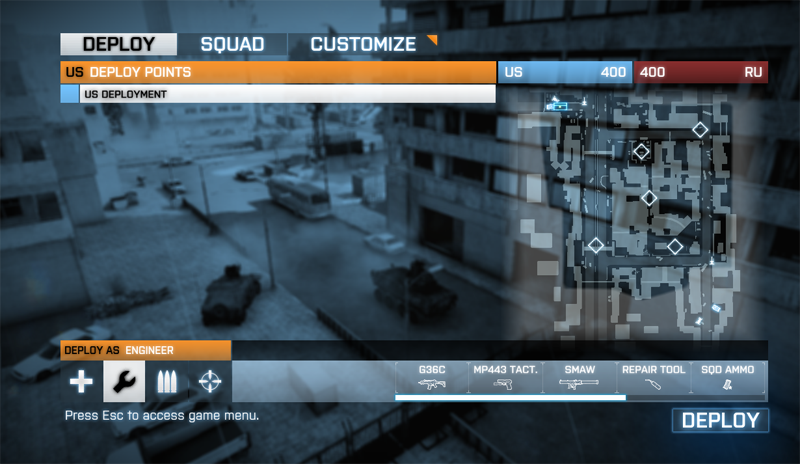
    The Deploy tab should be all you need to gear up.
    The Deploy tab should be all you need to gear up.

    2. The "Customize" menu is too deep. By not utilizing screen space correctly, the Customize menu is forced to be three levels deep (four if you count the number of clicks down from the main menu). The first menu is a generalized "choose kit" selection that only looks like it does anything more. The design of the "loadout" and "appearance" buttons is no more apparently clickable than the non-clickable (and much larger) weapon/gadget readout. A little separation between the kits' bars would have made this a lot more easy to read and navigate quickly. Keep in mind this is the whole point: you're supposed to be able to re-spec with some degree of speed to be able to come back with ammunition, health or anti-vehicle firepower to keep your squad alive. Extra time finding and clicking small screen areas is detrimental to smooth team-based gameplay that is the core of the experience.
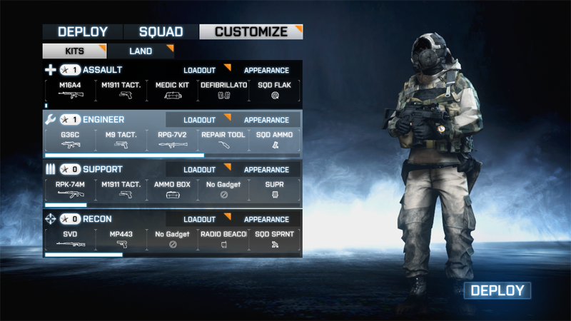
    OK, this makes sense even if it's a little hard to find where I need to actually click.
    OK, this makes sense even if it's a little hard to find where I need to actually click.
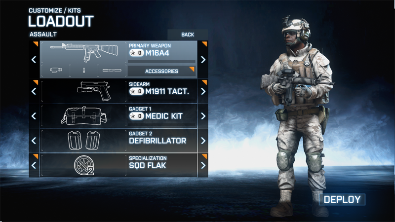
    Eh, i should really be doing this work in the previous step.
    Eh, i should really be doing this work in the previous step.

    The second level in "Customize" is general kit layouts or "appearance" depending on what you've clicked. "appearance" is a required visit at least once per round since the game doesn't appear to remember your previous camouflage settings. An interface for assigning camouflage patterns per-level would be ideal. Including an option to "always use" a certain pattern is also a possibility. For "loadout", this menu is easy enough to use, simply clicking left and right through your various options. The only problem is to further customize a given weapon, you now have to go to ...
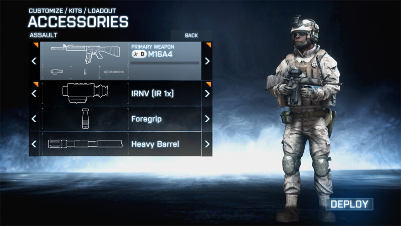
    This goddamn thing.
    This goddamn thing.

    ... The third level of menus wherein you attach gadgets to your primary weapon. The distribution of slots here is somewhat unintuitive. The first of three is easy: these are your scopes. I like that there are a lot of options and they're usually named clearly enough that you can distinguish them before being stuck with them for a spawn and restarting this process. The next two slots are less clearly defined. I often find myself paging through one menu only to find what i'm looking for in the other one. Off the top of your head, can you tell me whether the bipod belongs in the third row or the fourth? (... and if you can, good on you. I can't.)

    They've thoughtfully put a "deploy" button here on the third level to prevent you having to back all the way out. The problem is that this deploy often ends me up at my side's uncap, having been given no choice to select a spawn point. Thus, this button becomes useless for those trying to save time by diving straight into the re-spec options. Selecting a squad member or control point beforehand becomes useless as the viability of those points changes very quickly.

    3. The overall tendency of these menus is to take you out of your previous context. There are a lot of tabs and buttons, but throwing away the previous screen's tab set eliminates all sense of progression and context. Granted it's a complicated set of menus with a lot of options, but it can be done well. Especially for a game with this amount of development time and budget. The whole thing generally needs another pass to ensure consistency of structure and placement.

    What can be done?

    1. Build an all-in-one solution and eliminate "Customize" altogether. Having this more complex system work in one bar in the deploy screen (similar to Bad Company 2) would be a challenge, but can certainly be done by a team this talented. "Customize" feels like a catch-all and a cop-out.

    2. Use screen space in "Customize" more efficiently. Notice that the active area in "Customize" is about 1/4 to 1/3 of the screen space. Allowing the menu a little more room to work on a single plane rather than burying layers would make the user experience a lot more streamlined. Do we really need that giant model of the player's soldier over on the right?

    3. Move this process to BattleLog. One of the more popular topics on the Getsatisfaction feedback system the Battlefield team is using suggests just this. And it makes sense. For better or worse we're stuck with BattleLog for key in-game functionality. Why not let users tinker with and save their loadouts in BattleLog and access them by name through a quick menu while waiting to deploy? I could make an assault loadout called "long distance" that has my accuracy-enhancing accessories built into my M16A4 and switch to it quickly. This would speed the procedure for even a simpler operation like grabbing your Stinger to take down an aircraft that's after your squad. This is something that Call of Duty allows even on consoles and it's very convenient.

    You'd still have to have some sort of system in-game to fine-tune for situations that come up unexpectedly but having a system of preset loadouts on-hand that the user himself sets up would be a powerful and convenient tool.
    Avatar image for vonflampanker
    vonFlampanker

    352

    Forum Posts

    10

    Wiki Points

    0

    Followers

    Reviews: 0

    User Lists: 4

    #1  Edited By vonFlampanker

    Past Battlefield interfaces have been plagued by problems of unresponsive buttons and highlights, weird nonstandard interfaces, unreadable type and strange placement logic. With Bad Company 2 these issues began to slowly resolve into something more usable. Battlefield 3 introduces a much more complex upgrade tree as well as a camouflage selection option. Unfortunately, the interface hasn't kept up with the depth of options available, and this makes for an awkward experience when trying to spec out your soldier for battle.

    My argument has 3 points:

    1. The "Customize" tab exists. Every action needed to handle re-specing on the fly should be able to happen in the "Deploy" tab. Currently the "Deploy" tab contains a hobbled method of re-specing fast along the bottom right, but with weapon accessories becoming an important part of gameplay, this feature is obsolete in its current form. Also the rudimentary customization under "Deploy" completely ignores camouflage options.

    The Deploy tab should be all you need to gear up.
    The Deploy tab should be all you need to gear up.

    2. The "Customize" menu is too deep. By not utilizing screen space correctly, the Customize menu is forced to be three levels deep (four if you count the number of clicks down from the main menu). The first menu is a generalized "choose kit" selection that only looks like it does anything more. The design of the "loadout" and "appearance" buttons is no more apparently clickable than the non-clickable (and much larger) weapon/gadget readout. A little separation between the kits' bars would have made this a lot more easy to read and navigate quickly. Keep in mind this is the whole point: you're supposed to be able to re-spec with some degree of speed to be able to come back with ammunition, health or anti-vehicle firepower to keep your squad alive. Extra time finding and clicking small screen areas is detrimental to smooth team-based gameplay that is the core of the experience.

    OK, this makes sense even if it's a little hard to find where I need to actually click.
    OK, this makes sense even if it's a little hard to find where I need to actually click.
    Eh, i should really be doing this work in the previous step.
    Eh, i should really be doing this work in the previous step.

    The second level in "Customize" is general kit layouts or "appearance" depending on what you've clicked. "appearance" is a required visit at least once per round since the game doesn't appear to remember your previous camouflage settings. An interface for assigning camouflage patterns per-level would be ideal. Including an option to "always use" a certain pattern is also a possibility. For "loadout", this menu is easy enough to use, simply clicking left and right through your various options. The only problem is to further customize a given weapon, you now have to go to ...

    This goddamn thing.
    This goddamn thing.

    ... The third level of menus wherein you attach gadgets to your primary weapon. The distribution of slots here is somewhat unintuitive. The first of three is easy: these are your scopes. I like that there are a lot of options and they're usually named clearly enough that you can distinguish them before being stuck with them for a spawn and restarting this process. The next two slots are less clearly defined. I often find myself paging through one menu only to find what i'm looking for in the other one. Off the top of your head, can you tell me whether the bipod belongs in the third row or the fourth? (... and if you can, good on you. I can't.)

    They've thoughtfully put a "deploy" button here on the third level to prevent you having to back all the way out. The problem is that this deploy often ends me up at my side's uncap, having been given no choice to select a spawn point. Thus, this button becomes useless for those trying to save time by diving straight into the re-spec options. Selecting a squad member or control point beforehand becomes useless as the viability of those points changes very quickly.

    3. The overall tendency of these menus is to take you out of your previous context. There are a lot of tabs and buttons, but throwing away the previous screen's tab set eliminates all sense of progression and context. Granted it's a complicated set of menus with a lot of options, but it can be done well. Especially for a game with this amount of development time and budget. The whole thing generally needs another pass to ensure consistency of structure and placement.

    What can be done?

    1. Build an all-in-one solution and eliminate "Customize" altogether. Having this more complex system work in one bar in the deploy screen (similar to Bad Company 2) would be a challenge, but can certainly be done by a team this talented. "Customize" feels like a catch-all and a cop-out.

    2. Use screen space in "Customize" more efficiently. Notice that the active area in "Customize" is about 1/4 to 1/3 of the screen space. Allowing the menu a little more room to work on a single plane rather than burying layers would make the user experience a lot more streamlined. Do we really need that giant model of the player's soldier over on the right?

    3. Move this process to BattleLog. One of the more popular topics on the Getsatisfaction feedback system the Battlefield team is using suggests just this. And it makes sense. For better or worse we're stuck with BattleLog for key in-game functionality. Why not let users tinker with and save their loadouts in BattleLog and access them by name through a quick menu while waiting to deploy? I could make an assault loadout called "long distance" that has my accuracy-enhancing accessories built into my M16A4 and switch to it quickly. This would speed the procedure for even a simpler operation like grabbing your Stinger to take down an aircraft that's after your squad. This is something that Call of Duty allows even on consoles and it's very convenient.

    You'd still have to have some sort of system in-game to fine-tune for situations that come up unexpectedly but having a system of preset loadouts on-hand that the user himself sets up would be a powerful and convenient tool.

    Avatar image for jp_russell
    JP_Russell

    1195

    Forum Posts

    1

    Wiki Points

    0

    Followers

    Reviews: 0

    User Lists: 1

    #2  Edited By JP_Russell

    Yeah, it's kind of amazing how convoluted the loadout menu is. And I don't even really think it would be especially hard to put it all on one screen. 2142 had a level of customization that wasn't a terribly far cry from BF3's, and whoever did its UI was able to pretty easily put everything on a single loadout screen that didn't mask the static battlefield image and tabbed over to the spawn screen seamlessly.

    I think BF3 could have very much the same sort of menu setup and just have a couple rows of selector buttons for your weapons, gadgets, attachments, and specialization on each kit space (top row: primary weapon, attachment 1, attachment 2, scope; bottom row: sidearm, gadget 1, gadget 2, specialization), and another selector for the camo somewhere removed from the kit spaces. Each selector would open a low-opacity dropdown box with weapons/gadgets/specializations/etc. arranged in an appropriately sized grid of picture icons with text wherein you click on the item you want. That's more or less how I imagine it, anyway.

    Avatar image for vonflampanker
    vonFlampanker

    352

    Forum Posts

    10

    Wiki Points

    0

    Followers

    Reviews: 0

    User Lists: 4

    #3  Edited By vonFlampanker

    Considering the number of hours I spent in 2142 (it was the first Battlefield game I really loved), I wouldn't be surprised if i subliminally had the loadout screen from there in mind. I went and refreshed my memory and sure enough a system like that would definitely be one of the solutions that'd work in this case.

    This edit will also create new pages on Giant Bomb for:

    Beware, you are proposing to add brand new pages to the wiki along with your edits. Make sure this is what you intended. This will likely increase the time it takes for your changes to go live.

    Comment and Save

    Until you earn 1000 points all your submissions need to be vetted by other Giant Bomb users. This process takes no more than a few hours and we'll send you an email once approved.