Something went wrong. Try again later
    Follow

    Bayonetta 2

    Game » consists of 9 releases. Released Sep 20, 2014

    The sequel to the critically-acclaimed action brawler Bayonetta, this time with a two-player online co-op mode and exclusive to the Nintendo Wii U.

    Hideki Kamiya thinks the Wii U box art is "JUNK"

    • 83 results
    • 1
    • 2
    Avatar image for mindbullet
    MindBullet

    879

    Forum Posts

    0

    Wiki Points

    0

    Followers

    Reviews: 0

    User Lists: 4

    #1  Edited By MindBullet

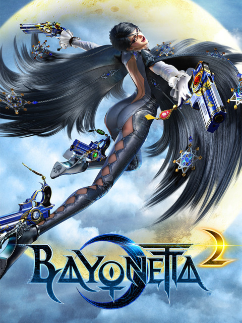
    "I hate the logo of WiiU ver.," tweeted the outspoken game creator in English. "Junk." In Japanese, Kamiya was slightly more salty, tweeting, "The Bayo 2 package is shit. Who's the damned bastard who changed it..."

    When asked why he was upset, Kamiya replied, "They removed the crescent behind Bayo & put full moon & changed the color of "2" in red. JUNK."

    Source

    Here's Hideki's original cover art next to the version shown at E3:

    No Caption Provided

    Avatar image for amyggen
    AMyggen

    7738

    Forum Posts

    7669

    Wiki Points

    0

    Followers

    Reviews: 0

    User Lists: 1

    Well, Kamiya isn't exactly known to hold back when speaking in public.

    Avatar image for jesus_phish
    Jesus_Phish

    4118

    Forum Posts

    3307

    Wiki Points

    0

    Followers

    Reviews: 0

    User Lists: 0

    He's not wrong.

    Avatar image for meatball
    MEATBALL

    4235

    Forum Posts

    790

    Wiki Points

    0

    Followers

    Reviews: 0

    User Lists: 10

    It does look worse, though my biggest issue with it is the big ugly "BONUS BAYONETTA INCLUDED" sticker.

    Avatar image for heyguys
    HeyGuys

    566

    Forum Posts

    7

    Wiki Points

    0

    Followers

    Reviews: 0

    User Lists: 2

    Yeah, he's right too. I have no idea why they made the changes they did.

    Avatar image for musubi
    musubi

    17524

    Forum Posts

    5650

    Wiki Points

    0

    Followers

    Reviews: 8

    User Lists: 17

    He is right. The one on the left is way better. All that yellow is uuuuugly.

    Avatar image for shagge
    ShaggE

    9562

    Forum Posts

    15

    Wiki Points

    0

    Followers

    Reviews: 0

    User Lists: 1

    I wouldn't call it junk, but the original art is certainly much better.

    Avatar image for hailinel
    Hailinel

    25785

    Forum Posts

    219681

    Wiki Points

    0

    Followers

    Reviews: 10

    User Lists: 28

    It's a downgrade cetainly, but I wouldn't call it junk. I do respect Kamiya's opinion, though.

    Avatar image for oursin_360
    OurSin_360

    6675

    Forum Posts

    0

    Wiki Points

    0

    Followers

    Reviews: 0

    User Lists: 0

    The composition is way better on the original. But i'm sure they did that to fit it on the wii u box, they probably changed it to a full moon to avoid confusion with the logo and her leg since they had to move her down some. If he personally did the art, he didn't think about the size of the box and the other shit they force on their when he designed it in the first place so i don't think he can really complain about it.

    Avatar image for impartialgecko
    impartialgecko

    1964

    Forum Posts

    27

    Wiki Points

    0

    Followers

    Reviews: 15

    User Lists: 2

    Avatar image for sharkethic
    SharkEthic

    1091

    Forum Posts

    0

    Wiki Points

    0

    Followers

    Reviews: 0

    User Lists: 2

    Unless he made it himself, dude needs to chill. Doesn't seem healthy to get that worked up about cover art.

    Don't get why they added feathers, though. Makes me kinda angry, actually...

    Avatar image for jesus_phish
    Jesus_Phish

    4118

    Forum Posts

    3307

    Wiki Points

    0

    Followers

    Reviews: 0

    User Lists: 0

    Unless he made it himself, dude needs to chill. Doesn't seem healthy to get that worked up about cover art.

    Don't get why they added feathers, though. Makes me kinda angry, actually...

    It's his character. They changed it without consulting him. And even if he didn't draw the original piece, there's no way he wasn't involved in the process of it.

    Avatar image for corevi
    Corevi

    6796

    Forum Posts

    391

    Wiki Points

    0

    Followers

    Reviews: 0

    User Lists: 4

    #13  Edited By Corevi
    Avatar image for bbalpert
    BBAlpert

    2978

    Forum Posts

    34

    Wiki Points

    0

    Followers

    Reviews: 0

    User Lists: 16

    That sure is some junk... in the trunk, gurrrrrrlll.

    I'm sorry.

    Avatar image for humanity
    Humanity

    21858

    Forum Posts

    5738

    Wiki Points

    0

    Followers

    Reviews: 40

    User Lists: 16

    It's not a really drastic change but the one on the left looks cleaner.

    Avatar image for sharkethic
    SharkEthic

    1091

    Forum Posts

    0

    Wiki Points

    0

    Followers

    Reviews: 0

    User Lists: 2

    @jesus_phish: Something which the publisher retain the right to do. I'd be surprised if this is the biggest compromise he's had to make while developing this game, and if it is, he most definitely needs to take a deep breath. Not saying it doesn't suck that someone painted a moon on his drawing, but Hideki, dude, damned bastard is a bit strong.

    Avatar image for steadying
    Steadying

    1902

    Forum Posts

    8

    Wiki Points

    0

    Followers

    Reviews: 0

    User Lists: 2

    #18  Edited By Steadying

    I think they're both bad.

    But I do respect that he actually came out and said that he doesn't like the new one.

    Avatar image for prestige
    Prestige

    162

    Forum Posts

    9390

    Wiki Points

    0

    Followers

    Reviews: 2

    User Lists: 0

    It's the addition of the yellow shit on the bottom that's really ugly. Which is a strange coincidence because it reminds me of this:

    No Caption Provided

    The original cover art for TOEE didn't have that yellow mist at the bottom, but Atari added it against the wishes of the developer and to the dismay of the original artist.

    Avatar image for jesus_phish
    Jesus_Phish

    4118

    Forum Posts

    3307

    Wiki Points

    0

    Followers

    Reviews: 0

    User Lists: 0

    #20  Edited By Jesus_Phish

    @sharkethic: And you're absolutely right, the publisher has the last say. But he's not wrong. The newer cover art looks worse and as the creator of the character and the game he's allowed express his dissatisfaction with the newer art.

    Avatar image for deactivated-62f93c42ce57b
    deactivated-62f93c42ce57b

    919

    Forum Posts

    0

    Wiki Points

    0

    Followers

    Reviews: 0

    User Lists: 0

    after reading through the bayo artbook and watching the dvd its quite clear that he has always been very very protective of the art and fearlessly vocal about it. i totally agree here. colors also look much more saturated.

    Avatar image for sharkethic
    SharkEthic

    1091

    Forum Posts

    0

    Wiki Points

    0

    Followers

    Reviews: 0

    User Lists: 2

    @jesus_phish: I mean, there's a fine line between expressing dissatisfaction and loosing your shit, calling people bastards, because of a - let's face it - fairly minor change to your box art. I don't know dude, something inside me tends to wanna not side with people throwing hissy fits.

    Avatar image for jeust
    Jeust

    11739

    Forum Posts

    15085

    Wiki Points

    0

    Followers

    Reviews: 8

    User Lists: 15

    #23  Edited By Jeust

    The final art looks worse but it's more noticeable due to brighter colours. One of the reasons could possible be to stand out in the shelf.

    Avatar image for jasonr86
    JasonR86

    10468

    Forum Posts

    449

    Wiki Points

    0

    Followers

    Reviews: 17

    User Lists: 5

    #24  Edited By JasonR86

    The original is better. But frankly that cover looks like shit too.

    Avatar image for emperor_norton
    Emperor_Norton

    100

    Forum Posts

    0

    Wiki Points

    0

    Followers

    Reviews: 0

    User Lists: 1

    Is she diving into a Scrooge McDuck-style pile of gold on the new cover?

    Avatar image for adequatelyprepared
    AdequatelyPrepared

    2522

    Forum Posts

    0

    Wiki Points

    0

    Followers

    Reviews: 0

    User Lists: 0

    "Who's the damn bastard who changed it"
    Probably a designer who was given the original work and told to make it stand out on the shelf more, and inform people that the original Bayonetta is included and that actually had no ill intent towards you Kamiya.

    Avatar image for audiobusting
    audioBusting

    2581

    Forum Posts

    5644

    Wiki Points

    0

    Followers

    Reviews: 4

    User Lists: 26

    #27  Edited By audioBusting

    I can't get over how bad that headline is. Nintendo changed the box art without any permission from the artists, and they decide to focus on Kamiya's tweets. No surprise that it's from Kotaku. He's not even working on the game. He's only speaking in defense of his coworkers.

    Avatar image for heyguys
    HeyGuys

    566

    Forum Posts

    7

    Wiki Points

    0

    Followers

    Reviews: 0

    User Lists: 2

    @sharkethic: I wouldn't take Kamiya too seriously. His tweets are all kind of like this, he likes his profanity.

    Avatar image for brendan
    Brendan

    9414

    Forum Posts

    533

    Wiki Points

    0

    Followers

    Reviews: 0

    User Lists: 7

    The original looks a bit better but his response seems a bit hyperbolic.

    Avatar image for disaya
    Disaya

    294

    Forum Posts

    5

    Wiki Points

    0

    Followers

    Reviews: 0

    User Lists: 0

    @shagge said:

    I wouldn't call it junk, but the original art is certainly much better.

    Avatar image for babychoochoo
    BabyChooChoo

    7106

    Forum Posts

    2094

    Wiki Points

    0

    Followers

    Reviews: 2

    User Lists: 2

    Personally, looking at the covers, I couldn't give a shit either way, but I don't see what reason there could have possibly been for the change. If the original had Bayonetta buck-naked, spreadeagle in the dead center of the cover, then okay, I might be able to grasp why a change was made. This though just seems like some bullshit change from a group of people higher up in the food chain for some inane reason that no one besides them would ever really care about.

    Avatar image for probablytuna
    probablytuna

    5010

    Forum Posts

    0

    Wiki Points

    0

    Followers

    Reviews: 0

    User Lists: 1

    Wait a minute, isn't there only one version of Bayonetta 2?

    Avatar image for mcfart
    Mcfart

    2064

    Forum Posts

    0

    Wiki Points

    0

    Followers

    Reviews: 0

    User Lists: 1

    #33  Edited By Mcfart

    Still can't believe that Nintendo's putting this on shelves without censoring the shit out of it.

    I feel like they picked this up in desperation, and won't publish anything this saucy again after. I mean look at everything else at their Digital Event. Tailored towards kids. Even MS Paint. Bayonetta sticks out like a sore thumb, lol.

    Also if the cover's the worst thing he has to complain about working with Nintendo, then that's pretty fucking awesome.

    Avatar image for jesus_phish
    Jesus_Phish

    4118

    Forum Posts

    3307

    Wiki Points

    0

    Followers

    Reviews: 0

    User Lists: 0

    @mcfart said:

    Still can't believe that Nintendo's putting this on shelves without censoring the shit out of it.

    I feel like they picked this up in desperation, and won't publish anything this saucy again after. I mean look at everything else at their Digital Event. Tailored towards kids. Even MS Paint. Bayonetta sticks out like a sore thumb, lol.

    Also if the cover's the worst thing he has to complain about working with Nintendo, then that's pretty fucking awesome.

    Yeah man, just look at this kiddy shit!

    Loading Video...

    (I'm aware this was not in the Digital Event, but it' still a WiiU exclusive game)

    Avatar image for dixavd
    Dixavd

    3013

    Forum Posts

    245

    Wiki Points

    0

    Followers

    Reviews: 0

    User Lists: 5

    I don't think the new one looks horrible, but I do think it looks worse purely because the yellow put it doesn't fit with the yellow of the moon before.

    Also, I think those feathers are dumb.

    Avatar image for dallas_raines
    Dallas_Raines

    2269

    Forum Posts

    45

    Wiki Points

    0

    Followers

    Reviews: 0

    User Lists: 1

    #36  Edited By Dallas_Raines

    Kamiya is the best.

    Avatar image for meauntienora
    MeAuntieNora

    1312

    Forum Posts

    0

    Wiki Points

    0

    Followers

    Reviews: 2

    User Lists: 1

    The new design makes me feel patriotic.

    I dunno, there's something very "amber waves of grain" about it.

    Avatar image for lordandrew
    LordAndrew

    14609

    Forum Posts

    98305

    Wiki Points

    0

    Followers

    Reviews: 0

    User Lists: 36

    Avatar image for erhard
    erhard

    493

    Forum Posts

    0

    Wiki Points

    0

    Followers

    Reviews: 0

    User Lists: 0

    #39  Edited By erhard

    It looks like shit regardless.

    Avatar image for ulquiokani
    UlquioKani

    1419

    Forum Posts

    818

    Wiki Points

    0

    Followers

    Reviews: 0

    User Lists: 1

    I like the new one. It's fine. If that sticker about Bayonetta 1 was smaller, it would be way better.

    Avatar image for turambar
    Turambar

    8283

    Forum Posts

    114

    Wiki Points

    0

    Followers

    Reviews: 0

    User Lists: 2

    #41  Edited By Turambar
    Avatar image for mcghee
    McGhee

    6128

    Forum Posts

    0

    Wiki Points

    0

    Followers

    Reviews: 0

    User Lists: 2

    Someone should tell him that Bayonetta's new mom hair is junk.

    Avatar image for seancoughing
    SeanCoughing

    280

    Forum Posts

    0

    Wiki Points

    0

    Followers

    Reviews: 0

    User Lists: 1

    @probablytuna: I thought the same thing when I read that quote. Possibly a slip of the tongue when saying "the wii u version".

    Avatar image for starvinggamer
    StarvingGamer

    11533

    Forum Posts

    36428

    Wiki Points

    0

    Followers

    Reviews: 0

    User Lists: 25

    It's a lot uglier but also more eye-catching so... I can't blame Nintendo's marketing department.

    Even if it's a lot uglier.

    Avatar image for mrcraggle
    mrcraggle

    3104

    Forum Posts

    2873

    Wiki Points

    0

    Followers

    Reviews: 0

    User Lists: 5

    Maybe EU and Japan will get better ones.

    Avatar image for dan_citi
    Dan_CiTi

    5601

    Forum Posts

    308

    Wiki Points

    0

    Followers

    Reviews: 0

    User Lists: 2

    If it has her fat bum on the cover, that's all that matters.

    Avatar image for humanity
    Humanity

    21858

    Forum Posts

    5738

    Wiki Points

    0

    Followers

    Reviews: 40

    User Lists: 16

    I'm surprised that the cover for a game they developed is something outside of their control. Granted - I'm not super versed in the publisher/developer relationship, but I thought the developer handled stuff all the way to the very end, including box slips and promo bubbles.

    Avatar image for roger_klotz
    Roger_Klotz

    841

    Forum Posts

    317

    Wiki Points

    0

    Followers

    Reviews: 0

    User Lists: 0

    I feel all the additions were added so that the uneducated gamer who is just browsing the shelf of games at the electronic store. Will see the explosion and think that the game has the" call of duty's" in it.

    Avatar image for fitzgerald
    Fitzgerald

    615

    Forum Posts

    699

    Wiki Points

    0

    Followers

    Reviews: 0

    User Lists: 1

    #49  Edited By Fitzgerald

    Honestly, the 2nd one doesn't look that much different from the 1st. Yeah, yeah, it's yellow at the bottom but it's still the same art.

    Avatar image for justin258
    Justin258

    16684

    Forum Posts

    26

    Wiki Points

    0

    Followers

    Reviews: 11

    User Lists: 8

    They both look pretty bad.

    This edit will also create new pages on Giant Bomb for:

    Beware, you are proposing to add brand new pages to the wiki along with your edits. Make sure this is what you intended. This will likely increase the time it takes for your changes to go live.

    Comment and Save

    Until you earn 1000 points all your submissions need to be vetted by other Giant Bomb users. This process takes no more than a few hours and we'll send you an email once approved.