
I saw this new cover art, and created this post mainly just because I wanted to yell. ATREYU!!!!!
OR
Maybe there's a hidden meta-game, in which you have to free a dragon named... Willy.


Game » consists of 27 releases. Released Nov 18, 2014

The blood dragon looking one is amazing.

I am probably going to end up getting it digitally anyways (even though that means going through origin, ugh) but that is some nice box art.
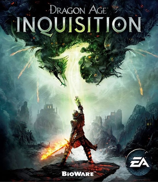
These covers do look good, but I can't help thinking the second one is just an altered/inverted first one. The work on the second one from a design perspective leaves a lot to be inspired in terms of the lost detail. For instance the outlines of the goblin-like/ghost-like creatures forming the top of the dragon in the first image are clearly still present in the second but almost all of the detail has been removed. It makes the slight detail we can see of them in the second image look like like shoddy remains of a drawing that has been rubbed out. So if they go for the second, I hope they touch up those edges (or makes the creature-likeness a bit more pronounced so it doesn't look like a random assortment or arms and spikes). Just my take though.
Although since my sister is an artist who sometimes asks for my input on her work before finishing it, maybe I'm just nit-picky (since that's what she expects me to be).
As a little test to see if it makes sense for the second one to be an inverted and slightly re-coloured first image I tried to do just that. I took the original image, inverted the colours and then just a quick adjustment with the curves function to change the image to be predominantly red. Here's what I got:

I think with someone at the helm who had more finesse with Photoshop (especially in terms of brightness and contrast) then It seems like that second image would be a very quick job. It took me less than 10 minutes including making this comment.

As a little test to see if it makes sense for the second one to be an inverted and slightly re-coloured first image I tried to do just that. I took the original image, inverted the colours and then just a quick adjustment with the curves function to change the image to be predominantly red. Here's what I got:
I think with someone at the helm who had more finesse with Photoshop (especially in terms of brightness and contrast) then It seems like that second image would be a very quick job. It took me less than 10 minutes including making this comment.
I don't think a quick job means it's a bad job. I like the way the second one looks. It's aesthetically pleasing.
@generic_username: I wasn't necessarily saying it was a bad job. I like the art direction and the aesthetic of the second one more than the first (And it continues the blood dragon connotations from the previous two games which I liked). I'm just saying its a sub-par reflection of that idea. Just needs a bit more polish.
Man, that box-art is way cooler now that I can actually see the dragon, I totally didn't notice it until that second image with the inverted colours or whatever. I do like the white and red aesthetic better, but it's a cool piece of box art anyway and pretty atypical for a major publisher's release. Nice to see.
Also interesting that "Inquisition" is more predominant than Dragon Age, seems EA/Bioware want us to refer to the game simply as Inquisition as shorthand.
Here's hoping this game is awesome.

I guess I'm in the minority. I like the first one better.

Didn't even notice the dragon in the first cover until the other guy pointed it out

The one on the right is baller

I like the first one better. I appreciate the details that went into the ghouls/demons that are reaching out to the warrior dude. The 2nd one looks nice is well, but those details were lost in making it white and red.

Pretty much everything I saw and heard about this game so far fills me with hope and hype.
Blood dragon one is better. The first one is nice, but the blood dragon is pretty much the de facto style for Dragon Age covers now. They should keep it. It's distinct.

I prefer the first one myself. The second one is decent as well, but as Dixavd said, it needs a bit more polish. I wonder if this means that an info dump of some sort is incoming.

Really cool looking. Very excited for this one.
Please Log In to post.
This edit will also create new pages on Giant Bomb for:
Beware, you are proposing to add brand new pages to the wiki along with your edits. Make sure this is what you intended. This will likely increase the time it takes for your changes to go live.Until you earn 1000 points all your submissions need to be vetted by other Giant Bomb users. This process takes no more than a few hours and we'll send you an email once approved.


Log in to comment