I can't believe that the banners I made last year as a joke are still sitting in my images folder on my computer. Might as well upload them to give everyone a laugh again:
Oh wow. I kind of want to gouge my eyes out so that these beautiful works would be the last thing I ever saw... but then I wouldn't be able to play any more videogames, so I'll pass on that idea.
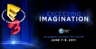
What I have so far and I think they look alright. I was trying to do something different than what's already on here. What do you guys think? Good.. Bad..
@face15: Can you add just a slight vertical gradient to each of these going light to dark? It'd make them look more embossed so the shadow is more believable. :] I really like the design regardless.
Once I started it felt like way more work than I anticipated. Didn't like at all what I had. Then once I got the curved shading on the text and decided to take out the GB logo and put in Luchadeer things started to fall together. It was easier after that, and actually kind of fun.
I do like the other submissions on here as they are slick ass fuck, but think these are my favorite as they seem to have great continuity, and they aren't abrasive to my eyes.
@CitizenKane: I had a plan to make 3 but for now i dont have time and my photoshop skills are poor I'll redo them in a different lossless format next time.
I'm going to be honest, I am absolutely shit at doing these type of things. But I was bored and gave it a go.
I noticed that it's a bit, uh, barren and rough. But the fact that it's not complete trash means I happy with it. Though after seeing some of the others here it was embarrassing to even consider showing this. But hey, it's a bit of fun.
Seemed like a good excuse to use Photoshop for the first time in a looooooong time. Unfortunately the result is not quite as fun as many of you guys have come up with. But still, here's version A of the set, hope someone likes them...
Made some more tweaks to my second design. I'll edit my other post (page 2) so that all my entries are all in one place, but here they are. Mainly, I changed the font up and added an effect to it, added the conference time, and made the colored section a bit smaller leaving more space for the images.
Oh God, Ryan Fenix looks weird! But Commander Gerstmann looks oddly badass. Design and colors and the font on the banners look great.
THE FUCK IS UP WITH RYANS FACE!? Jeff is reminding me of JCVD, wat. Majority of banners look slick as hell. Request: "E.. 3.. in the coffee. Never fails!" *York smile*
hehe, it's marcus fenix's nose combined with the rest of ryan's face! it looked boring with just ryan's face, and wasn't right in a whole different way.. so i went for crazy huge freak nose! :)
Hi, in response to a note, I've amended one of the previous versions with a BF3 image rather than a Bad Company 2 image (I'll edit my original post to reflect that). Thanks.
Okay, after a bit of thinking I've decided (for better or worse) to take this mildly serious and go back to mine and give a clean up. I hope it wasn't time completely wasted.
OK, one more (last?) edit to this design. I've changed the font used for the time of the conferences. Again, other post has been edited. Using EA again here, since that's the one people like to quote.
This edit will also create new pages on Giant Bomb for:
Beware, you are proposing to add brand new pages to the wiki along
with your edits. Make sure this is what you intended. This will likely
increase the time it takes for your changes to go live.
Comment and Save
Until you earn 1000 points all your submissions need to be vetted by other
Giant Bomb users. This process takes no more than a few hours and we'll
send you an email once approved.


Log in to comment