The third installment in the series sees a reluctant victim battling nature, pirates, and the island's insanity-inducing jungle to rescue his friends and family from an island paradise gone horribly wrong.
Okay you guys have probably seen the cover by now. But after seeing a Neo Gaf Thread on photoshopping it, I knew we had to have one. Here are some I found:
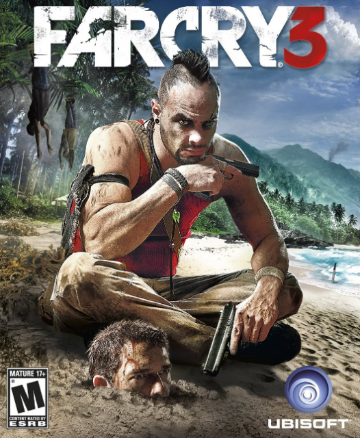
There's a bunch of dudes complaining about the boxart in that thread but, personally, I think it's pretty cool. So far, they're doing a good job selling me on their villain.
There's a bunch of dudes complaining about the boxart in that thread but, personally, I think it's pretty cool. So far, they're doing a good job selling me on their villain.
Yeah I don't mind it at all actually. Looks not bad at all.
I think that actually looks cool as fuck. From what I've seen this game is about getting high and killing dudes in tropical settings and this boxart seems pretty in line with that.
I think the thing that breaks it for me is the fact that he's looking at the camera. If he was just looking out towards to the beach or towards the guy it would tell much more of an interesting story, but by breaking the fourth wall it becomes so much less sinister.
There's a bunch of dudes complaining about the boxart in that thread but, personally, I think it's pretty cool. So far, they're doing a good job selling me on their villain.
Yeah I don't mind it at all actually. Looks not bad at all.
It's not just that they put the villain front and center - although that is done nicely. It's the way they depict the protagonist that really clinches the deal, for me. Making him so obviously fucked, and in such a bizarre way, just emphasizes the psychotic nature of the whole thing. I really don't like that in a lot of the box art images I'm seeing, the edges are blurred out. Mohawk man may be the centerpiece, but that dude freaking out in the bottom corner really 'brings the room together'.
Also, he looks like he just realized he needs to pee. Hilarious.
I'm really hyped for this. It's probably just gonna be ok, but they are killing it with the PR for this game. If this game is half as much of a mindfuck as they've made it out to be, I'll be one happy camper.
I haven't read any topics on the box art, and I haven't even seen this box art, but whoever said it's not great, I'll have to agree with. Unless the purpose is to say "look at this one villain in the game, and some dudes head in the sand!"
I honestly hope they keep something like this boxart for the real game. I'd drop the guy in the sand though since, while we get it, it's a strange touch for people who might not be listening to the pre-release marketing. I'll say that they're doing a fantastic job of selling me on the villain, though!
Solution? Get it on steam. NO FUCKING LOOKING AT BOX ART! PROBLEMZ SOLVED!
To this day I don't understand how your gaming experience can be complete when you're not swimming in the stickers and posters and manuals of the game you're playing. A game being nothing more than an Install button is just... cold. I almost inserted the Alan Wake postcards I got in my underwear while sleeping that night.
I prefer the previous promotional shots as the box art but I can live with this one. Hopefully they have a different cover for the collector's edition.
@AhmadMetallic: That stuff almost doesn't matter anymore. Hardly anyone prints manuals worth a crap anymore. Some not at all and when I'm just buying a disc in a case I'd rather have just a digital file when I'm going to install it on my 360 or PC anyways. Especially on my PC theres no reason for physical things since I have a 1TB HDD.
@warxsnake: Would they really bother making region-specific covers if it was a placeholder?
They are different stages of creation, one version got one state, one got another. Really people put way too much thought into this shit. US version got an older placeholder as the version was submitted first, europe gets a revised placeholder. This is done all the time, everywhere.
Thought I'd bring this to your beautiful thread. Turns out shitty radial blur and sunburn is trendy in America.
Awww look, somebody at UbiSoft USA discovered the filters in Photoshop. Always heartwarming when it happens. Next up: Assassins Creed 3, all embossed up the ass!
Thought I'd bring this to your beautiful thread. Turns out shitty radial blur and sunburn is trendy in America.
Awww look, somebody at UbiSoft USA discovered the filters in Photoshop. Always heartwarming when it happens. Next up: Assassins Creed 3, all embossed up the ass!
The US cover looks like shit. Why did they blur things out? Let the image speak for itself
This edit will also create new pages on Giant Bomb for:
Beware, you are proposing to add brand new pages to the wiki along
with your edits. Make sure this is what you intended. This will likely
increase the time it takes for your changes to go live.
Comment and Save
Until you earn 1000 points all your submissions need to be vetted by other
Giant Bomb users. This process takes no more than a few hours and we'll
send you an email once approved.


Log in to comment