
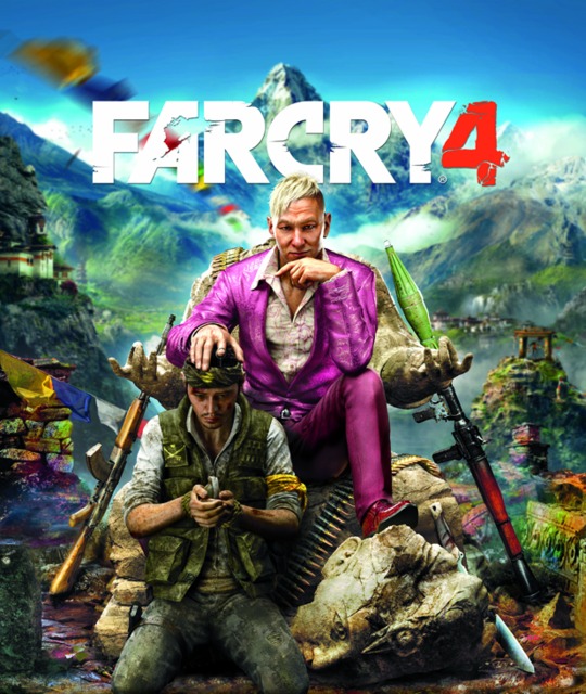
The only thing racist about this cover is this clearly red suit.
Far Cry 4
Game » consists of 15 releases. Released Nov 18, 2014
- PlayStation 4
- Xbox One
- PC
- PlayStation 3
- + 4 more
- Xbox 360
- PlayStation Network (PS3)
- Google Stadia
- Amazon Luna
Far Cry 4 puts the player in the role of Ajay Ghale and pits him against a deadly antagonist and an even deadlier environment. Caught in the middle of a brutal Civil War while fulfilling his mother's dying wish, Ghale must fight back against the oppression of Kyrat's leader, Pagan Min, while also battling the ruthlessness of the jungle.
Far Cry 4's Actual Box Art Not So Racially Charged


@evo said:
I prefer the promotional art. The way he's crossing his legs on the box art makes for a weird composition. It'd look better if his legs were like that in the promotional art, or crotch-closed.
Loading Video...
It's kind of funny that you would post this, given the fact that people are questioning the sexual preference of the purple suit guy. I remember many years ago I was sitting with my legs crossed at the knees, and an acquaintance of mine said "what are you, gay?" I asked him what he meant by that, and was told "Only gay guys sit like that. That's the way women sit."
This was over twenty years ago, and I was just a stupid kid, so I remember actively trying not to sit "the gay way" for a while after that. Of course, then I grew up, stopped caring what other people thought of me, and stopped listening to assholes in general.
So yeah, if the way you cross your legs is any indication of homosexuality--which it certainly isn't--he's totally straight. You can relax everybody. There will be no possible improper representation of a gay man as the villain, because he's clearly not gay.

The promotional one would make a really good piece of box art. The new one is merely pretty good, though still above-average.
If they indeed changed it for sensitivity reasons, I encourage them to consider how much the racism controversy hurt Resident Evil 5.


Mother fuckers, this suit ain't no normal pink or purple. Where the light hits the suit the colour is Thulian Pink. The mid-range of the pink shades at the top is called "Royal Health."

@spaceinsomniac: I was only looking at it from a compositional standpoint, but now that you mention it, if this guy is in fact supposed to be gay it would've been better if they crossed his legs "the gay way". I don't entirely agree with your friend, but I think there is some truth to his statement. Woman do sit like that, therefore I think on a subconscious level at least it does convey a message.

I never felt the first picture to be all that racially charged and I think it conveys a better idea of how much of a villain this guy actually will be.
@evo said:
@spaceinsomniac: I was only looking at it from a compositional standpoint, but now that you mention it, if this guy is in fact supposed to be gay it would've been better if they crossed his legs "the gay way". I don't entirely agree with your friend, but I think there is some truth to his statement. Woman do sit like that, therefore I think on a subconscious level at least it does convey a message.
Pfft, sitting that way is just bad-ass.


Well, duh.
As stated in the OP, there were two versions of that artwork released when the game got announced. Anyone with a little bit of brain power probably could've figured out that they weren't going to use the version with the kneeling soldier as their boxart to put on shelves.
@robertorri said:
Well, duh.
As stated in the OP, there were two versions of that artwork released when the game got announced. Anyone with a little bit of brain power probably could've figured out that they weren't going to use the version with the kneeling soldier as their boxart to put on shelves.
The Far Cry 3 box depicted the antagonist sitting on a beach next to a victim who was buried in the sand up to his head, while two likely dead bodies hung from the trees in the background. With that in mind, why is it that you believe "anyone with a little bit of brain power probably could've figured out that they weren't going to use the version with the kneeling soldier as their boxart" ?
Do the ones on the Far Cry 3 box look like ethnic minorities?
@robertorri said:
Do the ones on the Far Cry 3 box look like ethnic minorities?
It's funny, because you have others arguing the opposite.
"Ubisoft would never make a game cover where a minority would be in power over a white person!"
"Ubisoft would never make a game cover where a white person would be in power over a minority!"
Buncha damn racists the lot of ya!
Only kidding (mostly)

@liquidprince said:
Everyone has to complain about everything these days because they don't want to be seen as sexist, racist etc... Should we look and see if there is a reason as to why something is the way it is? Does it make contextual sense? Bah, screw all that. Complain, just to be on the safe side.
I fucking hate the safe side these days.
@notnert427: I can't believe what I'm seeing in this thread. Some people took offense with the image. And you know what, that's absolutely fine, nothing wrong with that whatsoever. But just because you weren't bothered by it doesn't mean you can go around, shit on people and call them ''crusaders''.
Jesus Christ people, not everyone who is trying to voice their concerns are ''crusaders''. Get off your high horses. Way to disregard all other point of views except your own. Because obviously if they aren't you their perspectives aren't valid right? And what if they are ''crusaders''? Is that really so bad?
A little empathy goes a long way.

You may think that there is nothing wrong with respecting a minority outcry, but when you restrict speech to that which offends no one, you are basically destroying creative freedom. Also, fuck empathy.
Also, you're all wrong, that suit is puce, and I hate it, because those matching shoes are so gauche.
Edit: When I look at the game page on GiantBomb it's clearly pink, and the one in the OP is desaturated to the point of being puce.
@veektarius: No I get that, I really do. But this whole thread is unnecessary. Colorism doesn't exist. The other -ism is a real problem.

@sccdemir: The cover doesn't offend me in the same way that your "Jesus Christ people..." doesn't offend me.
However, millions of people worldwide are deeply offended by using the lord's name in vain so perhaps, as a bastion of empathy, you could consider editing your post?

@sccdemir: I'm merely observing that the lengths people go to in order to get offended are ridiculous these days. With this promo art, the PC crusader response was "OMG white person subjugating minority - RACISM!!!" Now let's hypothetically say both characters were white people. PC crusader response: "This game is not inclusive enough - RACISM!!!" Now, let's say they switched the characters to where you've got a white guy being oppressed by a minority. PC crusader response: "A minority villain - RACISM!!!" See what I mean? If someone tries hard enough to get offended, they can do so about pretty much anything.
Look, actual racism is fucked up. However, this kind of stuff that's simply in the eye of the beholder and requires an extremely narrow focus through race goggles in order to get in a tizzy over it is WAY out of control. Can people really not understand that they're inherently not supposed to approve of a villain's actions? We've got a piece of promo art here that essentially communicates "stop this white villain from oppressing a minority" and that was apparently an offensive message? WTF? And yes, the people who get up in arms about this shit are crusaders. I'm not saying they're not entitled to their perspective, nor am I disregarding their point of view; I just grow weary of the ever-increasing number of people who act/are irate over non-issues out of sheer pomposity.


It was never racist in the first place.

Purple suit. It's a purple suit, guys.

@ulquiokani said:
I'm clearly missing something but why was the promotional image racist?
@legion_ said:
It's just so fucking stupid. This whole thing. Storm in a glass of water. Sensationalism at it's worst. Some Kotaku type shit right here.
Too much PC bullshit going on.
@professoress: Except Ubisoft actually did acknowledge the problem and edit the box art. They wouldn't do that if they didn't think there was any.
@notnert427: Don't beat yourself up over it so much. Like I said, they wouldn't have taken this course of action if this didn't upset as many people as it did.
@sccdemir said:
@professoress: Except Ubisoft actually did acknowledge the problem and edit the box art. They wouldn't do that if they didn't think there was any.
You just completely ignored the request to not use the Lord's name in vain.
And Ubisoft never changed the box art, because the first promotional image never was the box art.
@spaceinsomniac: I see.
I'm trying to find instances of people on the net speaking out against the box art (or the image that was first released) and I'm having trouble finding anything more than a few tweets, which are claiming the box art is white supremacist. The creative director already confirmed that he wasn't white and I assume that leaves a portion of Asian people who would be potentially offended by the art and since there doesn't seem to be any outcry from them, guess we are arguing about nothing here. Moving on.

Annoyed with how generalized the butthurt over what race he appears to be is. This is how we get nice things, by calmly observing. Generalizing those 'crusaders' (ISIS,GG jokes not linked? Disappoint) ignores the idea of homogenization of appearance and skin tone in media and really marginalizes those trying to comment on a nuanced matter. New evil guy reads more like shock jockery using tacky tactics to ensure attention, at after Vaas at least. Aren't people tired of 'shocking to effect 'in general? I guess not, much like equalists still being sold by sex in marketing.
People need to stop losing their shit of dumb stuff like a video game cover.

@sccdemir: For what it's worth, I do find your casual use of "Jesus Christ, people..." to be offensive, however by this point I'm so jaded and used to blasphemy I don't normally say anything about it anymore.
More to the point, my original reaction to that first box art image was that it looked a bit racist, but that was because I assumed the guy in violet to be the main protagonist. If he is clearly the villain (and I do think that's not obvious at all -- then it seems a reasonable trait for a villain and perfectly reasonable for you to go hunt him down.

I've never had a problem with the original promo art. It depicts a villain, looking evil, and doing villainous shit, like subjugating people. Depicting a bad person as a bad person is fine.
That said, I have no problem with the official cover either.

Why are people bumping this after huge amounts of time with no posts telling everyone to calm down? Lolz
I still think the original cover's great.

@believer258 said:
@fredchuckdave said:
@believer258: @jasonr86: It's definitely more pink than purple.
That's purple dude.
Stop arguing over colors like a child "believer258" its pink. The team said it themselves....

@crazybagman: We did. You're the one who necro'd the thread.

@exiledastronaut: Even besides that, I feel that if you have the villain of your game on your box art, do everything in your power to make the image as effective as possible. The first art type tells me that this is the kinda guy who lords over people, particularly those who are especially weak and easily oppressed. He also has no sense whatsoever of empathy for his fellow man.
The second, updated one tells me he's... Maybe a gun-runner? And dresses like a crime lord version of Don Cherry. Not as interesting at all.

@fredchuckdave said:
Fuck all you pink is purple commie motherfuckers.

I like how the previous guy who necroed the thread asked for it to be closed. The thread had been gone and forgotten for 4 months until he reminded everyone while begging for it to be closed. Also, this thread is full of stupid.
Please Log In to post.
This edit will also create new pages on Giant Bomb for:
Beware, you are proposing to add brand new pages to the wiki along with your edits. Make sure this is what you intended. This will likely increase the time it takes for your changes to go live.Comment and Save
Until you earn 1000 points all your submissions need to be vetted by other Giant Bomb users. This process takes no more than a few hours and we'll send you an email once approved.
Log in to comment