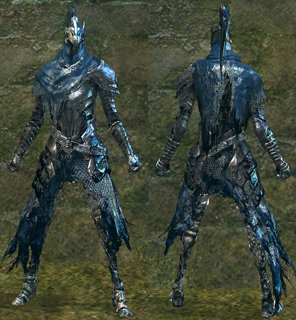
A study of the Dark Souls II cover art

Avatar image for galacticgravy
galacticgravy

665

Forum Posts

21

Wiki Points

0

Followers

Reviews: 0

User Lists: 1

#1  Edited By galacticgravy

I write these over at boxedinfinity.com, but I thought you guys would be interested seeing as though nobody knows my blog even exists.

GOOD COVER ART: DARK SOULS II
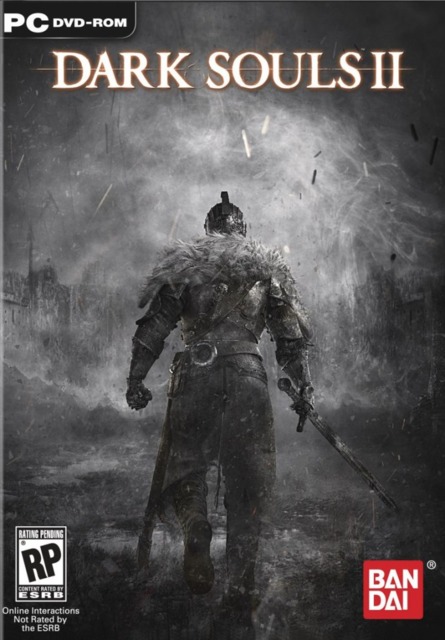
Dark Souls II, 2014, multiplatform

Grey is one of the more complex visuals tools. A seeming paradox, as it is complex in its perceived simplicity. Grey is not simple. When we think of grey we think of a mixture of black and white. The truth is that, in practical use, grey retains color. Thus, we can think of grey as an extremely desaturated color. Blue with 95% of the blue sucked out or red missing 98% of its redness. The essence of the hue remains, although barely perceivable. The soul of the color barely clings on waiting to be lopped off by the twitchy hands of the artist.

From Software’s Dark Souls II has fantastically bold cover art that is comprised, mostly, of grey. The back of a character, presumably the hero, faces the viewer as they trudge off, alone, into a foggy passage to a ruin. A bit of asymmetry in the sword-wielding hero and perhaps the hint of a forward hunch in the step suggests that this champion is worn, weathered, and might not have much time left. Anyone with even a passing knowledge of the Dark/Demon’s Souls franchise knows that the action RPG is characterized by brutal difficulty and an esoteric style of direction. The cover art alone beautifully depicts this and even to the eye ignorant of From Software’s monster, Dark Souls II seems daunting, strange, and cold.
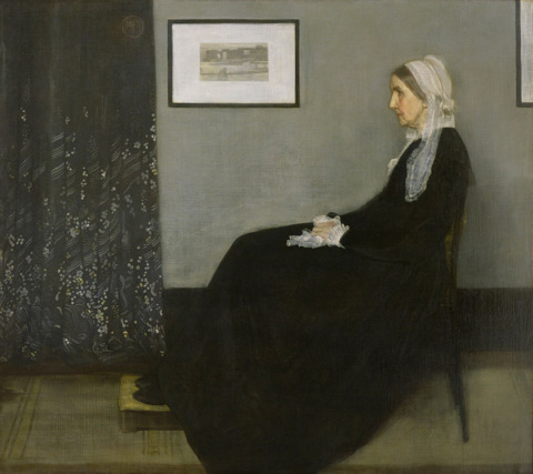
Arrangement in Grey and Black No.1, James McNeil Whistler, 1872, oil on canvas

For some historical reference let’s briefly study a painting more famous than its creator. Here we’ll see that same coldness personified in a setting as non-heroic as it gets. James McNeill Whistler’sArrangement in Grey and Black No.1 (colloquially known as Whistler’s Mother) uses many shades of grey and a single subject much like the cover of Dark Souls II. An old woman sitting solemnly against a grey wall dressed in black with a little white. In front of her is a hanging picture that looks perhaps like an industrial scene, and hanging across the left third of the painting is drapery that look floral in nature, but are also a darker grey. Is the grey sucking the life from this poor old woman? Is it a mirror of her current drab, menial life? Perhaps it’s metaphoric of an old woman having nothing to look forward to other than the darkness and flowers of a coffin. Was grey paint cheaper so that’s the color they happened to paint that wall? All of these are possibilities, but so much can be said for a painting simply of a woman in a chair. The lack of hue contrast gives a unified feeling to the piece. It’s not exciting but lonely and subdued. Think about how this would differ if just one item were red.
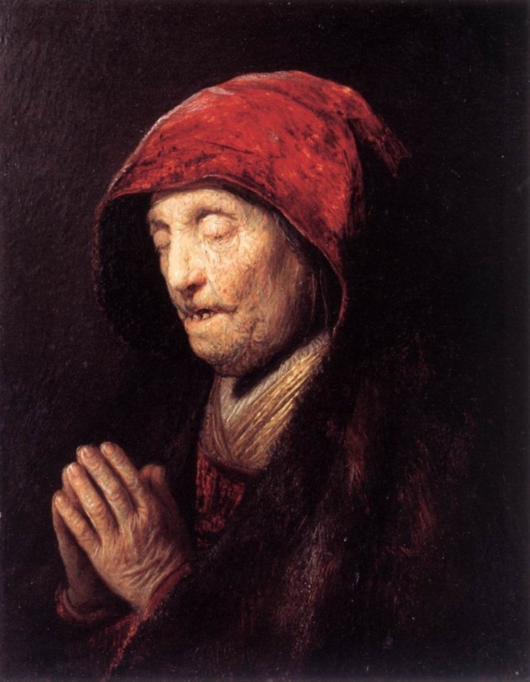
Old Woman Praying, Rembrandt von Rijn, 1630, oil on copper

Take a look at Rembrandt’s An Old Woman at Prayer for another elderly woman. While this woman looks less dignified than Whistler’s Mother (frankly, she looks like an enemy from Dark Souls) the red shroud around her and the contrast in lighting give her a look that’s almost holy. We have dynamic messaging here. This hideous old woman is a champion of light in her own way, bathed in light from above. The red around her could be symbolic of blood. As in, the blood of Christ. Holy light and the blood of her Lord make this old woman something we could conceivably want to be like. Whistler’s Mother, conversely, doesn’t paint the idea of something we want to achieve. Physical ugliness juxtaposed with holy reverence is something that’s not so ambiguous here. Instead of greyness sucking the soul from the piece we have light illuminating it. Light makes color possible (another religious message in Rembrandt’s portrait, should you chose to see it that way) and taking away that light threatens the color.

Return to our hero in grey and look closely. There is some color on and back, on the boot, and on the scabbard but the majority is in grey. It’s as if the color itself is being sucked away by the scene before us. If you’re over 25 you may remember "Rainbow Brite." Both an animated and a (super creepy) live action version of the show existed and the main villain’s plot was always to suck the color from the world. He wanted everything to be grey. This would, ostensibly, suck all of the happiness from the world. In the cover art for Dark Souls II we’re seeing a similar theme. Here, grey is being used as a threatening mechanic. The hero is having the life sucked from the world around and, by association, the soul itself. It’s important to remember that grey is not black or white. There is still hope. Our broken hero can still limp through the fog and save the day. Perhaps at the cost of a life or even a soul.
Avatar image for fredchuckdave
Fredchuckdave

10824

Forum Posts

0

Wiki Points

0

Followers

Reviews: 0

User Lists: 2

A bit silly but I think you're someone who would actually care about this: "The back of a character, presumably the hero, faces the viewer as they trudge off" is not so great writing; something like "the archetypal hero trudges away from the camera" would serve the same purpose with less than half the words. The usage of camera is not only acceptable but desired given the medium, and since "fourth wall" is not an option given the serious tone of the game it is probably the best representation of the stage.

Avatar image for geirr
geirr

4166

Forum Posts

717

Wiki Points

0

Followers

Reviews: 1

User Lists: 5

Fun read! I find the cover sort of boring myself, a bit too "expected" I guess? But after reading this there might indeed be more to it than meets the eye at first.

Avatar image for icemael
Icemael

6901

Forum Posts

40352

Wiki Points

0

Followers

Reviews: 20

User Lists: 20

#4  Edited By Icemael

There is no such thing as a colour that's complex. A colour is by definition the simplest visual element.

Avatar image for deactivated-5a4ea8fdbe490
deactivated-5a4ea8fdbe490

401

Forum Posts

0

Wiki Points

0

Followers

Reviews: 0

User Lists: 0

I thought it was just fog.

Avatar image for belegorm
Belegorm

1862

Forum Posts

0

Wiki Points

0

Followers

Reviews: 0

User Lists: 0

A bit silly but I think you're someone who would actually care about this: "The back of a character, presumably the hero, faces the viewer as they trudge off" is not so great writing; something like "the archetypal hero trudges away from the camera" would serve the same purpose with less than half the words. The usage of camera is not only acceptable but desired given the medium, and since "fourth wall" is not an option given the serious tone of the game it is probably the best representation of the stage.

Not to mention the words "character" and "hero" are singular while "they" is plural; considering it's obviously a male character it would be more grammatically correct to say "he trudges off"

Avatar image for laserguy
laserguy

550

Forum Posts

0

Wiki Points

0

Followers

Reviews: 0

User Lists: 1

I'm not getting Dark Souls 2 as someone who is stuck on Smough and his friend, i will be in Anor Londo for a bit more. Nice read, if a bit unpolished.

Avatar image for jacksukeru
jacksukeru

6864

Forum Posts

131

Wiki Points

0

Followers

Reviews: 0

User Lists: 22

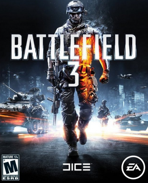
Even though he's facing the other way the boxart reminds me of this.

Broad shouldered anonymous tough guy walking slowly toward/away from camera.

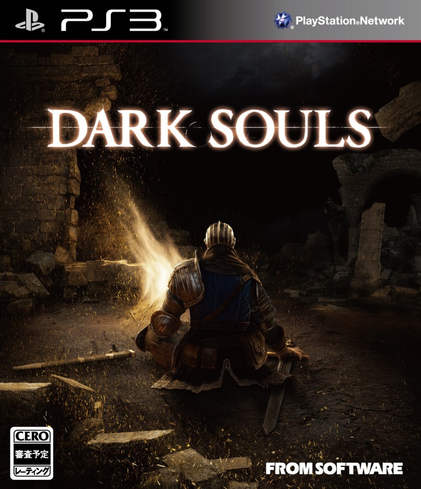
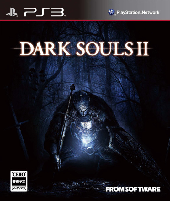
Personally I like the Japanese boxart a lot more.

Knight hunched over a souls-y blue light in a deep dark forest.

I'm probably going to get whatever collector's edition is available, which will have different art, so I guess it doesn't matter.

Avatar image for galacticgravy
galacticgravy

665

Forum Posts

21

Wiki Points

0

Followers

Reviews: 0

User Lists: 1

#9  Edited By galacticgravy

@belegorm: "They" can be used as a singular, and I was being sure to not use gender specific pronouns, because in Dark Souls you can be male or female.

Avatar image for fredchuckdave
Fredchuckdave

10824

Forum Posts

0

Wiki Points

0

Followers

Reviews: 0

User Lists: 2

I do like that Japanese art.

Avatar image for truthtellah
TruthTellah

9827

Forum Posts

423

Wiki Points

0

Followers

Reviews: 0

User Lists: 2

#11  Edited By TruthTellah

That Japanese cover is twice as good in my mind. The US one just looks a little too "cool". I can appreciate it being achromatic, but eh, that Japanese cover says "Dark Souls" to me.

Avatar image for ezekiel
Ezekiel

2257

Forum Posts

0

Wiki Points

0

Followers

Reviews: 0

User Lists: 0

#12  Edited By Ezekiel

It's generic crap. The Japanese cover is better, but I don't like it either. I don't want a player character on the cover. That's not what my characters will look like.

Well, it doesn't matter. I'm downloading it from Steam because the 60 dollar disc version doesn't come with an art book. I'm not even confident there will be a disc version for Windows in NA.

Avatar image for truthtellah
TruthTellah

9827

Forum Posts

423

Wiki Points

0

Followers

Reviews: 0

User Lists: 2

#13  Edited By TruthTellah

@ezekiel said:

It's crap. The Japanese cover is better, but I don't like it either. I don't want a player character on the cover.

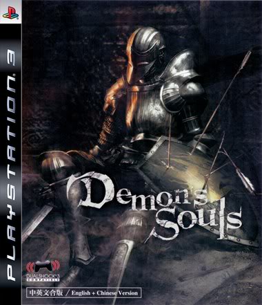
I think the Japanese cover fits each of the previous Souls games covers. A lone figure in a kind of simple and lonely darkness.

No Caption Provided
No Caption Provided

Avatar image for fredchuckdave
Fredchuckdave

10824

Forum Posts

0

Wiki Points

0

Followers

Reviews: 0

User Lists: 2

#14  Edited By Fredchuckdave

@ezekiel: Fluted Armor/Knight's Armor guy is the mascot of the series, sorry buddy (and pure 1 handed sword/shield is typically one of the harder ways to go through the game)

@truthtellah: The Demon's Souls one is a bit emo.

Avatar image for truthtellah
TruthTellah

9827

Forum Posts

423

Wiki Points

0

Followers

Reviews: 0

User Lists: 2

Avatar image for fredchuckdave
Fredchuckdave

10824

Forum Posts

0

Wiki Points

0

Followers

Reviews: 0

User Lists: 2

#16  Edited By Fredchuckdave

@truthtellah: No I am a jubilant fellow of the highest ethic. Also I'm pretty sure it's completely impossible for me to be emo, it's like thinking something was my fault. Impossible.

Avatar image for truthtellah
TruthTellah

9827

Forum Posts

423

Wiki Points

0

Followers

Reviews: 0

User Lists: 2

#17  Edited By TruthTellah

@truthtellah: No I am a jubilant fellow of the highest ethic. Also I'm pretty sure it's completely impossible for me to be emo, it's like thinking something was my fault. Impossible.

Fair enough. :|

Avatar image for fredchuckdave
Fredchuckdave

10824

Forum Posts

0

Wiki Points

0

Followers

Reviews: 0

User Lists: 2

Avatar image for crithon
crithon

3979

Forum Posts

1823

Wiki Points

0

Followers

Reviews: 1

User Lists: 11

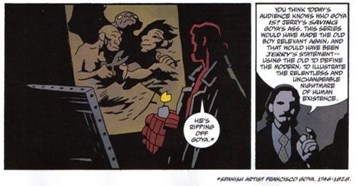
interesting.... but for some reason I'm reminded of Hellboy "Chapel Meloch" comic "He's ripping off of Goya" only because Hellboy references Goya a lot in his past comics. And then the artist eventually breaks down and screams "No I was just ripping off Goya." Well and that every time I play Dark Souls keep thinking of Hellboy comics.

No Caption Provided

Avatar image for cornbredx
cornbredx

7484

Forum Posts

2699

Wiki Points

0

Followers

Reviews: 0

User Lists: 15

I was not expecting this to be as interesting to read as it was.

Well done. I love being surprised =)

Avatar image for steadying
Steadying

1902

Forum Posts

8

Wiki Points

0

Followers

Reviews: 0

User Lists: 2

Kinda reminds me of a certain piece of artwork for Nier. The whole buff swordsman with his back turned walking into some broken city with fog everywhere thing. :P

Avatar image for galacticgravy
galacticgravy

665

Forum Posts

21

Wiki Points

0

Followers

Reviews: 0

User Lists: 1

#22  Edited By galacticgravy

@cornbredx: Thanks, man. I know the topic can be dull for some. Really, the entire purpose of the blog is from my experiences back in college. As an art student they make you take 4 art history courses. Everyone hated them. Everyone but me. I really enjoyed all of it and I wanted my fellow students to see the light. Even though my classmates are long gone from school, I was hoping to inspire new art students to look to art history as a source of inspiration and realize how important it is for both your own work and historical value.

Avatar image for belegorm
Belegorm

1862

Forum Posts

0

Wiki Points

0

Followers

Reviews: 0

User Lists: 0

Wow, I can't really decide if I prefer the NA Dark Souls II box, or the JP one. Definitely prefer the JP Dark Souls box though, I thought the NA one was pretty boring.

Avatar image for galacticgravy
galacticgravy

665

Forum Posts

21

Wiki Points

0

Followers

Reviews: 0

User Lists: 1

@belegorm: I think I prefer the Japanese one because I think it better personifies the feeling of powerlessness that Dark Souls can sometimes bring, but I wrote the article about the NA version because I was better able to fit it into a theme to discuss.

Avatar image for demmetje
Demmetje

224

Forum Posts

2

Wiki Points

0

Followers

Reviews: 0

User Lists: 0

#25  Edited By Demmetje

@icemael: Colours aren't instrinsically complex, but the cultural, historical, ideological and semiological values associated with a colour can be complex.

Avatar image for icemael
Icemael

6901

Forum Posts

40352

Wiki Points

0

Followers

Reviews: 20

User Lists: 20

@demmetje: Every colour has a rich history of use, but they still remain the simplest visual tools there are, and certainly no one of them is a more "complex visual tool" than any of the others. One might as well say that the note C is "one of the more complex musical tools" and "complex in its perceived simplicity". It's worthless nonsense being passed off as insight.

Avatar image for scampbell
Scampbell

517

Forum Posts

0

Wiki Points

0

Followers

Reviews: 0

User Lists: 0

#27  Edited By Scampbell

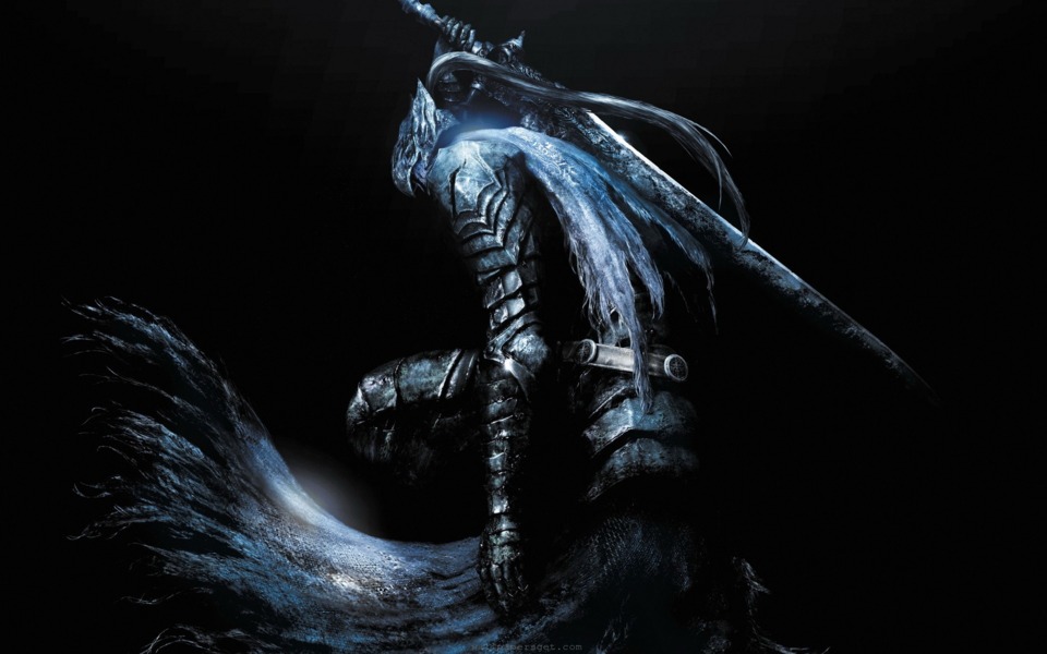
I really like the Prepare to Die Edition cover.

Interesting how they actually decided not to put the player on the cover but an enemy.

Avatar image for demmetje
Demmetje

224

Forum Posts

2

Wiki Points

0

Followers

Reviews: 0

User Lists: 0

@icemael: I think we pretty much agree on everything. Of course, colours stripped from its historical connotations aren't more or less complex from each other. But I also think it is impossible for any human being above a certain age to see these elements purely, associations are impossible te completely get rid off. Black, white and grey are more complex historical constructs than lets say, magenta or yellow, because of their ties to conceptual system linked to morality, race and art vs. science (Is white or black the culmination of all colours? And then: what is grey?). That's why I think there is some merit in claiming the complexity of grey in the OP.

Avatar image for oursin_360
OurSin_360

6675

Forum Posts

0

Wiki Points

0

Followers

Reviews: 0

User Lists: 0

Even though he's facing the other way the boxart reminds me of this.

Broad shouldered anonymous tough guy walking slowly toward/away from camera.

Personally I like the Japanese boxart a lot more.

Knight hunched over a souls-y blue light in a deep dark forest.

I'm probably going to get whatever collector's edition is available, which will have different art, so I guess it doesn't matter.

exactly, this cover looks lame and tired to me. They basically use this template for every game now, even the first dark souls lol

Avatar image for fredchuckdave
Fredchuckdave

10824

Forum Posts

0

Wiki Points

0

Followers

Reviews: 0

User Lists: 2

@scampbell: Obviously it's fluted knight armor guy with a change of clothes.

Avatar image for scampbell
Scampbell

517

Forum Posts

0

Wiki Points

0

Followers

Reviews: 0

User Lists: 0

@fredchuckdave: My mistake, had forgotten about the updated fluted armor.

No Caption Provided

Avatar image for galacticgravy
galacticgravy

665

Forum Posts

21

Wiki Points

0

Followers

Reviews: 0

User Lists: 1

#32  Edited By galacticgravy

Edit: Eh...I probably shouldn't instigate.

Avatar image for lysergica33
Lysergica33

601

Forum Posts

0

Wiki Points

0

Followers

Reviews: 0

User Lists: 0

Really nice article man. Such a seemingly simple aesthetic choice can hold a lot of meaning. I'm on the side of those that think this is pretty drab cover art, but as far as this style of cover goes (protagonist walks away from/towards camera, mid-stride) it's better than most and manages to convey a lot of information about what the game is about as a game, as a narrative and as a symbolic work. It's great to read an article on this kind of subject matter, rather than just discussing gameplay changes, story, etc.

This is actually kind of inspiring. I have a fair few ideas about this game as an allegory already, taken from what little we know about the narrative and some key symbolic words and phrases delivered through trailers but considering the response to this article and a couple of others I've seen, I'd probably just get called a pretentious loon.
FWIW though, nice to read something about this game that comes from a different perspective. Props duder.

Avatar image for aetheldod
Aetheldod

3914

Forum Posts

0

Wiki Points

0

Followers

Reviews: 0

User Lists: 2

This is the conversation to be had about videogames , I say. Nice write up duder.