Horrible Game Interfaces

Avatar image for crummo
crummo

17

Forum Posts

0

Wiki Points

0

Followers

Reviews: 0

User Lists: 0

Hi everyone :)

I am building up my user experience portfolio to finally have a go at a job in that field. I am doing some independent projects on usability to flesh the portfolio out and I have come up with an idea to test and redesign a game interface. I think that game interfaces are a perfect place to showcase usability, because they are so interactive compared to your average website or app. Games are always feeding you information and interacting back at you, sometimes faster than you can handle. I was thinking that an RPG might be a good place to showcase good usability, because complex inventories and stat management lend themselves to information architecture. It could be interesting to see how different people organize many different types of items into categories, given the chance to make those decisions.

So, I am looking for some games that offer a lot of interface, but need help badly. Perhaps a game that you found unfortunate, because it was a good game underneath a difficult interface. Maybe a game that lost you in the way that it failed to express the systems at work, even though you wanted to figure it out in spite of its shortcomings. PC or mobile games would be ideal because it would be very easy for me to get people in front of them, as I could DL the game on someone's PC, or I could have them do the testing on my phone. I can make mockups for either mobile or computer, so I don't have a huge preference.

Thanks in advance for the help!
Avatar image for beachthunder
BeachThunder

15269

Forum Posts

318865

Wiki Points

0

Followers

Reviews: 0

User Lists: 30

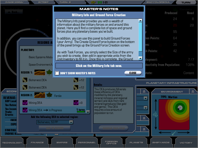
One of the best examples of terrible game UI is Master of Orion 3. So much info all over the place and so many tutorial pop-ups. You might think that it's just because it's a complicated game - which is true - but the previous two games do a pretty good job of presenting a lot of info in a much more bearable way.

No Caption Provided

The game is easily available via Gog.

Avatar image for mrcraggle
mrcraggle

3104

Forum Posts

2873

Wiki Points

0

Followers

Reviews: 0

User Lists: 5

Does Dwarf Fortress count?

Avatar image for niceanims
Niceanims

1754

Forum Posts

12

Wiki Points

0

Followers

Reviews: 0

User Lists: 0

Does Dwarf Fortress count?

This. I'd bet making Dwarf Fortress even marginally user friendly would look great on a portfolio.

Avatar image for dfl017
DFL017

311

Forum Posts

150

Wiki Points

0

Followers

Reviews: 0

User Lists: 0

#5  Edited By DFL017
Avatar image for chaser324
chaser324

9415

Forum Posts

14945

Wiki Points

0

Followers

Reviews: 1

User Lists: 15

#6 chaser324  Moderator

GT5 is up there on my personal list of worst menu interfaces. Also, pretty much any entry in the NBA 2K and Madden franchises (most of the other 2K and EA sports games too).

No Caption Provided

Avatar image for evilsbane
Evilsbane

5624

Forum Posts

315

Wiki Points

0

Followers

Reviews: 4

User Lists: 0

GT5 is up there on my personal list of worst menu interfaces. Also, pretty much any entry in the NBA 2K and Madden franchises (most of the other 2K and EA sports games too).

No Caption Provided

I have to echo this, these menus are the absolute worst they remind me of the Windows 8 "Metro" interface but infinitely messier.

Avatar image for crummo
crummo

17

Forum Posts

0

Wiki Points

0

Followers

Reviews: 0

User Lists: 0

@dfl017: Cool, I will definitely look into this. It might be cool to present my work to them if they are in the middle of development. Thanks!

Avatar image for crummo
crummo

17

Forum Posts

0

Wiki Points

0

Followers

Reviews: 0

User Lists: 0

#9  Edited By crummo

Thank you all for the replies! I will check all these games out, and yes, that GT5 interface is like some sort of Metro crap. It's not the worst I've seen, but it definitely isn't ideal. I have never played Dwarf Fortress. I always assumed it was an early PC game, and I am ashamed that I just learned it was released in 2006, haha. I am gonna play it just because I feel like it's required reading :)

Avatar image for handlas
handlas

3414

Forum Posts

18

Wiki Points

0

Followers

Reviews: 0

User Lists: 1

Probably not what your looking for but it always bothered me and I was reminded of it since the game comes out next week... but the Uncharted games have some of the ugliest menus imo. For such a well put together game in every other aspect they are so bad. Especially Uncharted 2. I can't remember if it was specifically confusing looking but they were just not visually appealing at all.

Avatar image for slowhanded
slowhanded

76

Forum Posts

0

Wiki Points

0

Followers

Reviews: 0

User Lists: 0

#11  Edited By slowhanded
@handlas said:

Probably not what your looking for but it always bothered me and I was reminded of it since the game comes out next week... but the Uncharted games have some of the ugliest menus imo. For such a well put together game in every other aspect they are so bad. Especially Uncharted 2. I can't remember if it was specifically confusing looking but they were just not visually appealing at all.

I specifically remember these being surprisingly barebones for a AAA game rather than non-functional.

Off the top the of my head, Smash 4 is really up there in terms of terrible UI (particularly the menus), but I doubt that's even close to the worst.

Avatar image for the_nubster
The_Nubster

5058

Forum Posts

21

Wiki Points

0

Followers

Reviews: 3

User Lists: 1

#12  Edited By The_Nubster

Any sports game in the past 5 years, whether it's Madden or NBA or NFL.

Mass Effect 1's menus also get a special mention; as much as I love that game, the menus are pretty nightmarish, especially when it comes to stat comparisons while buying new weapons and armour.

Avatar image for rongalaxy
RonGalaxy

4937

Forum Posts

48

Wiki Points

0

Followers

Reviews: 1

User Lists: 1

Kingdoms of amalur and dragon age: inquisition both had ugly interfaces.

Avatar image for beachthunder
BeachThunder

15269

Forum Posts

318865

Wiki Points

0

Followers

Reviews: 0

User Lists: 30

#14  Edited By BeachThunder

@the_nubster: I literally ended up just buying everything in Mass Effect because it was easier to compare stats that way. It's so baffling that you can't easily compare store items with your own inventory...

Avatar image for lawgamer
LawGamer

1481

Forum Posts

0

Wiki Points

0

Followers

Reviews: 5

User Lists: 0

Transistor - The menus look really nice, but the text for important stats is buried in really unintuitive places and gets small enough that it can be hard to read. Designed to prevent the player from getting anything useful done.

Mass Effect - For reasons already mentioned.

Two Worlds 2 - Christ, what a mess. A billion items with no way to sort through anything.

FIFA - Taking the beautiful simplicity of soccer and needlessly overcomplicating it with 10 trillion (ugly) menu options.

Avatar image for chilibean_3
chilibean_3

2406

Forum Posts

324

Wiki Points

0

Followers

Reviews: 0

User Lists: 5

@chaser324: Yuuuuuuup. God, GT5. Man. What a bummer that was.

Avatar image for joshakazam
Joshakazam

1282

Forum Posts

177

Wiki Points

0

Followers

Reviews: 0

User Lists: 0

I personally found the Marvel Heroes 2015 interface to be pretty horrid, and immediately turned me off the game.

Avatar image for mems1224
mems1224

2518

Forum Posts

0

Wiki Points

0

Followers

Reviews: 0

User Lists: 0

The battlefield games have horrible UIs. So many colors and icons on screen at once, often getting the way of the actions. Dragons Dogma and Souls games also have bad UIs

Avatar image for arbitrarywater
ArbitraryWater

16104

Forum Posts

5585

Wiki Points

0

Followers

Reviews: 8

User Lists: 66

One of the best examples of terrible game UI is Master of Orion 3. So much info all over the place and so many tutorial pop-ups. You might think that it's just because it's a complicated game - which is true - but the previous two games do a pretty good job of presenting a lot of info in a much more bearable way.

No Caption Provided

The game is easily available via Gog.

Welp, you took the one that I was going to say. Master of Orion 3's interface is one of the ugliest, most nightmarish things I've seen in a video game.

Avatar image for captain_insano
Captain_Insano

3658

Forum Posts

841

Wiki Points

0

Followers

Reviews: 5

User Lists: 15

I'll second the notion of pretty much any modern sports game.

I love the NBA2K series but the interface is woeful.

FIFA interface (which looks to be the EA Sports standard) sucks as well

Avatar image for oneloneclone
OneLoneClone

151

Forum Posts

0

Wiki Points

0

Followers

Reviews: 0

User Lists: 0

I disagree that a game interface is the best way to showcase your UX skills. I would consider solving a real world problem instead. Redesigning something employers might already be familiar with. If you want to do something "gamely" maybe do an Aug reality app that addresses a real world problem in an elegant way. It will be easier for prospective employers to understand than a complex game. Unless you REALLY want to work in the game dev hellscape.

Avatar image for 456nto
456nto

265

Forum Posts

0

Wiki Points

0

Followers

Reviews: 0

User Lists: 0

@itwongo said:
@mrcraggle said:

Does Dwarf Fortress count?

This. I'd bet making Dwarf Fortress even marginally user friendly would look great on a portfolio.

Dwarf Fortress may not have a user friendly interface at first, but it is incredibly fast to navigate through once you've learned which key does what. Some of the more advanced menus (health, military) are pretty damn intuitive once you know what you're doing, too. You can only do so much for UI design when you're working entirely with text. I would not call it "horrible" at all given the limits of the game. My only complaint is that as you get deeper into menus, certain keys are switched around for no real reason.

TW: Rome 2 has the worst user inteface in a game I've ever seen. Absolutely ugly. Important menus are crammed into tiny spaces - the tech tree is restricted to about 1/10th of the screen when it previously encompassed the entire screen. Some icons just blend into the UI (gray icons on a gray background). Units have health bars instead of raw numbers and the unit cards occupy far too much screen space. Information is unnecessarily hidden under layers of menus. It's the only game I've played where the UI has become a significant issue.

Shogun 2, on the other hand, has the best user interface I've seen in a game. Stylized in a very endearing way and it's simple enough that you're never bombarded with too much information at one time. No complaints at all about it.

Avatar image for crummo
crummo

17

Forum Posts

0

Wiki Points

0

Followers

Reviews: 0

User Lists: 0

I disagree that a game interface is the best way to showcase your UX skills. I would consider solving a real world problem instead. Redesigning something employers might already be familiar with. If you want to do something "gamely" maybe do an Aug reality app that addresses a real world problem in an elegant way. It will be easier for prospective employers to understand than a complex game. Unless you REALLY want to work in the game dev hellscape.

I don't necessarily want to get into the game dev hellscape. I want to get a good job with security, so I think there are definitely better fields to get that security than game design. I was just looking at games because they are heavily dependent on conveying systems through interface, and involve fast paced, constant interaction. I thought it would be a good place to get a lot of research data from. I am hoping that some of these suggestions click and I say "Aha! I can see this working out perfectly or a small to medium scale project." I agree with your point entirely. I would say that I am trying to find inspiration and opportunities everywhere. I don't know how to code unfortunately, and so I don't know how much I could do in terms of augmented reality. I suppose I could just make mockups that look like augmented reality, such as superimposing interfaces and images onto pictures. Can you think of any ways that I could do an augmented reality project without actually having working hardware, etc.?

Thanks for the input :)

Avatar image for thepanzini
ThePanzini

1397

Forum Posts

0

Wiki Points

0

Followers

Reviews: 0

User Lists: 0

#24  Edited By ThePanzini

@mems1224 said:

The battlefield games have horrible UIs. So many colors and icons on screen at once, often getting the way of the actions. Dragons Dogma and Souls games also have bad UIs

In Battlefield 4 you can shrink, fade or turn off the icons / HUD and change the colours, but words can't describe how bad battlelog is.

Avatar image for imsh_pl
imsh_pl

4208

Forum Posts

51

Wiki Points

0

Followers

Reviews: 0

User Lists: 4

#25  Edited By imsh_pl

I remember trying to make a fairly complex level in the original LittleBigPlanet and getting completely discouraged by the tedious browsing of the popit menu. Simply layering options in an infinite catalog is really bad design for a situation where you'll want to access a multitude of them over the course of a considerable amount of time. Yes, it was on a gamepad, but games like Magicka 2 and Mario Maker have shown that this kind of thing can be done efficiently.

Loading Video...

Also, as a developer interested in interface design I strongly recommend this GDC talk about the principles behind what I would consider one of the best UIs in games to date. There's actually a lot of interesting stuff here like the fact that Hearthstone having a 7 minion limit and a 60 card deck are both effects of the self-imposed limits to the design of the interface.

Loading Video...

Avatar image for paulmako
paulmako

1963

Forum Posts

0

Wiki Points

0

Followers

Reviews: 0

User Lists: 0

Just buy any cheap sports management simulator on Steam and you will want to take an axe to the interface.

Avatar image for bhtav
bhtav

157

Forum Posts

16694

Wiki Points

0

Followers

Reviews: 0

User Lists: 0

Witcher 3, pre-patch. Let's put everything into a single folder, not have any way to organize anything at all, and also no indication of whether something readable has been read. Even now, it's so bad that the Xbox One can't keep up with the menu in system memory. When you start looking for something in your pack, the interface has severe lag. Moreover, you have to scroll past the super laggy inventory to get to the other half of the screen to buy and sell. It was profoundly flawed, whereas now, it's merely frustratingly bad.

Avatar image for tresebrothers
tresebrothers

1

Forum Posts

40

Wiki Points

0

Followers

Reviews: 0

User Lists: 0

GT5 is up there on my personal list of worst menu interfaces. Also, pretty much any entry in the NBA 2K and Madden franchises (most of the other 2K and EA sports games too).

No Caption Provided

It must have come from a place of "we'll put everything on the screen with awesome pictures and they will be so happy!" ... it's overwhelming-hideous!

Avatar image for slaegar
Slaegar

935

Forum Posts

0

Wiki Points

0

Followers

Reviews: 0

User Lists: 0

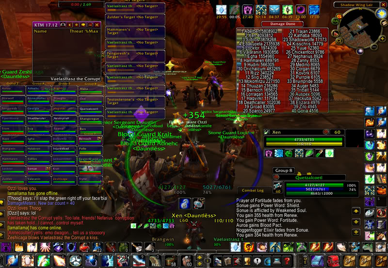
I don't remember where my old Molten Core picture where I had a postage stamp of actual screen left getting ready for a 40 man raid, but that was pretty bad. Even if it only sorta counts since your UI would be custom.

No Caption Provided

Avatar image for ajamafalous
ajamafalous

13992

Forum Posts

905

Wiki Points

0

Followers

Reviews: 0

User Lists: 9

Skyrim on PC

Avatar image for deactivated-5a00c029ab7c1
deactivated-5a00c029ab7c1

1777

Forum Posts

0

Wiki Points

0

Followers

Reviews: 0

User Lists: 1

FEAR 2 god that helmet hud was so intrusive I hate it not to mention everything about that game was a abomination compared to the first game.

Avatar image for getz
Getz

3765

Forum Posts

1003

Wiki Points

0

Followers

Reviews: 2

User Lists: 4

Any game made by Omega Force

Avatar image for mikelemmer
MikeLemmer

1535

Forum Posts

3089

Wiki Points

0

Followers

Reviews: 54

User Lists: 2

The UI for Crusader Kings 2 isn't the worst UI I've ever seen, but in a game where half the gameplay is searching for the right teacher/spouse/courtier out of hundreds of possibilities, it is aggravating. Some of the worst offenses include:

  • Immovable popups blocking vital information for said popup.
  • Button functions changing depending on the window. (Sometimes left-click confirms, other times it brings up an info window or cancels.)
  • No hotlinks to counties/people in notifications about counties/people.
  • A half-baked Search function that only lets you search by name instead of county, religion, dynasty, or a half-dozen other criteria you'd like to narrow down.

I swear, 20% of my time with the game is spent wrestling with the UI.

Avatar image for unavailable
unavailable

80

Forum Posts

0

Wiki Points

0

Followers

Reviews: 0

User Lists: 0

please kill me
please kill me

The first Witcher's interface is a great example of fantasy games trying to make their UIs look all ornate and relevant to their universe at the expense of not making me want to throw up.

Avatar image for alisbomb
alisbomb

9

Forum Posts

0

Wiki Points

0

Followers

Reviews: 0

User Lists: 0

The UI for Crusader Kings 2 isn't the worst UI I've ever seen, but in a game where half the gameplay is searching for the right teacher/spouse/courtier out of hundreds of possibilities, it is aggravating. Some of the worst offenses include:

  • Immovable popups blocking vital information for said popup.
  • Button functions changing depending on the window. (Sometimes left-click confirms, other times it brings up an info window or cancels.
  • No hotlinks to counties/people in notifications about counties/people.
  • A half-baked Search function that only lets you search by name instead of county, religion, dynasty, or a half-dozen other criteria you'd like to narrow down.

I swear, 20% of my time with the game is spent wrestling with the UI.

I can't this. Not even.... I think I was playing alpha protocol (I think it was that) where it had this problem of some menu's being closed with the button you opened them with, sometimes back. It's so annoying to not have a pretty much universal menu system that you can use any time. I was playing fallouts on PC as well and ran into a bit of maybe slightly unintuitive menu systems. The escape or backspace should always do exactly what they were meant to do. I hit them because whatever just happened was shit and I don't want to be around it anymore. I hate being told to press the x key to cancel. Don't tell me to do it.

Avatar image for shishkebab09
shishkebab09

154

Forum Posts

132

Wiki Points

0

Followers

Reviews: 3

User Lists: 0

PlayStation Store. Can I say that even though it's not a game per se? Yeah, PlayStation Store.

Avatar image for colonel_pockets
Colonel_Pockets

1458

Forum Posts

37

Wiki Points

0

Followers

Reviews: 0

User Lists: 46

Just look at any EA sports game of the past couple of years. I'm not mentioning other games because I haven't played them (NBA 2K, MLB the Show). They are terrible. There is just too much going on.

Avatar image for ripelivejam
ripelivejam

13572

Forum Posts

0

Wiki Points

0

Followers

Reviews: 0

User Lists: 0

#38  Edited By ripelivejam

@slaegar said:

I don't remember where my old Molten Core picture where I had a postage stamp of actual screen left getting ready for a 40 man raid, but that was pretty bad. Even if it only sorta counts since your UI would be custom.

No Caption Provided

hardcore WOW play seems horrendous based on this alone. i can barely manage juggling a lot of games' elements as is; this just seems like a logistical nightmare.

props to those who can manage it and enjoy it as well, though.

Avatar image for adequatelyprepared
AdequatelyPrepared

2522

Forum Posts

0

Wiki Points

0

Followers

Reviews: 0

User Lists: 0

Maybe not quite usage wise, but a crappy looking UI is just another mark against Tony Hawk Pro Skater 5. At any given moment there can be 3+ different font styles on the screen, and they all clash with each other.

@shishkebab09 said:

PlayStation Store. Can I say that even though it's not a game per se? Yeah, PlayStation Store.

The lack of an alphabetical searchable (and filterable, so you could filter out DLC) list of all my purchases is the real killer for me. How is this not a thing.

Edit: Fuck it, while I'm at it, why doesn't the store have a specific category for PS1/PS2 games? Why do I have to use a list on internet to figure this all out? This isn't just specific for PSN. I've noticed that most digital storefronts that offer old games don't actually have specific categories for those games, so trying to figure it all out is a nightmare.

Avatar image for mikelemmer
MikeLemmer

1535

Forum Posts

3089

Wiki Points

0

Followers

Reviews: 54

User Lists: 2

@ripelivejam: He's a healer. Their logistical nightmare is 10x as bad as anyone else's because they have to track the health of 40 raid members instead of just their own. It wouldn't be nearly as bad as a DPS, or in later raids.

But yeah, still pretty bad.

Avatar image for hermes
hermes

3000

Forum Posts

81

Wiki Points

0

Followers

Reviews: 0

User Lists: 7

Every FIFA in the last couple years. I think a barebones list of options would be preferable to that dashboard crap...

After some time with Borderlands 2, I forgot how awful the Borderlands 1 interface was... until I returned to it recently. So, Borderlands 1 counts too.

Avatar image for jesus_phish
Jesus_Phish

4118

Forum Posts

3307

Wiki Points

0

Followers

Reviews: 0

User Lists: 0

I played end game WoW for years and honestly I've seen some bad UI's but I think the one in this thread was made as a joke. There are plenty of good, minimum UIs in WoW even for healers. Some of them are fantastic looking and provide all the data you need. I had several that where even adaptive to what I was doing even on the same character.

Avatar image for sparky_buzzsaw
sparky_buzzsaw

9901

Forum Posts

3772

Wiki Points

0

Followers

Reviews: 39

User Lists: 42

I'll definitely echo the LittleBigPlanet UI. Not the worst I've seen, but for a game that should be about accessibility to players, it's got some pretty dumb design decisions. I'll also add the RollerCoaster Tycoon games, which had both stupidly tiny fonts and a Windows-esque layout, complete with folders and subfolders and the like.

Avatar image for rwbladewing
RWBladewing

161

Forum Posts

0

Wiki Points

0

Followers

Reviews: 0

User Lists: 0

#44  Edited By RWBladewing

World of Tanks is really bad. There is tons of statistical information being thrown at you and absolutely no explanation as to what any of it means. And tons more that is absolutely vital but left out (e.g. they only provide a single flat armor value for front, back, and side, while in actuality these values are not uniform at all, and completely ignore unique characteristics of a vehicle like sloped armor or softer armored weakspots.) The only tutorial teaches you the absolute basics of the controls, while instilling bad habits by emphasizing the use of the auto-aim. Figuring out where to access equipment and modules you've bought, how crew experience works, or even just how to change the battle type can be a massive exercise in frustration for a new player. I researched on the forums for hours before even starting my first battle, and doing so is basically a requirement to be even the tiniest bit competent.

World of Warships is even worse. Same issues with simultaneous information overload and information withholding, but there is also absolutely no tutorial whatsoever and it doesn't even have in-battle party chat.

The PC version of Final Fantasy Type 0 is also very rough. I realize it's a handheld port and sacrifices had to be made but man does it feel bad to have so many menus you can't even interact with unless you're at a save point. Being unable to change party formation and equipment and skill setups on the fly in a game with 14 playable and heavily customizable characters feels downright archaic.

Avatar image for bane
Bane

1004

Forum Posts

438

Wiki Points

0

Followers

Reviews: 0

User Lists: 2

The X Series of games are known for their near vertical learning curve, and part of the reason for that difficulty is the horrible UI. There's an absolute ton of stuff going on in these games from dogfighting and trading to building your own space stations and commanding fleets of AI controlled ships. I'm sure it was a daunting task to try to come up with a way to present all of that information to the player in some kind of elegant fashion, but man did they miss the mark big time.

It's a real shame because if you can come to grips with the UI and the general concepts they really are fantastic games with incredible depth.

Avatar image for nime
Nime

567

Forum Posts

386

Wiki Points

0

Followers

Reviews: 0

User Lists: 3

This topic has sent me down a deep rabbit hole of looking at my old WoW UI screenshots. A lot were pretty rough but I'm pretty happy with how they turned out more recently. A combination of early mods, smaller screens, and no sense of style definitely made Vanilla UIs something special.

Avatar image for casepb
Casepb

1008

Forum Posts

0

Wiki Points

0

Followers

Reviews: 0

User Lists: 0

Xenoblade Chronicles on the Wii. It took up so much of the screen and it was ugly to boot.

Avatar image for obsideondarman
ObsideonDarman

836

Forum Posts

3357

Wiki Points

0

Followers

Reviews: 0

User Lists: 13

Knights of the Old Republic has some god awful UI.