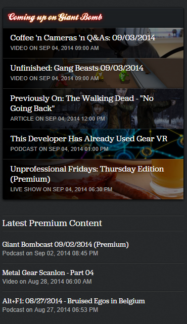
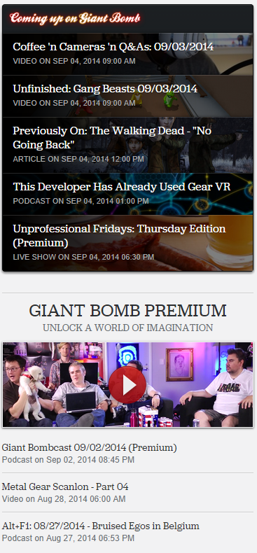
I don't like the "Premium content available"

  • 104 results
  • 1
  • 2
  • 3
Avatar image for cornbredx
cornbredx

7484

Forum Posts

2699

Wiki Points

0

Followers

Reviews: 0

User Lists: 15

Now that they have "coming up" stuff on there I can say I agree. It looks cluttered and tacky having the premium thing underneath it.

I also agree that I don't really think the "recent premium content" banner at the top adds anything.

One thing I've always liked about this site, above other gaming websites, is how much they try not to clutter the front page. It's always been concise in a way I appreciate because most gaming websites cram as much info on the front page as possible (this really isn't only gaming websites, though- it's a problem with website design I guess due to how the internet tends to work for people). Maybe there's a better way of doing what they are going for- the idea makes sense- but this currently isn't it.

As Jeff explained earlier in this thread, though, it was a rush job and they should figure it out in time.

Just wanted to give my thoughts on it now that I can see the full picture of what they're going for.

Avatar image for friendlypossum
friendlypossum

233

Forum Posts

0

Wiki Points

0

Followers

Reviews: 0

User Lists: 0

@splodge said:

@friendlypossum said:

Is it me or has nothing really gone up over the last couple of days? Usually a lot more.....have I missed something?

They were mostly all at pax from thursday to yesterday

Oh right yep

Avatar image for micemoney
micemoney

188

Forum Posts

0

Wiki Points

0

Followers

Reviews: 0

User Lists: 0

Yeah it does seem kinda weird that it's letting premium members know there's premium content available. But after reading this:

@aaron_g said:

I like it, it's easier to see premium content at a quick glance, rather than hunting for it.

I'm thinking maybe this is what they were going for, as well as a subtle way of reminding non premium they are missing out on content.

Avatar image for subyman
subyman

729

Forum Posts

2719

Wiki Points

0

Followers

Reviews: 2

User Lists: 0

I think its fine.

Avatar image for pandabear
PandaBear

1484

Forum Posts

238

Wiki Points

0

Followers

Reviews: 5

User Lists: 0

:_( ... I know man, this is such a huge deal. Such a huge deal!!

Avatar image for turambar
Turambar

8283

Forum Posts

114

Wiki Points

0

Followers

Reviews: 0

User Lists: 2

#56  Edited By Turambar

I'm perfectly fine with the current state of the "Latest Premium Content" box, though I find the "Premium Content Available" spot on the very top to be poor, given how the site has pretty much trained us to think that something in that spot implies a currently ongoing live stream of some kind. Still, its nothing that I can't get re-accustomed to after a while.

My bigger issue is with the redesigned play button that goes over the premium content videos. It just looks garish and ugly.

Avatar image for onimushroom
onimushroom

61

Forum Posts

0

Wiki Points

0

Followers

Reviews: 0

User Lists: 0

#57  Edited By onimushroom

@icyeyes said:

If they want to create a new section to show off the latest premium content, then go for it! But using the upcoming and live sections to do this is very confusing. I used to be able to know what was going on at a glance, but now I have to look very closely; Probably because I need glasses, but still!

I agree.

@selbie said:

Is this being shown to non-premium members? I can understand that, but don't show it to existing members.

Premium Content coming up is more useful to me than showing stuff that already exists.

Well said.

Avatar image for fattony12000
fattony12000

8491

Forum Posts

22398

Wiki Points

0

Followers

Reviews: 0

User Lists: 4

#58  Edited By fattony12000

Here's what it looks like for me, a deeply handsome premium user, right now:

No Caption Provided
Avatar image for tebbit
tebbit

4659

Forum Posts

861

Wiki Points

0

Followers

Reviews: 3

User Lists: 6

#59  Edited By tebbit

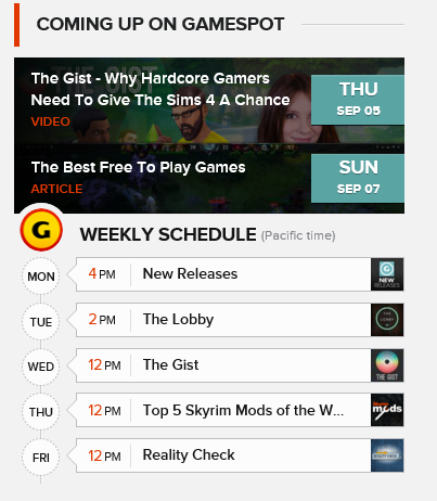
They should replicate the timeline on Gamespot, because that works really well:

No Caption Provided

They could integrate premium content by making it gold or something. Heck, I ain't no designer.

Avatar image for zleunamme
Zleunamme

1082

Forum Posts

1740

Wiki Points

0

Followers

Reviews: 0

User Lists: 9

It reminds of an episode of Whiskey Media Happy Hour when they were pushing premium subscription hard. I understand Giant Bomb has to pay the bills but I think there are better ways to encourage subscribers to upgrade. I just hope things don't get to this point in the future. Or maybe it has?

Loading Video...

Avatar image for poisonmonkey
poisonmonkey

477

Forum Posts

0

Wiki Points

0

Followers

Reviews: 0

User Lists: 0

All looks just fine to me, especially after the placeholder items used over PAX have now been updated. No confusion at all.

Avatar image for deactivated-5f8ac39b52e76
deactivated-5f8ac39b52e76

2590

Forum Posts

1360

Wiki Points

0

Followers

Reviews: 3

User Lists: 3

@bocam said:

I hate the "Premium content is available" button in the top corner, it seems completely unnecessary.

Don't know you if you guys can see the whole thing, there is a "medal simulation" right of it. It's quite neat, actually.

No Caption Provided

Avatar image for alexw00d
AlexW00d

7604

Forum Posts

3686

Wiki Points

0

Followers

Reviews: 0

User Lists: 5

One thing regardless of what I think about them asking me for money, they're advertising the podcast and telling me to become premium to watch. AINT NO WATCHING SOUNDS BOYS.

Avatar image for gamefreak9
gamefreak9

2877

Forum Posts

0

Wiki Points

0

Followers

Reviews: 0

User Lists: 2

@monkeyking1969:

With Steam/Humble Bundle sales I think I pay like 100 dollars a year on games. It is highly unreasonable to spend 50% of my whole gaming budget on a gaming website especially when there is a large amount of content whether it be review/gameplay/impressions for free on youtube. I think most PC gamers have a gaming budget about my size no? I mean I will buy maybe one game a year(dark souls 2) before a mega discount but that's about it

I mean I like Giantbomb more than competitors but when you get down to it, the analysis is nothing special, I just like the dudes. I liked it best when there was just a premium button up top. I think it would be even better if the premium videos only popped up if you were signed in with a premium account but I guess then they would not be dangling it in my face which would ruin the point.

Also its incorrect to say that non-premium users don't help the staff keep their checks. Our clicks count for how much revenue Giantbomb will generate from the advertising of video games and I would guess that that revenue is larger than the contributions. Either way, we should not be shoved stuff we can't consume.

Avatar image for deactivated-62f93c42ce57b
deactivated-62f93c42ce57b

919

Forum Posts

0

Wiki Points

0

Followers

Reviews: 0

User Lists: 0

people will find fault with absolutely anything

Avatar image for baillie
Baillie

4714

Forum Posts

37415

Wiki Points

0

Followers

Reviews: 0

User Lists: 4

people will find fault with absolutely anything

It's ridiculous. People just like to moan about everything.

Avatar image for deactivated-62f93c42ce57b
deactivated-62f93c42ce57b

919

Forum Posts

0

Wiki Points

0

Followers

Reviews: 0

User Lists: 0

@baillie said:

@billymagnum said:

people will find fault with absolutely anything

It's ridiculous. People just like to moan about everything.

wait, we should stop before we start to moan about this haha

Avatar image for gamer_152
gamer_152

15033

Forum Posts

74588

Wiki Points

0

Followers

Reviews: 71

User Lists: 6

#68 gamer_152  Moderator

It's kind of clunky and a bit robotically worded. The original point of displaying that content was available next to the logo was so people could catch live events they'd otherwise miss, but premium videos can be found at any time so it feels unnecessarily in your face. I think this is something that's going to get worked out in the near future.

Avatar image for baillie
Baillie

4714

Forum Posts

37415

Wiki Points

0

Followers

Reviews: 0

User Lists: 4

@baillie said:

@billymagnum said:

people will find fault with absolutely anything

It's ridiculous. People just like to moan about everything.

wait, we should stop before we start to moan about this haha

The old Giant Bomb curse strikes again!

Avatar image for razielcuts
RazielCuts

3292

Forum Posts

8

Wiki Points

0

Followers

Reviews: 0

User Lists: 0

I was fooled a couple of times over the few days seeing the MGScanlon in 'Latest Premium Content.' 'Oh theres a new one?' 'Oh..'

Avatar image for splodge
splodge

3309

Forum Posts

0

Wiki Points

0

Followers

Reviews: 0

User Lists: 0

For those finding fault with this to the point they are worried GB will become a string of popups and in your face advertising.... relax a bit! GB still has very unobtrusive advertising. As Jeff said, they are trying it out and it is not set in stone.

Avatar image for slindz
slindz

161

Forum Posts

0

Wiki Points

0

Followers

Reviews: 0

User Lists: 0

Here's what it looks like for me, a deeply handsome premium user, right now:

No Caption Provided

It's that freaking cursive font as a heading. Get some bold plain font that actually pops as a heading, the cursive is way too squished and unobtrusive.

Avatar image for do_the_manta_ray
Do_The_Manta_Ray

1681

Forum Posts

172

Wiki Points

0

Followers

Reviews: 0

User Lists: 0

#73  Edited By Do_The_Manta_Ray

I understand that these complaints might come across as nit-picking to a lot of folks, and I suppose that when you get right down to it, it is. The overall design for the site is still fantastic, though I can't help but think they're pushing the envelope on this a little too hard.

We now have 3 different indicators on the main page alone for premium content. 3. As a premium member, myself, I think it's distracting, I think it gets in the way. A lot of this has, ofcourse, to do with that I'm very familiar with the old design, and had gotten used to simply glancing in different directions to see what was new on the site. Right for upcoming shows, up top to see if a live-show was just about to start. And not being able to do so, and having to scrutinize the text each time is less efficient than the previous solutions.

I realize that they want to sell premium content, and you know what? They deserve to. These guys have been putting in a considerable amount of effort into premium lately, and anyone with the spare cash really wouldn't do wrong to opt in. That said, I very much hope that this is a work in progress and that they find a more subtle, and less distracting, way of showcasing the benefits of a premium subscription. Small preview-clips from premium shows appearing as another video for those of us who do not have premium, say.

At the very least, allow us premium users to enable and disable some of these notifications. I do not believe anyone on staff actually believes this'll help the users keep track in any way, it is simply advertisement, and part of a premium subscription is, ironically, no advertisement. For me as a premium user, the dashboard is more than enough to showcase the newest content. The "Latest Premium Content" is pushing it, but hey that's okay, and the notification up top that's in the exact same colour as a live show is, excuse my saying, the worst idea. THE worst. As long as that one is removed, or just shifted to somewhere else, so I'll stop being constantly disappointed there's no new live show on, I'll be satisfied.

Avatar image for lanechanger
Lanechanger

1779

Forum Posts

2289

Wiki Points

0

Followers

Reviews: 1

User Lists: 0

The problem I have with this is that it tricked me into viewing the metal gear scanlon episode 4 two times before I realized that I couldn't trust it!

Avatar image for bollard
Bollard

8298

Forum Posts

118

Wiki Points

0

Followers

Reviews: 3

User Lists: 12

#75  Edited By Bollard

@jeff said:

@veggiesbro said:

I like the idea of them showing premium content available. However, it needs to be clearly separated from the upcoming stuff. Which seems to be the case based on how they have listed the upcoming UPF.

I'm not a huge fan of the current look, since it can be confusing, but it was one of those "let's get this done and out before PAX and then revisit it to clean it up later" jobs. Hopefully the design team will be able to clean it up and make it clearer soon.

Thanks for the update Jeff!

Here's what it looks like for me, a deeply handsome premium user, right now:

No Caption Provided

Now that there is Coming Uup content again, I can confirm this looks worse than I had anticipated. I had at least imagined a gap between the two boxes, not one large blob of... stuff. Can't tell where the Coming Up ends and Premium begins...

Avatar image for playastation
playastation

256

Forum Posts

346

Wiki Points

0

Followers

Reviews: 0

User Lists: 2

Seriously? It's like a 40 x 20 pixel thing in the corner. I didn't even see it until you brought it up.

Avatar image for poisonmonkey
poisonmonkey

477

Forum Posts

0

Wiki Points

0

Followers

Reviews: 0

User Lists: 0

I'll just leave this here without comment!

Loading Video...

Avatar image for pyrodactyl
pyrodactyl

4223

Forum Posts

4

Wiki Points

0

Followers

Reviews: 0

User Lists: 0

I'll just leave this here without comment!

Loading Video...

this is INCREDIBLE

Avatar image for theimmortalbum
theimmortalbum

646

Forum Posts

0

Wiki Points

0

Followers

Reviews: 0

User Lists: 1

@crembaw said:

The only thing I don't like about it is that I'm very used to checking that spot to see whether there are streams starting, and the ad's tricked me more than a few times. I am a bit thick, though.

I didn't read the header, and thought multiple times that the Upcoming Shows thing was broken by showing old content.

Avatar image for rowr
Rowr

5861

Forum Posts

249

Wiki Points

0

Followers

Reviews: 2

User Lists: 3

#80  Edited By Rowr

Judging from the premium deal and the extra advertising stuff with the podcast, seems like all the sudden they are super needy for premium members. I assume upper management is pushing them or something or maybe numbers have fallen off in recent times - which stands to reason a little with all the shuffling. They have never sounded as needy about it than in recent podcasts etc, you can really tell when Jeff is laying that shit on.

I find it all leaves a pretty bad taste in my mouth. Especially the phony ass podcast stuff, there is a fine line between making it entertaining or just dick in mouth annoying.

I guess this is just how it goes.

edit- I guess i just remembered (or am i imagining) in theory there is a version of the Bombcast for premium user with no ads, i've never worked out where it is but yeh I guess i'll look for it in the future.

Avatar image for mannymar
MannyMAR

662

Forum Posts

3

Wiki Points

0

Followers

Reviews: 0

User Lists: 2

Honestly I would prefer the Upcoming box to remain just Upcoming content, although it would be cool if they divide it by non premium upcoming and premium upcoming. I think that way it better serves the dual purpose of informing when what's coming up, and as an effective ad to entice premium membership.

Likewise keep the upper left for only ongoing live events, but keep the color coded tags next to the text: red for regular, yellow for premium.

Avatar image for megalowho
megalowho

1148

Forum Posts

4888

Wiki Points

0

Followers

Reviews: 2

User Lists: 28

I like the listing underneath upcoming content but find the altert at the top of the page redundant and distracting, especially when the same piece of content is being advertised up there for days on end. Seems more appropriate for live show notifications. I get the push and I'm for it but between the side bar, top bar and headline displays, three links to the same destination seems like overkill for those that already subscribe.

Avatar image for teaoverlord
teaoverlord

592

Forum Posts

1

Wiki Points

0

Followers

Reviews: 0

User Lists: 0

@tebbit said:

They should replicate the timeline on Gamespot, because that works really well:

No Caption Provided

They could integrate premium content by making it gold or something. Heck, I ain't no designer.

Do you mean the weekly schedule? Because that wouldn't work for Giant Bomb, really. The only rigidly scheduled weekly show they have is UPF, and even that gets moved or starts an hour late sometimes.

Avatar image for mithhunter55
mithhunter55

1104

Forum Posts

709

Wiki Points

0

Followers

Reviews: 1

User Lists: 1

#84  Edited By mithhunter55

I love it!? Way easier to get to the shows I may have missed, especially If I haven't checked the site in a few days.

@gamefreak9 said:

@monkeyking1969:

With Steam/Humble Bundle sales I think I pay like 100 dollars a year on games. It is highly unreasonable to spend 50% of my whole gaming budget on a gaming website especially when there is a large amount of content whether it be review/gameplay/impressions for free on youtube. I think most PC gamers have a gaming budget about my size no? I mean I will buy maybe one game a year(dark souls 2) before a mega discount but that's about it

I mean I like Giantbomb more than competitors but when you get down to it, the analysis is nothing special, I just like the dudes. I liked it best when there was just a premium button up top. I think it would be even better if the premium videos only popped up if you were signed in with a premium account but I guess then they would not be dangling it in my face which would ruin the point.

Also its incorrect to say that non-premium users don't help the staff keep their checks. Our clicks count for how much revenue Giantbomb will generate from the advertising of video games and I would guess that that revenue is larger than the contributions. Either way, we should not be shoved stuff we can't consume.

It's your money to value decision. I spend less then 30$ a year on games. I would still pay 240$ a year for giant bomb premium if I that's how much they wanted to charge. I don't watch or read any reviews, I don't care for that crap on any site. For me I am a fan of these guys and their personality. Just chilling watching them play games. I doubt they make as much as you are assuming they do from ad revenue. I thought ad-block plus was ubiquitous at this point. I hardly ever watch Quicklooks either. I spend most of my time on the premium videos.

Avatar image for tnecniv
tnecniv

114

Forum Posts

258

Wiki Points

0

Followers

Reviews: 0

User Lists: 0

Well the "premium content" thing alerted me to the fact that the Bombcast is now premium. When did that happen?

Avatar image for jkz
jkz

4287

Forum Posts

268

Wiki Points

0

Followers

Reviews: 1

User Lists: 3

@tnecniv said:

Well the "premium content" thing alerted me to the fact that the Bombcast is now premium. When did that happen?

Premium version's ad free. They've had it since they introduced the adverts. Otherwise the premium/non-premium versions are identical.

Avatar image for alternate
alternate

3040

Forum Posts

1390

Wiki Points

0

Followers

Reviews: 0

User Lists: 4

@tnecniv: There is premium version without the adverts.

Avatar image for icyeyes
IcyEyes

607

Forum Posts

5394

Wiki Points

0

Followers

Reviews: 0

User Lists: 2

@baillie said:

@billymagnum said:

people will find fault with absolutely anything

It's ridiculous. People just like to moan about everything.

wait, we should stop before we start to moan about this haha

I think that the people that simply "moan" about constructive criticism, while offering nothing to the conversation, are the greatest hypocrites of all.

@jkz said:
@tnecniv said:

Well the "premium content" thing alerted me to the fact that the Bombcast is now premium. When did that happen?

Premium version's ad free. They've had it since they introduced the adverts. Otherwise the premium/non-premium versions are identical.

This appears to only be visible to premium members? If not, I'd consider it very misleading. However, I still don't like it.

@tebbit said:

They should replicate the timeline on Gamespot, because that works really well:

No Caption Provided

They could integrate premium content by making it gold or something. Heck, I ain't no designer.

They probably don't have enough content to fill such a schedule, but I think distinguishing the upcoming and recent sections like this would be much better.

Avatar image for veggiesbro
VeggiesBro

220

Forum Posts

0

Wiki Points

0

Followers

Reviews: 0

User Lists: 0

@jeff: Thanks for the update Jeff! It's a great idea and i'm sure the final product will look great.

Avatar image for jordanarama
JordanaRama

430

Forum Posts

0

Wiki Points

0

Followers

Reviews: 0

User Lists: 1

It's a necessary thing. Premium is their bread and butter and the foundation of their whole operation. They have to put it front and center to support that foundation. I wouldn't look at it like an ad, it's just more prevelant because it needs to be.

Avatar image for winsord
winsord

1642

Forum Posts

86

Wiki Points

0

Followers

Reviews: 0

User Lists: 13

#92  Edited By winsord

So it seems like the design has changed now:

Premium
Premium
Free
Free

Personally I like this a lot better, and I think the small banner does a good job of not being obnoxious while managing to keep the ad visible/noticeable.

Avatar image for ares42
Ares42

4563

Forum Posts

0

Wiki Points

0

Followers

Reviews: 0

User Lists: 0

#93  Edited By Ares42

@winsord: Ye, the current design looks good. Even with the big "Premium only" bumper on the main feature (although, I'm guessing that's gonna be rotating?). Personally I've always found the bumper to be more than competent at reminding me about subscriptions, but I get that they want something permanent on the main-page to advertise it.

Avatar image for cornbredx
cornbredx

7484

Forum Posts

2699

Wiki Points

0

Followers

Reviews: 0

User Lists: 15

@winsord said:

So it seems like the design has changed now:

Premium
Premium
Free
Free

Personally I like this a lot better, and I think the small banner does a good job of not being obnoxious while managing to keep the ad visible/noticeable.

Oh nice, I hadn't noticed it yet. Ya that does look a bit better. It doesn't come off quite as gaudy or whatever word I'm trying to think of.

It looks better.

Avatar image for truthtellah
TruthTellah

9827

Forum Posts

423

Wiki Points

0

Followers

Reviews: 0

User Lists: 2

#95  Edited By TruthTellah

The change to the right bar is much improved. It delineates the content well without being confusing. A welcome fix to that part of it.

The top notification where live streams usually go is still there though, and that's the main problem. We've gotten used to that spot for livestreams, and it only undermines its effectiveness to be used in this way. Seems like they're listening; so, hopefully that will be gone or significantly changed soon. :)

Avatar image for mcfart
Mcfart

2064

Forum Posts

0

Wiki Points

0

Followers

Reviews: 0

User Lists: 1

#96  Edited By Mcfart

@rowr said:

Judging from the premium deal and the extra advertising stuff with the podcast, seems like all the sudden they are super needy for premium members. I assume upper management is pushing them or something or maybe numbers have fallen off in recent times - which stands to reason a little with all the shuffling. They have never sounded as needy about it than in recent podcasts etc, you can really tell when Jeff is laying that shit on.

I find it all leaves a pretty bad taste in my mouth. Especially the phony ass podcast stuff, there is a fine line between making it entertaining or just dick in mouth annoying.

I guess this is just how it goes.

edit- I guess i just remembered (or am i imagining) in theory there is a version of the Bombcast for premium user with no ads, i've never worked out where it is but yeh I guess i'll look for it in the future.

Don't forget that GB is still a business being run by the massive CBSi who have execs that only track GB's income and budget them accordingly. GB hired some new staff, and opened a whole new office, so it makes sense that they'll want them to push for more premium subs to make the additional investment worth it.

It's fine. The only thing I want is a clear indicator for live content like before. If they don't indicate live content, then they'll run into Gamespot's problem where few people will watch just because nobody knows it's up.

Avatar image for jdp83
JDP83

328

Forum Posts

1

Wiki Points

0

Followers

Reviews: 0

User Lists: 0

I really like the long play projects like Metal Gear Scanlon and the full Endurance Run of Chrono Trigger.

I wish there were more video content pieces like that. I know they take a while to record but they don't have to be edited much and they make for nice entertaining background noise when I've already listened to this week's Bombcast.

Avatar image for onimushroom
onimushroom

61

Forum Posts

0

Wiki Points

0

Followers

Reviews: 0

User Lists: 0

@winsord said:

So it seems like the design has changed now:

Premium
Premium
Free
Free

Personally I like this a lot better, and I think the small banner does a good job of not being obnoxious while managing to keep the ad visible/noticeable.

Great! My thanks to the designers.

Avatar image for flstyle
FLStyle

6883

Forum Posts

40152

Wiki Points

0

Followers

Reviews: 0

User Lists: 17

The live show countdown is a red font now? I can't see it as well now, turn it back to white!