Japanese use of Serif Fonts

Avatar image for sirazalot
SirAzalot

30

Forum Posts

0

Wiki Points

0

Followers

Reviews: 0

User Lists: 0

I have a lot of trouble getting into Japanese games and media.
So i wanted to get to the bottom of this as I feel like I'm missing out on a lot of cool shit.
Since I'm a bit of an art and design dork i decided to make this my primary focus.
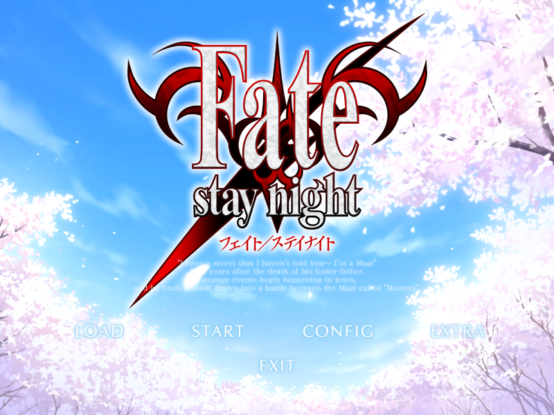
I've come to realize Japanese artists / art directors / content creators are grossly over using serif fonts.

In western art/media serif fonts are very much on the back burner. relegated to body text at best (obviously a bit of a generalization but look at the fonts used on all your favorite websites / media in general ).
Typography is also gaudy as fuck in a lot of Japanese games, I'm not just talking about the logos, I've seen JRPG's with Metallic effects and drop shadows on their god damn dialog.

I've answered my own question, this IS why I have a hard time getting into Japanese media but the question I want to ask you more informed folks is who do you think is responsible?
Is this a cultural thing. When a Japanese person thinks about western characters do they just think " Times new roman" the same way we might think of their characters always painted in brush strokes? are they equally tired of that?
Or is this a Localisation thing. I've always thought of localisation as a bunch of people translating and rerecording the dialog for games. But are localizes ( is that what you call them ) dropping the ball? are their experienced designers on staff recreating logos and typography for the western audience that reflects the intent of the original art direction?

If not where do I apply? sounds like a fascinating job.

Avatar image for wynnduffy
WynnDuffy

1289

Forum Posts

27

Wiki Points

0

Followers

Reviews: 0

User Lists: 0

Bad typography usually rears its head in low budget games where the translation effort was an afterthought or they didn't hire anyone experienced in Western fonts. MGS5 had some striking subtitle font but everything else looked fine.

Avatar image for danteveli
Danteveli

1441

Forum Posts

735

Wiki Points

0

Followers

Reviews: 7

User Lists: 30

Japanese kanji (hanzi the Chinese characters) are based on strokes and they are pretty important. I guess they assume its also important for us and put serif in western fonts. It's just a cultural thing since its also applied to their logos and stuff like that. Things looking cool in kanji may not look so great with our letters.

Avatar image for dstopia
dstopia

369

Forum Posts

0

Wiki Points

0

Followers

Reviews: 0

User Lists: 0

#4  Edited By dstopia

The representation of western characters in the double byte Japanese codification is "kind of" serif (I can't actually tell if it's serif or not, it looks like it varies from character to character) and awful looking.

I would guess some of it stems from that.

It kinda looks like this

The quick brown fox jumps over the lazy frog

Avatar image for thefakepsychic
TheFakePsychic

272

Forum Posts

53

Wiki Points

0

Followers

Reviews: 17

User Lists: 18

Atlus USA actually talked about font choice in an email they sent out about Etrian Odyssey IV: http://nintendonow.com/atlus-explains-their-font-choice-for-etrian-odyssey-iv/

According to them, the idea behind picking Serif fonts (at least for EO) was that it matched the feeling of reading an epic, heavy saga. Since what I assume you're talking about includes most big long JRPGs, it might fit there. (Also assuming I didn't grossly misread everything.)

Avatar image for kasaioni
kasaioni

2397

Forum Posts

0

Wiki Points

0

Followers

Reviews: 0

User Lists: 0

#6  Edited By kasaioni

@jasoncooke: Granted, I think the reason the subtitles looked like that in MGSV was to evoke the 80's theme with a sort of analogue-typewriter looking font. Other Metal Gear games, like MGS3 have sans serif subtitle fonts.

No Caption Provided

Avatar image for tastycakesmcg33
TastyCakesMcG33

103

Forum Posts

0

Wiki Points

0

Followers

Reviews: 0

User Lists: 0

#7  Edited By TastyCakesMcG33

Seems to me like it's just kind of a natural thing that came about because Asian, or I guess Eastern Asian, languages kind of look serif-iy in writing. It makes the English more reminiscent of the mother translation. That's not going to be your technical answer, I'm sure, and it's just conjecture, but it's what I'd believe.

Avatar image for brainscratch
BrainScratch

2077

Forum Posts

0

Wiki Points

0

Followers

Reviews: 0

User Lists: 0

@sirazalot: Yes! As a design/art guy myself, I've been having the exact same questions and noticing the exact same things as you did here. I'm so glad that there's more people who feels the same way!

I often have problems with asian games because of the way they clutter everything and overuse serifs and effects. I think an article that goes to the root of this would be extremely interesting.

Avatar image for frump
frump

52

Forum Posts

0

Wiki Points

0

Followers

Reviews: 0

User Lists: 0

#9  Edited By frump

Do you have any specific examples? I definitely haven't noticed any overuse of serif fonts for roman characters. Looking at many japanese and japanese localized games I own they use sans-serif just as much or more. When I think of Japanese typography I think of using huge gigantic lettering and trying to use 30 cutesy sans-serif fonts at once in all different colors.

Maybe it's just the type of thing you're looking at? If you're just looking at fantasy jrpgs maybe they're trying to be fancy and think serifs = fancy. Like fake british accents in western fantasy movies/shows/games.

Avatar image for kcin
kcin

1145

Forum Posts

9

Wiki Points

0

Followers

Reviews: 0

User Lists: 0

It seems like Japanese devs are just more likely to take the tone of the game into account when choosing fonts for the dialogue, and how to typeset it, than Western devs are. The fact that you notice serifs more often is probably the result of having overwhelmingly played serious games.

Avatar image for applefrog
Applefrog

7

Forum Posts

10

Wiki Points

0

Followers

Reviews: 0

User Lists: 0

I've also wondered this for a while but could never find an answer. Localized Korean MMORPGs tend to also use very similar, Courier-looking serif fonts to one another.

Avatar image for kvel2d
Kvel2D

149

Forum Posts

14

Wiki Points

0

Followers

Reviews: 0

User Lists: 3

#12  Edited By Kvel2D

I've heard somewhere that since the amount of kanji fonts is very small compared to western ones, Japanese devs are a bit trigger happy about using this variety. And I guess since they grew up with Japanese characters, their font sensibilities are also quite different.

Avatar image for rox360
rox360

1299

Forum Posts

154

Wiki Points

0

Followers

Reviews: 0

User Lists: 0

#13  Edited By rox360

I can't say I've noticed too much serifs, specifically, but eastern games always do have wonky fonts. They also seem to love gigantic, horizontal bars and lots of numbers. The font choice that honestly bugs me the most (I guess mostly from Korean online games, but Japan doesn't shy away either) is the round, unnecessarily bold font with unnecessarily thick outlines.

You know, this one:

No Caption Provided

The only game I can think of off the top of my head that I think takes it too far with the serifs is good ol' new Ninja Gaiden, but you can make a case for that deliberately trying to look both old and European, which reflects the setting. But it does come off as quite Japanese, doesn't it...

No Caption Provided

Edit: Whoa, that post formatting got... interesting, once I put the images in... I'm gonna leave it like this, though, it looks rad.

Avatar image for gundamguru
GundamGuru

786

Forum Posts

391

Wiki Points

0

Followers

Reviews: 1

User Lists: 0

Or is this a Localisation thing. I've always thought of localisation as a bunch of people translating and rerecording the dialog for games. But are localizes ( is that what you call them ) dropping the ball? are their experienced designers on staff recreating logos and typography for the western audience that reflects the intent of the original art direction?

So, slightly tangential to the topic, but they're called Localizers and they typically use the same fonts and design as the source material. The Japanese are fond of using gratuitous English for logos and names in the first place, anyway. They're also occasionally fond of highly stylized serif fonts for their hiragana/katakana as well. I'd personally chalk that up to the fact that kanji are so intricate and detailed that kana and latin letters look rather plain to them, but that's just speculation on my part.

The title screen of Fate/stay night

Avatar image for brainscratch
BrainScratch

2077

Forum Posts

0

Wiki Points

0

Followers

Reviews: 0

User Lists: 0

@frump: Just type the name of the asian game + "menu" or something similar on Google Images. There's a high probability that the menu of the asian game you wrote uses serifs. Most of them even use the same font.

Also, he's not talking about the serifs, he's talking about the whole way asian games treat fonts.

Avatar image for mchampton
McHampton

160

Forum Posts

6

Wiki Points

0

Followers

Reviews: 0

User Lists: 0

I've never actually thought about what font anything is, ever in my life. Blissful ignorance! Or maybe now I'll start seeing it...

Avatar image for onemanarmyy
Onemanarmyy

6406

Forum Posts

432

Wiki Points

0

Followers

Reviews: 2

User Lists: 0

@mchampton: Don't worry. I just learned about the difference between Serif and Sans Serif a week ago. And i'm still not sure my brain actively categorizes fonts i encounter.

Avatar image for frump
frump

52

Forum Posts

0

Wiki Points

0

Followers

Reviews: 0

User Lists: 0

#18  Edited By frump

@johnymyko: I did, I searched a bunch. Most were sans-serif. The only commonality I noticed was that fantasy themed games specifically use a lot of serif fonts. I think that's the key.

In terms of fonts in general, Japanese designers do love to use way too many of them and with wacky styling. NES Remix is one offender I really noticed. That game's menus and design are all over the place, and not just because of the multiple games contained within.

Japanese TV shows also have tons of fonts and text on screen at all times. That's one I've wondered about, why there's always so much text on the screen and subtitling during Japanese tv shows.

Avatar image for kasaioni
kasaioni

2397

Forum Posts

0

Wiki Points

0

Followers

Reviews: 0

User Lists: 0

@frump: I'll never understand the NicoNico thing of having comments scroll across the screen while watching the video. Imagine if Youtube had that.

Avatar image for geraltitude
GERALTITUDE

5991

Forum Posts

8980

Wiki Points

0

Followers

Reviews: 17

User Lists: 2

Localizers use fonts to try to communicate tone lost in language translation.

Avatar image for sirazalot
SirAzalot

30

Forum Posts

0

Wiki Points

0

Followers

Reviews: 0

User Lists: 0

@frump: after thinking a little more about this, yeah it's more complicated than that. This topic has piqued my interest enough that I will do a little more research and provide some examples.

Avatar image for sirazalot
SirAzalot

30

Forum Posts

0

Wiki Points

0

Followers

Reviews: 0

User Lists: 0

#22  Edited By SirAzalot

@freedom4556: Cheers, very insightful. I wanted to compare the Japanese version to your English example to see if the Japanese looked better but I'm running out of time :( Anyway the word fate has been stretched horizontally to fill the space that I imagine was filled with beautifully flowing kanji characters. Stretching fonts is a big design no no. I just wonder if this is a culture clash or there are people fucking up due to lack of budget or lack of knowledge while localizing.

Avatar image for dstopia
dstopia

369

Forum Posts

0

Wiki Points

0

Followers

Reviews: 0

User Lists: 0

@kasaioni said:

@frump: I'll never understand the NicoNico thing of having comments scroll across the screen while watching the video. Imagine if Youtube had that.

I fucking wish it had.

Avatar image for gundamguru
GundamGuru

786

Forum Posts

391

Wiki Points

0

Followers

Reviews: 1

User Lists: 0

@sirazalot: Actually, that is the Japanese title screen, complete with commands in English. TYPE-MOON (the developer) is a doujin studio (what we'd call an indie here in the West), so they probably don't have professional training in typography. Do notice that if you look at the font of the Japanese katakana subtitle you'll see that it's also a stylized serif font.

Japanese title screen of Fate's sequel uploaded from a JP website

Avatar image for aegon
Aegon

7345

Forum Posts

104

Wiki Points

0

Followers

Reviews: 0

User Lists: 3

I think it can be quite charming, depending on the overall vibe the game is going for.

Avatar image for sirazalot
SirAzalot

30

Forum Posts

0

Wiki Points

0

Followers

Reviews: 0

User Lists: 0

@thefakepsychic: I know that blog post is aimed at fans so they might not go into great detail but the fact they ruled out some fonts based on the spacing between characters( that's called kerning and its adjustable so they're reason for ruling out those fonts makes no sense) just proves the localisers have no idea when it comes to typography. But maybe you can't adjust kerning on the back end, who knows.

Avatar image for bonorbitz
BonOrbitz

2652

Forum Posts

1

Wiki Points

0

Followers

Reviews: 0

User Lists: 3

I'm so grateful for his thread. It's bugged me for years (years!) as a designer that the awful use of typography, graphical effects, and serifed fonts in a lot of Asian games and anime have become such a bad cliche to me and I've always wondered why this style is commonly used. It looks amateurish and it affects readability. I've been playing Resident Evil 4 recently and the game reminded me of this.

Avatar image for tobbrobb
TobbRobb

6616

Forum Posts

49

Wiki Points

0

Followers

Reviews: 0

User Lists: 13

What's wrong with serif text? It looks more interesting than sans-serif. :C

@dstopia said:

The representation of western characters in the double byte Japanese codification is "kind of" serif (I can't actually tell if it's serif or not, it looks like it varies from character to character) and awful looking.

I would guess some of it stems from that.

It kinda looks like this

The quick brown fox jumps over the lazy frog

This nightmare fuel however.... I wish I didn't recognize it as well as I do.

Avatar image for yumewaru
Yumewaru

43

Forum Posts

0

Wiki Points

0

Followers

Reviews: 0

User Lists: 0

#29  Edited By Yumewaru

The short answer is that typographic conventions are different between cultures. A strict set of systems is applied to the Latin alphabet. In Japan there's a more accepted use of custom type treatments. This influences how type in English is approached. It tends to result in wild divergences and embellishments.

Avatar image for an_ancient
an_ancient

306

Forum Posts

0

Wiki Points

0

Followers

Reviews: 0

User Lists: 0

I can't say as to why this is, but in google's IMEI and probably others you can switch to Latin letters on the fly. I always assumed that whatever character encoding that is common to Asia, i.e not ANSI which is American iirc or UTF which supports Latin alphabet with extra squiggles or dots like ö ò ô õ. Programming you are taught to always encode you text with UTF, but I'm currently finding out that Japanese has JIS which is their own way of encoding. I'm only glossing over it but it seems JIS only uses a small subset of Latin characters which are rendered in a specific fixed width way. Like you can't use Impact as a font with it. I'd also assume its another binary representation so that weird looking a in Japanese is not the same you use. You read it the same but for the computer its different.

Avatar image for takanu
takanu

63

Forum Posts

0

Wiki Points

0

Followers

Reviews: 0

User Lists: 0

#31  Edited By takanu

I think it may just depend on who's doing the localisation graphics. A friend of mine does translation graphics for visual novel games and when I asked him about this, stated that he refuses to use them because, "they look like shit"

¯\_(ツ)_/¯

Avatar image for deactivated-5e851fc84effd
deactivated-5e851fc84effd

1714

Forum Posts

53

Wiki Points

0

Followers

Reviews: 0

User Lists: 1

@tobbrobb said:

What's wrong with serif text? It looks more interesting than sans-serif. :C

@dstopia said:

The representation of western characters in the double byte Japanese codification is "kind of" serif (I can't actually tell if it's serif or not, it looks like it varies from character to character) and awful looking.

I would guess some of it stems from that.

It kinda looks like this

The quick brown fox jumps over the lazy frog

This nightmare fuel however.... I wish I didn't recognize it as well as I do.

Agreed. It's got a very nice comforting feeling for some reason.