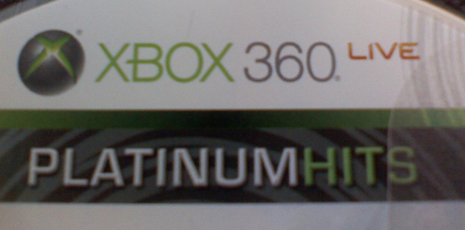
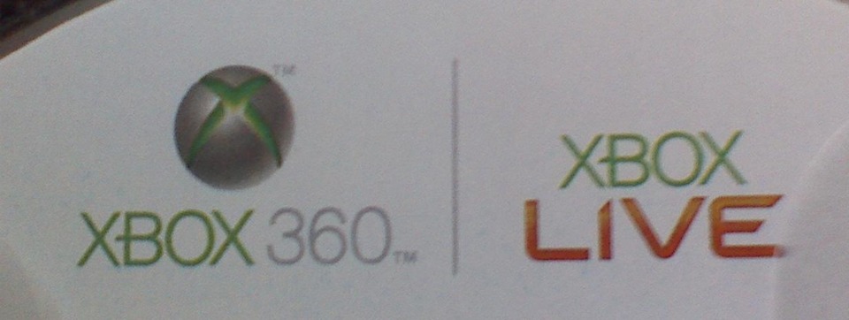
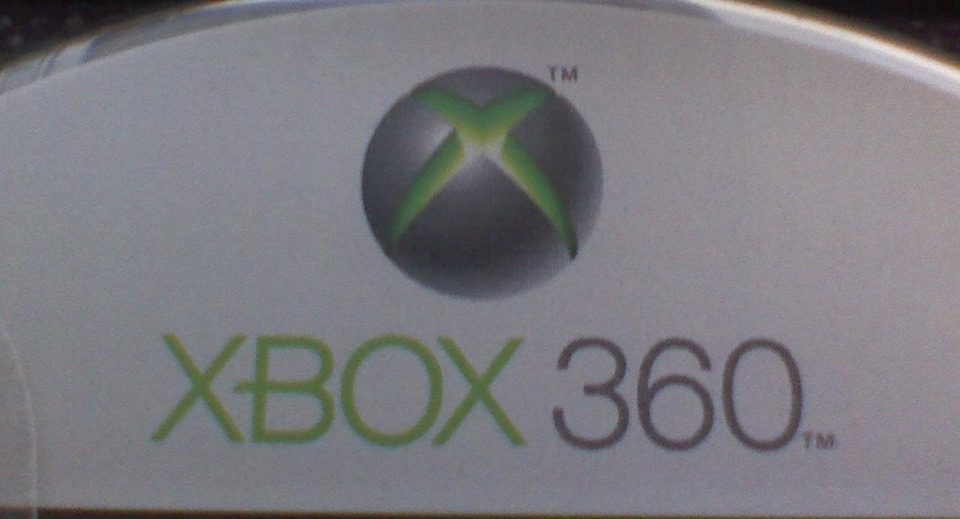
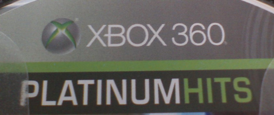
Xbox 360's Disc Xbox Live Logos

Avatar image for rjayb89
rjayb89

7813

Forum Posts

9437

Wiki Points

0

Followers

Reviews: 0

User Lists: 17

#1  Edited By rjayb89

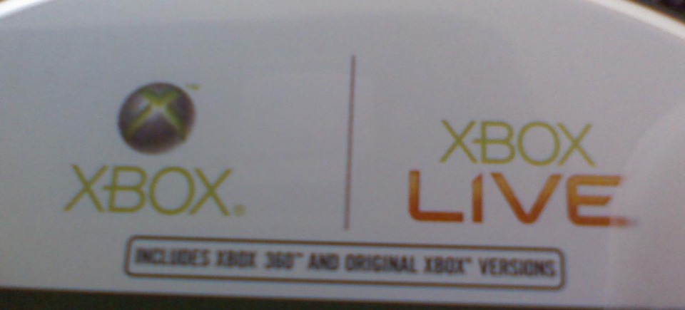
Nosomuch a complaint, but I noticed how varied the Xbox Live logos (across the top of the CD) on my 360 games were while rearranging my current-gen games' CD case.  Just something I thought worth mentioning.  I glanced through my PS2 collection, as well as my PS3's, games collection and noticed probably about 2 different variations of each: the initial release versions and greatest hits versions.
 Pocketbike Racer
 Pocketbike Racer


 Devil May Cry 4
 Devil May Cry 4


Lost Planet: Extreme Condition - Colonies Edition


Bioshock
Bioshock


Dead Space
Dead Space


 Assassin's Creed
 Assassin's Creed
Avatar image for end_boss
End_Boss

3386

Forum Posts

385

Wiki Points

0

Followers

Reviews: 0

User Lists: 1

#2  Edited By End_Boss

Yeah, I've noticed this inconsistency at my work as well. Weird... But... Yep.

Avatar image for nock
Nock

254

Forum Posts

6

Wiki Points

0

Followers

Reviews: 0

User Lists: 2

#3  Edited By Nock

well your top one is a BK game, cause I'm pretty sure that's the only time you'll ever see xbox and xbox 360 on the same disc

Avatar image for eroticfishcake
eroticfishcake

7856

Forum Posts

7820

Wiki Points

0

Followers

Reviews: 1

User Lists: 6

#4  Edited By eroticfishcake

Talk about indecisive artistry.

Avatar image for agentboolen
agentboolen

1995

Forum Posts

12

Wiki Points

0

Followers

Reviews: 1

User Lists: 0

#5  Edited By agentboolen

I don't think its that big of a deal. When the game's graphic designer is creating his cover he should have a few different ugly looking banner designs to chose from to put across his design. These banners have always just been ugly to the art.

Avatar image for iam3green
iam3green

14368

Forum Posts

350

Wiki Points

0

Followers

Reviews: 0

User Lists: 0

#6  Edited By iam3green

i think it is because microsoft wants to change it. the logo first comes out then they want to keep the same idea but change the design of it. i'm talking about like the platinum hits. the top devil may cry one doesn't have circles going through but the assassin's creed one does.

Avatar image for andorski
Andorski

5482

Forum Posts

2310

Wiki Points

0

Followers

Reviews: 0

User Lists: 3

#7  Edited By Andorski

I dig the Dead Space version the most.  It's just consistent with the boxart.

Avatar image for warp
warp

102

Forum Posts

1

Wiki Points

0

Followers

Reviews: 0

User Lists: 1

#8  Edited By warp

Kinda shocking how Microsoft changes its graphic design at random with reckless abandon and with a total lack of consistency.
 
Seriously, thats so completely outside of them that I am forced to pause in a moment of quiet reflection.
 
....