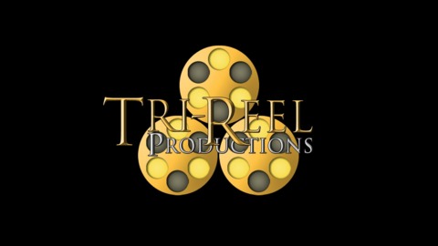
What do you think of my production company logo?
I think it's difficult to read. It'd be a lot better if you put the text underneath the three reels. Also try it in pure white, just to see how the shape reads.
Be careful with serif fonts as well they can be very dissonant with logos. Try a sans serif and stick to one color. I would try to simplify the image and keep the reels separate in case you ever want to use the logo in a text free situation. Reels are a good idea to work with.
Just some thoughts in no real order.
The coloring makes it reel messy. (see what I did there?)
The font should be a different color than the stuff it's over or better yet, not be over anything at all.
The text apart from the reels has a very... umm... crowded look to it as well. The front portion looks as if you're going for some decent typography but as soon as the "R" in Reel cuts into "Production" it all falls apart.
The "P" in production being lined up with the "R" in Tri makes absolutely no sense as the tail end of production lines up with nothing at all.
The reels themselves if taken away from the words don't particularly evoke film reels.
I'm not entirely sure there's anything in this one worth saving and you may be better off starting fresh rather than trying to fix it.
I enjoyed the feedback guys. Yeah the font needs to be fixed for sure. I really just wanted an opinion on the actual design. Does it look too similar to the triforce? I don't want any law suits on my hand.
@dr_nefarious said:
I enjoyed the feedback guys. Yeah the font needs to be fixed for sure. I really just wanted an opinion on the actual design. Does it look too similar to the triforce? I don't want any law suits on my hand.
No. Have you considered using just one reel?
@turboman: Oh, you flatter me.
I think it looks pretty good. The overall design is strong, I would just change a few things...
If we are just talking about the design and ignoring the typeface, I would recommend designing the reels just slightly more. Simple is better when it comes to logos but the way it is now I do not instantly read it as three film reels. I was thinking add the hole in the center were you would actually mount the reel.
More importantly though I think the color scheme you have right now is too busy. The two golds and the black are going to distract from whatever you end up putting in front of it. I think it would be much stronger if you changed the the black circles to the same yellow around them. That way it wouldn't pop forward as much. I think this would also make it look more film reel-y because realistically what would be behind the holes would be one single colored film reel.
Finally I'd mess around with the spacing between the reels. Things almost touching but not quite touching is annoying to our eyes and it also creates some distracting shapes when you put them behind text.
You have gold text on top of gold reels. The font is ripped straight from The Lord of the Rings. And then the circles in your reels have something weird going on. On the right side of each of the circles there is a protrusion.
It's cluttered and hard to read. Like others have already suggested, trying maybe putting the film reels next to, above or blow the name. Get rid of the serif font. I realize it's stylized, but still maybe look up what film reels actually look like...
In short, you're trying to do too much. Minimal is almost always better.
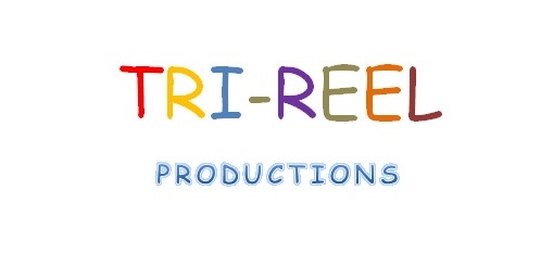
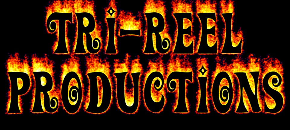
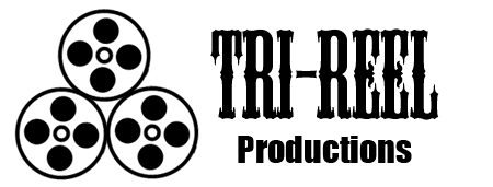
@dr_nefarious: Here's some ideas for you
Loading Video...
Main thing that's wrong with your logo is that it won't work at all in black & white, that is pretty important if you are actually going to use it for business purposes.
It's also hard to read, you should be able to read it just by glancing at it.
@dr_nefarious said:
I enjoyed the feedback guys. Yeah the font needs to be fixed for sure. I really just wanted an opinion on the actual design. Does it look too similar to the triforce? I don't want any law suits on my hand.
The actual design is nice, though maybe too many reels like @beachthunder said.. Maybe have two and have them overlap all cool-like?
@flacracker said:
You have gold text on top of gold reels. The font is ripped straight from The Lord of the Rings. And then the circles in your reels have something weird going on. On the right side of each of the circles there is a protrusion.
dem eyes wid dat eyesight
@singingmenstrual: You can make the picture bigger by clicking on it.
Font? Yeah, just like the other people said, Wrong placement. Having them be almost the same colour as the reels makes it unlegible. Also, pick a better font (HELVETICA).
The actual logo? The reels look off. They look more like gun cylinders than film reels. Look on Google Images for some pictures of real reels.
@nach0sanchez said:
Be careful with serif fonts as well they can be very dissonant with logos. Try a sans serif and stick to one color. I would try to simplify the image and keep the reels separate in case you ever want to use the logo in a text free situation. Reels are a good idea to work with.
I just want to point out that a serif typeface can work totally fine with a logo when used properly. Sans-serifs are more common for logo design to be sure, but they don't always capture the "classic" look quite the way a serif face can.
Anyway, I think this has a few big issues that should be fixed, but you've got the concept down which is the first step towards success!
- Avoid putting type on top of the graphic. Besides making it hard to read normally, the logo simply won't work in black & white, and forget about stuff like shirts or embroidery. I think a simple layout with text under the graphic is what you're looking for. Look at other production company logos (I'm thinking of the Weinstein one specifically but there's loads more).
- There's some weird jaggies on those reels. Not sure if that's just the upload or what, but I would open up Illustrator (if you don't have it maybe find someone who does) and redraw those as nice clean vectors. Reels are just circles so it shouldn't be too hard. Forget about the shading and drop shadows for now.
- The Lord of the Rings bevel *can* work, but it needs to be done well. For now I'd just stick with plain type
- This is just a suggestion, but I would avoid using small caps. Again, they can work, but for something like this I think you just want all caps.
That's all I got for now. Good luck!
Basically do everything quoted below would be my assessment.
@fobwashed said:
Just some thoughts in no real order.
The coloring makes it reel messy. (see what I did there?)
The font should be a different color than the stuff it's over or better yet, not be over anything at all.
The text apart from the reels has a very... umm... crowded look to it as well. The front portion looks as if you're going for some decent typography but as soon as the "R" in Reel cuts into "Production" it all falls apart.
The "P" in production being lined up with the "R" in Tri makes absolutely no sense as the tail end of production lines up with nothing at all.
The reels themselves if taken away from the words don't particularly evoke film reels.
I'm not entirely sure there's anything in this one worth saving and you may be better off starting fresh rather than trying to fix it.
@geirr said:
Basically do everything quoted below would be my assessment.
@fobwashed said:
Just some thoughts in no real order.
The coloring makes it reel messy. (see what I did there?)
The font should be a different color than the stuff it's over or better yet, not be over anything at all.
The text apart from the reels has a very... umm... crowded look to it as well. The front portion looks as if you're going for some decent typography but as soon as the "R" in Reel cuts into "Production" it all falls apart.
The "P" in production being lined up with the "R" in Tri makes absolutely no sense as the tail end of production lines up with nothing at all.
The reels themselves if taken away from the words don't particularly evoke film reels.
I'm not entirely sure there's anything in this one worth saving and you may be better off starting fresh rather than trying to fix it.
Thank you for bringing my attention back to this thread. Some of the work you guys have done is just fantastic. Lol.
@dr_nefarious: I like the type but don't care for the reels. The problem for me is there basically 3 big circles near your type (ignoring all the little circles). I would consider even just one reel, With the type. Or shrink the reels they seem really big and dominating.
Please Log In to post.


Log in to comment