Something went wrong. Try again later
    Follow

    New Xbox Experience

    Concept »

    The New Xbox Experience, or NXE, overhauled the Xbox 360's dashboard, released on November 19th, 2008. A new "Metro" dashboard was released on December 6th, 2011.

    Breaking news: Microsoft shows competency (Re: Dashboard update)

    Avatar image for blazehedgehog
    BlazeHedgehog

    1286

    Forum Posts

    16034

    Wiki Points

    0

    Followers

    Reviews: 30

    User Lists: 3

    Edited By BlazeHedgehog

    Ladies and gentlemen, I will just not shut the hell up about the Xbox 360 dashboard. There was an update yesterday morning, and I feel like I have to say something about it, given that my previous statements on the subject were, to quote, " this is bad enough that it almost seems like you're deliberately sabotaging yourselves, Microsoft."
     
    Somebody out there was listening. To me specifically? Probably not. But I was hardly the only voice. While the display issues with certain apps does not seem to have been corrected, yesterday's Xbox Dashboard patch has seemingly redesigned a significant portion of the Game Marketplace. 
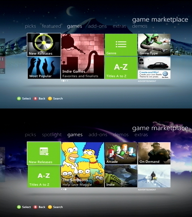
     

     The old dash (top) vs. the new dash (bottom).
     The old dash (top) vs. the new dash (bottom).
    What a world of difference! One of my main complaints of the old game marketplace was the fact that icons were all a random jumble of unrelated garbage - you had some icons that were like Windows icons in green squares, you had some icons that were random unrelated clip-art, and there were too many "clicks" standing in the way of you getting to the categorization options you wanted to get to. Now, everything makes a lot more sense. We lose sorting options like "Most Popular" and sorting by Genre, but now Xbox Live Arcade, Games On Demand, and Xbox Indie games are out in the open, no longer held hostage by the weird Parkour Girl. When icons deviate from the standard Xbox "green background and white pictograph" image, they're showing the best-selling products in their section - Castle Crashers, Halo Reach, and (ugh) FortressCraft. It's smart, it's focused, and it's the way it should've been to begin with (though given Microsoft's deal with Mojang for Minecraft on Xbox Live Arcade, I have to wonder how they feel about FortressCraft getting billing like that). Similar improvements have been made across the rest of the Marketplace:
     
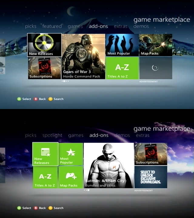
    Holy organization, Batman.
    Holy organization, Batman.
    Unlike with the games tab, where we lost sorting options in favor of exposing certain game types better, the add-ons section loses nothing but gains a ton of readability. System functions are clearly identified and grouped together, though the "subscriptions" tab is still off by its little lonesome there on the right - but I can't imagine a good place to put that myself, so it's fine. Again, this is exactly the way the dashboard should have looked when the update launched. It finally makes the whole thing feel cohesive; there's no more stopping and having to think about what might be an advertisement or a promotion - it's all properly organized and completely obvious, even at a glance. 
     
    Of course, I don't have to go through every section of the game marketplace, because it's all like this now. Microsoft deserves at least a little pat on the back; they took what used to be a slight trainwreck and made it workable. It's still not quite as good as it could be, of course, but it's definitely a step in the right direction.
    Avatar image for blazehedgehog
    BlazeHedgehog

    1286

    Forum Posts

    16034

    Wiki Points

    0

    Followers

    Reviews: 30

    User Lists: 3

    #1  Edited By BlazeHedgehog

    Ladies and gentlemen, I will just not shut the hell up about the Xbox 360 dashboard. There was an update yesterday morning, and I feel like I have to say something about it, given that my previous statements on the subject were, to quote, " this is bad enough that it almost seems like you're deliberately sabotaging yourselves, Microsoft."
     
    Somebody out there was listening. To me specifically? Probably not. But I was hardly the only voice. While the display issues with certain apps does not seem to have been corrected, yesterday's Xbox Dashboard patch has seemingly redesigned a significant portion of the Game Marketplace. 
     

     The old dash (top) vs. the new dash (bottom).
     The old dash (top) vs. the new dash (bottom).
    What a world of difference! One of my main complaints of the old game marketplace was the fact that icons were all a random jumble of unrelated garbage - you had some icons that were like Windows icons in green squares, you had some icons that were random unrelated clip-art, and there were too many "clicks" standing in the way of you getting to the categorization options you wanted to get to. Now, everything makes a lot more sense. We lose sorting options like "Most Popular" and sorting by Genre, but now Xbox Live Arcade, Games On Demand, and Xbox Indie games are out in the open, no longer held hostage by the weird Parkour Girl. When icons deviate from the standard Xbox "green background and white pictograph" image, they're showing the best-selling products in their section - Castle Crashers, Halo Reach, and (ugh) FortressCraft. It's smart, it's focused, and it's the way it should've been to begin with (though given Microsoft's deal with Mojang for Minecraft on Xbox Live Arcade, I have to wonder how they feel about FortressCraft getting billing like that). Similar improvements have been made across the rest of the Marketplace:
     
    Holy organization, Batman.
    Holy organization, Batman.
    Unlike with the games tab, where we lost sorting options in favor of exposing certain game types better, the add-ons section loses nothing but gains a ton of readability. System functions are clearly identified and grouped together, though the "subscriptions" tab is still off by its little lonesome there on the right - but I can't imagine a good place to put that myself, so it's fine. Again, this is exactly the way the dashboard should have looked when the update launched. It finally makes the whole thing feel cohesive; there's no more stopping and having to think about what might be an advertisement or a promotion - it's all properly organized and completely obvious, even at a glance. 
     
    Of course, I don't have to go through every section of the game marketplace, because it's all like this now. Microsoft deserves at least a little pat on the back; they took what used to be a slight trainwreck and made it workable. It's still not quite as good as it could be, of course, but it's definitely a step in the right direction.
    Avatar image for bollard
    Bollard

    8298

    Forum Posts

    118

    Wiki Points

    0

    Followers

    Reviews: 3

    User Lists: 12

    #2  Edited By Bollard

    It's nice to see they're trying to make it work better, but it's still way too unorganised. Nothing makes sense - especially the god damn Youtube app.

    I don't know how they screwed up something so mindnumbingly simple as a Youtube app, but boy did they succeed there. The search feature is abysmal (what was wrong with the normal on screen keyboard? Having everything in a line takes forever, and means my keypad doesn't work.) Secondly, it takes forever to load, as for some reason it has to load the thumbnail of every video you could possibly access from any of the buttons before those buttons show anything. And the videos behind the buttons behind those buttons. And so on. Thirdly, you can log in/sync your Youtube account. Sweet! So I can watch all the videos I subscribe to on my TV, right? Wrong. The subscriptions button isn't even on the front page of "My Youtube". What?!?! Even when you do get to your subs, they load in a random ass order, and I only want to even view like 5 of the 50+ I already have.

    Lastly, to round the shit-show out, the videos don't even display correctly. The edges are cropped off the goddamn screen, which means whenever I watch Starcraft videos I can't see the supply, minerals or gas, or most of the minimap. GG NO RE Youtube app, thanks for nothing.

    Avatar image for deactivated-629eab11cc270
    deactivated-629eab11cc270

    1671

    Forum Posts

    521

    Wiki Points

    0

    Followers

    Reviews: 0

    User Lists: 1

    Fuck yeah! Still needs work but the thing that bugged me the most is over. Real life unrelated shit isn't a good way to point me in the right direction.

    Avatar image for karl_boss
    Karl_Boss

    8020

    Forum Posts

    132084

    Wiki Points

    0

    Followers

    Reviews: 0

    User Lists: 2

    #4  Edited By Karl_Boss

    Thankfully arcade games are easier to get to now.

    Avatar image for jasonr86
    JasonR86

    10468

    Forum Posts

    449

    Wiki Points

    0

    Followers

    Reviews: 17

    User Lists: 5

    #5  Edited By JasonR86

    I like how it still takes nearly a minute (which may as well be a million years) to open my games library or look at the 'storage' option in the system settings.

    Avatar image for turbo_toaster
    turbo_toaster

    1056

    Forum Posts

    7

    Wiki Points

    0

    Followers

    Reviews: 0

    User Lists: 7

    #6  Edited By turbo_toaster

    Oh I had no idea that's what the update was for. I usually get used to dash updates even if I dislike them but this one has been really awful, and the inexplicable tucking-away of the Arcade section specifically irked me. I'll have to check this out.

    Avatar image for joshthebear
    joshthebear

    2704

    Forum Posts

    726

    Wiki Points

    0

    Followers

    Reviews: 0

    User Lists: 2

    #7  Edited By joshthebear

    Holy shit, nice job pointing that out. Now if only they'd make the rest better.

    Avatar image for bsw
    BSw

    391

    Forum Posts

    80

    Wiki Points

    0

    Followers

    Reviews: 0

    User Lists: 0

    #8  Edited By BSw

    Interesting. Haven't seen the update myself yet, but I hope this does indeed make things a little bit better. I truly dislike the current dashboard. The old dashboard worked much more intuitively for me. I don't mind getting used to a new interface, but I still haven't been able to like most of the changes, even after a few weeks. I especially dislike the (absence of) current options to search for arcade games.

    @BlazeHedgehog: I'll ruin your topic if I find out that it still sucks!

    Avatar image for evo
    EVO

    4028

    Forum Posts

    20

    Wiki Points

    0

    Followers

    Reviews: 0

    User Lists: 4

    #9  Edited By EVO

    Nope, I still don't like it.

    Avatar image for dany
    Dany

    8019

    Forum Posts

    416

    Wiki Points

    0

    Followers

    Reviews: 0

    User Lists: 4

    #10  Edited By Dany

    Fantastic

    Avatar image for vexxan
    Vexxan

    4642

    Forum Posts

    943

    Wiki Points

    0

    Followers

    Reviews: 0

    User Lists: 3

    #11  Edited By Vexxan

    @Unknown_Pleasures said:

    Thankfully arcade games are easier to get to now.

    This. Navigating to them before was a pain in the ass.

    Avatar image for time allen
    time allen

    2329

    Forum Posts

    29

    Wiki Points

    0

    Followers

    Reviews: 0

    User Lists: 0

    #12  Edited By time allen

    i was wondering what that update was for. glad to see they're getting on the right track, and i hope they keep it up.

    Avatar image for james_ex_machina
    James_ex_machina

    1083

    Forum Posts

    8

    Wiki Points

    0

    Followers

    Reviews: 0

    User Lists: 5

    #13  Edited By James_ex_machina

    Nice tweaks but I wish gold members had no ads or less ads.
    I just hope someone improves the new netflix interface. It's terrible.

    Avatar image for drflapjack
    DrFlapjack

    373

    Forum Posts

    15

    Wiki Points

    0

    Followers

    Reviews: 0

    User Lists: 0

    #14  Edited By DrFlapjack

    Thank goodness. Just last week it took me over 10 minutes to try and find where they hid games on demand so I could get Psychonauts. Then it took me another 10 minutes to realize Psychonauts was no longer available, what the heck.

    Avatar image for shagge
    ShaggE

    9562

    Forum Posts

    15

    Wiki Points

    0

    Followers

    Reviews: 0

    User Lists: 1

    #15  Edited By ShaggE

    @Unknown_Pleasures said:

    Thankfully arcade games are easier to get to now.

    I haven't seen the new update yet: please tell me they're on the first or even second page now. The previous layout felt like MS was deliberately trying to hide the damn things.

    Avatar image for hughesman
    hughesman

    314

    Forum Posts

    0

    Wiki Points

    0

    Followers

    Reviews: 0

    User Lists: 0

    #16  Edited By hughesman

    That's a little better i guess. Now just tell me why the "games" tab is like five tabs over on my video game machine. Also, why doesn't netflix have a "restart episode" option anymore?

    Avatar image for audiosnow
    audiosnow

    3926

    Forum Posts

    729

    Wiki Points

    0

    Followers

    Reviews: 0

    User Lists: 0

    #17  Edited By audiosnow

    It's still got a long way to go, but that is such a huge improvement.

    Avatar image for sooty
    Sooty

    8193

    Forum Posts

    306

    Wiki Points

    0

    Followers

    Reviews: 2

    User Lists: 3

    #18  Edited By Sooty

    It's still garbage, the PS3's XMB is so much better than this. No ads, nice app for the store, and Netflix doesn't suck balls on that. (unrelated but somebody fucked up that 360 version)

    Avatar image for pezen
    Pezen

    2585

    Forum Posts

    14

    Wiki Points

    0

    Followers

    Reviews: 0

    User Lists: 0

    #19  Edited By Pezen

    Great to see Arcade getting a fast link. Never understood why I had to run around in circles to get to those games.

    Avatar image for somedelicook
    SomeDeliCook

    2353

    Forum Posts

    61

    Wiki Points

    0

    Followers

    Reviews: 0

    User Lists: 1

    #21  Edited By SomeDeliCook

    I like that Xbox Live is a paid subscription yet they waste space with advertisements.

    I just wish Microsoft would stop changing the dashboard so much. The oldest/first one is still my favorite, and I miss it very much.

    Avatar image for agentboolen
    agentboolen

    1995

    Forum Posts

    12

    Wiki Points

    0

    Followers

    Reviews: 1

    User Lists: 0

    #22  Edited By agentboolen

    I don't like the marketplace mind games there doing, they mixed all of the games up. I liked when they had categories for the type of games they were, old Xbox, New Xbox, Arcade and Indie. The way they have it now makes me think they believe all the games will sell better if there just jumbled together.

    Stupid because I finally got a bigger hard drive and wanted to see what old Xbox games I might have missed out on, but the way it is its just to much work to look for them.

    Avatar image for blazehedgehog
    BlazeHedgehog

    1286

    Forum Posts

    16034

    Wiki Points

    0

    Followers

    Reviews: 30

    User Lists: 3

    #23  Edited By BlazeHedgehog
    @ShaggE said:

    @Unknown_Pleasures said:

    Thankfully arcade games are easier to get to now.

    I haven't seen the new update yet: please tell me they're on the first or even second page now. The previous layout felt like MS was deliberately trying to hide the damn things.

    You could always look at the images I posted. :p
     
    @James_ex_machina said:
    Nice tweaks but I wish gold members had no ads or less ads. I just hope someone improves the new netflix interface. It's terrible.

    It's kind of sad what a bad deal Xbox Live Gold still is after all this time. Their entire list of "Gold benefits" is mostly a bunch of stuff you can get on most other platforms for free. It's especially ridiculous for stuff like Hulu+ and Netflix, because you have to have two separate subscriptions to access one service. No matter how you spin it, that's all sorts of ridiculous.
     
    @agentboolen said:

    I don't like the marketplace mind games there doing, they mixed all of the games up. I liked when they had categories for the type of games they were, old Xbox, New Xbox, Arcade and Indie. The way they have it now makes me think they believe all the games will sell better if there just jumbled together.

    Stupid because I finally got a bigger hard drive and wanted to see what old Xbox games I might have missed out on, but the way it is its just to much work to look for them.

    But they're still categorized. Go to the Game Marketplace, and under the Games tab, select "Arcade". Boom. All XBLA games. Select "Indie", you get all Indie Games. And so on. 
     
    What Microsoft REALLY REALLY REALLY needs to do is have some way to show me all the games I've purchased whether they are installed or not. There is no way to look at your entire game library, only what's currently on that system at that given time. I'd assume it has something to do with the fact that every time you boot up your console it verifies your installed games over Xbox Live (seriously, try unplugging the ethernet cable when you first turn the system on and watch how much faster "My Games" loads). If it had to verify one's entire library, regardless of install, it would just take that much longer.
     
    If that's the case, then Microsoft is a little too strict with security and it's bogging down the user experience.
    Avatar image for hitchenson
    Hitchenson

    4708

    Forum Posts

    121

    Wiki Points

    0

    Followers

    Reviews: 0

    User Lists: 0

    #24  Edited By Hitchenson

    I still think the dashboard is an eyesore and really poorly done.

    Avatar image for buft
    buft

    3409

    Forum Posts

    1787

    Wiki Points

    0

    Followers

    Reviews: 13

    User Lists: 4

    #25  Edited By buft

    Its nice that they are listening to the users on this, the original design is pretty but less functional than the previous dashboard, a few more changes and it could be great again.

    Avatar image for agentboolen
    agentboolen

    1995

    Forum Posts

    12

    Wiki Points

    0

    Followers

    Reviews: 1

    User Lists: 0

    #26  Edited By agentboolen

    @BlazeHedgehog said:

    @agentboolen said:

    I don't like the marketplace mind games there doing, they mixed all of the games up. I liked when they had categories for the type of games they were, old Xbox, New Xbox, Arcade and Indie. The way they have it now makes me think they believe all the games will sell better if there just jumbled together.

    Stupid because I finally got a bigger hard drive and wanted to see what old Xbox games I might have missed out on, but the way it is its just to much work to look for them.

    But they're still categorized. Go to the Game Marketplace, and under the Games tab, select "Arcade". Boom. All XBLA games. Select "Indie", you get all Indie Games. And so on. What Microsoft REALLY REALLY REALLY needs to do is have some way to show me all the games I've purchased whether they are installed or not. There is no way to look at your entire game library, only what's currently on that system at that given time. I'd assume it has something to do with the fact that every time you boot up your console it verifies your installed games over Xbox Live (seriously, try unplugging the ethernet cable when you first turn the system on and watch how much faster "My Games" loads). If it had to verify one's entire library, regardless of install, it would just take that much longer. If that's the case, then Microsoft is a little too strict with security and it's bogging down the user experience.

    Yea your right they do break it in categories, I actually found this out later on while playing around in the marketplace looking for some old games that I can't figure out where they have gone after upgrading to a bigger hard drive! I think the new interface was suppose to be simple but seems to be complicated in some areas with a lot of button presses being needed... Microsoft has never been a company that can simplify a interface IMO.

    That leads me to your request of showing us grayed out games that aren't installed like steam, I second that one too! My Rootbeer tapper classic is very lost in the roots of Xbox Live at the moment because of Midway going out of business!!

    Avatar image for agentboolen
    agentboolen

    1995

    Forum Posts

    12

    Wiki Points

    0

    Followers

    Reviews: 1

    User Lists: 0

    #27  Edited By agentboolen

    @BlazeHedgehog: O.k. found my Rootbeer Tapper, had to go on the Xbox.com site, they have a section were you can see all the games you have bought and just match it up to what you have on your console, your able to put any of the games you bought in your download que. I'm still all for grayed out titles meaning you don't have those currently installed on your console, but this is a good fix for now.

    This edit will also create new pages on Giant Bomb for:

    Beware, you are proposing to add brand new pages to the wiki along with your edits. Make sure this is what you intended. This will likely increase the time it takes for your changes to go live.

    Comment and Save

    Until you earn 1000 points all your submissions need to be vetted by other Giant Bomb users. This process takes no more than a few hours and we'll send you an email once approved.