
Persona 3 used a lot of blues throughout the game, while Persona 4 used a lot of yellows and orange. Even on Persona 3 Portable, when you play as the girl, there is a large use of pink. I like this because it gives all the menus a very stylish look. What color do you think P5 will have, if you want it to have one at all. Personally, I really like the color red or green.
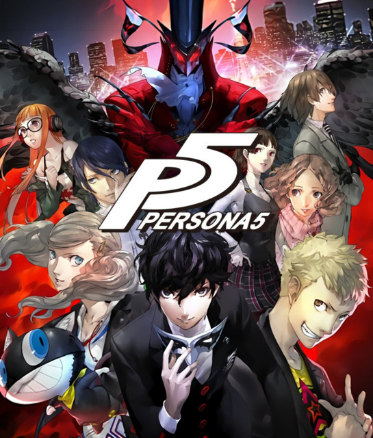
Persona 5
Game » consists of 17 releases. Released Sep 15, 2016
The sixth main iteration in the long-running Persona series, Persona 5 follows a group of high school students (and a cat) who moonlight as the Phantom Thieves, out to reform society one rotten adult at a time.
Persona 5's "Color"

I've never liked green menus... Kinda in-your-face annoying. Red would be cool though.
It kinda depends on the vibe of the game. P3 was darker and mellow, thus it was blue. P4 was more comedic and friendly, thus the bright colors. Red would be nice since it would be more towards the darker feel, which I enjoyed much more.

I believe there's already a topic about this..

Green or purple, purple being my hopeful, green being the more plausible.

"Blue seemed to be the theme color for P3, and yellow for P4. Are theme colors a conscious choice? What do they represent?"
"When I work on a title, its theme color is very important to me. I think when a person remembers things unconsciously, what leaves the strongest impression isn’t words or shape, but color. Persona 3’s theme color, blue, symbolizes adolescence; Persona 4’s yellow is the color of happiness. Both meanings are tied to Japanese culture, so it might be hard for western audiences to understand."
So ultimately the color is really determined according to the game's plot and undertones, so really, it's anyone's guess as to what Persona 5's color will be. Kudos if they can do a convincing brown without the Unreal Engine, though.

I was thinkin purple

I would love a very blood red theme. Not like a pink, maroon, or an orange tint... RED! A very definitive red.

Black menus with black text.


" Purple or brown would be suitable and really nice. Both are very hot colours right now. "Brown? They would have to do the right kind of brown. I wouldn't want crap color menus.

i really liked what they did with the yellow in p4

" @uberpwner93 said:That's why it's the perfect choice, it's unprecedented and potentially very snappy." @Blair said:I don't remember ANY game that looked good with a lot of brown. "" Purple or brown would be suitable and really nice. Both are very hot colours right now. "Brown? They would have to do the right kind of brown. I wouldn't want crap color menus. "
A game could look gorgeous and ultra stylish in a tasteful set of natural (perhaps wood coloured) browns and shades of tan.


Red is what I would choose for the 5th game.

" @TheGremp: You're on the right track in presuming that the colors are representative of those games' underlying themes, although colors in Japan tend to have different connotations than they do in Western cultures. In fact, Play Magazine had an interview with the art director where he actually directly commented on the significance of the colors. I'll just copy and paste the question and answer out of sheer laziness.Interesting. I had heard that color in Japan had different meanings, but I think yellow can universally mean happiness. It's so bright... But red was also very used in Persona 3 via the Dark Hour. There was lots of what we can assume is blood everywhere, even blood waterfalls in Tartarus itself.
"Blue seemed to be the theme color for P3, and yellow for P4. Are theme colors a conscious choice? What do they represent?""When I work on a title, its theme color is very important to me. I think when a person remembers things unconsciously, what leaves the strongest impression isn’t words or shape, but color. Persona 3’s theme color, blue, symbolizes adolescence; Persona 4’s yellow is the color of happiness. Both meanings are tied to Japanese culture, so it might be hard for western audiences to understand." So ultimately the color is really determined according to the game's plot and undertones, so really, it's anyone's guess as to what Persona 5's color will be. Kudos if they can do a convincing brown without the Unreal Engine, though. "


Gray perhaps?
" Maybe Atlus's UI team will go, uh, "postmodern" for Persona 5. I'm talking minimalism, white and black, DOT Pictogram-style imagery, and Helvetica. Everywhere. Bold, narrow, italic, whatever. See: Quick Look: Wipeout HD Fury. "Ooh, that would be pretty neat. I'd like to see how it matches up with the themes presented in the game.
" @FluxWaveZ said:Yeah,one thing I can think of is if it had a futuristic vibe which coincides with the Wipeout HD example you gave. I'm not sure that that theme would fit with a Persona game though. Some things other than that could be: the game could have a focus on the yin and yang concept (having a heavier focus of evil and good or something else that are opposites) or, kind of following the same idea of the yin and yang, it could have a focus on life and death as I believe white is the color of life in Japan and black, as in our society, can mean death." @gakon5 said:If we concede that Persona 3 = dark = blue, and Persona 4 = happy = yellow, I'm not sure where white and black leave us thematically. Or where it fits in with the music, etc. Somehow, the visual styles, themes, and interfaces of P3 and P4 matched up to give each game a distinct feel. "" Maybe Atlus's UI team will go, uh, "postmodern" for Persona 5. I'm talking minimalism, white and black, DOT Pictogram-style imagery, and Helvetica. Everywhere. Bold, narrow, italic, whatever. See: Quick Look: Wipeout HD Fury. "Ooh, that would be pretty neat. I'd like to see how it matches up with the themes presented in the game. "


something that doesn't hurt my eyes
Something tells me it'll be red. But then again, if you told me Persona 4's color was going to be yellow, I would have informed you that you are crazy. But hey, it turned out alright, so maybe P5 will go for another obscure color.
Indeed, I thought of either Red or Green or Purple. I hope it's Red.

I want purple and white. It has been used to great effect with the Dominion ships from DS9, Freeza, and the Scifi network. Although Green would be a nice alternative.
" I want purple and white. It has been used to great effect with the Dominion ships from DS9, Freeza, and the Scifi network. Although Green would be a nice alternative. "But I don't think that color scheme would look good in use with the actual interface, menus and stuff. But again, it all depends on the theme it would have, I guess.


Considering there is absolutely no information about this game....
None. None what so ever.

" @uberpwner93 said:Not true......(thinking)....... Resista.......World at Wa.........Prince of Persia: The Sands of Ti....... Yeah, you're probably right." @Blair said:I don't remember ANY game that looked good with a lot of brown. "" Purple or brown would be suitable and really nice. Both are very hot colours right now. "Brown? They would have to do the right kind of brown. I wouldn't want crap color menus. "
I guess I can see blue tying to death, although that symbolic link, if it ever existed, has been effectively "retconned" by Persona 3 Portable, because choosing the female protagonist changes all blue elements of the interface to be pink.Well, you do play as a girl and since everyone knows pink's a girl color, I think that it fits in well enough. Though yeah, the death relation with the color is lost.
I'd rather they make a functional, efficient, and aesthetically-pleasing UI than work to make the color scheme match the theme of the game. That's nothing more than a novelty to me. "
Yeah, I think it should look good before anything else. Perhaps making a sort of symbolic link a second priority.
And would you agree that Mass Destruction -> Wiping All Out -> Genocide would be the logical progression of the name? That's one of the first things I thought of when I saw the name Wiping All Out the first time...

I see a progresstion: Blue in P3 was subdued, sad-like - it represented the a jazzy era, as did the music. It was based on an old feel, with few modern elements.
Persona 4 was balls-out crazy: Orange, yellow and red-orange pallette signified a complete ownership of the game: it represented new, contemporary and unorthodox views, as did the high-school setting and the dialogue associated with it.
I gaze upon my crystal ball and see them moving back to a P3 feel, but so...meh. They'll combine elements of both P3's and P4's design: they'll use old designs, but they'll own them. I'm hearing a lot of purple and red, and I imagine that both will be used (both are close enough of the color circle to be appealing at the same time).
I also saw people saying green, but I can't imagine them using it: P5 needs to be something serious, something worthy of the badass look of the PS3 (I think we can all agree the PS3 is the more 'mature' and serious of the two consoles, eh?). Green is too lush, too clean, too organic for a setting I KNOW will involve murder, betrayal, etc.
However, this is my opinion, and the color thing is just my low-level synesthesia acting up. I don't know, I just feel the 5 being red, all serious and shit.


" @TheGremp: You're on the right track in presuming that the colors are representative of those games' underlying themes, although colors in Japan tend to have different connotations than they do in Western cultures. In fact, Play Magazine had an interview with the art director where he actually directly commented on the significance of the colors. I'll just copy and paste the question and answer out of sheer laziness.If this Vincent stuff is what it seemed, then I suppose a color that represents confusion?
"Blue seemed to be the theme color for P3, and yellow for P4. Are theme colors a conscious choice? What do they represent?""When I work on a title, its theme color is very important to me. I think when a person remembers things unconsciously, what leaves the strongest impression isn’t words or shape, but color. Persona 3’s theme color, blue, symbolizes adolescence; Persona 4’s yellow is the color of happiness. Both meanings are tied to Japanese culture, so it might be hard for western audiences to understand." So ultimately the color is really determined according to the game's plot and undertones, so really, it's anyone's guess as to what Persona 5's color will be. Kudos if they can do a convincing brown without the Unreal Engine, though. "

The recent Persona 2 PSP announcement got me thinking.....there aren't much colors left for P5.
Right now its:
P1=Purple(and sort of gray)
P2IS=Red
P2EP=?(I'm assuming Green based on the Maya's eyes/clothes)
P3=Blue,Pink
P4=Yellow
Right now all that's left is orange(debatable), green, gray(debatable), white and black! And I highly doubt orange will be used. The only colors that fit with it are yellow and black, so it'll just end up looking like P4(which was filled with orange already).
I'm thinking green or gray is gonna be it.
Edit: Brown is a possibility as well.

I would honestly love a Black and white theme, black and while always seem dynamic to me... also, i'd like to see...gears.. i don't know why." The recent Persona 2 PSP announcement got me thinking.....there aren't much colors left for P5. Right now its: P1=Purple(and sort of gray)P2IS=Red P2EP=?(I'm assuming Green based on the Maya's eyes/clothes) P3=Blue,Pink P4=Yellow Right now all that's left is orange(debatable), green, gray(debatable), white and black! And I highly doubt orange will be used. The only colors that fit with it are yellow and black, so it'll just end up looking like P4(which was filled with orange already). I'm thinking green or gray is gonna be it. Edit: Brown is a possibility as well. "
I don't care what color I just want Persona 5 right now!

Something about Persona 5 just feels like black.
Please Log In to post.
This edit will also create new pages on Giant Bomb for:
Beware, you are proposing to add brand new pages to the wiki along with your edits. Make sure this is what you intended. This will likely increase the time it takes for your changes to go live.Comment and Save
Until you earn 1000 points all your submissions need to be vetted by other Giant Bomb users. This process takes no more than a few hours and we'll send you an email once approved.
Log in to comment