In April 1966 Bill Putnam announced that the eventual “Philadelphia Flyers” name was to be decided based on a name-the-team contest, after Ed Snider the then vice-president of the Philadelphia Eagles had witnessed the sheer number of audience there was in the area to check out a last place hockey team. Knowing there might be a great opportunity for a competitive team, Snider started making plans for a new arena upon hearing the NHL was looking to expand for fear of a league on the west coast looking to gain leverage over the NHL, and a desire for a new TV contract in the United States.
The teams colors were chosen based on the idea that they looked “hot” The teams logo has an orange dot to represent a puck, and the four stylized lines represent a wing. The jerseys stripes down the arms and sides were designed to take the idea of the wings and carry the flying aspect through each player. (It's unknown if this influenced the P-wing in the Super Mario Franchise)
The alternate Orange jerseys were made available in the ‘08-‘09 season based on the ‘73-‘74 jerseys of past, became the Flyers permanent home color starting the ‘09-‘10 season, replacing the black home jerseys, and instead choosing black as the new alternate color.
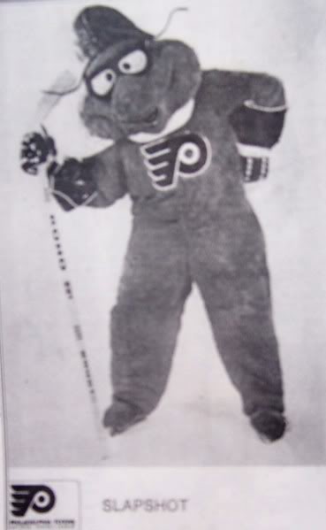
Back in ‘76 The Philadelphia Flyers played with the idea for a team mascot, labeled “Slapshot” but was dropped after only once season and was the only mascot in Flyers history.
Log in to comment