PlayStation 4 is Sony's fourth home video game console, released on November 15, 2013 in North America, and November 29, 2013 in Europe. On November 10 2016, Sony released the Playstation 4 Pro, an updated version of the console targeting 4K gaming.
Ugh, not sure I'm a fan of this. Parts of the system are obscured and the layout is confusing. How appropriate.
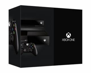
That said, at least Microsoft's box is interesting. Sony's is a bit boring, really. It fails to show off the system's novel shape and the controller, while I'm sure it's great to use, is a bit ugly face-on like that.
Wow...are we really going to war over packaging design too? Is there any aspect of the Xbox One that the internet won't find a reason to complain about or any aspect of the PS4 that the internet won't herald as the second coming?
Wow...are we really going to war over packaging design too? Is there any aspect of the Xbox One that the internet won't find a reason to complain about or any aspect of the PS4 that the internet won't herald as the second coming?
My thoughts going into this. What's wrong with just liking video games, guys and gals?
I like the PS4 box more than the Xbox One, but who cares how good either cardboard box looks? Either one will get thrown in my closet, never to be seen again, unless I move.
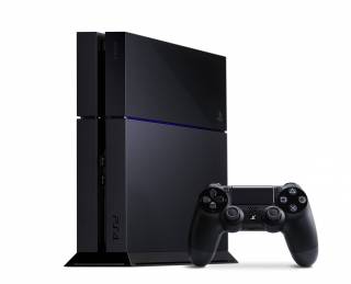
Is that a blue led in the middle or is that just paint? If it's a LED then it's gonna look really good in a dark room. A silver version of that could be cool.
PS. Is 500GB enough? I know you can change the hard drive but.. Why not go 1TB right away?
Keep costs down. My guess is they're probably already taking a hit on each box sold at $400.
Is that a blue led in the middle or is that just paint? If it's a LED then it's gonna look really good in a dark room. A silver version of that could be cool.
PS. Is 500GB enough? I know you can change the hard drive but.. Why not go 1TB right away?
That should be an LED, if I remember the many e3 talks right.
As for the HD, I've no clue why it's not 1TB. They cost like $10 more than 500gb here.
I'm probably putting in an SSD as soon as I get a hold of a PS4 though.
I think the XB1 box is really sharp. The composition is striking. Giving over half the box front to the logo floating in black is bold. I like it a lot. Love the controller on the side, too. Great, strong package design.
The PS4 box is nice too, but pedestrian. It is what it is, no more or less.
The important thing is the PS4 box has a PS4 in it, and that thing is gorgeous.
Ugh, not sure I'm a fan of this. Parts of the system are obscured and the layout is confusing. How appropriate.
That said, at least Microsoft's box is interesting. Sony's is a bit boring, really. It fails to show off the system's novel shape and the controller, while I'm sure it's great to use, is a bit ugly face-on like that.
Oh no that's horrible! I've done tons of texture work and when the image just cuts off like that it reminds me of misaligned textures and the seams that follow.
Is that a blue led in the middle or is that just paint? If it's a LED then it's gonna look really good in a dark room. A silver version of that could be cool.
PS. Is 500GB enough? I know you can change the hard drive but.. Why not go 1TB right away?
Keep costs down. My guess is they're probably already taking a hit on each box sold at $400.
The majority of consumers won't use 100GB, and for advanced folk putting 1TB in is a half measure. Users that want better storage would likely be unimpressed with the OEM drives regardless of storage. They can buy faster or bigger drives themselves, or try out an SSD if the bus speed is there.
I think you're all getting a little too excited over this. Console boxes haven't been an artform since the 90s. In fact, the last truly special one was this:
Is that a blue led in the middle or is that just paint? If it's a LED then it's gonna look really good in a dark room. A silver version of that could be cool.
PS. Is 500GB enough? I know you can change the hard drive but.. Why not go 1TB right away?
In Japan apparently (my Dreamcast box is blue). The guy was a higher-up in Sega's marketing division and starred in their adverts, so there is some method to the madness.
@jensonb: You're only saying that because the photo has the horizontal stand in it.
PS. Is 500GB enough? I know you can change the hard drive but.. Why not go 1TB right away?
To keep the cost under the magical 400 I guess. Also that is plenty, it will probably support external hard drives for media and such, so you can install upwards of 10 games in the worst case. Also many people will want to put a SSD in there over the lifecycle of the console (or buy a slim in 5 years or so).
@jensonb: Ah, I wish I still had my original PS2 box for reference (I think I still have a yellow one for the slim model somewhere). You might be onto something with the notion that the less they show the better it looks though...
Also, not a console, but it was the top result when I searched for "jaguar box":
These are the possible but very probable contents of the PS4 Box. Figured I'd put this here instead of making a new thread for it. Even though less people will probably see this.
You think that I am joking, but I will fight one of you at random in the street for one.
WELL YOU BEST BE READY TO THROW DOWN THEN PLAYER.
Unless they've released a Saints Row Purple Edition by then because DAT PURP.
I want a green one because my favorite color is green. Maybe a dark green instead of a light or regular green. I will not fight you guys for that, I'll just try to murder you all. I WILL KILL YOU UNTIL YOU ARE DEAD!
This edit will also create new pages on Giant Bomb for:
Beware, you are proposing to add brand new pages to the wiki along
with your edits. Make sure this is what you intended. This will likely
increase the time it takes for your changes to go live.
Comment and Save
Until you earn 1000 points all your submissions need to be vetted by other
Giant Bomb users. This process takes no more than a few hours and we'll
send you an email once approved.


Log in to comment