Something went wrong. Try again later

Marino

Is it the shoes?

8614 1365087 73 84243
Forum Posts Wiki Points Following Followers

By the Numbers: 500 Reviews on Giant Bomb

From Poker Smash to Steel Battalion, it's been over four years of reviewing games for the staff at Giant Bomb. To celebrate this milestone, I've compiled a bunch of colorful pie charts, bar graphs, and grids to break it all down. But, it's not just about the staff in this set of data porn! Of the 500 games that the staff has reviewed, users have written over 10,000 reviews on those same games. So, I've included all of that info as well, which, among other things, allows us to see which staff members the community agrees with most. Spoiler Alert: There's one staff member that users agree with 100% of the time!

No Caption Provided

On a side note, user reviews allow for half-stars while staff reviews do not. So, to make things easier to compare, I've rounded off the user review scores. For example, seventy users reviewed Burnout Paradise, which resulted in an overall 4.2. I round that down to a 4 in order to compare it to Jeff's 5-star review. Also, if you added up the percentages in the system section of each staff members reviews, it will be over 100%. That's because some reviews include more than one system. Got it? Good. Let's get started!

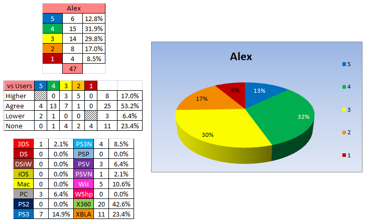
Alex

Mr. Navarro got a late start compared to most of the other staff members, but he's catching up fast. Over half the time (55.3%), users reviewing the same game as Alex agree with him. The real crazy stat here is that 23.4% of the games Alex reviews, no one else has.
No Caption Provided

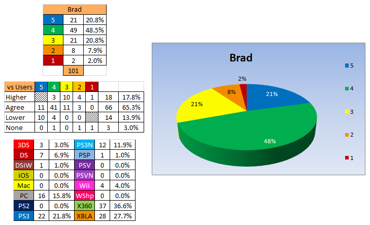
Brad

Mr. Shoemaker's first review was Metal Gear Solid 4: Guns of the Patriots, which earned a stellar five stars. His latest review, Steel Battalion: Heavy Armor, was one of the worst games ever reviewed on Giant Bomb. Brad also just passed the century mark with his review of Diablo III. Brad is also tied with Jeff for the most DS reviews (7).
No Caption Provided

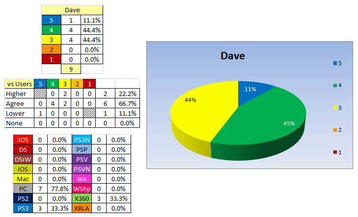
Dave

Mr. Snider has chipped in with nine reviews including some top-tier blockbusters such as Battlefield 3 and Dragon Age: Origins. Even with just nine reviews, he has the 4th most PC game reviews. And, at 66.7%, Dave is tied for 2nd place for the average user reviews that agree with his.
No Caption Provided

Drew

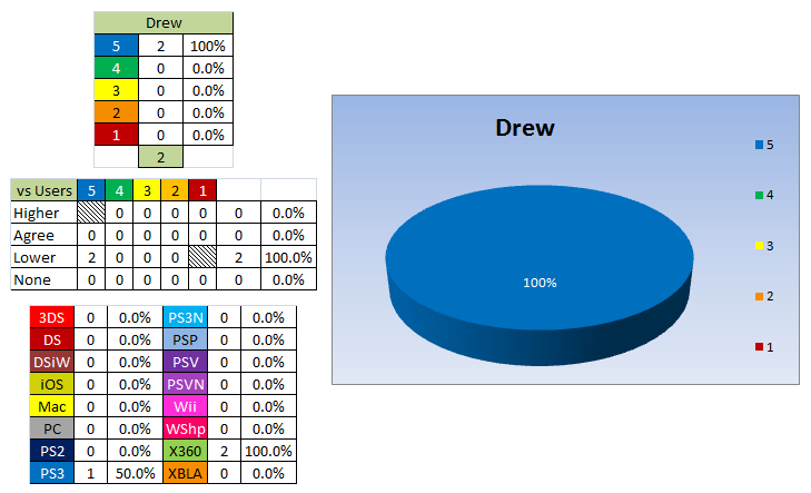
It's no secret that Mr. Scanlon loves DiRT. Unfortunately, two reviews doesn't make for a very pretty pie chart. If you're wondering why users "disagree" with Drew, both DiRT 2 and DiRT 3 got a 4.2 from users, so it was pretty close to being 100% agreement.
No Caption Provided

Jeff

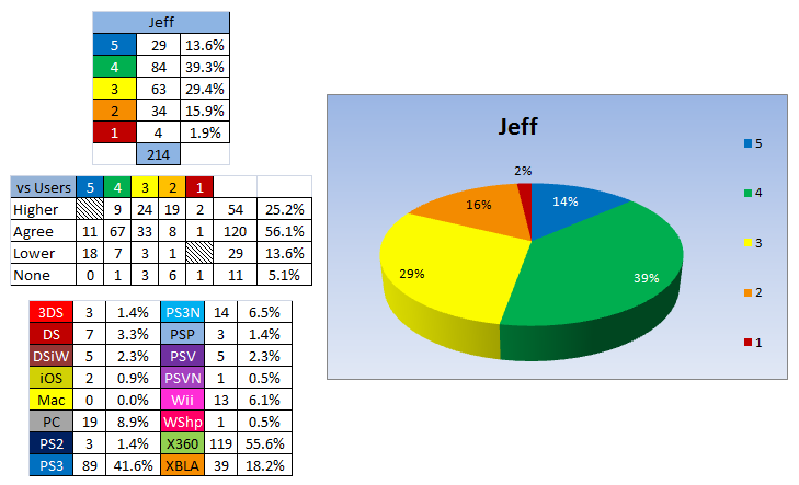
It should be no surprise to anyone that Mr. Gerstmann has reviewed more games than anyone on Giant Bomb. With over 200 total reviews, Jeff has reviewed more 3DS, DSiWare, PC, PS2, PS3, PS3N, PSP, Vita, Xbox 360, and XBLA games than anyone else.
No Caption Provided

Matt

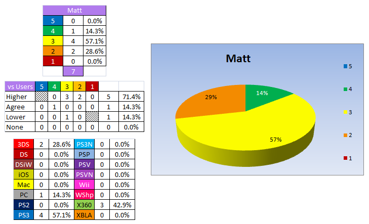
During his reign as Whiskey Media King-tern, Mr. Kessler reviewed several games. I think the percentages "vs Users" are a bit skewed on this one since he only reviewed a few games. So, I wouldn't pay attention to those numbers much.
No Caption Provided

Patrick

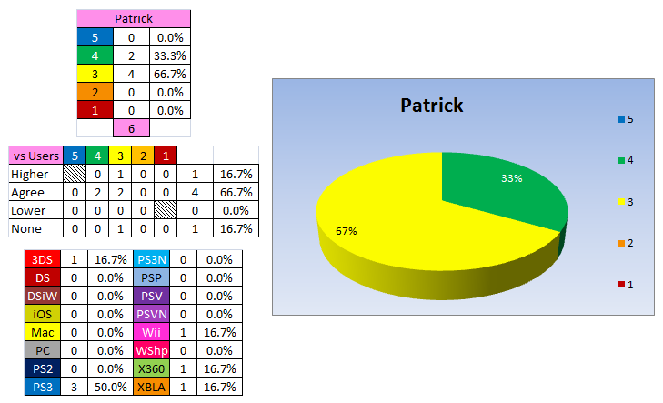
Despite being the newest staff member, Mr. Klepek is tied for second place in terms of users agreeing with his reviews. The only game that users actually disagreed with him on was Dragon's Dogma, which users liked more than Patrick did.
No Caption Provided

Ryan

From Bully: Scholarship Edition to Max Payne 3, Mr. Davis has reviewed over 100 games so far here at Giant Bomb. Also, did you know Ryan has reviewed more Wii Shop titles than Jeff? I think he's trying to derail the train. He's also reviewed more Wii and Mac games than anyone else.

No Caption Provided

Vinny

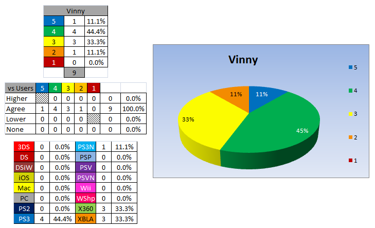
Sadly, Mr. Caravella has not reviewed a game since October 2009. Although we haven't seen an official review from Vinny in nearly three years, user reviews agree with him ONE HUNDRED PERCENT OF THE TIME! It's clear that the community is more in tune with Vinny's opinions than any other staff member.

Also, Vinny has never given a game a 1-star review, which makes that cartoon header the only one that's never officially been used on the site.
No Caption Provided

Andy

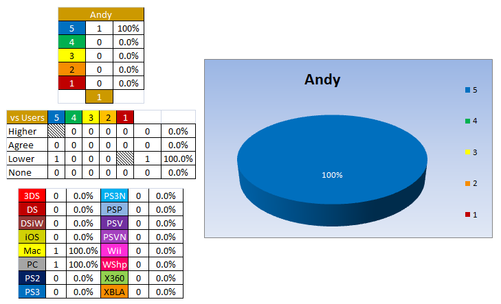
You thought I would forget Mr. McCurdy's review? Or maybe you didn't know he did one. The Bomb Squad guild knows about it, for sure.
No Caption Provided

Staff Totals

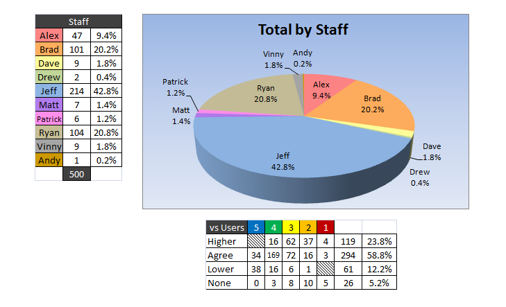
Now that you've seen each staff member individually, here's all of them smashed together. And some user review info below.
No Caption Provided

Platform Totals and Staff vs Users

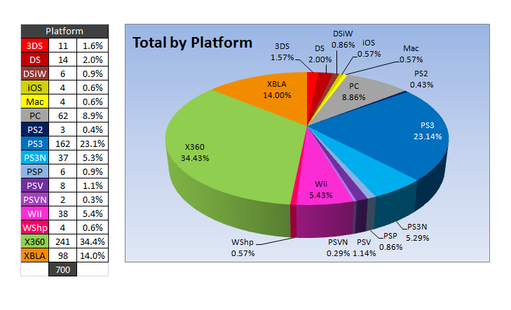
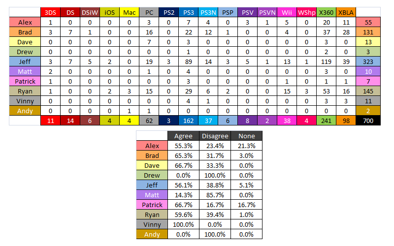
Here's a breakdown of the reviews by platform. Keep in mind that the reason the total is 700 reviews is because some games' reviews count towards multiple systems.
No Caption Provided

The top chart here is simply a breakdown of each staff members' totals per platform.

The bottom chart is a condensed version of how much user reviews agree or disagree with staff reviews. In this chart, I have combined the "Higher" and "Lower" totals to make one "Disagree" percentage. So, whether the user reviews liked the game more or less is irrelevant. "None" means no users reviewed the game that the staff did.
No Caption Provided

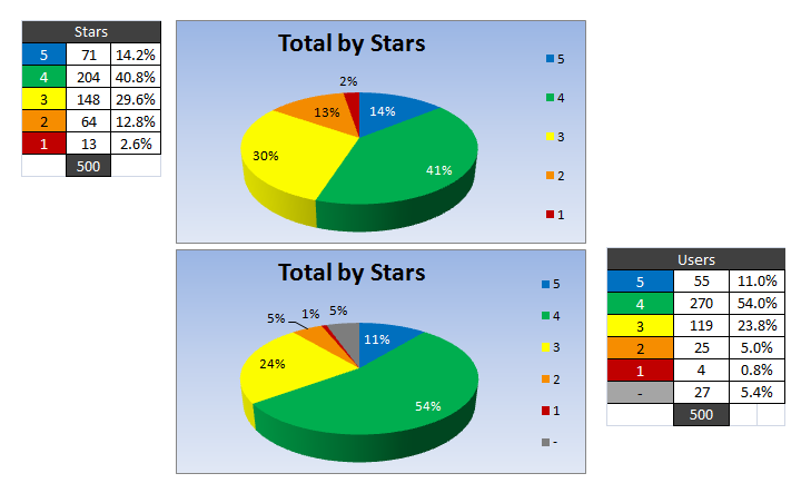
This one is just a simple breakdown of Total Stars by Staff and Total Stars by Users.
No Caption Provided

Yearly Breakdown

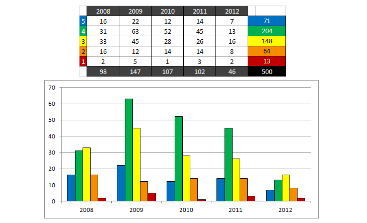
2009 must've been a hell of a year. Aside from that one, we're on pace for roughly 100 reviews per year.
No Caption Provided

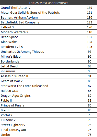
Top 25 Most Reviewed Games by Users

No Caption Provided

Random Stuff

No Caption Provided
104 Comments

109 Comments

Avatar image for marino
Marino

8614

Forum Posts

1365087

Wiki Points

0

Followers

Reviews: 92

User Lists: 102

Edited By Marino  Staff
Avatar image for halos_god
Halos_god

207

Forum Posts

7045

Wiki Points

0

Followers

Reviews: 0

User Lists: 34

Edited By Halos_god

@joshth said:

I only have one question. Who's Andy?

IKR

Avatar image for marino
Marino

8614

Forum Posts

1365087

Wiki Points

0

Followers

Reviews: 92

User Lists: 102

Edited By Marino  Staff

@liako21 said:

what your trying to say is that MGS4 is a good game?

...sure?

Avatar image for liako21
liako21

566

Forum Posts

270

Wiki Points

0

Followers

Reviews: 0

User Lists: 0

Edited By liako21

what your trying to say is that MGS4 is a good game?

Avatar image for lozz
Lozz

345

Forum Posts

2851

Wiki Points

0

Followers

Reviews: 4

User Lists: 1

Edited By Lozz

Awesome post. Now that I think about it Jeff does review a lot of games. Didn't realise it was that much more than the other staffers though.

Avatar image for pandabear
PandaBear

1484

Forum Posts

238

Wiki Points

0

Followers

Reviews: 5

User Lists: 0

Edited By PandaBear

Excellent job ... pie charts make life easier. Seriously, visualising information like this makes it so much easier to digest.

Avatar image for citizenkane
citizenkane

10894

Forum Posts

29122

Wiki Points

0

Followers

Reviews: 0

User Lists: 106

Edited By citizenkane

@Marino: You are making my inner graph/numbers nerd so fucking happy right now.

Avatar image for marino
Marino

8614

Forum Posts

1365087

Wiki Points

0

Followers

Reviews: 92

User Lists: 102

Edited By Marino  Staff

@ashleychittock said:

Yay! My claim that Brad gives more 5*'s than the rest of the crew can now be falsified.

Based on percentage, he does give the most. (if you don't count Drew or Andy)

Avatar image for ashleychittock
ashleychittock

153

Forum Posts

2

Wiki Points

0

Followers

Reviews: 10

User Lists: 2

Edited By ashleychittock

Yay! My claim that Brad gives more 5*'s than the rest of the crew can now be falsified.

Avatar image for lelcar
Lelcar

1189

Forum Posts

14

Wiki Points

0

Followers

Reviews: 1

User Lists: 25

Edited By Lelcar

@Marino: i love the giantbomb community. thanks for the timely response

Avatar image for marino
Marino

8614

Forum Posts

1365087

Wiki Points

0

Followers

Reviews: 92

User Lists: 102

Edited By Marino  Staff

@Lelcar said:

do we know what all the one-star reviews are?

Fable II Pub GamesXBLA8/18/081Ryan
Rock RevolutionPS3 X36010/29/081Jeff
Interpol: The Trail of Dr. ChaosXBLA1/9/091Ryan
Master of Illusion Express: Funny FaceDSiWare4/7/091Jeff
Velvet AssassinX3605/15/091Brad
G.I. Joe: The Rise of CobraPS3 X3608/10/091Jeff
Tony Hawk RIDEPS3 X36011/20/091Jeff
PowerGig: Rise of the SixStringX36011/24/101Ryan
Madden NFL Football3DS3/30/111Alex
Lucha FuryXBLA6/28/111Alex
BlackwaterX36012/15/111Alex
South Park: Tenorman's RevengeXBLA4/4/121Alex
Steel Battalion: Heavy ArmorX3606/19/121Brad
Avatar image for lelcar
Lelcar

1189

Forum Posts

14

Wiki Points

0

Followers

Reviews: 1

User Lists: 25

Edited By Lelcar

do we know what all the one-star reviews are?

Avatar image for aquacadet
aquacadet

310

Forum Posts

2830

Wiki Points

0

Followers

Reviews: 5

User Lists: 5

Edited By aquacadet

@Marino said:

@Thompson820 said:

Really cool to see this stuff broken down, as always. I kind of want to see just how much raw data you had to work from to create this, but I fear it.

I have one gripe, and it's only because I do this kind of stuff frequently in my course, the formatting of your graphs bugs me. Every time I look at this stuff I can't help but want to order it correctly instead of having it in random order. Pie charts are meant to start with the largest chunk beginning at the 12 o'clock position and the other chunks in descending order clockwise.

That nitpicking aside, this is awesome. Do more.

As for the raw data, I could post the Excel file I guess, but it's basically just a giant table with headers for Game Title, Platform, Review Date, Review By, Staff Score, # of User Reviews, User Average. To get the data, I just had to go to each game's review page. The site already provides an average score on user reviews. The only tricky part was reviews on DLC. I had to manually pick those out and calculate an average since all DLC reviews are bundled together on the game's page.

As for the pie charts, yeah, I thought about that too. But, for whatever reason, I just stuck with a uniform 5-4-3-2-1 clockwise format. And on the giant platform pie chart, I wanted to keep it so that you could see the Sony platforms all together vs the Nintendo platforms all together, etc. I tried to keep the colors in such a way that variations of blue/purple was Sony, red was Nintendo, green/orange for Xbox/XBLA, yellow for Apple, etc.

Please do post the Excel file. Thanks!

Avatar image for dahitman
dahitman

66

Forum Posts

3

Wiki Points

0

Followers

Reviews: 2

User Lists: 0

Edited By dahitman

Posting in epic thread, also Brad gives more 5-stars!

Avatar image for marino
Marino

8614

Forum Posts

1365087

Wiki Points

0

Followers

Reviews: 92

User Lists: 102

Edited By Marino  Staff
No Caption Provided

@sthusby said:

My mind. It is blown.

Also, where can I see Vinny's one star header?

Avatar image for sthusby
sthusby

449

Forum Posts

68

Wiki Points

0

Followers

Reviews: 0

User Lists: 0

Edited By sthusby

My mind. It is blown.

Also, where can I see Vinny's one star header?

Avatar image for dan_citi
Dan_CiTi

5599

Forum Posts

308

Wiki Points

0

Followers

Reviews: 0

User Lists: 2

Edited By Dan_CiTi

@BirdkeeperDan: I have to say 3D pie charts just arent as good, though bad 2D ones suck too. Why can't all charts look all high-res, colorful, and have nice shading and depth? That would be cool but then we would all have to use Numbers or something.

Basically I am saying bar graphs are the coolest.

Avatar image for dan_citi
Dan_CiTi

5599

Forum Posts

308

Wiki Points

0

Followers

Reviews: 0

User Lists: 2

Edited By Dan_CiTi
Avatar image for uitdetoekomst
UitDeToekomst

800

Forum Posts

2

Wiki Points

0

Followers

Reviews: 1

User Lists: 1

Edited By UitDeToekomst

there is nothing i like more than bizarre statistical minutiae. thank you, marino... for making us laugh about reviews... again.

Avatar image for marino
Marino

8614

Forum Posts

1365087

Wiki Points

0

Followers

Reviews: 92

User Lists: 102

Edited By Marino  Staff

@Scrawnto said:

@Marino: Jeff's individual chart says he has reviewed only 8 PC games. Then I saw that you said he had reviewed the most PC games, which didn't make any sense with that data. On the big comparison chart it says he actually reviewed 19.Actually, his 360 and XBLA platform numbers are messed up too. I thought you might want to know.

Yep. The numbers on Jeff's individual platform chart are wrong. Not sure what happened there. The big chart is correct. I'll get on fixing that.

Avatar image for y2ken
Y2Ken

3308

Forum Posts

82

Wiki Points

0

Followers

Reviews: 2

User Lists: 28

Edited By Y2Ken

This is fantastic. Always agree with Vinny.

Avatar image for scrawnto
Scrawnto

2558

Forum Posts

83

Wiki Points

0

Followers

Reviews: 0

User Lists: 2

Edited By Scrawnto

@Marino: Jeff's individual chart says he has reviewed only 8 PC games. Then I saw that you said he had reviewed the most PC games, which didn't make any sense with that data. On the big comparison chart it says he actually reviewed 19.Actually, his 360 and XBLA platform numbers are messed up too. I thought you might want to know.

Anyway, I love this sort of crazy data aggregation. Good on you.

: I tend to agree on the pie vs. stacked bar chart issue. Stacked bar graphs are really useful, since you can line the stacked bar for each data subset next to each other to compare them easily. For example, placing the stacked bars for Jeff and Brad next to each other, you could quickly see not only the distribution of scores for each individual, but also how they compare to one another.

And 3D charts are right out if you want to examine things in anything but the broadest terms.

Avatar image for lanechanger
Lanechanger

1779

Forum Posts

2289

Wiki Points

0

Followers

Reviews: 1

User Lists: 0

Edited By Lanechanger

Wow this is amazing, love to nerd out at stats like these.

I had figured Jeff has done the most reviews but didn't realize it was as much as the other 4 combined.

Avatar image for 1p
1p

798

Forum Posts

42

Wiki Points

0

Followers

Reviews: 0

User Lists: 3

Edited By 1p

@BirdkeeperDan said:

@1p: Saying pie charts are confusing because ``They`re just not very good`` is straight contradiction and kindof rediculous.

I'm saying it's the other way around - they're not very good because they are often confusing.

@BirdkeeperDan said:

@1p: Pie charts are very commonly used

This is true, but doesn't imply anything about their effectiveness.

@BirdkeeperDan said:

@1p: with your charts I need to look at the axis to interpret, which to me means they are no better than the table which was already included.

If you remove the axis labels from both of my above charts, you can still read their message clearly: Most of Jeff's reviews are either 3 stars or 4 stars and scores on the extreme ends of the rating scale are rather rare in comparison. This distribution pattern is immediately clear when looking at the charts (especially the second one). I intentionally left out the exact data labels (eg. 39% of reviews were 4 stars), because they don't help to convey the message any better than the graph already does.

Because we're only talking about a total of five data points here: You could absorb these pretty quickly just by looking at the data table, yeah. Same goes for Marino's pie chart, because he printed the actual percentage numbers right onto it - it basically works as a fancy table. The visualization aspect is obviously lost at that point.

Avatar image for 1p
1p

798

Forum Posts

42

Wiki Points

0

Followers

Reviews: 0

User Lists: 3

Edited By 1p

@BirdkeeperDan said:

I am amazed people can be confused by pie charts.

Actually it's very easy to get confused by pie charts. They're just not very good, and often used where another form of visualization would be more appropriate to the data. In many cases, even a simple table might be a more effective communication of the data.

Avatar image for 1p
1p

798

Forum Posts

42

Wiki Points

0

Followers

Reviews: 0

User Lists: 3

Edited By 1p

@Marino: Hey Marino, i love you and i sincerely appreciate all the work you clearly have put into this awesome post, so thanks for that,

HOWEVER,

i have to point this out: The 3D pie charts are a terrible choice for displaying these data. 2D pie charts would have been slightly less terrible, but still a bad visualization. A horizontal stacked bar chart would be more appropriate in this case, like so:

Foregoing the legend and putting the star ratings right on the chart makes the reader's eyes jump less. Also, using fewer colors works in this chart's favor.

The bumps chart is also a worthwhile idea here:

Even more so than in the above example, we immediately see the pattern in Jeff's review scores.

I wonder how this would compare to the other reviewers' versions of this chart.

Avatar image for cloneslayer
cloneslayer

1890

Forum Posts

587

Wiki Points

0

Followers

Reviews: 0

User Lists: 3

Edited By cloneslayer

Things I took away:

4 stars is the new 3 stars.

Vinny rocks

Avatar image for thegamergeek
TheGamerGeek

2892

Forum Posts

2350

Wiki Points

0

Followers

Reviews: 40

User Lists: 13

Edited By TheGamerGeek

This is crazy. I love you, Marino.

Avatar image for bigchickendinner
BigChickenDinner

787

Forum Posts

0

Wiki Points

0

Followers

Reviews: 0

User Lists: 0

Edited By BigChickenDinner

Great stuff! Thanks for your time.

Avatar image for darkstorn
darkstorn

481

Forum Posts

0

Wiki Points

0

Followers

Reviews: 0

User Lists: 0

Edited By darkstorn

Thanks for crunching the numbers, this is fascinating! I underestimated how many reviews Alex has done...and he's a kickass reviewer to boot.

Avatar image for charlesalanratliff
CharlesAlanRatliff

5763

Forum Posts

13647

Wiki Points

0

Followers

Reviews: 0

User Lists: 34

Fantastic work. I can't believe it's been four years. That's craaaaazy.  
 
I totally forgot Andy did a review.

Avatar image for aaron_g
Aaron_G

1694

Forum Posts

3259

Wiki Points

0

Followers

Reviews: 8

User Lists: 6

Edited By Aaron_G

Vinny needs to review more games. I demand it.

Avatar image for riogordo
riogordo

11

Forum Posts

35

Wiki Points

0

Followers

Reviews: 0

User Lists: 0

Edited By riogordo

Fantastic work here. Very interesting read. Thank you for your efforts!!

Avatar image for pxabstraction
PXAbstraction

397

Forum Posts

1720

Wiki Points

0

Followers

Reviews: 1

User Lists: 1

Edited By PXAbstraction

That's some epic stat work right there! Well done sir!

Avatar image for jayzilla
Jayzilla

2709

Forum Posts

18

Wiki Points

0

Followers

Reviews: 0

User Lists: 7

Edited By Jayzilla

@Daveyo520 said:

Wow, it has been 4 years? Seems like only yesterday or maybe 2 years.

The title to my favorite song, "Seems like only yesterday or maybe 2 years".

Avatar image for smilingpig
SmilingPig

1370

Forum Posts

5

Wiki Points

0

Followers

Reviews: 0

User Lists: 0

Edited By SmilingPig

2009 was a Big year.

Avatar image for zelnox
Zelnox

656

Forum Posts

213

Wiki Points

0

Followers

Reviews: 0

User Lists: 0

Edited By Zelnox

This is ossum.

Avatar image for marino
Marino

8614

Forum Posts

1365087

Wiki Points

0

Followers

Reviews: 92

User Lists: 102

Edited By Marino  Staff

@Lokno: I don't think it's a big deal. I labeled them with the percentages on the chart anyway, plus the raw data has been provided as well. The pie charts are primarily just to liven up the look so it's not just a wall of text and numbers.

Avatar image for lokno
Lokno

434

Forum Posts

219

Wiki Points

0

Followers

Reviews: 0

User Lists: 7

Edited By Lokno

Nice analysis. I'd prefer 2D pie-charts, though. 3D pie charts are cool looking, but they distort the data. Observe:

No Caption Provided
Avatar image for oginam
Oginam

459

Forum Posts

242

Wiki Points

0

Followers

Reviews: 1

User Lists: 4

Edited By Oginam

@JJOR64 said:

Amazing stuff as always. Wonder if Patrick did his scores on purpose so his chart can look like Pac-Man.

Patrick...is a genius! (or a troll genius!)

Avatar image for enchantedecho
EnchantedEcho

810

Forum Posts

659

Wiki Points

0

Followers

Reviews: 17

User Lists: 6

Edited By EnchantedEcho

This is really interesting and well put together, good job!

Avatar image for d_w
D_W

1973

Forum Posts

2440

Wiki Points

0

Followers

Reviews: 10

User Lists: 21

Edited By D_W

@gladspooky said:

@D_W said:

I think it's real interesting that for almost everyone 4 stars is the most common score.

It's just because all games are slightly better than average.

Wait, that doesn't make any sense.

Heh. That's what I had thought at first as well. That's the problem if you think of reviews in as objective things, which they very much aren't. I think this data shows more that review scores are more just metrics on how much that individual reviewer liked the game. Which is essentially what Jeff has been saying about reviews for years.

Avatar image for marino
Marino

8614

Forum Posts

1365087

Wiki Points

0

Followers

Reviews: 92

User Lists: 102

Edited By Marino  Staff

@Thompson820 said:

Really cool to see this stuff broken down, as always. I kind of want to see just how much raw data you had to work from to create this, but I fear it.

I have one gripe, and it's only because I do this kind of stuff frequently in my course, the formatting of your graphs bugs me. Every time I look at this stuff I can't help but want to order it correctly instead of having it in random order. Pie charts are meant to start with the largest chunk beginning at the 12 o'clock position and the other chunks in descending order clockwise.

That nitpicking aside, this is awesome. Do more.

As for the raw data, I could post the Excel file I guess, but it's basically just a giant table with headers for Game Title, Platform, Review Date, Review By, Staff Score, # of User Reviews, User Average. To get the data, I just had to go to each game's review page. The site already provides an average score on user reviews. The only tricky part was reviews on DLC. I had to manually pick those out and calculate an average since all DLC reviews are bundled together on the game's page.

As for the pie charts, yeah, I thought about that too. But, for whatever reason, I just stuck with a uniform 5-4-3-2-1 clockwise format. And on the giant platform pie chart, I wanted to keep it so that you could see the Sony platforms all together vs the Nintendo platforms all together, etc. I tried to keep the colors in such a way that variations of blue/purple was Sony, red was Nintendo, green/orange for Xbox/XBLA, yellow for Apple, etc.

Avatar image for marino
Marino

8614

Forum Posts

1365087

Wiki Points

0

Followers

Reviews: 92

User Lists: 102

Edited By Marino  Staff

@egg said:

These charts are really confusing, but they definitely don't make sense. You can't say user reviews either "agree" or "disagree" with staff reviews, if a staff review gives a game 4 stars and a user review gives the same game 5 stars, they are if anything agreeing rather then disagreeing. Same if the staff gave 5 and the user gave 4. Same could apply for 3 stars and 4 stars ("good"), and 1 star and 2 star ("bad"). Not to mention these are just ratings. Two people can give the same rating but that does not mean they agree. To a lesser extent the opposite is true as well.

I understand what you're saying I guess, but all I did was break it down further. You're basically saying that a 4 and 5 are both "good," so they're equal in terms of "agreeing" that a game is good. What I'm looking at is specifically how good or how bad the game is in the eyes of the staff and the community. That's the point of having stars or points anyway. So, using your example, if the staff gives a 5 and the average user review equals 4, yes they both "agree" that it's a good game, but the staff thinks it's better than the users do, therefore they "disagree."

Avatar image for egg
egg

1666

Forum Posts

23283

Wiki Points

0

Followers

Reviews: 0

User Lists: 10

Edited By egg

These charts are really confusing, but they definitely don't make sense. You can't say user reviews either "agree" or "disagree" with staff reviews, if a staff review gives a game 4 stars and a user review gives the same game 5 stars, they are if anything agreeing rather then disagreeing. Same if the staff gave 5 and the user gave 4. Same could apply for 3 stars and 4 stars ("good"), and 1 star and 2 star ("bad"). Not to mention these are just ratings. Two people can give the same rating but that does not mean they agree. To a lesser extent the opposite is true as well.

@boocreepyfootdoctor said:

Why did people seemingly give up on user reviews circa 2009? Or is it just that today's sequels to those games haven't been around long enough to garner up the same totals?

I don't know but it kind of sucks that user reviews don't show on a wiki page unless the staff reviewed the game. So usually there is no point in writing a review since nobody will see it.

Avatar image for rachelepithet
rachelepithet

1646

Forum Posts

1374

Wiki Points

0

Followers

Reviews: 3

User Lists: 11

Edited By rachelepithet

Why did people seemingly give up on user reviews circa 2009? Or is it just that today's sequels to those games haven't been around long enough to garner up the same totals?

Avatar image for thompson820
Thompson820

425

Forum Posts

1857

Wiki Points

0

Followers

Reviews: 0

User Lists: 1

Edited By Thompson820

Really cool to see this stuff broken down, as always. I kind of want to see just how much raw data you had to work from to create this, but I fear it.

I have one gripe, and it's only because I do this kind of stuff frequently in my course, the formatting of your graphs bugs me. Every time I look at this stuff I can't help but want to order it correctly instead of having it in random order. Pie charts are meant to start with the largest chunk beginning at the 12 o'clock position and the other chunks in descending order clockwise.

That nitpicking aside, this is awesome. Do more.