Something went wrong. Try again later

vonFlampanker

This user has not updated recently.

352 10 23 8
Forum Posts Wiki Points Following Followers

REVIEW: Rise of the Videogame Zinesters

Amazing what a ten-minute drive can do for one's outlook. I got up and started to work one morning and put on the post-Molyjam Bombcast. I'd had a passing interest in the event up to that point but in general, game jam events weren't anything I'd ever focused on up to this point. My assumption was that it's a developer-centric thing and an art-centric guy like myself would, in the event I'd ever choose to participate, be left to simply polishing up the developers' ideas.

So when Patrick told the story of Cody and Kari Clark's experience at the Molyjam I began to pay attention, and then to get excited. I later compared it to the first time I picked up Photoshop way back when. There's something energizing about the moment when one discovers so much untapped potential. In the few short minutes it took Patrick to describe that story, my outlook was changed.

I'd had a similar moment when I first saw the iPad. There was a platform chock full of potential to perfectly realize a number of projects I'd been mentally mulling over for years. The tech had finally caught up to what I wanted to express, or so I thought. There was just the one setback: I cannot program. I can code HTML and CSS. I can draw. I can design. I can plan. I can organize. None of these things prepared me for the immense mental shift that trying to grasp Objective-C (and ActionScript before it) required. I ended up with a decent grasp of the concepts, but always became frustrated when I actually tried to assemble something.

Obstacles be damned, I went to a programmer friend of mine who liked the project I proposed. We started to work. And eventually problems started to arise, as they will, and my programmer eventually dropped the project (unceremoniously I might add. But I digress).

So I was left with a bunch of art, a plan for a game and no ability to execute the plan on any platform. Until I heard Patrick talking about Cody and Keri Clark. Hearing that story led me to explore a few of the programs that Patrick had mentioned: GameSalad, GameMaker, Construct2 and Unity. I also picked up a book that he mentioned: Anna Anthropy's "Rise of the Videogame Zinesters."

No Caption Provided

RotVZ aims to wake up nonprogrammers to the existence of their game-creating potential. It's stirring, and emotionally driven more than an encyclopedia of options. It takes the time to lay out the history of video games and how the artform (The author's words, not mine. That's a debate for another time.) has evolved to be first too inscrutable and then too expensive for the average Joe to employ. These first chapters that build the case for a breaking point from mainstream development practices and a return to a more democratized way of creating games are the book's strongest.

The middle section of the book describes a few of these folk-gaming projects with emphasis on the author's own creations. She includes the story of how she familiarized herself with game creation (similar to the way I started out this post) and outlines some of what she considers to be important practices when undergoing a game-making project; working with a time limit to avoid feature creep and overanalysis, for example. While the practice-related anecdotes are valuable, the game descriptions quickly become tiresome. It's difficult and subtle to make an experience sound worthwhile (especially in print), and the author's style is too mechanical and matter-of-fact even for these simple experimental games. I suspect it's tied to the author being the creator of a lot of these games and thus being too close to them. It's a fine line and there may be some contradiction there since this is a book about making games rather than playing them, but I posit that the reader shouldn't feel disengaged or awkward, which I did.

She concludes by listing out a few options for someone who wants to begin making games. This is where the book starts to weaken significantly. She talks about using Game Maker and a few other programs (including programs like Scratch, which are more of a stepping stone and familiarization tool). Viable current programs like GameSalad aren't mentioned for some reason. I'm not sure how the process of publication goes for a more or less time-sensitive book like this, but GameSalad has been around since 2009. Even a brief amount of research would have turned up its existence. Same for Construct2. Same for Unity.

The point about research leads into a larger point: this book reads like an extended - padded? - article or blog post. It's shifted heavily to the side of editorial rather than reference. Maybe not a bad idea for a book that will quickly become outdated (and maybe already is), but unless you're willing to experience this topic through the eyes and experiences of one particular person, this may not be the book for you. Personally, I felt it went too far in constantly reiterating the lifestyle of the author as inseparable from the author's creations. Note that I wasn't offended by the author's lifestyle, it just wasn't the topic I wanted to inform myself about. One could make the case that games including previously marginalized lifestyles is the whole point, and I won't argue against that. I'll only state that I found it a bit heavy-handed in light of the book being short on research. There's also the implied (and tired) correlation between "bad" and "mainstream" and "white" and "male" which is a bridge too far on the editorial front for a book that's supposedly about an artform being inclusive.

Should a person who's not into programming but interested in making games read this book? I think so. It's short, it's an easy read, and it's one of the only books of its kind at the moment. It makes a decent, if not essential, starting point. I think the medium of printed book doesn't serve the topic all that well, but it will do as a primer until something better comes along. Anyone who's interested further should be pointed at Patrick's coverage of the Molyjam and the stories that came out of it.

1 Comments

What DICE got right

I'm taking a bit of a breather from detailing problems with Battlefield 3 to spell out some of the bits that I think DICE got right, or at least significantly improved. In no particular order:

  • The suppression mechanic. The BF games have always been good at giving you something to do even if you're not shooting at the enemy. This is a nice way to be doing something even if you're not hitting the enemy. And there's a point bonus for it. I was worried this would be irritating when I heard it described, but I think it works extremely well even if your accuracy stat suffers for it.
  • The kill-assist mechanic. Much improved over Bad Company 2's "always get 20 points for an assist", you can now know how much damage you did to an enemy before someone else takes 'em down (and at what range). This is another way to gain feedback about your weapons' effects. Combined with the suppression bonus you can end up getting more for a suppress/assist than for an outright kill. More teamwork emphasis is a good thing.
  • The weapon accessory system. You get a wide range of customization options on top of the already-varied weapon platforms. The amount of fine-tuning you can do with scope preference alone should be represented throughout the rest of the game.
  • The camouflage system. It's a good start. I'd like to see the soldier customization options pushed even further. Knowing EA, this will mean paying for every little piece.
  • Blood! I've always wanted to see more blood in BF games. In this one I've noticed you can leave a nice big splat on the wall when you shoot someone. I'd like even more blood if possible. Maybe not the amount that's in Gears, but enough that it doesn't feel cleaned-up.
  • Traversal and vaulting. Significantly improved over older games. I still get stuck on weird geometry in the maps on occasion but I get a better sense of being able to get going with some speed when I need to. The vaulting over obstacles (while far from perfect) helps with this. I'd like more level obstacles to be more clearly vault-able or not vault-able.
  • Balance. I don't envy the teams that have to tweak the post-launch balance on games. You can't please all the people, etc. That said, this game's probably as close to well-balanced at launch as I've seen. In BC2 there had to be hastily-applied nerfs for the M60 and AN-94. If there's a ridiculous touch-of-death weapon in BF3 I've yet to find it.
  • Disabling vehicles. I wasn't sure what to think of this system, but it seems to be a nice grey area between "doing well in a vehicle" and "you are dead'.
  • BattleLog. For the most part, I'm pleased with BattleLog. Some visual design issues aside (I'm a graphic designer, i'm going to pick everything apart by nature) I think it's doing what's intended for the most part. I'm not sure why it was going to be so difficult to build this stuff into the game, but there you go. BattleLog has so far won out over COD Elite by default. It would have been nice to have the two services competing and influencing each other.
3 Comments

Battlefield UI Gripes part 2: The menu system

Past Battlefield interfaces have been plagued by problems of unresponsive buttons and highlights, weird nonstandard interfaces, unreadable type and strange placement logic. With Bad Company 2 these issues began to slowly resolve into something more usable. Battlefield 3 introduces a much more complex upgrade tree as well as a camouflage selection option. Unfortunately, the interface hasn't kept up with the depth of options available, and this makes for an awkward experience when trying to spec out your soldier for battle.

My argument has 3 points:

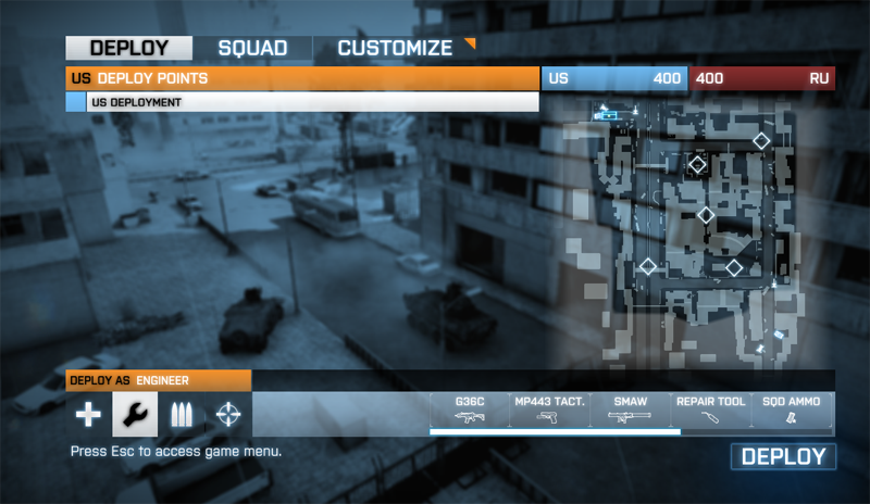
1. The "Customize" tab exists. Every action needed to handle re-specing on the fly should be able to happen in the "Deploy" tab. Currently the "Deploy" tab contains a hobbled method of re-specing fast along the bottom right, but with weapon accessories becoming an important part of gameplay, this feature is obsolete in its current form. Also the rudimentary customization under "Deploy" completely ignores camouflage options.

The Deploy tab should be all you need to gear up.

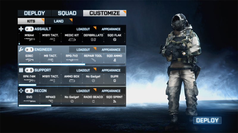
2. The "Customize" menu is too deep. By not utilizing screen space correctly, the Customize menu is forced to be three levels deep (four if you count the number of clicks down from the main menu). The first menu is a generalized "choose kit" selection that only looks like it does anything more. The design of the "loadout" and "appearance" buttons is no more apparently clickable than the non-clickable (and much larger) weapon/gadget readout. A little separation between the kits' bars would have made this a lot more easy to read and navigate quickly. Keep in mind this is the whole point: you're supposed to be able to re-spec with some degree of speed to be able to come back with ammunition, health or anti-vehicle firepower to keep your squad alive. Extra time finding and clicking small screen areas is detrimental to smooth team-based gameplay that is the core of the experience.

OK, this makes sense even if it's a little hard to find where I need to actually click.
Eh, i should really be doing this work in the previous step.

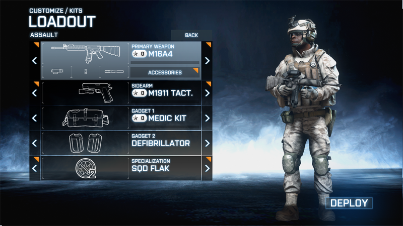
The second level in "Customize" is general kit layouts or "appearance" depending on what you've clicked. "appearance" is a required visit at least once per round since the game doesn't appear to remember your previous camouflage settings. An interface for assigning camouflage patterns per-level would be ideal. Including an option to "always use" a certain pattern is also a possibility. For "loadout", this menu is easy enough to use, simply clicking left and right through your various options. The only problem is to further customize a given weapon, you now have to go to ...

This goddamn thing.
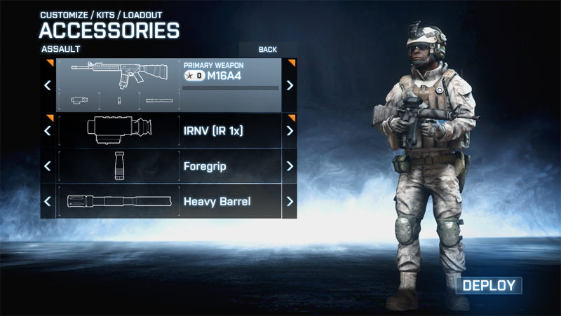
This goddamn thing.

... The third level of menus wherein you attach gadgets to your primary weapon. The distribution of slots here is somewhat unintuitive. The first of three is easy: these are your scopes. I like that there are a lot of options and they're usually named clearly enough that you can distinguish them before being stuck with them for a spawn and restarting this process. The next two slots are less clearly defined. I often find myself paging through one menu only to find what i'm looking for in the other one. Off the top of your head, can you tell me whether the bipod belongs in the third row or the fourth? (... and if you can, good on you. I can't.)

They've thoughtfully put a "deploy" button here on the third level to prevent you having to back all the way out. The problem is that this deploy often ends me up at my side's uncap, having been given no choice to select a spawn point. Thus, this button becomes useless for those trying to save time by diving straight into the re-spec options. Selecting a squad member or control point beforehand becomes useless as the viability of those points changes very quickly.

3. The overall tendency of these menus is to take you out of your previous context. There are a lot of tabs and buttons, but throwing away the previous screen's tab set eliminates all sense of progression and context. Granted it's a complicated set of menus with a lot of options, but it can be done well. Especially for a game with this amount of development time and budget. The whole thing generally needs another pass to ensure consistency of structure and placement.

What can be done?

1. Build an all-in-one solution and eliminate "Customize" altogether. Having this more complex system work in one bar in the deploy screen (similar to Bad Company 2) would be a challenge, but can certainly be done by a team this talented. "Customize" feels like a catch-all and a cop-out.

2. Use screen space in "Customize" more efficiently. Notice that the active area in "Customize" is about 1/4 to 1/3 of the screen space. Allowing the menu a little more room to work on a single plane rather than burying layers would make the user experience a lot more streamlined. Do we really need that giant model of the player's soldier over on the right?

3. Move this process to BattleLog. One of the more popular topics on the Getsatisfaction feedback system the Battlefield team is using suggests just this. And it makes sense. For better or worse we're stuck with BattleLog for key in-game functionality. Why not let users tinker with and save their loadouts in BattleLog and access them by name through a quick menu while waiting to deploy? I could make an assault loadout called "long distance" that has my accuracy-enhancing accessories built into my M16A4 and switch to it quickly. This would speed the procedure for even a simpler operation like grabbing your Stinger to take down an aircraft that's after your squad. This is something that Call of Duty allows even on consoles and it's very convenient.

You'd still have to have some sort of system in-game to fine-tune for situations that come up unexpectedly but having a system of preset loadouts on-hand that the user himself sets up would be a powerful and convenient tool.

3 Comments

Battlefield UI Gripes part 1: The chat box

EDIT: I couldn't be happier that this post is now obsolete. They did a great job fixing these problems.

DICE did what DICE always does: they gave us a fantastic, immersive shooter that's hobbled by some terrible, seemingly obvious UI decisions. I maintain the most irritating of these numerous BF3 UI gripes is that the in-game chat window is a complete failure.

My argument has three points:

1. It's too brightly colored / opaque. BF3 contains mostly earth tones dark shadows, making even the [what appears to be around] 50% opaque and 50% desaturated blue box too colorful and in a game where that 3x3 square of pixels in the distance may be a guy who's about to shoot you in the head, it's unacceptable.

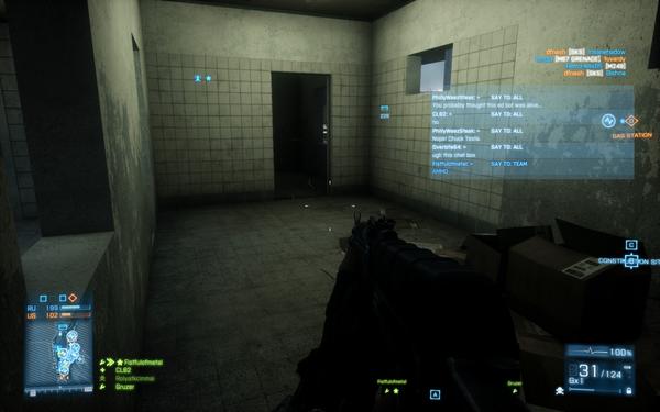
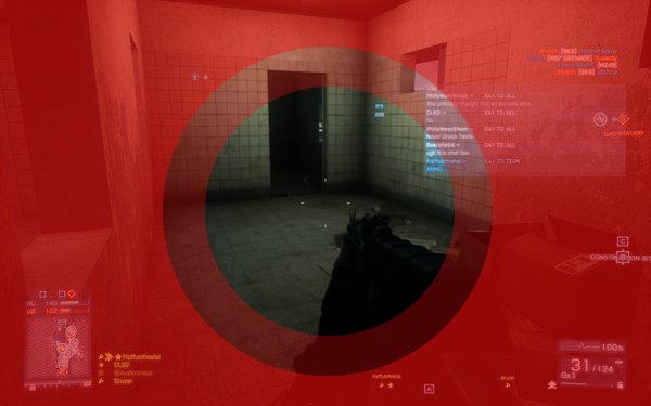
2. It's too wide. Check out this screenshot (kindly provided by GB user CL60). Easily half of the width of the box is wasted space in this current state. I know the space is anticipating more text but in my experience (~30 hours so far) the in-game text rarely gets long enough to fill this space.

No Caption Provided

Now consider that it's also frequently appearing and disappearing every time a server message or user-typed message is received. The effect is hard to describe, but if you consider that the human eye is only good at focusing on one thing at a time, and that in most cases while playing this game your eye is focused on an area around the crosshair, you might begin to see how this is a problem:

Again: CL60's image, my totally non-scientific edits.

My eye is usually really focused on an area about the size of the center circle, with the middle circle being the "grey area" marking the edge of concentration. The outside area is, in effect, peripheral vision. The proximity of the bottom left corner to the crosshair is the key problem here. It not only obscures a critical area within the circle you're concentrating in, but it also puts something that's moving and heavy emphasis into your peripheral vision, where the blinking on and off is likely to divert your attention.

This phenomenon is much, much worse for those still using a 4:3 monitor instead of a 16:9 monitor. I've done both.

3. It doesn't do its job anyway. The window is very difficult to glean information from while in-game. There's no color-coding to indicate the source so you can easily filter information. [edit: it slipped my mind that it does color code messages from squadmates to other squadmates.] The window disappears very quickly without a method to call it back (besides typing something).

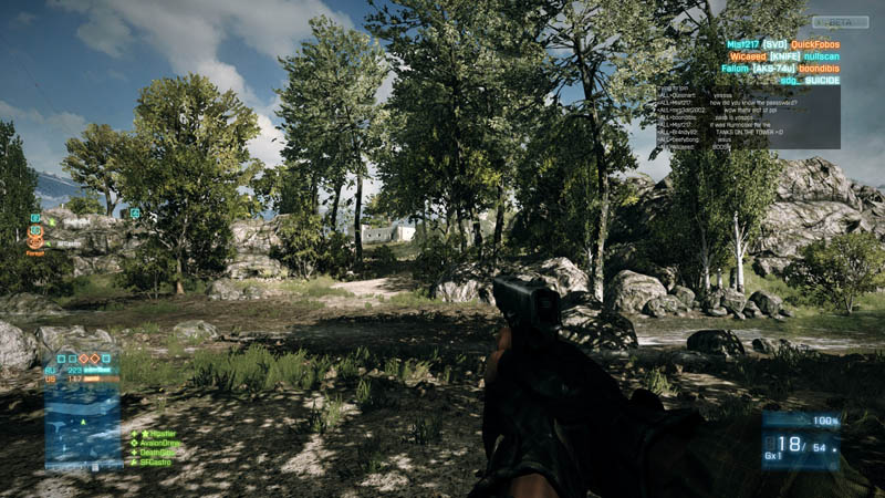
Interestingly enough, all of these detriments were added very late in the development cycle with probably very little chance to test the changes with a wide audience. Check out how the chat window looked in the Beta:

What was wrong with this?

So what's to be done?

0. Just roll back to the Beta chat window. Easy enough.

1. Halve the size of the window to about 1.5x the width of the map box. Why does the least-essential element of the HUD have the most prominent place in the hierarchy?

2. Reduce the font size by a point or two. This would bring the BF3 chat box into a consistent place with previous BF games.

3. Desaturate the color and reduce the opacity by another 25%. Check the background of the "points captured" indicator on the bottom left for what I'd be happier with.

4. Reposition it to the top left. Get it away from the circle of focus at the center of the screen. Again, something that previous Battlefield games have done.

5. Most importantly, give us the option to turn the damn thing off. This is 2011. We've had the option to alter and turn off pieces of the HUD since at least the days of Unreal Tournament (and probably even earlier though that was the first time I remember being able to do it). If not an option in the game options, at least give us a console command or an .ini to edit.

19 Comments

On Battlefield

Gaming as an activity has always been two-faceted in my experience. There's the super-focused single player trek, best exemplified by something like Fire Emblem or Final Fantasy Tactics in my case. The other side of that coin is an engaging multiplayer experience. This latter side of gaming has become more important to me in the past few years, and one franchise in particular has been the centerpiece of my social gaming: DICE's Battlefield series.

Multiplayer gaming, at the beginning of my days of gaming anyway, used to be friends in front of a single console where a game like Contra or Tecmo Bowl provided a focal point for interaction. This shifted over to what could probably be considered a less healthy method of social interaction: multiplayer deathmatch-style games on PC. What was lost between the two different styles was any chance of building bonds with your fellow players. Getting someone out of the room usually meant your only interaction with them was via bullets, or the occasional profane in-game chat remark.

When a friend of mine invited me to join his usual weekly Battlefield 2 group, I was hesitant. I'd skipped Battlefield 1942 for no specific reason other than I was probably buried deep in Unreal Tournament at the time; locked into a different paradigm. I saw BF2 as a complex and potentially frustrating challenge, and didn't (at first) welcome taking on the difficult learning curve as part of a new social group where everyone was more experienced than I was.

As it turns out, I was right. I hated BF2 at first. I couldn't get a handle on the spawn-die-spawn-die pacing. I'd never encountered anything other than deathmatch or CTF, so it took a couple of rounds to grasp the idea of Conquest mode. Worst of all, I felt ineffective both as a player and as part of a team. Eventually I started having a better time with BF2, but I'd never actually play it without the group (who by then were slowly getting used to me, and I to them).

By the time Battlefield 2142 came around, I wasn't looking forward to starting that learning curve all over again. I was actually the first person in my group (we've never formally called ourselves a "clan", the concept is mutually hokey to all of us) to try the game out. I started it up, pointed my Level 1 assault rifle at another character, fired, and actually hit and killed him. That little bit of success gave just the slightest edge of positive feedback to BF2142 that I never, ever got playing BF2.

The Battlefield games to this day have a disproportionate share of jank. I don't get stuck on slight changes in ground geometry in BFBC2 like i used to in earlier games, but there are definite, noticeable differences from server to server and game to game. Sometimes you feel like you've got the touch of death and sometimes you feel like your gun is firing blanks. A player gets the impression (and this is true of every Battlefield game I've played) that what they're seeing is merely an interpretation of what's really happening in the game. Frustrations run the spectrum from inconsistent knifing distances (and other general hitbox weirdness) to bits of lag that manifest themselves as your character dropping dead after you've scrambled to safety. The earlier games suffered from a horrible user interface outside of gameplay, and the netcode never seemed quite right either.

When it's clicking, though, Battlefield is far and away one of the best gaming experiences I've ever encountered. It brings back and encourages the sorely-missed personal interaction with a team of friends. It's a case of not feeling alone against the enemy (even in a team-based environment) as well as an incomparable sense of accomplishment when you succeed at something larger than individual effort. I think it's amazing that this can be simulated so well in a video game. At a time of transition in my life, getting together to play Battlefield on Thursdays with my friends became an important social connection. I can't help but think that the game itself helped facilitate this (though I don't give it all the credit).

Which has me thinking about what I expect from Battlefield 3. The introduction of the Frostbite Engine did away with a lot of the glaring flaws of the earlier games. Hopefully the new engine has been polished even further. Battlefield's flaws have, in my opinion, always been tied directly to its ambitious goals and I'm optimistic that the technology and talent at DICE have finally grown into the vision of what they originally set out to achieve.

6 Comments

Why I am here.

Fact: The Bombcast sounds way better when you become a paying member. It's not a matter of audio quality but the sort of thing that settles into your gut knowing that you're supporting good content and good community. I started listening to the podcast maybe two years ago after the 1UP podcasts either folded or lost most of their members, which turned out to be a more or less positive thing. It got me here anyway.

So after enjoying the podcast for a couple of years, I realized I was visiting GiantBomb pretty well every day, and that there's an atmosphere about what's produced at this site that I haven't really seen anywhere else. I worked as a web content manager and currently work as a web designer. I talk to a lot of people trying to build community and quality content, and this site's the one I think of first when I think of those things done right. I want to see if this model works, and I want to see whether there really is such a thing as "community" on the 'net. Most of all I want to give back a little since i've gotten a ton of enjoyment out of GB over the years. Thanks, and I'm looking forward to being around awhile.

1 Comments