The New Xbox Home Screen Sucks

Avatar image for brian_
brian_

1280

Forum Posts

12560

Wiki Points

0

Followers

Reviews: 0

User Lists: 4

#1  Edited By brian_

Please indulge this rant and excuse my bad photos as I vent my frustrations about UI...

Why can't console manufacturers help themselves? Why are "new and improved" interfaces always worse than the one before it. Today Xbox started rolling out the new home screen for Xbox consoles and I hate everything about it. They have combined what used to be a handful of separated horizontal screen pages into one giant vertical page. It is a hideous, clustered mess of ads for garbage I don't want to engage with burying the few things I do want to engage with and has removed virtually all customization options of the previous iteration.

No Caption Provided

Here's the first thing you see when you turn on the console. Looks pretty similar to the old one. They've added a XMB-style little menu at the top to get to stuff like the dedicated Game Pass and store pages, which is a fine addition. But then they've shrunk down all your app tiles, but not the ads, in favor of this big empty space on the top half of the screen, to show off custom backgrounds, I guess.
No Caption Provided

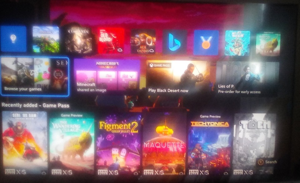
Scroll down to the next screen, and it's immediately an ad for Game Pass. They've just added the same section that is on the dedicated Game Pass page to the home screen. Completely redundant. Previously these screens would be fully customizable. You could add apps, groups of apps, or remove apps as you saw fit, and order them any way you liked. As far as I can tell, there's no more ordering or removing. Your stuck with what Xbox wants you to see.

No Caption Provided

On the next page you do get two of the custom groups you have set up, but as far as I can tell, you only get two. I used to have five or six, so now if I want to see all the stuff I used to have, I need to go into my full list of games and apps in the Games and Apps menu. The entire point of grouping this stuff onto a home page is to avoid doing that for quick access of the stuff I use the most. And as a reminder, I now have to scroll past the previous screen of Game Pass ads to get to them.

No Caption Provided

Scrolling down to the next page we have this Friends & Community app that I've never used once in my life as well as more Game Pass ads.
No Caption Provided

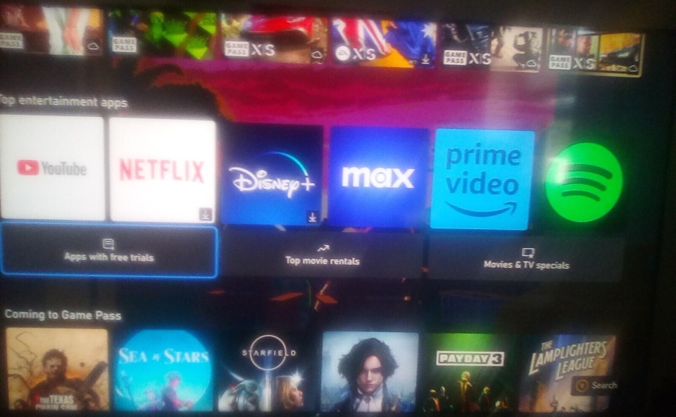
The next page is more ads. This time for media apps and Game Pass.
No Caption Provided

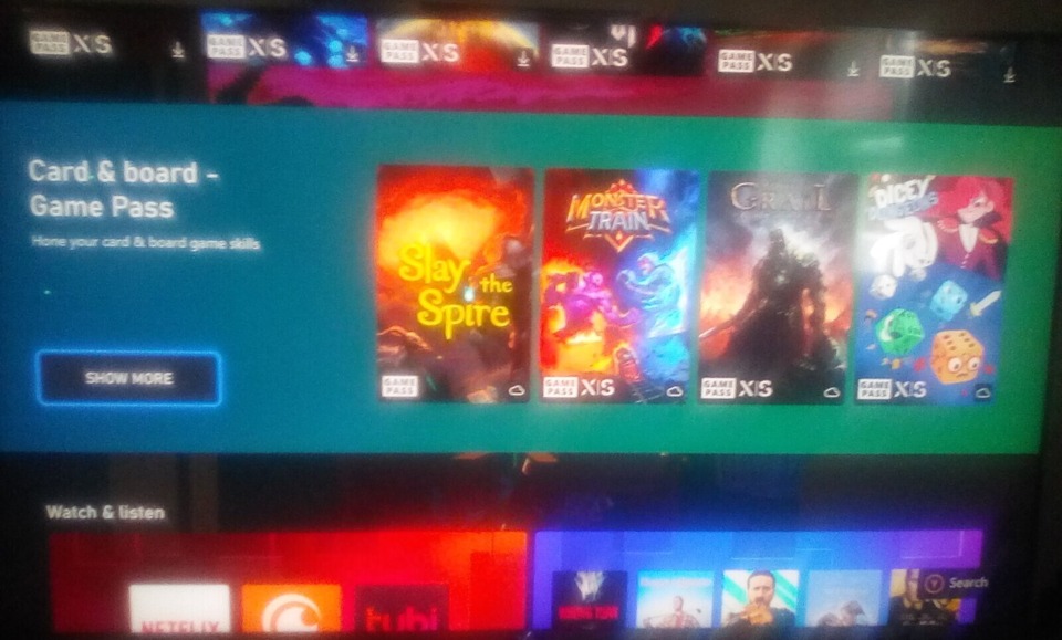
Followed by a second page of ads that are once again for Game Pass and media apps for some ungodly reason.
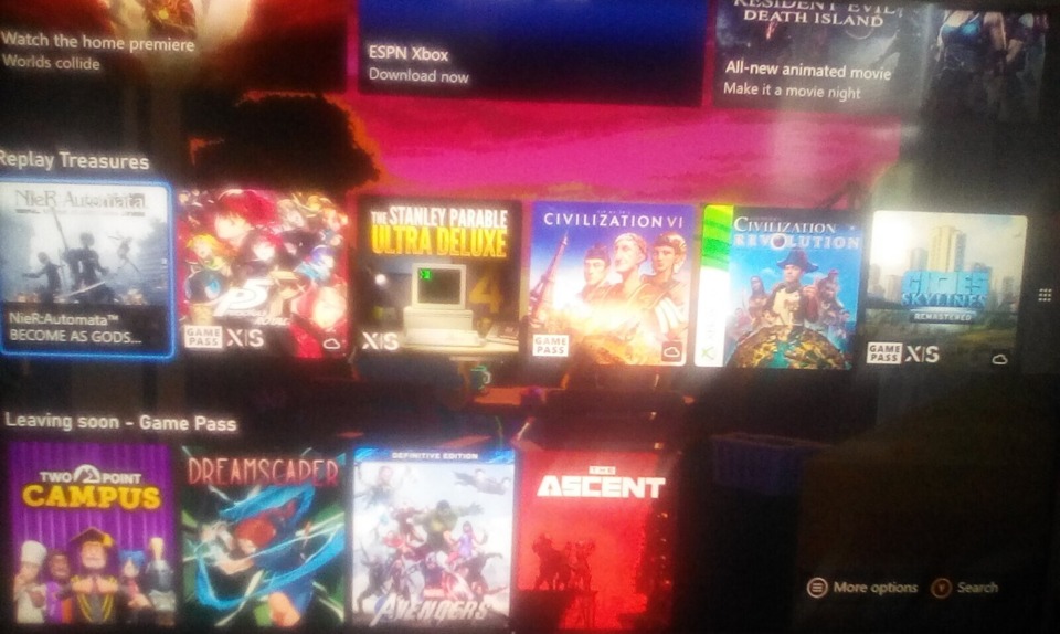
No Caption Provided

More ads for Game Pass. Again, there's an entirely separate, dedicated page for Game Pass that shows all the exact same stuff. Why is any of this needed on the home screen?

No Caption Provided

Ads for stuff in the Xbox Store.

No Caption Provided

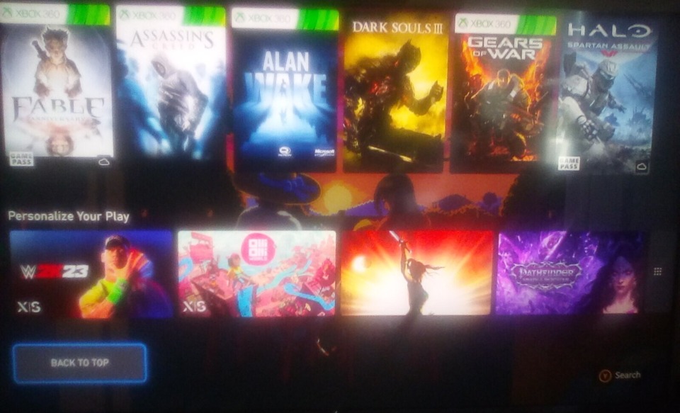
And finally, some ad called "Personalize Your Play" for games I don't own. Apparently, "personalize" just means "Buy some shit", which is hilarious considering they just took out any and all options to personalize this new home screen.
Avatar image for jeffrud
jeffrud

870

Forum Posts

9980

Wiki Points

0

Followers

Reviews: 18

User Lists: 45

I categorically hated the PS4 navigation screen stuff. Let me tell, I am not happy at all that this feels like a big shift toward that design paradigm. Even allowing for the ads that slipped past my PiHole, the Series X UI was reasonably dense and usable. This looks kinda miserable.

Avatar image for nickmitch
NickMitch

73

Forum Posts

0

Wiki Points

0

Followers

Reviews: 0

User Lists: 6

I like the new one better than the previous one. That said I am not much for customization at large but having more of my chosen background is a plus in my book.

I guess the ads are meant to inspire exploration - because if you know what you want to play - why would you scroll down and not go directly to "my games and apps"?

Avatar image for cikame
cikame

4474

Forum Posts

10

Wiki Points

0

Followers

Reviews: 0

User Lists: 0

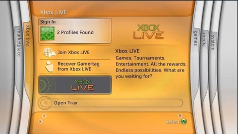
No Caption Provided

Avatar image for justin258
Justin258

16684

Forum Posts

26

Wiki Points

0

Followers

Reviews: 11

User Lists: 8

Towards the end of the Xbox 360's lifespan, they made a similarly obnoxious UI change. I personally wanted the Blades back, but I wasn't going to get those. I would have been happy with the mid-era 360 design, but nope. They changed it to something like that - the game you wanted to play was one small square in the top left corner and the rest of the screen was ads. Ads, ads, ads, all the way, every screen except settings was asking you to buy something. This was one of several things that pushed me even more towards finally just dumping a bunch of money in a gaming PC. Windows 7, at the time, was pretty ad-free, or could be easily made so.

Back then, I would have told you that I would never be back, but I have a Series X underneath my TV so I'm not so foolish anymore as to say "well, fuck that then!" It's still a very handy device to have and sometimes I just don't want to fuck with computers. Still, the PS5 and Switch already see a lot more use and my PC, regardless of its quirks, still sees the most use out of any gaming device. I just don't see a good reason for this thing to be anything more than a box to try out Game Pass games and easily play some 360 or original Xbox games.

But really the actual answer is that the PSP/PS3 XMB is the best console UI ever implemented. Clean, nice, neatly organized, it had plenty of room for customization and personalization without also losing functionality, and getting ads to fit in was difficult. Wish everything would just use that.

Avatar image for ben_h
Ben_H

4836

Forum Posts

1628

Wiki Points

0

Followers

Reviews: 1

User Lists: 5

Oh great. They turned it into the Netflix/Disney+/Prime/every other streaming service user interface where they cram a bunch of junk into one page with only about 5% of it being remotely relevant to the user. It'd be one thing if these interfaces were any good but they just aren't. They lack anything resembling useful information density and shove things you don't care about in your face with no option to tell it "Hey I don't care about this item/category. Stop showing it to me".

That's one thing Steam does well: it allows you to ignore a game or particular tag if you want. I could not give less of a shit about Call of Duty and because Steam lets me tell it that, I never see those games anywhere within Steam. It's great that they give this option and others should do so too.

I think in general the console makers could learn a lot from the UI Valve have built for the Steam Deck and eventually made as the new Big Picture mode. It's fast, informationally dense, and convenient. They don't try to cram a bunch of different things into the same page and it helps a lot. At the same time though, it can handle libraries of hundreds of games easily while making them easy to navigate.

Avatar image for bigsocrates
bigsocrates

6311

Forum Posts

184

Wiki Points

0

Followers

Reviews: 0

User Lists: 0

It doesn't feel that different to me and is in some ways better for me personally. The top row is my most recently used apps which is pretty useful. Then next down is "browse your games" (also useful) with some ads to the right of that (kind of annoying but whatever.) THen there's "recently added to Game Pass," which is meh but I agree does not belong there, and then we're down to my quick resume stuff (a little duplicative with most recently used but somewhat different) and then down to pins.

I agree that the biggest issue here is that pins should be much higher, ideally right below most recently used apps. And below pins is a whole bunch of Game Pass stuff that should just be its own tab. But in terms of what I want to get to quickly (most recently used/quick resume and then my pins) it's all easily navigable within 2-3 seconds.

I think it is arguably a mild downgrade and I do wish console makers would just stop messing with their homescreen and shortcuts (to this DAY I use PS4 commands on my PS5 that just don't work, and I have had a PS5 for 2.5 years) but I don't see this as egregious as the Xbox 360 stuff @justin258 was talking about.

The Xbox 360 should be the post console for starting great and then getting worse in basically every way. Exclusive games, UI, form factor, you name it.

Avatar image for zombiepie
ZombiePie

9251

Forum Posts

94844

Wiki Points

0

Followers

Reviews: 3

User Lists: 19

Honestly, a lot of the points that have been brought up were what I was going to add. All I will say is that while the Blades were certainly cool, with the advent of DLC, they became an absolute pain in the ass to use. Guitar Hero song packs were a complete pain to search for and find as one example. Likewise, I think there's an element of cowardice in Microsoft's part in putting the burden on the end user to make a front page that works for them. Not everyone has that time and not everyone has the background knowledge on how to edit the widgets to make them better. I get that this issue is one that was lost years ago, but it is still something that stands out to me.

Avatar image for splodge
splodge

3309

Forum Posts

0

Wiki Points

0

Followers

Reviews: 0

User Lists: 0

I'm completely nonplussed, maybe even think it's a slight improvement for me. I find the game pass focus useful as I often forget to check if anything came out.

Everything else feels more or less the same.

Avatar image for creepingdeath0
CreepingDeath0

537

Forum Posts

0

Wiki Points

0

Followers

Reviews: 0

User Lists: 0

Microsoft have been consistently failing at UI design for years so it's no surprise that this is, once again, a complete mess.

It's always been wild to me how much they incorporate ads into the Xbox dashboard and people have seemingly been fine with it.

Avatar image for bigsocrates
bigsocrates

6311

Forum Posts

184

Wiki Points

0

Followers

Reviews: 0

User Lists: 0

@splodge: 95% of the time when I turn on my Xbox I know what I want to do with it (sometimes that includes browsing Game Pass additions) so from a user perspective the ideal UI is one that lets me get down to it as quick as possible. Game Pass should just have its own tab in the UI and maybe one link to that tab in the main screen because they want to push it. If my goal is to go to my pins because I want to watch an app I don't really need to be told about what's new on Game Pass. That being said, we're talking about a couple controller inputs to get down to pins now and it will become muscle memory soon enough. One of the biggest issues is just that this is new so users don't know where everything is yet.

@creepingdeath0: This is an industry wide problem. The PS5 interface is just as cluttered and in some ways worse. Certainly just as full of ads. Getting to your screenshots is a pain and PS5 added and continues to promote two features (activity cards and those weird guide things that I don't even know how to use properly and wouldn't want to) that seemingly nobody uses and few games support. The PS5 UI is a complete mess, and that's not even getting into issues like PSN's crappy web store or how when you buy a season pass you often have to tag each piece of content it comes with separately instead of just automatically getting it.

Nintendo is the only UI that's not a cluttered mess but it's getting worse, and it has its own Nintendo issues like taking half a decade to implement a basic function like game folders.

Also both Nintendo and Sony have done away with themes even though they seemed like a popular feature people liked? I definitely did and they made for a better Pre-order bonus than avatars.

It's clear that everyone thinks that having more ads is worth whatever backlash they bring and also that UI just doesn't matter for console commercial success.

Console UI arguably peaked with PS4, though some of the Xbox One iterations were decent, though that whole console was hamstrung but the moronic decision to build it around working alongside cable television just as cable television was starting to really shed subscribers in enormous numbers.

Avatar image for ginormous76
Ginormous76

509

Forum Posts

114

Wiki Points

0

Followers

Reviews: 0

User Lists: 11

@cikame said:
No Caption Provided

This was the pinnacle of console UI design.

Avatar image for gtxforza
gtxforza

2190

Forum Posts

5217

Wiki Points

0

Followers

Reviews: 0

User Lists: 2

To me, the new UI menu for the Xbox Series X looks pretty good, yeah I still personally prefer the Xbox Series X and PlayStation 5's UI menu more than the Nintendo Switch's UI menu.

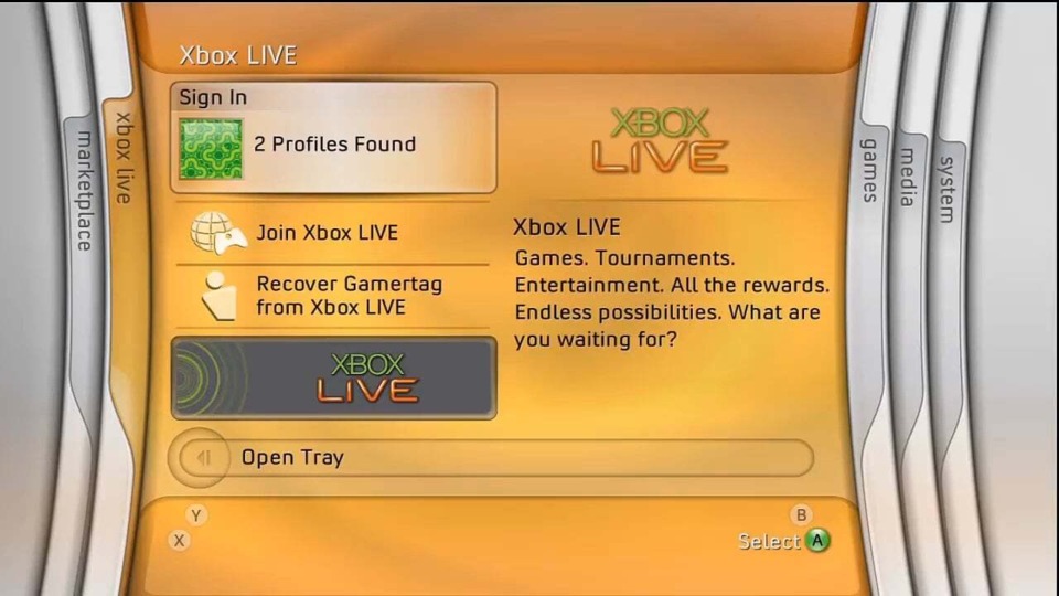
@cikame said:
No Caption Provided

This Xbox 360 menu UI makes me really miss the 2000s decade of video games.

Avatar image for brian_
brian_

1280

Forum Posts

12560

Wiki Points

0

Followers

Reviews: 0

User Lists: 4

#14  Edited By brian_

I've now noticed they've also removed the Game Pass and Series X/S logos from your apps on the home screen, which was useful info to have at a glance.

Avatar image for drmoltz
drmoltz

5

Forum Posts

0

Wiki Points

0

Followers

Reviews: 0

User Lists: 0

How many tens of billions of dollars is Microsoft throwing at Activision? They gotta make that back in game sales and services somehow.

Avatar image for drsunchips
DrSunchips

54

Forum Posts

72

Wiki Points

0

Followers

Reviews: 0

User Lists: 0

Seems fine an not worth spending time thinking about one way or the other.

Avatar image for mrangryface
mrangryface

1029

Forum Posts

60

Wiki Points

0

Followers

Reviews: 0

User Lists: 5

lately when I turn on my xbox series s it doesnt show any of the games not installed that are in my digital library and its maddening

Avatar image for xosohay88
xosohay88

1

Forum Posts

0

Wiki Points

0

Followers

Reviews: 0

User Lists: 0

If those changes don't affect "my games and apps", I'm fine, because sometimes you'll need more options to entertain without thinking too much.

Avatar image for monkeyking1969
monkeyking1969

9095

Forum Posts

1241

Wiki Points

0

Followers

Reviews: 0

User Lists: 18

It takes time to un-see what you don't find informative. In a few month you mind will know the new layout and you can go about ignoring the advertisements.

Avatar image for sombre
sombre

2249

Forum Posts

34

Wiki Points

0

Followers

Reviews: 0

User Lists: 4

Is there a reason I haven't had this on the Series S yet?

Avatar image for brian_
brian_

1280

Forum Posts

12560

Wiki Points

0

Followers

Reviews: 0

User Lists: 4

@sombre: It sounded like they were going to roll this out over time, as opposed to updating everyone at the same time. Not sure what criteria they're using to decide who gets it when. I've got an S myself, so it's probably not platform specific. Maybe region based?

Avatar image for ralphmoustaccio
RalphMoustaccio

485

Forum Posts

0

Wiki Points

0

Followers

Reviews: 0

User Lists: 0

@brian_: My daughter's S has the new update, but my X does not. We're in the same house, so it's not region-based, either.

Avatar image for thepanzini
ThePanzini

1397

Forum Posts

0

Wiki Points

0

Followers

Reviews: 0

User Lists: 0

Just got the update I only ever really use the home screen, but holy crap that's a lot of real estate for ads.