
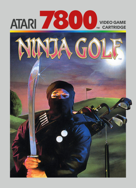
Box 'Art'
Regardless of whether or not I've actually played them, I do have eyes, and I know what I like, so here are some games who's boxart I'm particularly fond of in serious and not so serious ways.
Regardless of whether or not I've actually played them, I do have eyes, and I know what I like, so here are some games who's boxart I'm particularly fond of in serious and not so serious ways.
This falls into the 'did not play' category, but I can still appreciate it. Definitely get a Watchmen vibe from it, though admittedly, its mostly because of some similarities in the typeface more than the art style or anything. Doesn't hurt that its got a absolutely gorgeous illustration underneath it all.
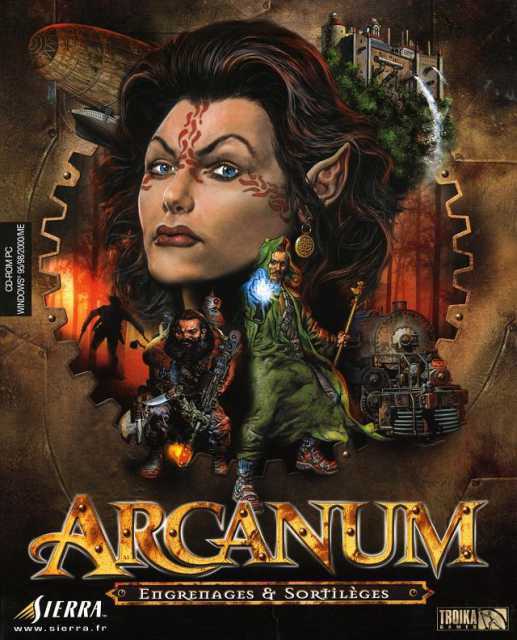
Steampunk is STILL a underused genre/setting in video games nowadays and Arcanum knew that, even back in 2001. Sure, it suffers from floating head syndrome, but this is remedied by the fact that they are actually steampunk floating heads...thus, a successful boxart!
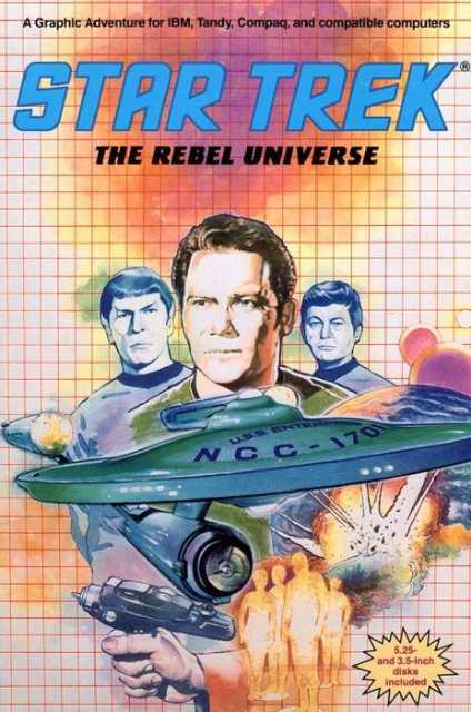
Another one before my time, but boy do I love me some 'painted' box art (and also Star Trek). Sure, it's a bit off kilter composition-wise (e.g. why is their a phaser coming out of those dudes at the bottom?), but how can you not love the colors, it just says, "Yeah I was made in 1987, what of it?"
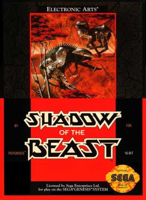
Speaking of colors....glorious. It doesn't have one thing to do with the game (except for the colors of course), but I don't think I could think of a better way to market the game. :P
Roger Dean is the man to thank for this, and while he is better known for this work with album covers his styles lend itself quite well to some truly great looking box art.
And yes, I looked him up, so sue me.
Simple, effective, love it. While I believe that the boxart we have here on GB is the more modern version, the original was not too different if I recall, so booyah.
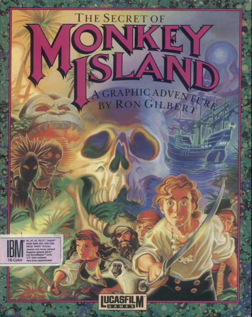
Again, painted box arts, especially those created by LucasArts, always a favorite. As much as I enjoy the Special Edition remake it really did change the style of the game quite significantly, and the new version of this box art isn't nearly as enjoyable.
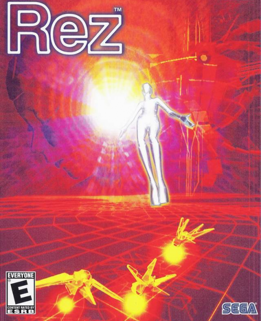
It's just a really visually pleasing boxart, for a really visually pleasing game. Appropriate I guess. The outlined type just works here so well.
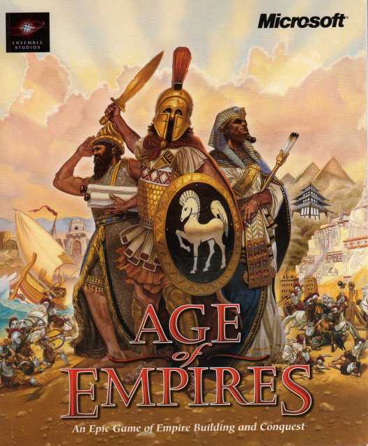
Winner of the most straight forward boxart goes to.....Age of Empires! Not that I'm knocking it of course, its absolutely gorgeous, but it pretty much tells you what's up the moment you look at it.
A bunch of ancient civilizations duking it out? Got it.
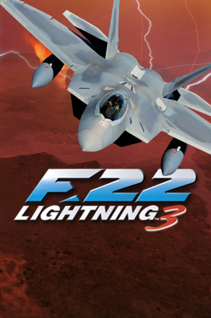
You would think the F-22 front and center on the box would be enough to persuade any red-blooded American/person to pick up this flight-sim gem, but no, they go and add lightning bolts against a blood red sky to seal the deal.
Obviously a less serious pick, but hey, can you blame me?
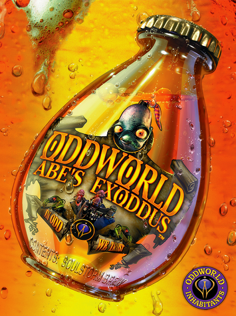
I could put most any of the Oddworld games here honestly, they all have a great sensibility when it comes to art style. This one just pops though.
Again, I'm not old enough to have any nostalgia for arcades and their ilk, but boy do I enjoy arcade flyers and machine art nonetheless. They are all designed to out do each other with vivid colors and effects and since the art we have here on Giant Bomb is a arcade flyer I say...mission accomplished.
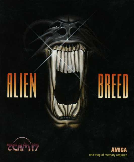
Is it kind of (totally) a Alien rip off? Maybe a little, but you know what, if your going to rip off something, Alien is a pretty good source...
I honestly didn't know that LucasArts developed this game, though, in some odd way I should of known all along. Regardless, I suppose they can also be blamed for this great homage to the B-movies posters of the 1950s.
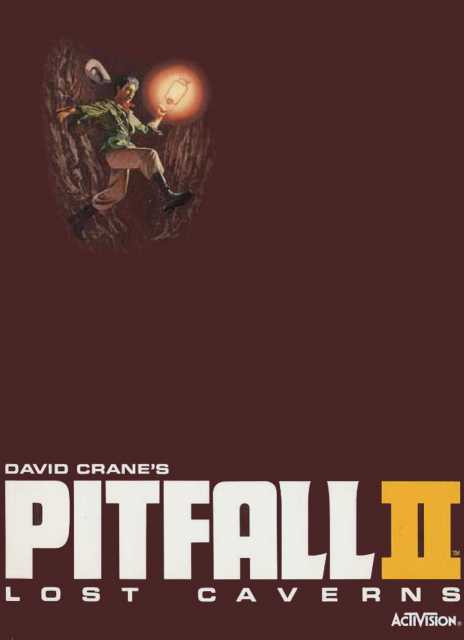
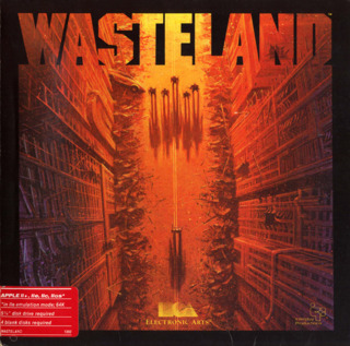
It's like the Wasteland cover, but reversed! Well, alright, not exactly but both certainly feature some pretty strong type and some great use of space. I also really like the use of empty space. Normally this would come off as kind of cheap, but being as it's the lost caverns, understandable, no?
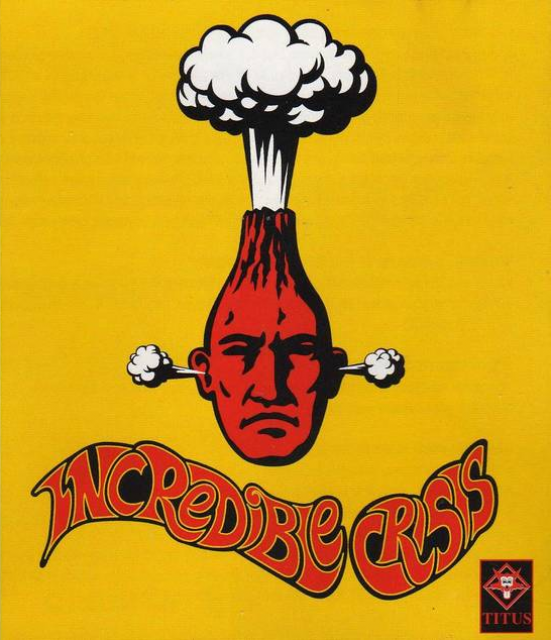
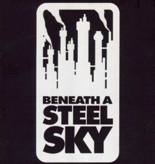
Much like the Beneath A Steel Sky cover, Incredible Crisis's box art works because it's so simple. Also it doesn't prepare you whatsoever to the crazy this game throws at you. Not sure what's up with the 'psychedelic' type treatment though.
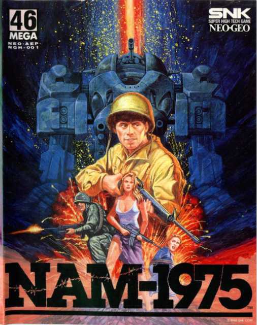
How to make a awesome boxart in a few easy steps, brought to you by NAM1975:
1. Dudes with guns running towards the viewer.
2. Scantily clad (gun toting) women.
3. Fill remaining background with Giant (gun toting) mech and explosion(s)...also add lasers.
4.DONE!
Yet another 'so-bad-it's-good' type boxart. That said, that spaceman is shooting that mecha-T-Rex THROUGH THE HEAD. Just saying. I do like when boxarts can pull off a good tilted/cropped composition and this one does a admiral job.
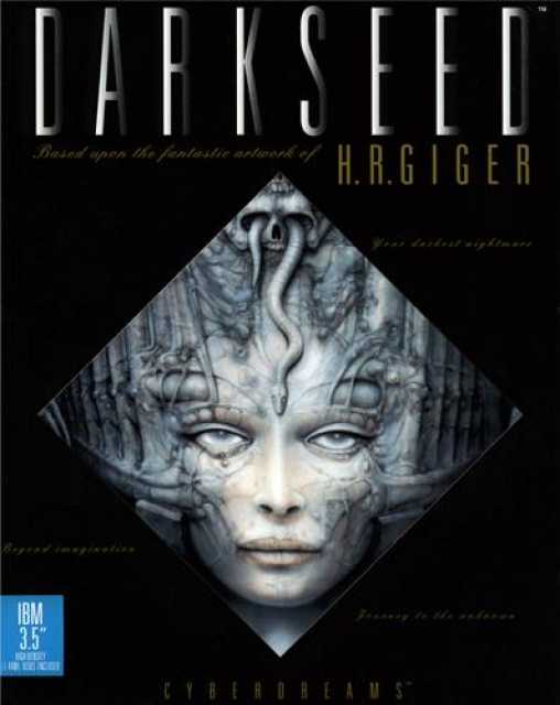
Based off the writing/illustrations of H.R Giger novels is right! The simple use of illustration and cool type just make this work...even if his stuff is pretty much completely creepy.
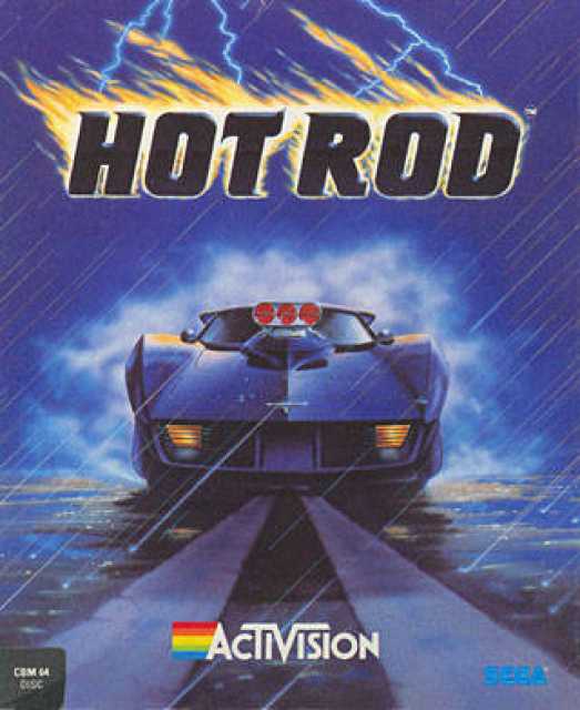
Let me get this straight, this Hot Rod is so awesome that despite a torrential downpour, lightning, and its logo being on fire, this car is STILL ready to race!? Wow.

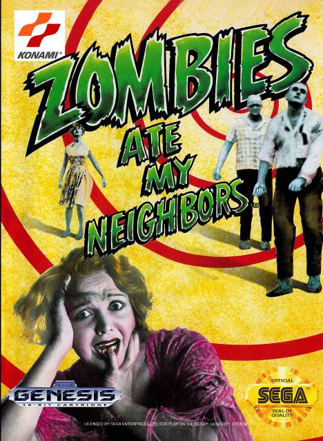
I wonder who made this game? Talk about not giving credit when it's due I mean-...oh. The giant Sega logo aside I just love the color here and the mixing of game graphics and illustration.

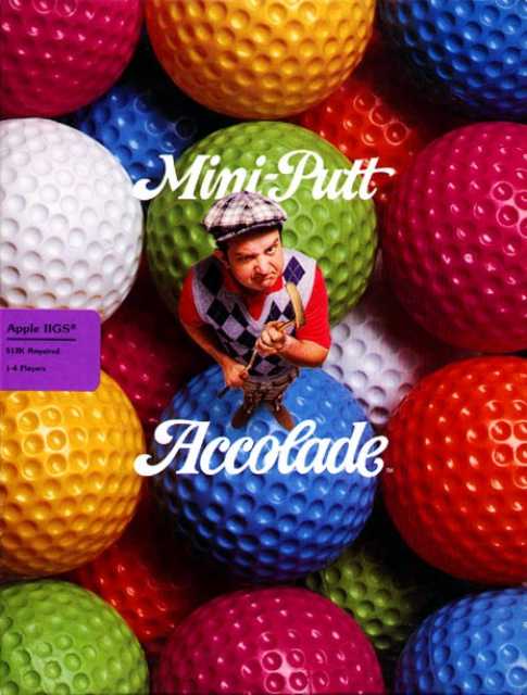
We need more photography based box art like this. You know exactly what your getting into the moment you look at it and its completely hilarious which isn't something you see nowadays.
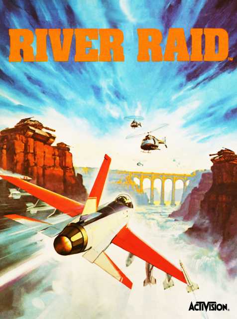
Oh god look out for all those helicopters and tanks! Oh wait, your in a jet....Oh god look out for that bridge! A great example where the boxart and game are kind of at odds, but boy is it a pretty.

I always love when simplicity works when it comes to boxart, it feels like most designs are just way cluttered to try to get peoples attention, but it works both ways I think, thus a great boxart.
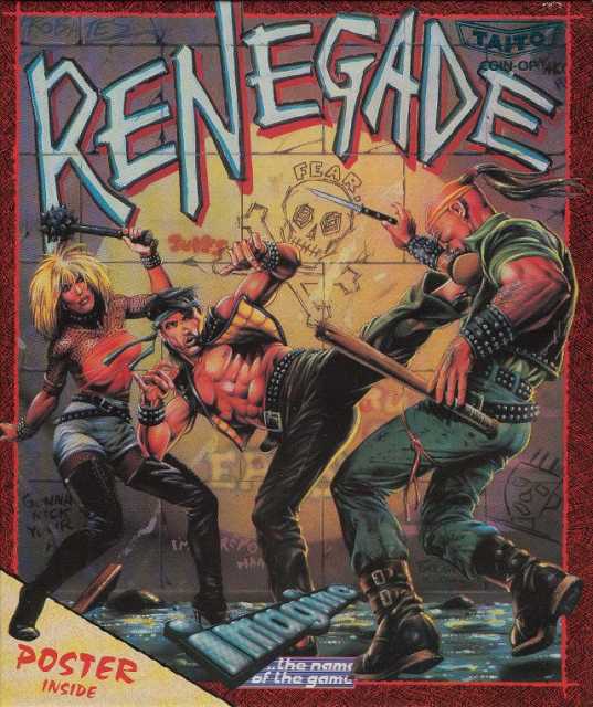
I don't think you could have a more 80's boxart if you wanted to. Well, ok, I take that back, you could, but it certainly doesn't take away from how great the cover is. Sure, its style doesn't really seem to come through in the game at all, but then again, that was the case with most games at the time, and what away to get someone interested in your video game than fill it with gritty grafitti filled background complete with matching weapon wielding thugs.
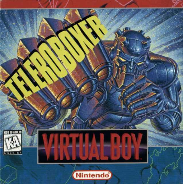
Another less serious, pick, but you have to admit, of the few Virtual Boy games released, this one is one of the few that capitalizes off of the 3D nature of virtual boy in terms of its boxart.
And yes, I'm still trying to figure out what Teleroboxer actually means.
Photography heavy boxarts are always a tricky proposition, but man, this is absolutely splendid. (Gets points for color as well!)
I think this one is fairly self-explanatory.
Saw this one while adding Game Room releases(!) and I must say I really really love this guy. Its not that its layout or contents is that much different or better than others of the time its just the use of color and type is just so effective. Also, it doesn't hurt that the illustration is genius, showing you exactly what you need to know while also being humorous about it all.
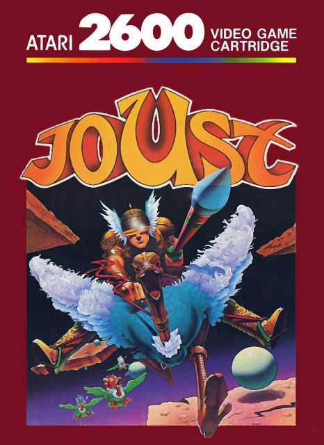
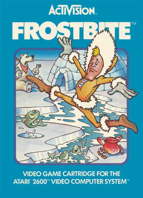
OH GOD THERE'S A OSTRICH COMING RIGHT AT ME...whew. Besides the craziness coming out of that boxart its actually pretty direct and to the point. This is what you do...you joust!
I wish I knew what this games title was or what its about, oh well.
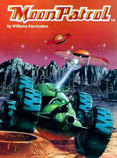
This is is great mostly due to the color. Though that moon patrol buggy is pretty sweet looking to and that mountain range is---
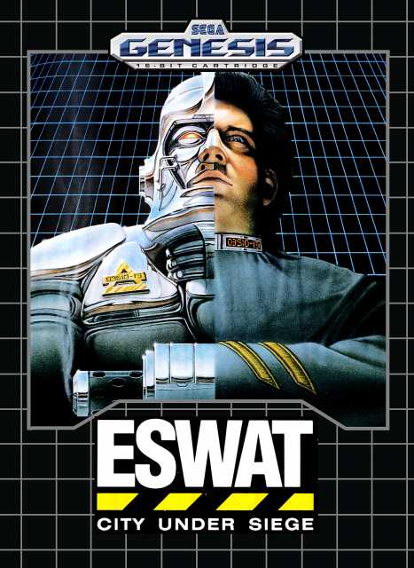
I don't know whats going on here, but this half man have robot is looking styling, especially on the Grid.
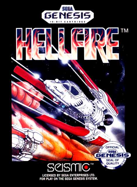
Crazy perspective is always fun especially when its space ships. But come on now, the real star of the show is that logo...it IS the hellfire!
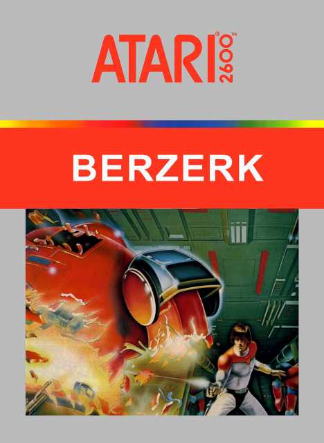
(2600 version) Not only is that guy SHOOTING THAT ROBOT IN HALF but this box art continues the great condition of Atari boxart featuring pieces of the the art coming out of the frame. Yessir.
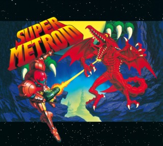
Has Ridley ever been red? No. Does Samus have any kind of beam weapon? Nah. Is Kraid really that big? Yes! Boxart redeemed people! All joking aside, besides the nostalgia associated with this for many, its still a great in-your-face 90s style boxart with a love for red.
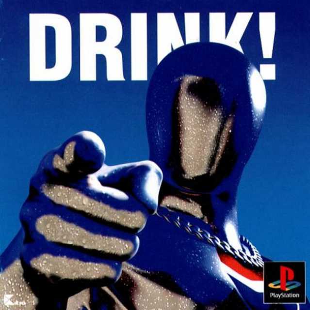
I'm a sucker for straight forward boxart and the art for Pepsiman here is pretty much that a million times over. It's almost like he's trying to tell me someth- DRINK!
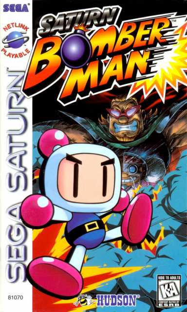
I'm not sure why I like this one so much. Maybe its the color, maybe its the gradients, whos to say, it just pops! (I guess I also find the title kinda funny, do we really need to clarify what version this this? I'd be more confused if it was Mega Drive Bomberman).
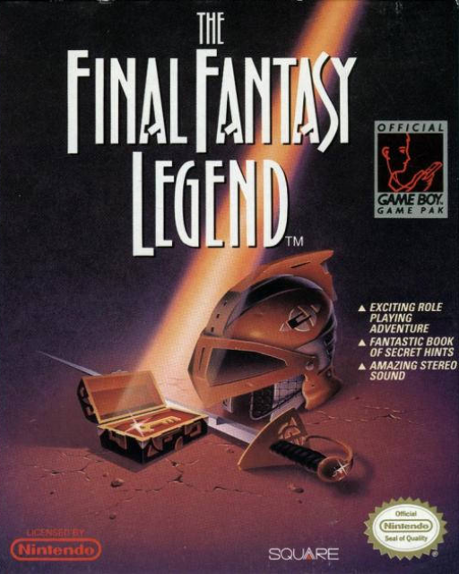
Is this actually a Final Fantasy game? Well, no, but that doesn't mean that I don't kind of love this cover. Again, simplicity is the key and it sets a appropriately(?) mysterious tone.
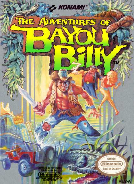
Saw this boxart in a thread entitled "Renting Games in the 80s/90s: The Boxart scam". Looks like a shit game with a hot shit box art.
Man, I have to thank Jeff for introducing me to this awesome box art. Look at it!