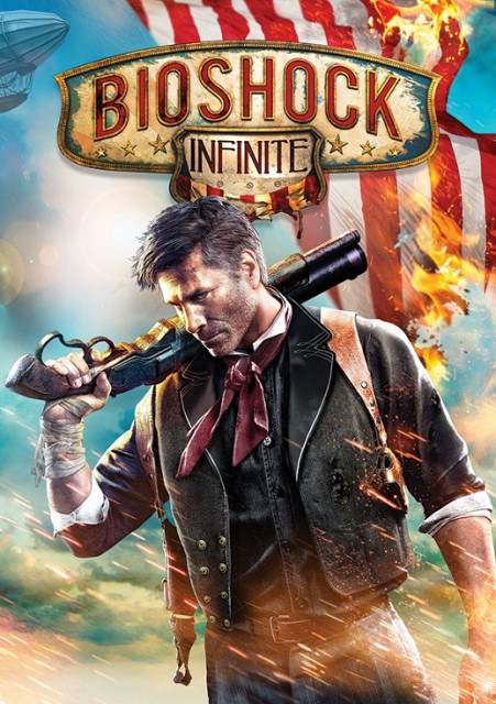
The third game in the BioShock series leaves the bottom of the sea behind for an entirely new setting - the floating city of Columbia, circa 1912. Come to retrieve a girl named Elizabeth, ex-detective Booker DeWitt finds more in store for him there than he could ever imagine.
Oh man. My dream is that no one likes any of these either or that whichever one is picked everyone that freaked out about the last cover freaks out about the new cover too.
Designs 5 and 6 are really good although there is a bit too much lens flare on the fifth. Design 6 is simple but cool looking and conveys properly what's in the game rather than the angry guy with gun original.
You're exactly right. I think people are going "look how different it looks, it must be great" when the image is actually kind of a mess in terms of composition. Most of these are. People are making the Brad Mistake, which is going "this must have artistic value beyond the normal because it looks different". The only one that actually works with the font treatment is the third one (which is essentially the basic cover). Some of them just look slapdash and lazy (1 looks like they just cropped out a Liz picture and put it on a gradient) and others just ... they don't work from a compositional, directing the eye standpoint. 2 and 6 probably come closest. 5 is a mess.
4 might work if they lose the background image of the floating city in the left portion and replace it or leave it blank. Maybe move Songbird a little lower, and closer.
They're not exactly final drafts. They're very rough drafts thrown out very quick to get an idea of what people like in an alt cover, or what they didn't like/thought missing from the actual cover. I'm sure they'd look much better with the polish that will go into the final draft.
The last time I was promised reversible cover art I got blank white as the other side. Now I'm stuck with that shit ICO/SotC collection cover art.
Wait, what? I was almost about to jump on the ICO/SotC collection just because of the reversible cover art and now you're telling me that's a lie? Well, fuck. Was it Japan only or something?
@Brodehouse:
4 just looks good, dude. Although it does clash with the logo, you're right about that. I do wish they'd reworked the logo a bit.
Y'all are crazy, 2 is where it's at, especially since its box art. I agree that 4 and 6 are cool too but man, 2 tells me everything I need to know and also to play that fucking video game.
I wonder how many votes 3 will get given that it's the same ass shit.
I'm with you on that, 2 is awesome.
Me, too. I prefer 2 by a wide margin. It conveys far more information about the game than any of the other covers.
Unfortunately we seem to be in the minority, though, since it's getting almost no votes.
The last time I was promised reversible cover art I got blank white as the other side. Now I'm stuck with that shit ICO/SotC collection cover art.
Wait, what? I was almost about to jump on the ICO/SotC collection just because of the reversible cover art and now you're telling me that's a lie? Well, fuck. Was it Japan only or something?
@Brodehouse:
4 just looks good, dude. Although it does clash with the logo, you're right about that. I do wish they'd reworked the logo a bit.
I think it might be something to do with Canadian packaging being different because of language laws. Or it could be that they manufactured some, decided to do the reverse cover art and sent the first run of non reversed versions to Canada. Most of the time these things are manufactured in Mexico and I'm practically in the middle of the atlantic ocean so shipping things here takes time. It's probably a first run blunder and I bet you'll be fine picking it up now.
You're exactly right. I think people are going "look how different it looks, it must be great" when the image is actually kind of a mess in terms of composition. Most of these are. People are making the Brad Mistake, which is going "this must have artistic value beyond the normal because it looks different". The only one that actually works with the font treatment is the third one (which is essentially the basic cover). Some of them just look slapdash and lazy (1 looks like they just cropped out a Liz picture and put it on a gradient) and others just ... they don't work from a compositional, directing the eye standpoint. 2 and 6 probably come closest. 5 is a mess.
4 might work if they lose the background image of the floating city in the left portion and replace it or leave it blank. Maybe move Songbird a little lower, and closer.
They're not exactly final drafts. They're very rough drafts thrown out very quick to get an idea of what people like in an alt cover, or what they didn't like/thought missing from the actual cover. I'm sure they'd look much better with the polish that will go into the final draft.
I hope so. I like the idea behind #4 but don' actually like how it looks, especially with the clashing logo.
Not that I should care, I'm not even planning on getting the game.
All of those covers blow. I don't much care for how the game's logo was handled in any of them, but I still voted for #4.
Really, though, I'd vote for this cover instead if they put it up for voting:
I'm sure they'd have to get permission from the artist, and The Saturday Evening Post. Although, I think replacing "The Saturday Evening Post" and making it say "Bioshock Infinite" in the same font might be even cooler.
I like 4 the most. Too bad the "Bioshock Infinite" logo is not done in the same style as the rest of the cover, but that is just me bitching over nonsensical issues.
Wow design four is beautiful. Reminds me of the Resistance 3 cover. That bright orange was an eye catcher, we would have at least six customers pick it up to check it out a day. Some didn't even have a PS3 they just wanted to see what the game was.
@Vigorousjammer: oh wow. That would be my pick if it were an option.
@Phatmac: Elizabeth looks fine to me, its the plain background thats bringing it down for me. Seems like that could have done something better with the backdrop. Elizabeth looks goooooood though.
Fuck man Elizabeth is the most strikingly beautiful female character I've seen in some time. I vote #5 I want her on my cover.
I know right? Damn she's pretty.
She has portions of a child (with boobs)...
Uh no she doesn't. The character designs are slightly caricatured from what real humans look like. Secondly, the notion that all females have to have the same body type and proportions or they look like children is absurd.
This edit will also create new pages on Giant Bomb for:
Beware, you are proposing to add brand new pages to the wiki along
with your edits. Make sure this is what you intended. This will likely
increase the time it takes for your changes to go live.
Comment and Save
Until you earn 1000 points all your submissions need to be vetted by other
Giant Bomb users. This process takes no more than a few hours and we'll
send you an email once approved.


Log in to comment