A quasi-sequel to From Software's action-RPG Demon's Souls, set in a new universe while retaining most of the basic gameplay and the high level of challenge. It features a less-linear world, a new checkpoint system in the form of bonfires, and the unique Humanity system.
I'm pretty sure that the second one is the US art. The third one's the best. E:Oh wait, the US one might actually be the first one since it has the ESRB rating on it.
I'm pretty sure that the second one is the US art. The third one's the best. E:Oh wait, the US one might actually be the first one since it has the ESRB rating on it.
I'm pretty sure that the second one is the US art. The third one's the best. E:Oh wait, the US one might actually be the first one since it has the ESRB rating on it.
I like the first one the best. Oh wait. That's the US cover? Oh god it's awful! When will publishers learn to stop ruining the amazing Japanese covers with these terrible MS paint imitations?
I'm writing my Senator. I mean, someone is getting a letter over this. I know! I'll start a facebook petition!
They all look pretty good, I think I like the top one the best.
The second one is a little plain but is still cool, with a nice colour scheme.
Third one might be a bit too hardcore for me. It seems like it's trying to convey the mood of the game, and does so well, I just like my covers to "pop" a bit more.
The bright blue light in the fourth one kinda goes the other way of being to gaudy, but at least there's no orange in there.
I definitely like the first one. Free of floating heads (depends on your view of what a floating head is, though), explosions and cast get-togethers, but it has a subtle sense of 'danger' to it. And it's also just really pretty.
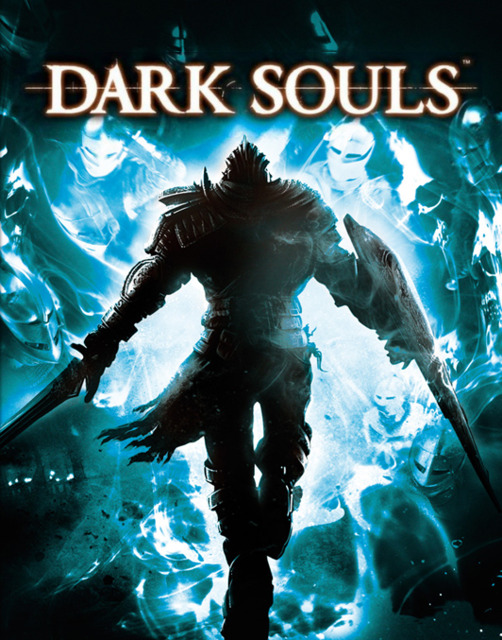
First cover: Limited Edition NA boxart Second cover: Europe boxart Third cover: Japan boxart Fourth cover: Standard NA boxart
My favorite is the limited edition North American box art. It evokes how gruesome the game will be, much like Demon's Souls' box art. The Japan one is also cool as it represents one of the new game mechanics as well as how desolate and lonely the world the player will go through is. The worst is probably Europe's box art because it doesn't mean shit. A simple image of an enemy bearing armor is really just boring.
See what's stupid (among other things) about the last one is he's walking away from the viewer and into the demons, right? Then why the hell would he have his shield in his right hand and his sword in his left? Anyone who's played Demon's Souls would know that doesn't make sense.
As for the first one, it's better, but that's not how reflections work. They just slapped the image from the second box art onto the helmet and called it a day, while an actual reflection on an uneven reflective surface like that one would not stay intact and perfectly vertical like that.
Second one I find a little generic and not very indicative (presumably) of the game. The Black Knight's just handing you the sword? I don't think he will.
Third one's best for me. As has been said, it illustrates the (again, presumed) feel of the game without intrusion of unnecessary elements. Though, it kind of looks like the dude's shoulder is on fire.
Limited looks sweet, although in the UK it's cited as a 'Day 1 Edition' - meaning if you don't buy it the day it's released, you won't get your pre-order AT ALL.
I like the 3rd Cover most, explains the Demon/Dark Souls franchise wonderfully.
This edit will also create new pages on Giant Bomb for:
Beware, you are proposing to add brand new pages to the wiki along
with your edits. Make sure this is what you intended. This will likely
increase the time it takes for your changes to go live.
Comment and Save
Until you earn 1000 points all your submissions need to be vetted by other
Giant Bomb users. This process takes no more than a few hours and we'll
send you an email once approved.


Log in to comment