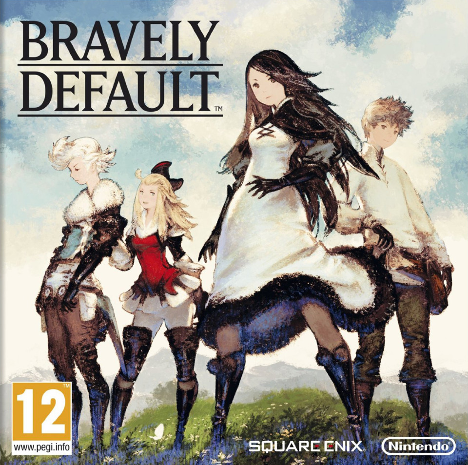
Are you bothered by games where the promotional art and in-game art don't match? Or: why is Bravely Default so ugly

  • 54 results
  • 1
  • 2
Avatar image for bisonhero
BisonHero

12793

Forum Posts

625

Wiki Points

0

Followers

Reviews: 1

User Lists: 2

#1  Edited By BisonHero

Right up front, I'll reiterate the thread title: I think the in-game characters in Bravely Default are straight trash. But the whole reason I'm making this thread is that they didn't have to be! I'll get into it.

Look, I get it, there is a whole cultural underpinning in Japan that has led to an appreciation of cute things, so a wide range of manga, anime, and video games sometimes channel this and use a chibi/super deformed/"SD" aesthetic. I'll admit this rarely appeals to me; I can appreciate cuteness inserted into Japanese games when it suits the whole vibe of the game, like say the whimsical, coming-of-age-believe-in-yourself-preteen vibe of Pokemon and its cute Pokemon designs and trainer outfits. I don't think every game can pull off that level of carefree cuteness.

So back to Bravely Default. Some of the characters in that game: real horny. Some of the job classes your party can change into: real silly. Like Elvis impersonator silly. But overall the setting is some pretty standard techno-magical-medieval JRPG class system stuff, and you're off on a quest to save the world, and some characters take themselves quite seriously. I wouldn't put the game in that Pokemon class of game where I think it is light and carefree, or jokey enough, that it warrants leaning hard into really exaggerated cuteness.

Buckle up, we're about to enter the part of the thread where all I do is post pictures.

Let's go over some of the character art of the 4 party members from the first title:
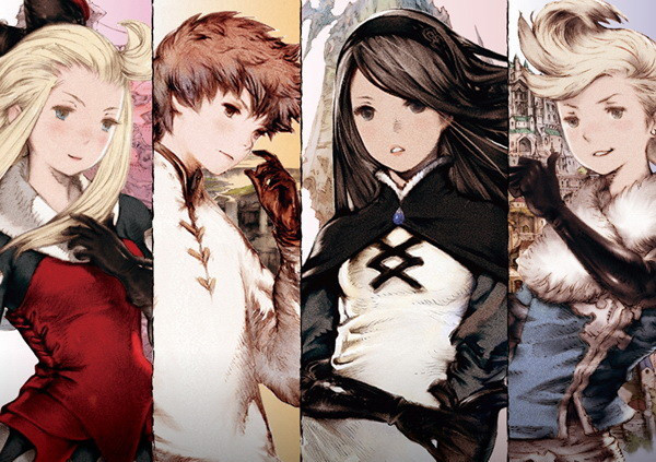
No Caption Provided
No Caption Provided

Not the most memorable designs ever made, but I don't hate it. Everybody has a pretty generic slim, pop idol-y build, but what can you do. Now let's see some in-game models:
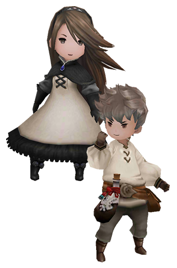
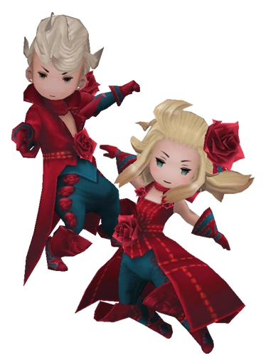
No Caption Provided
(in this last picture, these 2 characters are an alternate job class. I couldn't find a suitable pic of their models in the default story attire)

Oh no! What happened? Did everybody lose their shins in a horrible war injury, much like Hank Hill's father?
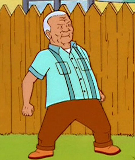
No Caption Provided

Nope, chibi has struck again! But, I thought to myself, perhaps the chibi appendages of those bobbleheaded weirdos was easier to rig and animate on the 3DS, somehow saving horsepower for other uses in the game. That was sort of why everyone in Fire Emblem: Awakening has horse hooves instead of feet: the devs had to commit to the complexity of character models early in development, before the final specs of the 3DS were locked in, so just to be on the safe side they simplified the character models to not have any kind of ankle joint or foot. Behold, the hooves of Fire Emblem:
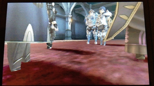
No Caption Provided

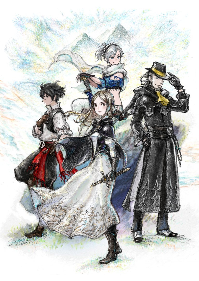
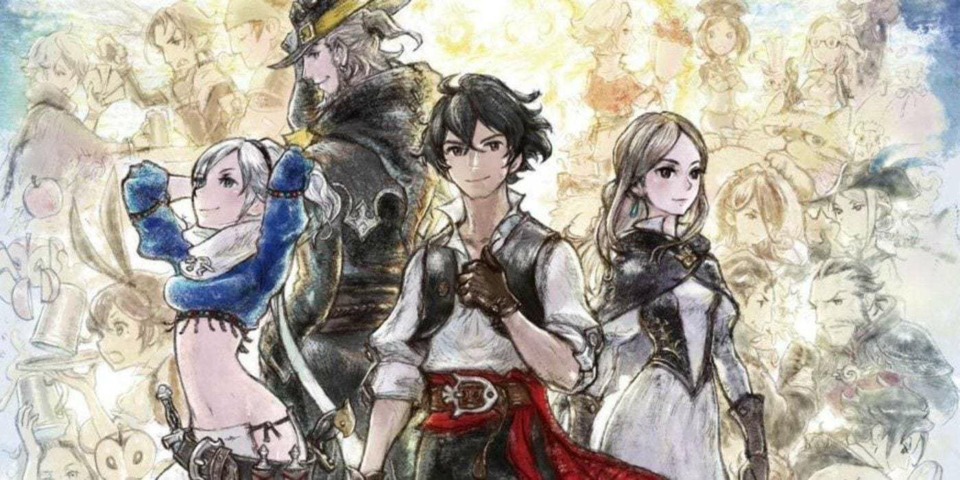
So naively believing this was the case, I looked at some art from the Switch game Bravely Default 2 (the third Bravely Default game):
No Caption Provided
No Caption Provided

What a cheeky set of adventurers. Surely nothing could go wrong between this character art, and digitally creating polygonal versions of these character designs.
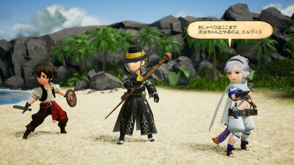
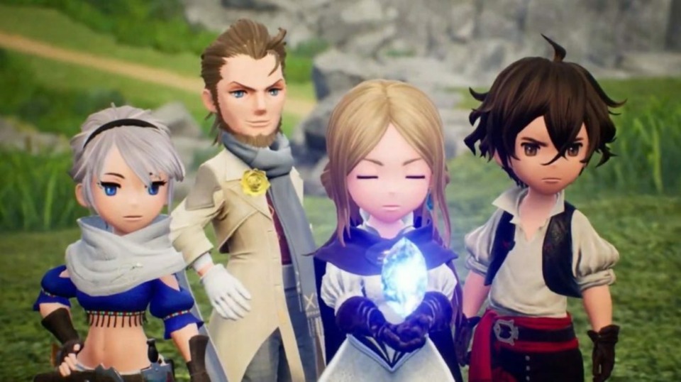
No Caption Provided
No Caption Provided

You monsters, you've done it again! Why do you hurt me so?

I do not like the in-game character art at all in this series. Though the games are still some real lookers when it comes to environmental art:
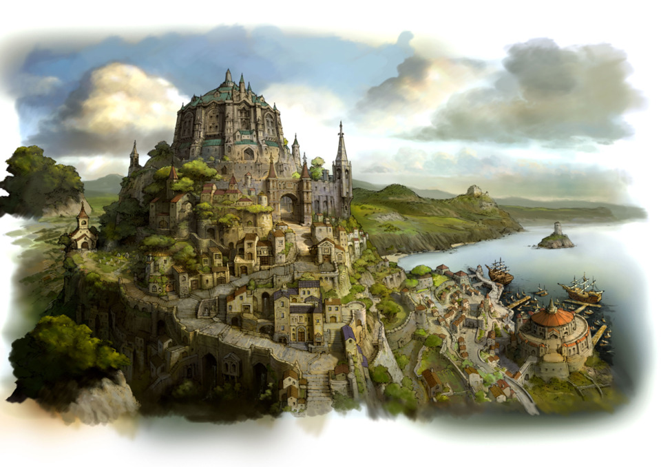
In the first 3DS game, your polygonal characters walk around on the streets of this city as a 2D prerendered background like you're playing a PS1 game. With the 3D turned on, some of the city elements are on different planes and depths and it's a striking effect

In closing, I'd be curious to know what the discussion is like between the cover art team and the in-game art team on something like this, because the character designs just have noticeably different proportions, like the two teams are working from completely separate style guides. I would much prefer that they go with something closer to the tall, slim cover art version of the characters, as opposed to the Funko Pop monstrosities used in-game. The SD look is just not my jam unless the game is some Super Puzzle Fighter II Turbo levels of nonsense.

So what are your thoughts on the look of Bravely Default? Do you love it, or do you share my aversion? Have any other games caught your attention where the official art/in-game art divide was too vast for your liking?

Avatar image for panfoot
Panfoot

673

Forum Posts

0

Wiki Points

0

Followers

Reviews: 0

User Lists: 0

No Caption Provided

Not exactly the same idea since they never show any art for the games in anything other than the chibi style, but the Super Robot Wars series is definitely still a case of putting together a bunch of cool stuff and them mashing it down into a style I absolutely hate, a real monkey's paw situation.

Avatar image for efesell
Efesell

7502

Forum Posts

0

Wiki Points

0

Followers

Reviews: 0

User Lists: 0

#3  Edited By Efesell

I dunno, I think I like the doofy style that the games actually use more than I would if they just made faithful representations of the concept art.

Besides which Bravely Default is all about hearkening back to Final Fantasy of Yore and like you can't have character models that look like their artwork if you're gonna do that. What would Amano think?

Avatar image for bigsocrates
bigsocrates

6267

Forum Posts

184

Wiki Points

0

Followers

Reviews: 0

User Lists: 0

These are different questions. Do I care if concept art and in game art don't match? Buddy I played games on the NES. I don't care.

Do I like the look of the Bravely Default series characters? No. I think they're ugly.

The thing is, this isn't just a stylistic thing, it's a money thing. Chibi characters are easier to model and especially animate (since they don't have to have 'realistic' animations and physics). It's partially a style thing but partially an attempt to make the games cheaper to produce.

Square Enix has been struggling with how to make RPGs that aren't Final Fantasy or Dragon Quest economical in this day and age. For a while they did it by putting them all on handhelds, but now that the Switch is the handheld and has HD high poly graphics they are trying alternate art styles, like with Octopath and now this. These are niche games and Square doesn't want to invest in them like it did in FF VII Remake or whatever.

Would I prefer a different art style? Yes. This resembles I Am Setsuna and Lost Sphear, and while I liked Setsuna as a game the art never jelled with me. But as a compromise to enable them to make the games complex and deep while still not very expensive to make I think it's reasonable.

Better than some of the compromises they made with the first Bravely Default.

Avatar image for judaspete
judaspete

369

Forum Posts

0

Wiki Points

0

Followers

Reviews: 0

User Lists: 0

#5  Edited By judaspete

Yeah, this kinda bugs me too. In fact I prefer games have a consistent art style throughout. Like if it has super stylised cut scenes, then switches to realistic in game graphics, that's disappointing. My preference is for a game to have a unique art direction, and in engine cut scenes.

Avatar image for efesell
Efesell

7502

Forum Posts

0

Wiki Points

0

Followers

Reviews: 0

User Lists: 0

@judaspete: Well, Bravely is wholly consistent with it's look. This alternate look for the characters only exists to put on covers.

Avatar image for bisonhero
BisonHero

12793

Forum Posts

625

Wiki Points

0

Followers

Reviews: 1

User Lists: 2

#7  Edited By BisonHero

@bigsocrates said:

These are different questions. Do I care if concept art and in game art don't match? Buddy I played games on the NES. I don't care.

Do I like the look of the Bravely Default series characters? No. I think they're ugly.

That's fair. To address your points in reverse order:

In a vacuum, I would think the Bravely Default characters are ugly, and then in reality I extra hate them because they've shown me what could've been by releasing all of the official promotional character art/cover art where they have (for anime) halfway normal proportions.

Cover art and in-game art not matching sure has a long and storied history in video games, but can you still get away with that, in current year? We're really not getting any wild shit like Phalanx anymore. Sometimes the cover is a drawn representation, or an extremely high poly rendering, while the in-game art is going to be the actual real-time polygonal models they could get working, but usually the two at least try to exist on the same wavelength. I struggle to think of very many games from the past 10 years that are as divergent as some of the shit Bravely Default is pulling.

Point taken that chibi character models are more economical in general for JRPGs, and publishers can't afford to make many cutting edge "realistic" looking giant JRPGs on current hardware.

Avatar image for imhungry
imhungry

1619

Forum Posts

1315

Wiki Points

0

Followers

Reviews: 3

User Lists: 3

#8  Edited By imhungry
No Caption Provided

I mean apart from being expressed in a more 'chibi' style, I'd say the art has been translated to the in-game character designs remarkably well. Their distinguishing traits and features are instantly recognizable in the in-game models. Also worth noting that since these pictures are cover art and promotional art I do think you're misusing the term 'concept art' here, which certainly includes art not dissimilar to what you've posted but also includes stuff like this:

As for the art style of Bravely itself, personally I'm pretty much good with it. I certainly wouldn't have wanted them to attempt more 'realistic' models on the 3DS, which would almost certainly have looked bad. The art style also benefits the job system IMO, some of the more ridiculous job costumes would lose their expressiveness or look completely idiotic if they were slapped onto more 'realistic' models.

Avatar image for bisonhero
BisonHero

12793

Forum Posts

625

Wiki Points

0

Followers

Reviews: 1

User Lists: 2

#9  Edited By BisonHero

@imhungry: Thanks, I couldn't think of the right terminology, but promotional art/cover art is a better term for what I'm referring to. I think I've edited the post to reflect this.

Avatar image for sulcath
Sulcath

65

Forum Posts

0

Wiki Points

0

Followers

Reviews: 0

User Lists: 0

Portable gaming looked garbage on all but the most cunning developer's games forever. But yeah, chibi sucks, those designs are trash.

Avatar image for efesell
Efesell

7502

Forum Posts

0

Wiki Points

0

Followers

Reviews: 0

User Lists: 0

#11  Edited By Efesell

Also I don't really know that these designs are what I would call chibi either.

Avatar image for plinko
plinko

142

Forum Posts

0

Wiki Points

0

Followers

Reviews: 0

User Lists: 0

@efesell: Yeah, I haven't played any of these games so keep that in mind, but I'm someone who likes chibi art and I don't really like whatever they did with this game. This is gonna sound really weird but it kinda looks like...Caillou? Am I crazy for saying that? Where the features are small and the heads are really big and round. Lol maybe I'm being silly but that's what it reminds me of. The 3DS versions more than the Switch versions though. I think the Switch ones look much better from the pictures in this thread.

Avatar image for efesell
Efesell

7502

Forum Posts

0

Wiki Points

0

Followers

Reviews: 0

User Lists: 0

@plinko: I mean there's definitely a bobblehead like feel to some of it, mostly in the first game, but I look at the designs and see stylistic designs of people instead of like... just heads with limbs attached which is what a lot of proper chibi art reads to me.

Avatar image for justin258
Justin258

16684

Forum Posts

26

Wiki Points

0

Followers

Reviews: 11

User Lists: 8

#15  Edited By Justin258

The first game didn't bother me. A lot of those environments and backgrounds and such look amazing and power limitations made the chibi characters acceptable - plus, I recall their movements being quite expressive, which is a lot more than you can say for most isometric RPGs. So, I dunno, I'm not bothered by these.

As long as the environments and backgrounds and such hold up, I'd probably be A-OK with the look of this game. It ain't no Octopath Traveler, but what is?

Avatar image for brittonpeele
BrittonPeele

861

Forum Posts

2253

Wiki Points

0

Followers

Reviews: 6

User Lists: 7

I don't hate the way the Bravely Default games look in-game, but I also agree that looking like the box art would have been great/better.

For a long time now I've thought it would be really awesome if there was an old-school Final Fantasy game that actually looked like animated Yoshitaka Amano art. Some of the polygonal games got closer (ish), but I would love to see something super stylistic.

Avatar image for efesell
Efesell

7502

Forum Posts

0

Wiki Points

0

Followers

Reviews: 0

User Lists: 0

I just don’t think the artwork is particularly interesting, so rendered realistically would just be kind of whatever.

Accurately depicted Amano however is the sort of monkeys paw idea I’m willing to try exactly one time though.

Avatar image for theoriginalatlas
Atlas

2808

Forum Posts

573

Wiki Points

0

Followers

Reviews: 7

User Lists: 19

I hadn't really seen actual in-game footage of Bravely Default's character models before the last couple of days, I probably always assumed that those beautiful promo art characters were, y'know, actually reflective of the game's style.

Yo those character models look like ass.

Avatar image for wollywoo
wollywoo

1056

Forum Posts

0

Wiki Points

0

Followers

Reviews: 0

User Lists: 0

#19  Edited By wollywoo

I don't care whether it matches the promotional art or not, but I'm not a big fan of this art style either, and it's hard to pinpoint exactly why. I don't have a problem with cutesy or chibi in general.

I think it's the plastic look of their faces. It reminds me of early CGI like Sid from Toy Story 1. Cute characters should seem soft to the touch, not like they're chiseled out of marble.

And yet - I love the look of Link's Awakening on Switch even though it's a broadly similar style. Maybe the toy look just works better on a less detailed, less anime-ish art style for me. LA looks like adorable little toy figures out on an adventure, whereas Bravely Default II character design just seems... low-budget. I'd prefer a detailed pixellated look. Still, I'm sure if I played it I would get used to it and I wouldn't mind.

off-topic: Can we talk about how dumb the name of this series is? My theory is that the devs did not speak very much English and came up with this name on their own and wouldn't let the localizers change it. Nobody had the guts to tell them that it sounds dumb. The word "default" in English is almost exclusively used in the context of finance or as a menu option in computer UIs, and it doesn't have the mystical connotation they were presumably going for.

Avatar image for efesell
Efesell

7502

Forum Posts

0

Wiki Points

0

Followers

Reviews: 0

User Lists: 0

#20  Edited By Efesell

@wollywoo: The game actually has a lot of like.. English puns in Japanese. I’m not sure it’s a case of misunderstanding but just like.. the name carries a specific meaning to the writer and it’s important to him in that way.

I like it though, and I’m glad they’re going the KH route of all or nothing on dumb naming schemes. Given that we’re in Bravely Default II the third game.

Avatar image for noboners
noboners

751

Forum Posts

0

Wiki Points

0

Followers

Reviews: 0

User Lists: 0

Every character in this looks like they came from Wonderful 101.

I guess I'm in the minority here, but I don't think it looks that bad? All the reviews called out the character design as well, so I was prepared for something awful, but I don't think it looks any worse than most jrpgs characters.

But as I'm typing this, I realize they look similar to the lalafell race in ffxiv, which is what I play as, so maybe I'm just more used to it.

Avatar image for imhungry
imhungry

1619

Forum Posts

1315

Wiki Points

0

Followers

Reviews: 3

User Lists: 3

@wollywoo: Worth noting that the other characters outside the main party have far more varied skin textures. Not entirely sure what a detailed pixelated look means in the context of a 3D game but flattening the art would lose out on so much expression in the job outfits for the Switch game.

Also just to add on to what @efesell wrote, the name completely makes sense in the context of the combat system as well. Not going to argue that it doesn't sound dumb in a vacuum but what a wild leap to assume that this multi-million dollar Japanese company is just bad at sounding 'mystical'.

Avatar image for efesell
Efesell

7502

Forum Posts

0

Wiki Points

0

Followers

Reviews: 0

User Lists: 0

#23  Edited By Efesell

Also these are the folks responsible for Octopath Traveler as well which is another nonsense sounding name that has similar thought put into why it is the way that it is. I do demand that Project Triangle Strategy be retained for final release however and force the writers to furiously figure out how to contextualize that.

Back to the models though I do think they look better in proper motion on a 3ds and among the excellent backdrops that the series has for most of its locations.

Avatar image for swthompson
swthompson

138

Forum Posts

0

Wiki Points

0

Followers

Reviews: 0

User Lists: 0

I think the designs for the characters are fine, even in game. But the very simple art style, total lack of detail, and overall cheap look to the game really hurts it.

On the 3DS I'm fine with the look - it's an extension of the DS Final Fantasy games. Square decided on this "portable game" art style they use for everything, and it's alright. But it doesn't scale to the Switch or higher-res platforms like mobile, and BD2 looks pretty bad.

Avatar image for efesell
Efesell

7502

Forum Posts

0

Wiki Points

0

Followers

Reviews: 0

User Lists: 0

Honestly I think it scales better on the Switch even, the only potential downgrade in BD2s visuals for me is that the designs for the jobs are real hit or miss. I think Elvis and his absurd Fedora Black Mage is fantastic but one of the later mage jobs my man is basically wearing a throw rug.

Avatar image for wollywoo
wollywoo

1056

Forum Posts

0

Wiki Points

0

Followers

Reviews: 0

User Lists: 0

@imhungry said:

@wollywoo: Worth noting that the other characters outside the main party have far more varied skin textures. Not entirely sure what a detailed pixelated look means in the context of a 3D game but flattening the art would lose out on so much expression in the job outfits for the Switch game.

It would look like this.

Not that every game has to have that look or anything. Obviously the designers have thought this through much more than I have. I'm just not a big fan of the current character design. (I love the look of the environments, though.)

@imhungry said:

Also just to add on to what @efesell wrote, the name completely makes sense in the context of the combat system as well. Not going to argue that it doesn't sound dumb in a vacuum but what a wild leap to assume that this multi-million dollar Japanese company is just bad at sounding 'mystical'.

How it sounds in a vacuum is the point. The first impression when you hear the name is that it has something to do with credit cards or iPhone settings. I doubt that was what the intention.

Avatar image for brian_
brian_

1277

Forum Posts

12560

Wiki Points

0

Followers

Reviews: 0

User Lists: 4

I also have no problem with it. It's been this way forever. I just don't think the chibi thing works for me in 3D. Between this and the Pokemon Diamond and Pearl remakes, I think these game are just worse off visually by going 3D. I think the chibi look would be better suited if these games just went for some really high quality 2D sprites.

Avatar image for efesell
Efesell

7502

Forum Posts

0

Wiki Points

0

Followers

Reviews: 0

User Lists: 0

@wollywoo: I mean the game uses an accurate if slightly reaching definition of Default. I don't think very many people would assume it's referencing either of those. Now there's a much better chance of people assuming your initial theory which is that Japan does like to name things with English words just for the sake of English being kind of trendy in Japan.

Avatar image for wollywoo
wollywoo

1056

Forum Posts

0

Wiki Points

0

Followers

Reviews: 0

User Lists: 0

@efesell: Well, I didn't mean that too literally. What happens is that in the split-second you hear the name for the first time your brain does some processing between the word 'bravely' which conjures images of adventure and 'default' which conjures images of sitting on your butt doing some programming or something, and the result makes you go '...huh?' The grammar is also a bit weird, as 'default' is more common to hear as a noun and your brain has to stretch to realize that it is being used as a verb, which is unusual in titles.

The English = trendy theory makes sense I think.

Avatar image for efesell
Efesell

7502

Forum Posts

0

Wiki Points

0

Followers

Reviews: 0

User Lists: 0

#30  Edited By Efesell

@wollywoo: There's some interview floating around where the writer explains what Bravely Defaulting means in his mind and it's not terribly thought out or anything. It doesn't make the name sound better in a void but it's isn't just like someone didn't wanna tell him that he has no idea what he's talking about.

Listen I'm just gonna be excited to play Bravely Default IV which will be the fifth game and the proper sequel to Bravely Second.

Avatar image for thechris
TheChris

698

Forum Posts

11347

Wiki Points

0

Followers

Reviews: 1

User Lists: 8

Yoshida’s chibi designs looked pretty good in the first game, it’s the recent game where I don’t think the designs look all that great.

Avatar image for imhungry
imhungry

1619

Forum Posts

1315

Wiki Points

0

Followers

Reviews: 3

User Lists: 3

@wollywoo: Yeah I guessed you meant Octopath but that style, while incredibly beautiful to me, would be such a bad fit for what they do with environments in BD, in addition to the detriment to job outfits that I already mentioned.

Also, it's good that the name conjures up thoughts of credit cards in a vacuum! The combat is about credit!

Avatar image for damodar
damodar

2252

Forum Posts

1248

Wiki Points

0

Followers

Reviews: 0

User Lists: 2

#33  Edited By damodar

Not really a huge fan of look of the characters in Bravely Default, but I do think it makes sense considering both the power of the 3ds as well as the screen size and resolution. I think in that context, it makes a lot of sense to have the character's heads be proportionally fairly massive, so that more pixels are used to resolve the characters' faces, simple as they may be in this case. For example, consider how the characters in Final Fantasy XI read at 320x240 on a CRT compared to the characters in Final Fantasy VIII.

Anyway, I guess the style is just kind of locked in at this point. Having said that, the Switch game could definitely have kept the proportions and done something better or more interesting. Could be worse, I suppose. They could look like Funko Pops.

Avatar image for quantris
Quantris

1524

Forum Posts

0

Wiki Points

0

Followers

Reviews: 0

User Lists: 0

I think it was totally acceptable when this was a 3DS game and profoundly disappointing that the Switch iteration is not more of a stylistic departure.

Avatar image for fluidk
Fluidk

84

Forum Posts

0

Wiki Points

0

Followers

Reviews: 0

User Lists: 0

@bigsocrates: it’s not a money thing. It’s a direction thing. There are other, CHEAPER ways to do the graphics in BD and have it look better. Like, for instance, using the concept art in character portraits like the old days.

The game just looks goofy and it was a decision. I Am Setsuna got to the point where I didn’t see it as much, so I may get used to it here. But yeah, the style is painful.

Avatar image for vortextk
vortextk

973

Forum Posts

0

Wiki Points

0

Followers

Reviews: 0

User Lists: 1

@quantris said:

I think it was totally acceptable when this was a 3DS game and profoundly disappointing that the Switch iteration is not more of a stylistic departure.

Agreed. They seem to be maybe overly long grindy jrpgs that I would love to play for the class stuff but most likely won't because of 1: straight grind time investment and 2: I LOVE the artwork style used for this game in promo materials and hate the ingame look of it. The newest game looks much worse in my opinion, knowing what the switch is capable of and also I think they went in a further direction of making them look like something I don't enjoy at all.

Avatar image for bigsocrates
bigsocrates

6267

Forum Posts

184

Wiki Points

0

Followers

Reviews: 0

User Lists: 0

@fluidk: It absolutely is a money thing. Of course there are other ways to make these games relatively cheaply (I mentioned Octopath Traveler) but they chose this one. Square loves making lavish "realistic" 3D games when the economics work for it, but lavish RPGs are hard to market outside their mammoth series so they've experimented with ways to make them cheaper. This is one of those experiments.

OP asked why the characters don't look like the concept art and this is the reason. Now of course there are other ways to do this kind of thing cheaply. Absolutely. But there are always multiple ways to do things cheaply. You can't try to figure out this game's look without budget being an essential element in the calculation.

Avatar image for sombre
sombre

2241

Forum Posts

34

Wiki Points

0

Followers

Reviews: 0

User Lists: 4

No Caption Provided

Avatar image for deactivated-629ec706f0783
deactivated-629ec706f0783

1682

Forum Posts

0

Wiki Points

0

Followers

Reviews: 0

User Lists: 0

My wife just picked this up and every time I look over at it I really, really dislike how the characters look. The world and monsters are fine, but those characters models are so ugly to me. The voice acting seems not great too. Also, I haven't played a strictly fantasy genre JRPG in many, many years, but the initial story beats in this game seem almost identical to ones of years or decades past. I'm sure some stuff happens further in but, in terms of originality in the opening hours, this game seems like it has none.

Avatar image for bigsocrates
bigsocrates

6267

Forum Posts

184

Wiki Points

0

Followers

Reviews: 0

User Lists: 0

@takayamasama: It's an intentional throwback. It's meant to mirror the beats of those past games. The whole series is basically about mimicking earlier Final Fantasy games.

To be fair the game probably gets nuts later because all those games do too (after like the first couple.)

Have you played FF IX recently? That game goes completely bonkers on the end. It doesn't just go full anime it surpasses full anime. When anime goes off the rails they say it went FF IX.

And I think FF VIII is even crazier (though I haven't finished that game because I don't like it.)

Even games from the Tales of franchise (which is more traditionalist than Final Fantasy) go totally nuts by the end. Tales of Xillia is crazypants bananas by the end.

Avatar image for raven10
Raven10

2427

Forum Posts

376

Wiki Points

0

Followers

Reviews: 27

User Lists: 5

I think part of the problem is that Square employs some of the best concept artists in the world. Going from the frankly brilliant concept to the 3D models is always disappointing when you have a fantastic concept team. It took them 40 years to get in game Dragon Quest to look as good as the concept art and that was a huge investment. So, yea, it sucks, but it’s not the end of the world. I prefer the look of Octopath Traveler to this.

Avatar image for chiefbeef123
chiefbeef123

116

Forum Posts

0

Wiki Points

0

Followers

Reviews: 0

User Lists: 0

#45  Edited By chiefbeef123

Hell no. ANYONE who looks at pre-release footage, especially if they say something like "This is a taste of the world of this game" or "this is target footage" or "yeah this is an xbox 360 game but if you read the whole article you see that it's running on a beefy ass PC"--anyone who excepts a promise to exceed their expectation played themselves. No, don't go off about EA or Ubi not delivering. Watch Dogs 2 was refreshing considering WD1 sounded like it was written and directed by someone who thinks hacking should really portray just how boring and lonely it can be. Did Bioshock Infintie not match that trailer? That's because making games is fuckin HARD. Unless you have put years into a game and spent hours talking to play testers and hunting down that one bug you're afraid would turn off your favorite reviewer--unless you have some idea of how to take a design doc and turn it into something that has a massive budget and millions of fingers in the pie, do not talk shit. Was that Warcraft remaster shit? Yes. Did you fool yourself by thinking a company that used to be cutting edge for innovation and quality is now actually called Activision Blizzard? They are a two headed hydra. It's not like when Activision had Bungie in a contract. They were consolidated due to pure coporate greed as a result of unregulated captialism. Clearly, the suits are calling the shots. If you hate bloated AAA games, don't give them a cent of your money and don't buy it and refund it because at best you're telling that CEO, "Hmmm, some refunded but they were willing to risk it by buying it." Put your money where your mouth is and follow individual teams and developers (people not studios). Art is never finished--only abandoned.

Avatar image for hiend83
hiend83

34

Forum Posts

11

Wiki Points

0

Followers

Reviews: 0

User Lists: 0

#46  Edited By hiend83

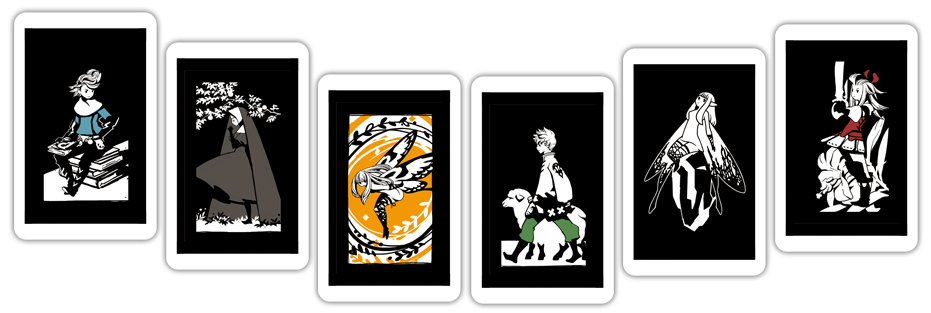
In relating to the disconnect of the concept/promotional art vs the in-game aesthetic, it really grinds my gears that they already made 3D models strongly representing the former and have been included in the shippable product. AR (Augmented Reality) cards (see image) allowed a brief glimpse of that possibility, running on the in-game engine.

No Caption Provided

These were made available for download/print, or were included in purchasing the collector's editions. They even used motion-capture to bring them to life in some of these story vignettes.

Having played the downloadable demo pre-release, I had already come to terms with the game art. But seeing them represented in superior fashion, through little more than promotional content, hurt my enthusiasm. Still, it's a great game to play. I simply wished its game art evolved like Fire Emblem did; fully embracing their conceptual art style as hardware improved.

Avatar image for efesell
Efesell

7502

Forum Posts

0

Wiki Points

0

Followers

Reviews: 0

User Lists: 0

#47  Edited By Efesell

The intro cinematic uses the same style as those cards and I think THAT all looks super uninspired. Like those dodgy cinematic they added to the snes FFs on Playstation.

Avatar image for dijidiji
dijidiji

287

Forum Posts

0

Wiki Points

0

Followers

Reviews: 0

User Lists: 0

I was bummed after the intro cinematic when it switched to the chibis. They're not even good chibis, IMO. On 3DS it wasn't a big deal because of the tiny screen, though. Bravely Default II looks somehow worse than the first game, though. Kinda like they tried to add more realism/detail to the models or something and it gives it a really weird, uncanny feel.

Avatar image for badseed
badseed

234

Forum Posts

0

Wiki Points

0

Followers

Reviews: 0

User Lists: 5

I'm not bothered because I grew up in the c64 era so i'm used to those things not matching at all.
I don't agree that Bravely Default looks bad though, it's a stylistic choice. It's not great looking either, but pretty far from bad

Avatar image for apewins
apewins

381

Forum Posts

0

Wiki Points

0

Followers

Reviews: 0

User Lists: 0

One of the characters of Bravely Default 2 seems to be a tall, trench-coat and fedora wearing, blonde and blue-eyed neckbeard and ponytail donning mage, and if so I have a feeling that Square-Enix knows their target audience a little too well. He's literally tipping his hat in one of the promo pictures.