Do you like the re-design of the site?

  • 188 results
  • 1
  • 2
  • 3
  • 4
Avatar image for do_the_manta_ray
Do_The_Manta_Ray

1681

Forum Posts

172

Wiki Points

0

Followers

Reviews: 0

User Lists: 0

Poll Do you like the re-design of the site? (869 votes)

Oh, yeah, it's snazzy and dark and it reminds me of Bladerunner, and that makes me happy. 15%
Yes. No 90's commentary needed. 23%
No, I think certain elements of it are far too large. 34%
Is this the beta? I think I've landed in the beta. 17%
Giant Bomb? Giant Dark Void is more like it. 7%
I consume all their content via youtube and am part of the problem. 3%

Question is pretty simple; do you like the new design of the site? I personally think it has a lot of promise, but that it launched too early. The beta period seemed to last no time at all, and any concerns I saw people bring up have not been addressed.

I've seen a lot of other folks who weren't so pleased either, so I thought we might establish a poll proper, as the staff hasn't actually asked us if we like it. I mean, they did, but then they launched that beta in the form it was in anyway, so.. Just.. Yeah. Point being; I wanna' hear what the "people" think at this point.

Now, please don't see this as an invite to complain about GB in general. Just it's shitty flashy redesign.

 • 
Avatar image for theadmin
TheAdmin

1062

Forum Posts

6686

Wiki Points

0

Followers

Reviews: 5

User Lists: 8

They could put an article up to ask us... oh wait, the homepage doesn't support anything besides video... well, guess someone can go find it under words?

Avatar image for do_the_manta_ray
Do_The_Manta_Ray

1681

Forum Posts

172

Wiki Points

0

Followers

Reviews: 0

User Lists: 0

#2  Edited By Do_The_Manta_Ray

Also, I was being extra mean in my description there because.. Well, this is just a big ol' stinking pile of hobgoblins. But I was going edit it as soon as I posted it once I'd had my laugh; but now I can't even edit the thing in any fashion; be it from this page or my own profile page.

I feel like my initial message was too kind in retrospect; in that I compared it to Bladerunner.

I don't wanna' come off as too negative here, it's great we're doing something new. It really is; this just seems a bit sudden and forced. Let's have ourselves a good ol' chat about it, and say what we would like to have improved.

Avatar image for justin258
Justin258

16684

Forum Posts

26

Wiki Points

0

Followers

Reviews: 11

User Lists: 8

#3  Edited By Justin258

I'm in mobile so I can't expand too much, but...

Eh. I don't like "bigass blocks" UI design, but that seems prevalent these days so I guess I oughta get used to it. I'll reserve my other comments until after I've used it for a while.

EDIT: All right. Now I'm on a proper computer and can type out what I think.

I don't really like it. I think the previous design was really, really good, it just needed some serious work with categorization. With the previous site, you could see a description of every video before opening it. Sure, it was always a little joke, but it was always nice to see and added a bit of character to everything. I don't see that when scrolling through the front page now. I don't see a lot of things, and frankly it looks a little barren. If this were my first time visiting the site, I don't think I'd know where to start.

But that's not the thing that bothers me the most. The thing that bothers me the most is that everything is too big. Way too big. The highlighted feature of the day, the thing that appears on top, takes up almost my entire screen at 100% zoom on Chrome (for more context - 1080p, 24" screen). Why is this the thing? What was wrong with the size before? And anyway, do we really need to go with the "bigass blocks" design that I keep seeing these days? I don't like that design. I like a thumbnail to the left, a title on top, and a one-sentence description below the title, and the next item below that. Not three gigantic fucking images next to each other, with a title and a post date below that and that's it. That looks barren.

Speaking of things that are too large, the forums are too small. When I'm zoomed at a hundred percent, the text in the forums is freaking miniscule while everything else is gargantuan. This means that in order for the forum text to be reasonable, I have to be zoomed in to 125%, which makes going back to videos even more of a pain because everything is so damn big.

As a staunch adherent to the black site, I also think this one might be a little too grayscale. A bit more color here and there would be great. Only a bit, though.

Is it going to stop me from visiting Giantbomb and paying for the site? Nope. If I didn't stop visiting while they were getting used to the new office, then I doubt that something as simple as a redesign is going to get me to stop now. I'll just get used to this version of the site's quirks and figure out what I need from there (alternatively, I'll start using QLCrew way more often - why Giantbomb hasn't looked to that for inspiration on how to organize videos, I'll never know). But that doesn't mean I like this site.

Avatar image for humanity
Humanity

21858

Forum Posts

5738

Wiki Points

0

Followers

Reviews: 40

User Lists: 16

#4  Edited By Humanity

So far not really.

I'm not sure where some of the design choices came from, and I'm equally not sure how some of the things remained the way they are and they decided "nope this is good, lets go." I particularly don't understand this new grey-on-grey color scheme the sit has adopted. I've always associated Giant Bomb with the color red, and it worked wonderfully on the black scheme. Now everything is completely muted with various shades of grey on grey. The same issues the forums have had still remain, like how messy quotes appear and how weird it is to edit messages with them, but now the stylizing makes everything blend together. Comments and forum posts on the mobile version are a weird mess with everything justified to the left leaving a huge empty space to the right, giant user names and extremely tiny "reply" buttons to comments hidden under them. All the empty space, the way videos show up newest to oldest from right to left for some reason. The huge "thanks for being a premium member" block that takes up a ton of space for no good reason.

I dunno, I'm sure it will get there, but it's not there yet and I'm not sure why they were in such a rush instead of continuing to tinker with it until it was solid.

Avatar image for efesell
Efesell

7501

Forum Posts

0

Wiki Points

0

Followers

Reviews: 0

User Lists: 0

It feels like the draft you think is done and perfect but no one else had ever seen it to edit.

Avatar image for alistercat
alistercat

8531

Forum Posts

7626

Wiki Points

0

Followers

Reviews: 2

User Lists: 27

#6  Edited By alistercat

I'm sorry, Dan, but I miss Alexis. (edited to be less of a dick)

I prefer Alexis' design sensibilities and general aesthetic to Dan's, so I'm not a fan.

Avatar image for xanadu
xanadu

2157

Forum Posts

0

Wiki Points

0

Followers

Reviews: 1

User Lists: 0

Wow did you have to make the poll options so shitty?

Avatar image for liquiddragon
liquiddragon

4314

Forum Posts

978

Wiki Points

0

Followers

Reviews: 2

User Lists: 19

#8  Edited By liquiddragon

@alistercat: Christ, really? This only aims to hurt. Wtf, these are actual ppl you know. You got a problem, point them out but don't be a fucking asshole. I've been seeing too much of this kind of bullshit.

This whole "make it like Netflix" sounds like Jeff's initiative so blame him if anything.

Avatar image for otacon
Otacon

2337

Forum Posts

846

Wiki Points

0

Followers

Reviews: 0

User Lists: 1

I basically only use the mobile site, seems cool to me!

Avatar image for alistercat
alistercat

8531

Forum Posts

7626

Wiki Points

0

Followers

Reviews: 2

User Lists: 27

#10  Edited By alistercat

@liquiddragon: You're right, it's overly simple, but conveys that I prefer Alexis' design sensibilities and general aesthetic to Dan's. It's too broad for criticism, but I also don't have the energy to give constructive feedback.

I have updated my post to be less dickish.

Avatar image for animasta
Animasta

14948

Forum Posts

3563

Wiki Points

0

Followers

Reviews: 4

User Lists: 5

dark site bad

Avatar image for alistercat
alistercat

8531

Forum Posts

7626

Wiki Points

0

Followers

Reviews: 2

User Lists: 27

@otacon said:

I basically only use the mobile site, seems cool to me!

I bet it plays a lot better on a mobile device.

Avatar image for deactivated-5d5f33a6b34f9
deactivated-5d5f33a6b34f9

210

Forum Posts

0

Wiki Points

0

Followers

Reviews: 0

User Lists: 1

It's very different but I think I'll get used to it quickly.

Avatar image for therealturk
TheRealTurk

1412

Forum Posts

0

Wiki Points

0

Followers

Reviews: 0

User Lists: 0

I really am not a fan. I think the unifying theme of my complaints is that it is too hard to find what I'm looking for. Here's what I mean via the rundown of my page as it looks on my laptop:

1. You start with this humongous most recent video. It is distractingly large, and moves everything else down the page so that I can't actually understand what's below it. While I can just barely see the tops of the next series of videos, I can't see enough to know what they actually are. If this isn't content I'm interested in, I need to start scrolling down the page.

2. A series of three recent uploads, which is OK, but also begs the questions why these aren't given a greater level of promotion? I'm guessing people aren't constantly looking at the site, so it would make more sense to display more items of recent content up front than forcing people to scroll. It's more likely I'll be "interested" in 1 of 4 items of content than a single giant item of "newest" content.

3. A gigantic section division telling me thank you for my premium membership together with the "Upcoming" content bug. This is functionally dead space. The thank you is something I really don't need and seems thrown in there because they needed something to balance out the line, while the "Upcoming" is something that should be visible immediately when you come to the site. Since I can't click on anything there, I need to scroll again to get to more content.

4. A "Now on Giant Bomb Infinite" bar. This is just weird. It's tiny and seems like something that could have been pinned at the top of the page. It's easy to miss where it is and again, just serves to push other things down the page.

5. The Continue Watching section. Personally this isn't useful to me, as it contains either (a) things I've already watched in their entirety or (b) content that I started watching but decided I didn't like. For people with different viewing habits, it makes far more sense to move this much farther up the page. If you were interrupted in viewing a feature, it seems like the first thing you would want to do is continue where you left off. Now it's buried half way down the page and requires scrolling to get to.

6. A section for Latest content. This is actually confusing to me. What's the difference between this and what's at the top of the page? Wouldn't a new or random viewer be most interested in the most recent content? Shouldn't this be farther up the page?

7. A "Popular" videos section, which is OK, but also isn't content I'm necessarily interested in.

8. Shows. I think this is more of a category than anything else. I think it would be better if these were in their own section in the navigation bar.

8. Quick Looks. Given that this is the primary reason I come to this site, I find it really obnoxious that I need to scroll down this far to find them.

9. This Day In Giant Bomb history. Sort of a random thing. It's fine down here.

10. Recent forum posts and staff twitter. I guess this is fine, although I have never liked the staff Twitter feed and think the site would be better off without it. However, if people like it, then that's OK too. My major problem here is that the Latest from the Community section is not sized properly. Because it is less tall than the Staff Twitter feed, there is a large amount of dead space at the bottom of the page. Making these the same height would allow more Community Content to be displayed.

That's it. Like I said, I'm not a huge fan. The pie in the sky ideal would be to give users control of the order and/or size of some of the sections so I can get a site that's actually useable for my preferences.
Avatar image for alistercat
alistercat

8531

Forum Posts

7626

Wiki Points

0

Followers

Reviews: 2

User Lists: 27

@therealturk: The "thank you" is in place of "sign up for premium" upsell slot. I agree that it's not a good solution but they needed something there.

Avatar image for mistersims
MisterSims

167

Forum Posts

0

Wiki Points

0

Followers

Reviews: 0

User Lists: 0

No, I do not.

Avatar image for alkusanagi
AlKusanagi

1667

Forum Posts

0

Wiki Points

0

Followers

Reviews: 0

User Lists: 4

I didn't want to say anything, but I think the new bomb is a narc...

Avatar image for do_the_manta_ray
Do_The_Manta_Ray

1681

Forum Posts

172

Wiki Points

0

Followers

Reviews: 0

User Lists: 0

#18  Edited By Do_The_Manta_Ray

I wanna' just hop back in here for a moment and say; I fucking love this website. It's special, to this day; there's something genuine and effortless about it that makes all 'em youtubers and .com imposters across the globe seem like they're just trying to hitch a ride. The content's amazing, the people are fantastic. I really wanna reiterate this, because I don't want this to get off-track.

Now.. That aside, I feel like the community matters fairly little to the site compared to the days of yore. That's fine.. I guess? My fondest memories are of weird forum threads involving photoshop, but hey; things change, the times change, people change. Biff has changed; to the detriment of us all.

But when you launch a beta for the "public" to weigh in on, and then don't implement any suggestion the community brings up for the actual release; that just makes it seem like any promise you're making for the future is hollow and empty, and we at Giant Bomb don't want that. We wanna' engage with the staff. (We even wanna' hear the in-depth details of Vinny's wood-working adventures.)

This is not the redesign of youtube, or gamespot, or Wikipedia or "properlypettingpuppies"; we ought to be able to have some say in this, the people who have supported the site for a decade. That might sound come across as entitled, but when we say "this shit is broke", please do listen. And I think that's all I think anyone has been asking. All the criticism I've personally seen so far has been level-headed and calm. But I don't know, maybe they're too busy recording "All Systems Goku". I'd personally take that trade any day.

Avatar image for mindbullet
MindBullet

879

Forum Posts

0

Wiki Points

0

Followers

Reviews: 0

User Lists: 4

I imagine part of it is just getting used to new things, but so far I'm not a huge fan. I do like some of the new features like the "watch more of [series]" scrollbar below videos and Continue Watching being on the front page.

Avatar image for mercutio123
mercutio123

570

Forum Posts

0

Wiki Points

0

Followers

Reviews: 0

User Lists: 0

@therealturk: You've nailed most of my criticisms. I will reiterate the things that I personally really don't like.

When you mouse over Videos or Podcasts etc. it should give me a list of what the different "shows" are not just a link to another page - this is frankly a garbage solution to just offload you to another page. The fact that is made worse that when you get to the new page everything is so bloody large you can't really browse quickly.

Also forums not being at the bottom of the page is really really not the way to keep the community engaged - I tended to just fly down to the bottom when I landed on the site and quickly have a nosey of what was going on in the forums - sounds ridiculous but because the forums are tucked away even a little bit I will be much less likely to go find them.

That GB premium membership banner has to go - it is absolutely useless.

And that HUGE video as you land on the page - if this was a player you could just start watching it'd be okay if not a little big - but it just bounces you to another page so it's useless.

Avatar image for frytup
frytup

1954

Forum Posts

5

Wiki Points

0

Followers

Reviews: 0

User Lists: 0

Those certainly are some poll questions.

The new design needs a light option, but other than that I'm good with it.

Avatar image for big_denim
big_denim

1125

Forum Posts

30

Wiki Points

0

Followers

Reviews: 6

User Lists: 1

#23  Edited By big_denim

Hmmm...well I guess I will chime in since I seem to be the only one with positive things to say (for the most part).

Some positive things:

  • The updates to how videos are grouped together is fantastic. It was a pain in the ass to find the premium video version of the bombcast if you didn't watch it that very day or the following day. Having it grouped under a 'Giant Bombcast' section with two easy toggles between premium/free and video/audio is so much better. Not to mention the fact comments are now combined (though I can see some folks wanting a filter to only see premium users maybe...doesn't bother me though).
  • Adding a 'My Watchlist' functionality that can support the addition of shows as opposed to individual episodes is great. I'm not sure if this functionality existed before, but if it did it wasn't nearly as obvious or easy to use. I, and I think other users of the site are similar, really only care about certain content where as other series I couldn't care less about.
  • Overall, the site has a much more approachable and professional design to it that I think will drive in new users. I discovered Giant Bomb via their podcast on iTunes. When I decided to finally check out the site because I liked the podcast content, I sat there looking at the homepage thinking 'huh...well this is kind of a mess.' The legacy design was a direct reflection on the company as whole still somewhat struggling to find their identity. Are they a news site? A review site? A personality content site? All of the above? The new design highlights what this site is all about and what their vision is moving forward.

I do have some criticisms though, and I believe I made the same criticisms in the feedback thread on the beta site. Soooo...

Some feedback/suggestions:

  • The black background stuff within text-based sections of the site has gotta go (or be an optional thing). It's fine for video-centric pages, but comments and forums is damn near unusable for me.
  • The NEW video-based review things they've been experimenting with. Are these something the crew/site is gonna stick with? If so, they should be under the 'Reviews' show (which is also lacking a logo at the moment). Right now, they are in a black hole within the site. The only way to view the newest reviews is to either navigate to the game page itself, or go to "Latest" in the videos drop down.
  • Community Spotlight seems redundant now. If the "Community" section of the site works as intended, we should need a blogpost that also tells all the cool stuff the community is currently doing. And for those that do like this blogpost style, I would argue it still belongs in the "Community" section of the site, and not under the strangely named "Words" section of the site.
  • OR...let's bring those last two bullet points together. How much written content does the site really put out these days? Outside of the community spotlight and written reviews...not much. So let's just move the community spotlight stuff to the community tab, create a new dropdown menu called reviews which stores both the video and written version of a game review, and leave it at that. Now you don't have to worry about having some weird, catch-all section in the site called 'Words.' Once in a blue moon, when you have something else that's written and doesn't fall under those two categories, it can probably be put in the GiantBomb newsletter and a temporary sticky in the forums and then call it a day.
  • The NEWEST CONTENT section on the front page, is too big. It's like reallybig. And I only watch about 1/3 of the content the crew puts out, so the other 2/3s of the time it's just wasted space to me. I'd rather a quick highlight on new content from my watchlist be the top thing on the page. It's an easy and effective way to make a dynamic homepage that caters to each unique individual visiting the page. You made the my watchlist tool snappy, intuitive, and enjoyable to use. So take full advantage of that functionality - don't bury it. Alternatively, a way for a user to customize which panels go where on the home page would be AMAZING. But I know that's probably a big ask, so maybe some re-ordering or re-sizing will do for now.

Overall though, I really dig this site, and I hope some of the negativity doesn't make you guys totally roll back. No offense to others in this thread, but it comes off as curmudgeon-y and just people that get too used to a bad design and are grumbling because they got used to the horribly flawed legacy design. The new design is so much better.

PS And some may say this, so I'll just come out and say it up front. I know. I know. I shouldn't be telling them solutions or suggestions. They know better than me on what does or doesn't work and why they did or did not make certain suggestions. But I figured I'd at least throw my suggestions out there. It helps convey how/why I feel a certain way without coming off as just a negative nancy.

EDIT: @rorie Do you know if the team will be doing any sort of survey or a more official message thread to gather feedback like they did with the beta? Or will the design team just be scouring message boards to see what folks are praising and grumbling over? No offense to OP, but a message thread like this where the poll options are a single option for 'yes, I like it', and all other options are some sarcastic variation of 'no, I don't like it' does not seem productive for the design team and GB crew to consume feedback in a useful and effective manner.

EDIT 2: Nevermind, I just noticed that the beta feedback thread is still open. I suppose feedback should still be getting logged there? Maybe?

Avatar image for shagge
ShaggE

9562

Forum Posts

15

Wiki Points

0

Followers

Reviews: 0

User Lists: 1

#24  Edited By ShaggE

It's far from dialed in (the beta ended far too early), but I like what they're aiming for. Let's say I cautiously like the redesign.

But yeah, above all else, please shrink that damn recent video splash. It's way too big, and I keep accidentally opening new tabs as a habitual "click the scrollwheel to scroll" person who easily forgets that 90% of the screen is a link to another page.

One of my biggest positives, to contrast, is how snappy and sleek the user menus are. It feels good to scroll over my notifications.

Avatar image for mistersims
MisterSims

167

Forum Posts

0

Wiki Points

0

Followers

Reviews: 0

User Lists: 0

@jaalmo: im with you on this. i also really hate the carousels.

Avatar image for johnnymcginley
johnnymcginley

550

Forum Posts

4

Wiki Points

0

Followers

Reviews: 0

User Lists: 0

My feeling is that it was taken out of beta too quickly and a lot of the issues haven't been addressed, alongside a heap of small details that cheapen the look, feel and functionality of the site.

Avatar image for jaycrockett
jaycrockett

873

Forum Posts

80

Wiki Points

0

Followers

Reviews: 13

User Lists: 5

It's fine. It confirms that the site continues to move away from text towards video, which is personally not to my liking but it's certainly not surprising.

Avatar image for 49th
49th

3988

Forum Posts

26

Wiki Points

0

Followers

Reviews: 0

User Lists: 5

I have no idea what I'm supposed to answer, this poll is completely useless.

I think the redesign had some decent ideas but they didn't spend long enough thinking about how people would actually interact with the website. It takes too many clicks to get where I want to go. I think the carousels are unnecessary and annoying and prevent me from seeing content. They could also do with re-ordering the front page instead of having a giant wasted space with the Premium/Upcoming thing taking up the entire screen for no reason. It's even above the Latest section which makes no sense to me - I want to see what I can watch now, not what I can watch tomorrow. I like all the new artwork including the logo though.

Avatar image for wjb
wjb

2158

Forum Posts

0

Wiki Points

0

Followers

Reviews: 0

User Lists: 0

Don't have too much of an issue with it; I just have to get used to it.

The "Continue Watching" works for Netflix because it's mostly TV shows with several episodes and (maybe) multiple seasons. Stuff I would most likely continue watching in the future. When I'm done with something it goes away. Here it's nothing but singular videos I just got done watching within the past week and will probably not watch again anytime soon. Unless I'm bad at finishing videos, there's no reason to have a carousel of it, especially when it's similar to "Popular Videos" or whatever. Even Netflix knows this.

And I'm kind of meh about the new bomb logo. It's nbd, though.

Avatar image for the_nubster
The_Nubster

5058

Forum Posts

21

Wiki Points

0

Followers

Reviews: 3

User Lists: 1

#30  Edited By The_Nubster

Most of the criticism has been fairly level-headed but this thread was just made with the intent to hurt. Seriously OP, you're being a massive dick both in the original post and your follow-up. It's fine not to like it but you really don't have to be so abrasive about it.

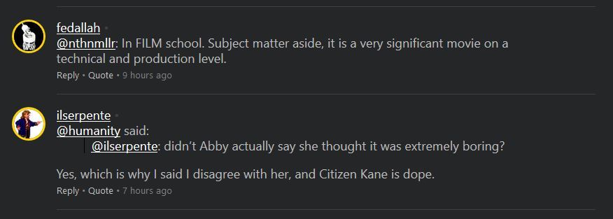
With that being said, it does need some tweaking. One thing I've noticed, since going through the "On This Day" videos and diving into the comments, is that the comments section has ended up being somewhat difficult to read. Usernames and @'s within the post are both aligned which isn't very pleasing to look at. The flat design also makes the comments section somewhat difficult to browse with little other than a thin line between each individual comment.

No Caption Provided

I'm not a designer so take whatever I say with a grain of salt, but it would be good to have a little more emphasis on each individual comment, and then have the body of the comment be aligned differently than the poster's name.

Edit: I'm just now noticing that little gray dot next to the name. When a user is online, there's a blocky green chunk that says "Online" and doesn't line up with the spacing of the name. Could this little dot instead be used to denote whether a user is online or off-, ie. green when online or gray as pictured otherwise?

Avatar image for ares42
Ares42

4562

Forum Posts

0

Wiki Points

0

Followers

Reviews: 0

User Lists: 0

#31  Edited By Ares42

I think there's some nice ideas with a lot of bad execution. The thing that boggles my mind the most though is that they were totally aware of the fact that the way Bombcasts were archived was bad (where it displayed the last five or so and you had to keep clicking a button to cycle through the next set), and now they've made the entire front page exactly into that.

I think they would've benefited a lot from trying to make a flowchart of how someone would use their site and then design the main page around that. I suspect the vast vast majority of the traffic on this site now is open the front page, pick a category from the top bar, pick the specific content you want. So why not make the top bar into the front page ?

In the end it's like every other website redesign, we're gonna get used to it but it never seems to actually make the experience more user friendly.

Edit: It says something that I've probably opened the front page 20+ times today to "test" the site in different ways and it took 5 hours before I discovered there was a new QL released.

Avatar image for strikealight
StrikeALight

1275

Forum Posts

0

Wiki Points

0

Followers

Reviews: 0

User Lists: 0

Well, I like the look of the site, but perhaps the functionality - not so much.

I'm a simple guy, so perhaps it will just require a little time to make the most of its features.

I still miss the 2009 site design, so...?

Avatar image for frodobaggins
FrodoBaggins

2267

Forum Posts

0

Wiki Points

0

Followers

Reviews: 0

User Lists: 0

I do not like it at all.

Avatar image for sethmode
SethMode

3666

Forum Posts

0

Wiki Points

0

Followers

Reviews: 0

User Lists: 0

#34  Edited By SethMode

I think that it's fine. I don't find it confusing or hard to locate things. The only complaint I could see myself having is just based around my own personal need to just get used to the new thing.

Avatar image for ben_h
Ben_H

4829

Forum Posts

1628

Wiki Points

0

Followers

Reviews: 1

User Lists: 5

#35  Edited By Ben_H

The Show stuff is cool, though I would like there to be a way to track progress on the show page itself. The old "how much you've watched" bars on the old site were good for that. Something like that. I'm always like 5 episodes behind everything and those bars were how I kept track of what I had watched. Or even some kind of indicator of whether I've watched or have partly watched a video. That would help too. The bars are on the front page but not the actual show pages themselves.

I like the direction the front page is going, but I do think some of the elements are too big and spaced out on it. Even just scaling down the top video player thingy enough so that it shows a whole row beneath it instead of a fraction of a row would help a lot with making the initial load of the webpage look a little cleaner. Also, adding a carousel for text articles would be a good idea too since right now it's hard to tell when a new text article comes out without having to go into a menu.

This Day In Giant Bomb history is super duper cool. It's a great way to surface old content. I've already watched a couple things off of it.

Avatar image for mrgreenman
MrGreenMan

452

Forum Posts

0

Wiki Points

0

Followers

Reviews: 0

User Lists: 0

I do love the dark theme. Just a lot easier on my awful eyes. A few minor things are a little confusing but after a week I'm sure I'll used to it. Overall everything cleaner, smoother and a just feels more natural and easier to find. Overall is pretty rad. I give it 5 burritos out of 5. Would play again.

Avatar image for btsjigs
btsjigs

59

Forum Posts

30

Wiki Points

0

Followers

Reviews: 0

User Lists: 0

#37  Edited By btsjigs

I’m a fan. Great work guys!

Avatar image for shiftygism
shiftygism

1729

Forum Posts

0

Wiki Points

0

Followers

Reviews: 0

User Lists: 0

Gimme a light theme for the boards, and the old logo back and I'm good.

I'll never shut up about the logo change, it was f'n perfect.

Avatar image for echasketchers
echasketchers

910

Forum Posts

0

Wiki Points

0

Followers

Reviews: 0

User Lists: 6

*shrugs* I like it, no complaints so far. Its easy enough to get to videos I want to watch, and I've wanted a proper watchlist feature like Youtube has for a while.

Avatar image for wrighteous86
wrighteous86

4036

Forum Posts

3673

Wiki Points

0

Followers

Reviews: 5

User Lists: 1

Hey, I managed to find the forums which are likely to die under this redesign.

Avatar image for coryukin
Coryukin

114

Forum Posts

28

Wiki Points

0

Followers

Reviews: 0

User Lists: 12

I think things are easier to find in a lot of ways, but it takes soooooooo many more clicks to get to anything you want to get to.

Avatar image for cursethesemetalhands
CurseTheseMetalHands

210

Forum Posts

0

Wiki Points

0

Followers

Reviews: 0

User Lists: 0

Honestly, I thought the link was broken and I got one of those shitty 'own this address' pages or something. This design is fucking terrible, not to mention ugly as sin. It looks like fucking YouTube or something, what with the near total eradication of text and all the big, dumb baby-friendly pictures that just link to videos. I mean, I'm sorry, because I know someone probably worked hard on it, but...fucking hell. Could I get used to it in time? I'm sure I could. But it kinda makes me want to not visit the site, so I'll likely never give it that time.

I freely admit, I've never been the biggest fan of change. And Giant Bomb, for better or worse, has been going through a lot of changes lately. Not sure I can handle one more.

Avatar image for mellotronrules
mellotronrules

3606

Forum Posts

26

Wiki Points

0

Followers

Reviews: 0

User Lists: 0

i think it looks pretty good on my phone ans ipad- but if i’m being honest there’s a lot of friction between me and the desktop browser site. a lot of clicks, extra space and a design that seems better for a tv than mouse and monitor....which is a bit of a bummer given desktop is still my main point of interaction.

and yeah- i worry this is the final nail in the coffin for the forums. and i really don’t want to go to reddit.

Avatar image for csl316
csl316

17004

Forum Posts

765

Wiki Points

0

Followers

Reviews: 0

User Lists: 10

I don't know, I'm not used to it. So ignore the grumpiness here, but the last major update gave me a purely positive reaction.

It seems a little barebones and feels like I'm scrolling more than I needed to before. I haven't been a fan of site trends of making things way larger. I'm also not sure why I have to click on a dropdown now to get download options. Having those options slowly fade in takes a second too long.

Didn't the front page show descriptions of the videos, or am I making that up?

And on mobile, I can't just scroll up and down. Gotta scroll down a little, let the site settle, then swipe horizontally with my shaky hands.

Avatar image for empiresoul
empiresoul

2

Forum Posts

0

Wiki Points

0

Followers

Reviews: 0

User Lists: 0

When the site loaded up I thought i clicked on the wrong link at first. I left and came back and then thought the website loaded wrong and refreshed the page. After this, now knowing it had be redone, I was pretty upset with the new look. While I enjoy the fact that it's now more or less a dark mode of the site, I feel it looks like an starting website someone made for a class in intro to web design. I feel like that the old site was so well done, so easy to use and navigate, and now it takes several clicks to get to the things i want to see. While it's not all bad, some things are easier to find on the front page, but the overall look of it is just not good. It's just an ugly design now with everything just blending into the background and into the other things on the page.

Avatar image for boozak
BoOzak

2858

Forum Posts

0

Wiki Points

0

Followers

Reviews: 0

User Lists: 5

I'm gonna be honest, I havent liked any of the redesigns but i've gotten used to them. I'm sure if there was an option to go back a few versions i'd be like "what is this shit!?".

Avatar image for deactivated-5c295850623f7
deactivated-5c295850623f7

497

Forum Posts

0

Wiki Points

0

Followers

Reviews: 0

User Lists: 0

I've been an FED for a while and I get feeling rushed and overwhelmed, but the styling issues (no inertia scrolling, weird margins, missing line breaks, random padded inline sections, mixed line-heights and letter-spacings, mishmash of widths) still being present on launch seem like mistakes I made when I wasn't as experienced.

Functionally it's great and this isn't meant to sound mean, but the styling is seriously not there yet and hopefully highlights the need for a rollback and a massive tidy up.

Avatar image for giant_frying_pan
giant_frying_pan

133

Forum Posts

5

Wiki Points

0

Followers

Reviews: 0

User Lists: 2

It's okay. Definitely a little half-baked, but I don't think much has to be done to tighten things up...especially with everyone's excellent constructive feedback.

I know how hard everyone has worked and of course, I have a decade's worth of attachment but...I really dislike the new logo I'm afraid. I notice the intent is to use the style with different iterations (e.g. on the pint glass) but it somehow looks more dated than the one from 2008.

And you got rid of the spark over the 'I' :(

Avatar image for hnke
hnke

201

Forum Posts

0

Wiki Points

0

Followers

Reviews: 0

User Lists: 0

#49  Edited By hnke

I posted this in another thread but this seems like a better place for it. The highlighted feature element is comically large to the point that it takes up almost the entirety of the usable browser area of a 1440p screen. Here's a simple comparison of the way it currently is and the way it would look if trimmed a bit (I just scrolled down a little).

The current state of things:

https://i.postimg.cc/NG94XYd9/before-final.jpg

A more reasonable state of things:

https://i.postimg.cc/26q4nF7R/after-final.jpg

And have they said something about the reasoning behind what appears to be an attempt at constricting the forums? Seems like a weird thing to do given the importance of community engagement on this website. If the problem is a lack of space, I know just the place to get it.

Avatar image for wightnnerdy
WightnNerdy

696

Forum Posts

603

Wiki Points

0

Followers

Reviews: 32

User Lists: 16

I don't really like it so far, mainly because everything is so huge and in your face while other things are hard to find. To be fair I haven't used it enough, and honestly I don't think I've ever really loved any of the site designs anyways.

One thing that sort of bugs me is the new logo. I feel like it's a half-step. I think the new bomb dude is OK but I think they should've went for something completely new. Just my two cents.