Poll Fable: The Lost Chapters VS Fable Anniversay: Which artstyle you like best? (85 votes)
Which artstyle do you prefer?
Here is a video comparison of both:
Which artstyle do you prefer?
Here is a video comparison of both:
While I appreciate a lot of the graphical improvements in the new version, it feels like it takes away some of what made Fable what it was aesthetically. Kind of felt that way in the quick look, too.
People are still slapping the "next gen" dull, muted colors filter on things?
I thought the industry had come out the other side of that fad...
@theht said:
There's something more mellow about the Anniversary style that's easier on the eyes. Muted colours? Softer everything? I dunno, it's just more pleasant to look at, even if that adult child looks creepy as fuck.
my thoughts, essentially. The only thing I dislike about the art in Anniversary is that the character models (well, a lot of them anyhow), look far too realistic to fit into the "cheeky Disney" tone of the overall game. I got over it in a lot of cases (Twinblade looks fantastic, for instance), but the Chicken Chaser looks like he has downs syndrome. It's really off-putting.
People are still slapping the "next gen" dull, muted colors filter on things?
I thought the industry had come out the other side of that fad...
Unreal Engine 3..... it cannot get anything down right. The people who make it look good are few.
People are still slapping the "next gen" dull, muted colors filter on things?
I thought the industry had come out the other side of that fad...
Unreal Engine 3..... it cannot get anything down right. The people who make it look good are few.
irrational got it really damn good looking/colorful with Bioshock Infinite
uhhhhh...... uhhhhh..... uhhhhh..... mmmm..... making lots of faces.
well I got this weird bug where Elizabeth just stuck to one frame and then was ice skating along her series of lanes and then waited to lock into her next frame of animation. That was probably the worst first impression I got Bioshock Infinite, I don't deny it's interesting in a hand crafted sense....... BUUUUUUUUUUUUUTTTTTTTTTTTTTTTTTTTTTTTT....... I've seen the concept art of elizabeth and their modelers are really amateurs compared to pencils.
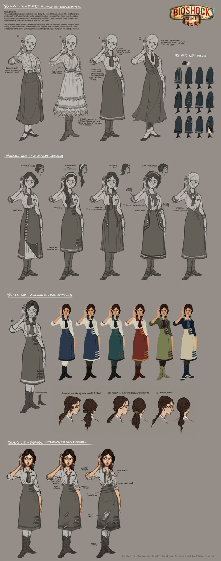
this is the same reaction I had to 90s disney animation concept art. Man wished Aladdin looked this good, man beast looked better.
People are still slapping the "next gen" dull, muted colors filter on things?
I thought the industry had come out the other side of that fad...
Unreal Engine 3..... it cannot get anything down right. The people who make it look good are few.
irrational got it really damn good looking/colorful with Bioshock Infinite
uhhhhh...... uhhhhh..... uhhhhh..... mmmm..... making lots of faces.
well I got this weird bug where Elizabeth just stuck to one frame and then was ice skating along her series of lanes and then waited to lock into her next frame of animation. That was probably the worst first impression I got Bioshock Infinite, I don't deny it's interesting in a hand crafted sense....... BUUUUUUUUUUUUUTTTTTTTTTTTTTTTTTTTTTTTT....... I've seen the concept art of elizabeth and their modelers are really amateurs compared to pencils.

this is the same reaction I had to 90s disney animation concept art. Man wished Aladdin looked this good, man beast looked better.
well you're looking at a 3d game and not hand drawn art so obviously it's not the same thing is it? i thought the animations (particularly of Elizabeth) were sublime for the most part, especially her dancing and the Will the Circle Be Unbroken scenes (about as Disney hand drawn as you can get with 3d graphics imo). i'm sorry you got a bad first impression here but i think you want it to be something it isn't. B:I is definitely a league above your average Unreal Engine 3 game in terms of art design any way you cut it (it's probably the only game using that engine i can recall that doesn't have that chunky glistening look to it).
People are still slapping the "next gen" dull, muted colors filter on things?
I thought the industry had come out the other side of that fad...
Unreal Engine 3..... it cannot get anything down right. The people who make it look good are few.
irrational got it really damn good looking/colorful with Bioshock Infinite
uhhhhh...... uhhhhh..... uhhhhh..... mmmm..... making lots of faces.
well I got this weird bug where Elizabeth just stuck to one frame and then was ice skating along her series of lanes and then waited to lock into her next frame of animation. That was probably the worst first impression I got Bioshock Infinite, I don't deny it's interesting in a hand crafted sense....... BUUUUUUUUUUUUUTTTTTTTTTTTTTTTTTTTTTTTT....... I've seen the concept art of elizabeth and their modelers are really amateurs compared to pencils.

this is the same reaction I had to 90s disney animation concept art. Man wished Aladdin looked this good, man beast looked better.
well you're looking at a 3d game and not hand drawn art so obviously it's not the same thing is it? i thought the animations (particularly of Elizabeth) were sublime for the most part, especially her dancing and the Will the Circle Be Unbroken scenes (about as Disney hand drawn as you can get with 3d graphics imo). i'm sorry you got a bad first impression here but i think you want it to be something it isn't. B:I is definitely a league above your average Unreal Engine 3 game in terms of art design any way you cut it (it's probably the only game using that engine i can recall that doesn't have that chunky glistening look to it).
concept art is an interesting thing, sometimes it's super ambitious and sometimes there's ideas where you can see where they went the wrong way. Personally for me, just kept seeing the flaws in the tech, the unreal engine 3 has this weird animation problem which should happen father way models to have less animation to save up memory..... but then suddenly happen to the model just standing in front of me, best example of this are the combine forces in HL2ep2 scene. And yes, it's a very hand crafted detailed world where everything has this care put into it..... just wish it didn't feel like wood, even the people, which is again another problem with the unreal engine 3.
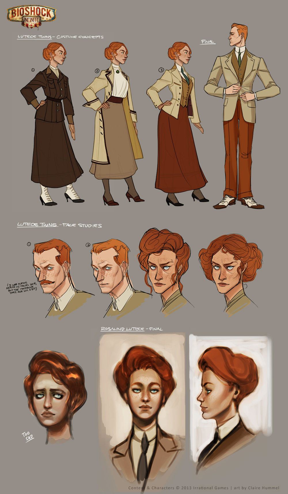
It's a weird thing, if the character isn't gears of war, then it looks off, there's some impressive soft skin that could be achieved, but even then memory needs to slowly catch up and then we get numerous glitches.
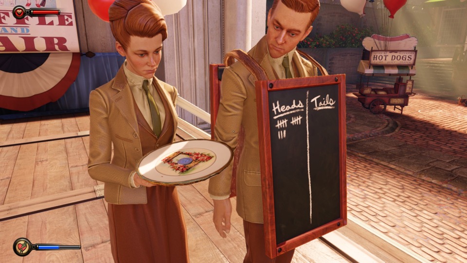
I'm not saying it's the worst looking game in the world, far from it. It feels like a marionette, and marionettes are not easy to puppeteer, they are really delicate and ornate characters and when they emote it's really beautiful. I just think it could have had just a little bit more, just a bit, just a bit. Maybe an engine that didn't fall apart every few seconds. I'm reminded of a line by Brad Bird on the Incredibles "WHY CAN'T IT DO WHAT I CAN DO WITH A FUCKING PENCIL! GOD DAMNIT!" I wish I wasn't joking on that one.
By the way, the artist Clair Hummel worked on Kinect Disnland Adventures, Kinectamles, and I believe right now she's on Fable Heroes?
I prefer the original, but it's probably partially because Fable is my favorite Xbox game, so it's completely ingrained in my mind at this point.
...Man I did not know anniversary looked so crappy. I can safely say I prefer Lost Chapter over anniversary which just looks dull and generic. The fable games have always had a very bright cartoony fairy tale look to the world. One of the big things that makes it different to something like skyrim. Anniversary has more detail but it just looks worse than all the fable games. The character models are even worse by the look of it. I wonder how the magic and effects look?
Please Log In to post.
Log in to comment