Post-Redesign Development & Design Priorities

Avatar image for deactivated-64b8656eaf424
deactivated-64b8656eaf424

1450

Forum Posts

12205

Wiki Points

0

Followers

Reviews: 0

User Lists: 1

^^

I think I like that new change. Curious though, what determines the bg color? It doesn't seem to be locked to the show. At a glance I'm seeing greens and red/browns a lot, maybe it analyzes the thumb and picks a color? Well, anyway. On Firefox (at least on my end) there's a scrollbar on the box regardless of if there's anything to scroll. No idea if that's a FF bug or what though, but figured I'd mention it anyway.

Avatar image for flasaltine
flasaltine

2547

Forum Posts

739

Wiki Points

0

Followers

Reviews: 0

User Lists: 0

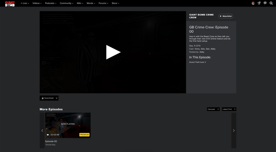
I do not like that the video player is now off center and smaller than it was before. Bad change. The information is great but it should be below the video, not attached to it.

Avatar image for pd
PD

170

Forum Posts

288

Wiki Points

0

Followers

Reviews: 5

User Lists: 9

#154  Edited By PD

I really like the look of how the information is displayed. Unfortunately, as much as I wanted to see more info more easily on the video page, that wasn't a feature worth losing full width video to me. Having the full width video up at the top was great. Now it's this small box off the the side and there's no button to enlarge the player. The closest toggle would be the "Fill to browser" button but that's not actually useful to me. I don't want the video to just take up my entire browser window in the center, and black out everything else. Usability wise, a full width video up top that still leaves the page navigable was perfect for how I watch videos (on GB and other video sites). Think maybe we can get toggle for the player size now? The return of embiggen maybe?

No Caption Provided

I'm also seeing a bug in Safari 12.1 on macOS 10.14.4 where the new video page is misaligned and allows me to scroll horizontally. Doesn't happen on Chrome on macOS. Added a little gif of that below.

EDIT: That bug seems fixed now. That was quick! Thank you!

Either way, I think it's great that y'all continue to take in feedback and try your best to make something that works for everyone. Thanks for your hard work.

Avatar image for tricksterloki
TricksterLoki

18

Forum Posts

0

Wiki Points

0

Followers

Reviews: 0

User Lists: 0

On one hand, I really enjoy the video information. On the other I am really missing the Embiggen feature, its how I mostly like to watch videos on my second monitor. Loosing that video space for me is kind of a shame, especially because there is no option otherwise.

Avatar image for garr123
Garr123

91

Forum Posts

0

Wiki Points

0

Followers

Reviews: 0

User Lists: 0

Echoing the sentiment that I like the information actually being available, but miss embiggen and just generally having a larger player without having to fill browser. Having a step between small and FILL IT ALL is nice for a large monitor.

Avatar image for wemmick
wemmick

138

Forum Posts

48

Wiki Points

0

Followers

Reviews: 0

User Lists: 2

@garr123: Indeed, we will look for a way to replace embiggen. Good call.

Avatar image for wemmick
wemmick

138

Forum Posts

48

Wiki Points

0

Followers

Reviews: 0

User Lists: 2

@theadmin: I just updated the list - we're just about done!

Avatar image for chaser324
chaser324

9415

Forum Posts

14945

Wiki Points

0

Followers

Reviews: 1

User Lists: 15

#159 chaser324  Moderator

Just wanted to say that I appreciate the work on the new episode page. It's a big improvement. Having a more easily readable description and all of the tags is much appreciated. It's also nice that the free/premium audio/video option on the Bombcast is much more apparent because that was something that people would frequently not notice on the previous layout.

Avatar image for brainscratch
BrainScratch

2077

Forum Posts

0

Wiki Points

0

Followers

Reviews: 0

User Lists: 0

#160  Edited By BrainScratch

@flasaltine said:

I do not like that the video player is now off center and smaller than it was before. Bad change. The information is great but it should be below the video, not attached to it.

Came here to say this as well. This current format is an huge improvement over the one that launched with the new website, but I'm not a fan of the off center and, more important, the lack of embiggen. I think it should work like the old website: small player looks like it is now, embiggen player has a way bigger video and all the info below it.

The download button now looks real out of place and taking unnecessary space. It would probably look better inside that new side bar. Watchlist button also looks weird next to titles without logo (mailbag and unfinished, for example).

I also feel like there's some issues with spacing and padding, but that's an issue with the site redesign overall and not just the videoplayer, and I still have to use the site in 80% or 90% zoom otherwise it's an eyesore.

And there's still to way to differentiate between underlined text and linked text. Bullet points and numbered lists also don't work, they show on the edit box but not on the actual comments.

Avatar image for theadmin
TheAdmin

1062

Forum Posts

6686

Wiki Points

0

Followers

Reviews: 5

User Lists: 8

probably a bug: https://www.giantbomb.com/shows/kane-cups/2970-19258 the video player doesn't match the width of the content below it - the panel is not wide enough.

Avatar image for the_nubster
The_Nubster

5058

Forum Posts

21

Wiki Points

0

Followers

Reviews: 3

User Lists: 1

@johnymyko: The underline-vs-link thing is really a bother. I hope that gets addressed soon.

As for the new video player, @wemmick, I think having the info surfaced is great. I do miss the player being centered, though; it doesn't look natural as it is now. Would it be possible to implement a toggle for the info? Almost like an attached tab you could pull up and tuck away at will?

Avatar image for fetchfox
fetchfox

1835

Forum Posts

219

Wiki Points

0

Followers

Reviews: 0

User Lists: 0

After the update I can no longer cast videos to chrome cast without it chopping (using an android phone, Nexus 6p). And that goes for live shows too, but it's been like that since forever. It's really annoying that I can't use this fantastic feature, which did work.

Avatar image for eulogize_my_baked_goods
eulogize_my_baked_goods

215

Forum Posts

16

Wiki Points

0

Followers

Reviews: 3

User Lists: 0

Credit where credit is due - the updated video page is good. It provides the information you need as a viewer in a clear, unfussy manner and embeds these pages better within the rest of the site (ie, the player pages are no longer islands without links to the wiki any longer). Keep up the good work.

Avatar image for brainscratch
BrainScratch

2077

Forum Posts

0

Wiki Points

0

Followers

Reviews: 0

User Lists: 0

I know the design is not a top priority and pages with more content look better but, oh boy, the video page of a new show is a great example of how the new website lacks it's own personal character and feels like a soulless and unfinished generic template with buttons and text randomly placed.

I'm sorry for being so harsh and direct, but this shot really shocked me:

No Caption Provided

Again, I know other pages don't look like this and I understand Giant Bomb is just one of the sites the team is working on. But I felt like this was a really great example of why most of us feel like the new site is a step down.

Avatar image for pandashake
pandashake

762

Forum Posts

14

Wiki Points

0

Followers

Reviews: 0

User Lists: 1

Can the video information be an overlay instead that slides in from the right when you move your cursor over the video? That way, the video can stay centered and the area around the video remain clean.

Avatar image for theadmin
TheAdmin

1062

Forum Posts

6686

Wiki Points

0

Followers

Reviews: 5

User Lists: 8

I know the design is not a top priority and pages with more content look better but, oh boy, the video page of a new show is a great example of how the new website lacks it's own personal character and feels like a soulless and unfinished generic template with buttons and text randomly placed.

Again, I know other pages don't look like this and I understand Giant Bomb is just one of the sites the team is working on. But I felt like this was a really great example of why most of us feel like the new site is a step down.

Not to mention that it's very difficult to see which are links vs just regular text in the description box.

Avatar image for cettu
cettu

125

Forum Posts

5940

Wiki Points

0

Followers

Reviews: 0

User Lists: 0

#168  Edited By cettu
@theadmin said:
@johnymyko said:

...

Not to mention that it's very difficult to see which are links vs just regular text in the description box.

@wemmick And this is why I (and others) have been asking for y'all to bring back the red links (and names, and really wherever it extended to in the old design) since the day we got this new look.

Not only would it bring back some lost personality, it would also fix this problem (which extends to the forums and the wiki) of not being able to easily distinguish between linked content and underlined text, unless you hover over them. Please bring back the color! I haven't been constantly posting about this issue here since that would be annoying, and I assumed it was something you've been looking at. But nothing's really happened on that front to my knowledge, so I'm mentioning it once more.

Not to be all negative, I have to say the new video page looks much better in my eyes. And as long as you also bring back the embiggen feature or something similar (which you've acknowledged, thank you), I'm all good on that front.

Avatar image for fistoh
Fistoh

298

Forum Posts

769

Wiki Points

0

Followers

Reviews: 2

User Lists: 3

Can the video information be an overlay instead that slides in from the right when you move your cursor over the video? That way, the video can stay centered and the area around the video remain clean.

Also, this just occurred to me for the Talk Over State of Play, if it's a video like that where there is an element of mystery to the games in the video, it would be nice if that could be hidden at first just in case someone would rather not be spoiled. Especially with press conferences coming up, I know I like going into those things without knowing what the games are going to be.

Might have it be a preference so people can toggle it on if they don't care and want the information right there.

Avatar image for swordstruck
swordstruck

124

Forum Posts

0

Wiki Points

0

Followers

Reviews: 0

User Lists: 0

Did the redesign of the video slot make it so that videos now start playing immediately after landing on the page? Can this be turned off? Or at least be changed to respect the 'autoplay' setting on the user profile?

Avatar image for convox
ConVox

472

Forum Posts

0

Wiki Points

0

Followers

Reviews: 0

User Lists: 0

#171  Edited By ConVox

Can we please have a mechanism to collapse the Carousel - and remember this preference? I don't make use of the carousel to move to new videos and it effectively forces you to scroll the video off-screen in order to access the comments.

Similarly, I've never intentionally used the 'Play Next' button at the end of a video - but I've sure come back to a videos I left playing and find the tiny replay button and lack of a timeline frustrating to deal with.

Edit: And while we're at it can we take that Download button and put it at the bottom of the video deck? It's just one more element spacing the page out vertically right now.

Avatar image for monkatar
Monkatar

6

Forum Posts

0

Wiki Points

0

Followers

Reviews: 0

User Lists: 0

#172  Edited By Monkatar

Hi,

Do any of you have problems with the new site regarding video playback via Chromecast? I can not watch the videos anymore since they start horribly stuttering after approx. 30 seconds of playtime (both audio and video). Was the encoding changed with the redesign or something that might affect Chromecast playback? Is this the correct thread to ask about this or should I write a support mail?

Avatar image for hardtarget
Hardtarget

389

Forum Posts

0

Wiki Points

0

Followers

Reviews: 0

User Lists: 14

@wemmick said:

@garr123: Indeed, we will look for a way to replace embiggen. Good call.

oh thank god. I've been asking for this since the original redesign

Avatar image for mrbubbles
mrbubbles

1558

Forum Posts

152

Wiki Points

0

Followers

Reviews: 0

User Lists: 17

I'd really like an option to disable autoplay when I click on a video. Sometimes I don't want to watch the video right away or other times I've watched the video already and just want to browse the comments and it's real annoying when the video starts playing again.

Avatar image for dawnrazor
Dawnrazor

11

Forum Posts

0

Wiki Points

0

Followers

Reviews: 0

User Lists: 0

@monkatar said:

Do any of you have problems with the new site regarding video playback via Chromecast? I can not watch the videos anymore since they start horribly stuttering after approx. 30 seconds of playtime (both audio and video).

I have had this exact issue for some time now, I really hope this gets some attention.

Avatar image for themanwithnoplan
TheManWithNoPlan

7843

Forum Posts

103

Wiki Points

0

Followers

Reviews: 1

User Lists: 14

Is there any update with the readability issues for the forums and wiki involving the bright white text over black background? It's ultimately led to me almost never checking gb anymore (besides checking this very thread every couple weeks) I miss it.

Avatar image for pd
PD

170

Forum Posts

288

Wiki Points

0

Followers

Reviews: 5

User Lists: 9

#177  Edited By PD

Oooo. Nice change to the homepage with the carousel arrows. I did notice that now the "Latest" section only shows 6 videos now though. It used to show either 2 or 3 sets of 5 videos. Is that a bug or is the new limit intended?

EDIT: Looks like that's fixed now!

Avatar image for theadmin
TheAdmin

1062

Forum Posts

6686

Wiki Points

0

Followers

Reviews: 5

User Lists: 8

#178  Edited By TheAdmin
Typography. Typography everywhere.

Hey @danauer not sure if this is a bug, but it looks like the fonts are kinda all over the place. The updated dropdowns (which are now in 3 different styles - black, white/clear, small) read at heading size. Plus it's a little confusing with the pagination so close with the thumbs when there are a bunch of them. There's a lot of white space that doesn't help anchor the sections.

My suggestion would be to make the dropdowns the black again and put them by the arrows and have them be the same height, which is where people will most likely be putting their mouse to move through the list. Then give the carousels/grid a heading of "More in this series" to even out left/right side. You should move the buttons such as download into the bottom of the info panel, then the context is clear that it relates to that specific item. I'd also suggest a divider line between the related vidoes and the comments, or better yet, move them to a tab like system where I can call them up if I want to read them.

Lastly, can you please please please make grid/carousel a choice that stays as I browse?

Avatar image for danauer
danauer

59

Forum Posts

0

Wiki Points

0

Followers

Reviews: 0

User Lists: 0

@theadmin: You're right, there's a lot of moving parts here. There's some updates we have lined up that changes things site-wide for colors, especially in all the text. There's more updates that focus on modules specifically – like the carousels. This stuff is going out iteratively, so definitely keep an eye out. We're making sure to avoid big, monolithic changes for a myriad of reasons but that means these early updates might have some inconsistencies.

Also I could've sworn I've asked about persisting the grid/carousel choice. I don't have a definite answer for ya but I'll absolutely bring it up.

Avatar image for themanwithnoplan
TheManWithNoPlan

7843

Forum Posts

103

Wiki Points

0

Followers

Reviews: 1

User Lists: 14

Awesome! Appreciate the info!

Avatar image for the_nubster
The_Nubster

5058

Forum Posts

21

Wiki Points

0

Followers

Reviews: 3

User Lists: 1

I brought this up in Bug Reporting but got no traction: how is the "In This Episode" list sorted? I've yet to see one sorted by order of appearance in multi-game shows, so I was curious as to what sort of sorting is happening in the background. I'd like to be able to use it to approximate where in the video I can skip to for what games, but it's currently not usable that way.

Avatar image for theadmin
TheAdmin

1062

Forum Posts

6686

Wiki Points

0

Followers

Reviews: 5

User Lists: 8

#183  Edited By TheAdmin

@danauer said:

@theadmin: You're right, there's a lot of moving parts here. There's some updates we have lined up that changes things site-wide for colors, especially in all the text. There's more updates that focus on modules specifically – like the carousels. This stuff is going out iteratively, so definitely keep an eye out. We're making sure to avoid big, monolithic changes for a myriad of reasons but that means these early updates might have some inconsistencies.

Also I could've sworn I've asked about persisting the grid/carousel choice. I don't have a definite answer for ya but I'll absolutely bring it up.

Doing things iteratively makes sense, but only as complete thoughts. Releasing parts of pages/features sucks for the end user. You're asking us to re-learn the UI again and again.

On another note, let's talk about the header, specifically the animations and dropdowns.

They're bad. The menu animations are slow to open and if you mouse-over another item on your way to the open menu it closes. When going to search for something it's way over there in the right hand corner, which means I usually pass by the other icons with my mouse which then quickly flashes the screen. Then with the search open, if I want to change the search type I have to scroll to the complete opposite side of the browser to change it. Go look at the header on https://www.metacritic.com/ They solve these issues by making search open and accessable. They also solve the dropdowns by having a timer on before it closes/changes so if you open the games menu but mouse past movies, it doesn't instantly close and then start to open that one. That's how it should work for this site too.

Also on GB, if you open the account menu and then mouse over to the notifications menu, the menu should stay open just the content should change.

These are the kinds of experiences I'm expecting when I pay for premium. Yes, I'm paying for the great editorial content, but I'm also paying for a great user experience to enjoy that content. Think how much time and effort went into the design previously, like the Andre embiggen button. It's a small thing that went a long way in giving the site the identity and polish it deserves. Premium members expect that attention to detail and polish to continue, even as those who did them move on to other things. I, along with other members, are frustrated in losing those things, and in getting a site that feels like it's still in beta and we're the testers.
Avatar image for wemmick
wemmick

138

Forum Posts

48

Wiki Points

0

Followers

Reviews: 0

User Lists: 2

@the_nubster: The "In this Episode" text is entered manually and isn't generated by the code. I'll pass your feedback along to the production team to see if it's something they can accommodate.

Avatar image for swam
swam

27

Forum Posts

0

Wiki Points

0

Followers

Reviews: 0

User Lists: 0

#185  Edited By swam
No Caption Provided

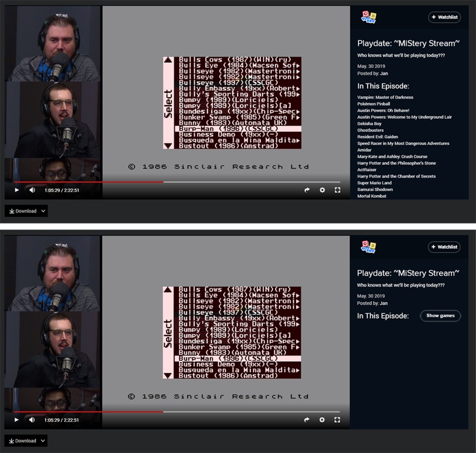
Is there a way to 'hide' games which are played on UPF and similar streams?. Next to the 'In This Episode' title maybe have a little drop-down arrow or button so the list can be revealed if you want to see it?.

Or maybe a way to close that entire right hand container if need be, along the lines of the way you can close the chat on Twitch and the video enlarges slightly.

Avatar image for the_nubster
The_Nubster

5058

Forum Posts

21

Wiki Points

0

Followers

Reviews: 3

User Lists: 1

@swam: I second this. Since the introduction of the container, I've felt that it takes up too much space and can be too revealing, even if the info provided is helpful for those who want it.

On a similar note, are there any plans to remove autoplay? Having to remove "autoplay=1" from the promoted video links is getting very old.

Avatar image for humanity
Humanity

21858

Forum Posts

5738

Wiki Points

0

Followers

Reviews: 40

User Lists: 16

#187  Edited By Humanity

I guess I might want to add something on a very back burner that might be just a "me" issue but can the animation for the green "Message Added" bar be shortened or moved down? Not sure how others navigate the forums, maybe I'm doing it a real weird way, but when I submit a post I click the forums link up at the top of the screen in order to get back to the Index so to speak. Now after you post the green bar slides down covering the interaction menu bar up top and forcing you to wait for it to disappear before you can click anything else.

A real small thing, you have to wait like 2 extra seconds, so hey just throwing it out there for a down the road sort of thing.

Avatar image for brainscratch
BrainScratch

2077

Forum Posts

0

Wiki Points

0

Followers

Reviews: 0

User Lists: 0

@humanity: I navigate the exact same way and that annoys me too

Avatar image for Hilfemaster
Hilfemaster

140

Forum Posts

4506

Wiki Points

0

Followers

Reviews: 3

User Lists: 13

Is it possible to have the list of games in "in this episode" be a dropdown or something. For some shows like unprof. fridays I like to be surprised...

Avatar image for the_nubster
The_Nubster

5058

Forum Posts

21

Wiki Points

0

Followers

Reviews: 3

User Lists: 1

@humanity: Definitely not just a "you" issue. This happens to me nearly every time but it's never been at the front of my mind.

Avatar image for wemmick
wemmick

138

Forum Posts

48

Wiki Points

0

Followers

Reviews: 0

User Lists: 2

@the_nubster:We have some things coming that I think will help the cluttery feel of the In This Episode section.

As for autoplay, if you click "watch now" when coming from the homepage, it won't autoplay. We felt that if you click on the main image on the homepage (which has a play button), it would be kind of weird to then have to click again to watch the video (and we had a good amount of feedback to that effect.)

Avatar image for the_nubster
The_Nubster

5058

Forum Posts

21

Wiki Points

0

Followers

Reviews: 3

User Lists: 1

@wemmick: Okay, fair enough. I'll be more discerning with my clicks, my instinct is to click whatever is easiest.

Avatar image for themanwithnoplan
TheManWithNoPlan

7843

Forum Posts

103

Wiki Points

0

Followers

Reviews: 1

User Lists: 14

Hopped on Gb today to check out this forum thread again and to my surprise the text has been updated! Thank you so much for such a small, but meaningful adjustment. I can actually read on the forums again. Looking forward to when this readability update (hopefully) goes live for the wiki and article text as well. Big props to the dev team here on Gb.

Avatar image for therealturk
TheRealTurk

1411

Forum Posts

0

Wiki Points

0

Followers

Reviews: 0

User Lists: 0

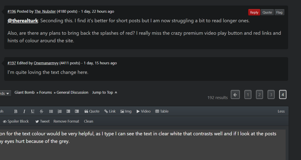
Any chance of backing off the change to the forum text, or at least giving us some option to control how it looks? There is now so little contrast I can barely read the forums. My eyes swim trying to read the text and I can already tell it's a thing that will give me an eyestrain headache looking at it long-term.

I mean, I get people who didn't want the super-bright white against black present before, but this feels like an over-correction.

Avatar image for the_nubster
The_Nubster

5058

Forum Posts

21

Wiki Points

0

Followers

Reviews: 3

User Lists: 1

@therealturk: Seconding this. I find it's better for short posts but I am now struggling a bit to read longer ones.

Also, are there any plans to bring back the splashes of red? I really miss the crazy premium video play button and red links and hints of colour around the site.

Avatar image for onemanarmyy
Onemanarmyy

6406

Forum Posts

432

Wiki Points

0

Followers

Reviews: 2

User Lists: 0

#197  Edited By Onemanarmyy

I'm quite loving the text change here.

Avatar image for theuprightman
theuprightman

350

Forum Posts

55

Wiki Points

0

Followers

Reviews: 0

User Lists: 0

An option for the text colour would be very helpful, as I type I can see the text in clear white that contrasts well and if I look at the posts above my eyes hurt because of the grey.

No Caption Provided

Avatar image for bikedog
bikedog

15

Forum Posts

2

Wiki Points

0

Followers

Reviews: 0

User Lists: 0

Minor suggestion: For 'shows' with Premium and Non-Premium options, is it possible to default to whichever is available for that user? Thanks.