T-shirt contest: Do I need design changes?

Avatar image for themustachehero
TheMustacheHero

6647

Forum Posts

120

Wiki Points

0

Followers

Reviews: 1

User Lists: 0

#1  Edited By TheMustacheHero


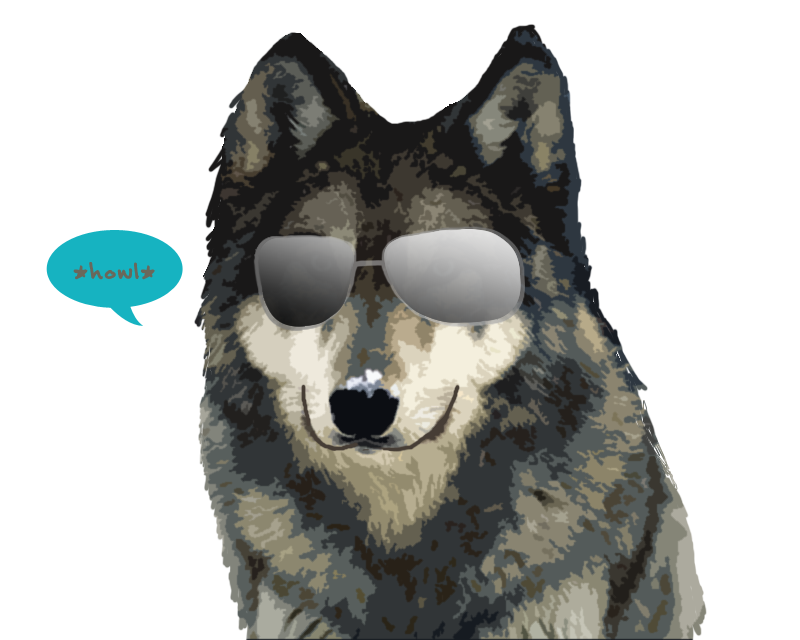
Ok so I am going to enter a Tee shirt design contest but before I enter I need some thoughts on my design, what should I change before I enter it?
The Title for the shirt is "Wolf shirts are cool!" Which is basically a play on making those god-awful red-neck wolf shirts cool.
Also: Later once I make said changes I'll make a new thread and link you to the site to vote and have you guys vote  for my design >:D

Note: This is not for the Giant bomb "Never" T-shirt contest
Avatar image for cowmuffins
CowMuffins

1781

Forum Posts

435

Wiki Points

0

Followers

Reviews: 0

User Lists: 1

#2  Edited By CowMuffins

The outline on the glasses needs to be darker.

Avatar image for jayge_
Jayge_

10269

Forum Posts

2045

Wiki Points

0

Followers

Reviews: 1

User Lists: 3

#3  Edited By Jayge_

I dunno if the glasses are supposed to look like they don't fit in at all or not but that's how they look, take it as you will.


I think the wolf's head is too big. The dialogue bubble makes looking at the shirt kind of awkward.
Avatar image for themustachehero
TheMustacheHero

6647

Forum Posts

120

Wiki Points

0

Followers

Reviews: 1

User Lists: 0

#4  Edited By TheMustacheHero
@Jayge said:
" I dunno if the glasses are supposed to look like they don't fit in at all or not but that's how they look, take it as you will.

I think the wolf's head is too big. The dialogue bubble makes looking at the shirt kind of awkward.
"
Hmm awkward? Care to elaborate? Also I have to admit once I started making the glasses try to be realistic I kept failing miserably so I just decided to make them look as tacked on as possible.
Avatar image for jnerd
jNerd

2232

Forum Posts

258

Wiki Points

0

Followers

Reviews: 1

User Lists: 3

#5  Edited By jNerd

I think the rims on the glasses should be darker & you might want to lighten up the lense on the left. It looks a little too dark.

Avatar image for jayge_
Jayge_

10269

Forum Posts

2045

Wiki Points

0

Followers

Reviews: 1

User Lists: 3

#6  Edited By Jayge_
@TheMustacheHero said:
" @Jayge said:
" I dunno if the glasses are supposed to look like they don't fit in at all or not but that's how they look, take it as you will.

I think the wolf's head is too big. The dialogue bubble makes looking at the shirt kind of awkward.
"
Hmm awkward? Care to elaborate? Also I have to admit once I started making the glasses try to be realistic I kept failing miserably so I just decided to make them look as tacked on as possible. "
The way I see it there are two main attention-focusing parts to the image, the blotch of white on the nose which is fine I guess because it's centered and the dialogue box, which is weird and has the person looking at it focusing randomly on the upper-right part of the dude's chest. It just seems kind of awkward to me for some reason. Although it might just be me because I pay attention to strange things.
Avatar image for themustachehero
TheMustacheHero

6647

Forum Posts

120

Wiki Points

0

Followers

Reviews: 1

User Lists: 0

#7  Edited By TheMustacheHero
@Jayge said:
" @TheMustacheHero said:
" @Jayge said:
" I dunno if the glasses are supposed to look like they don't fit in at all or not but that's how they look, take it as you will.

I think the wolf's head is too big. The dialogue bubble makes looking at the shirt kind of awkward.
"
Hmm awkward? Care to elaborate? Also I have to admit once I started making the glasses try to be realistic I kept failing miserably so I just decided to make them look as tacked on as possible. "
The way I see it there are two main attention-focusing parts to the image, the blotch of white on the nose which is fine I guess because it's centered and the dialogue box, which is weird and has the person looking at it focusing randomly on the upper-right part of the dude's chest. It just seems kind of awkward to me for some reason. Although it might just be me because I pay attention to strange things.
"
I get what you're saying now...I can take out the white blotch no problem. As for the dialogue box it was actually the last thing I put in there because I thought it needed a splash of color. Originally the dialogue box was to be right next to the head almost touching it, but as I placed it onto the shirt I realized there wasn't enough room for it on the side if I still wanted to keep everything big.

Here's what it looked like originally...
No Caption Provided

Avatar image for jnerd
jNerd

2232

Forum Posts

258

Wiki Points

0

Followers

Reviews: 1

User Lists: 3

#8  Edited By jNerd

I didn't notice it until someone else pointed it out but I'd work the white on his nose more into the surrounding colors because it sticks out a lot.

Avatar image for themustachehero
TheMustacheHero

6647

Forum Posts

120

Wiki Points

0

Followers

Reviews: 1

User Lists: 0

#9  Edited By TheMustacheHero

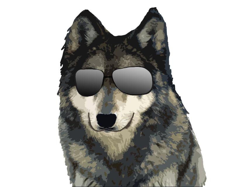
Alrighty. I made the rims darker and got rid of the white splotch and dialogue box. I still have to correct the lenses on the glasses, but I think I might just do the glasses all over.

No Caption Provided


Avatar image for jimbo
Jimbo

10472

Forum Posts

2

Wiki Points

0

Followers

Reviews: 0

User Lists: 3

#10  Edited By Jimbo

Needs more moons.

Avatar image for jnerd
jNerd

2232

Forum Posts

258

Wiki Points

0

Followers

Reviews: 1

User Lists: 3

#11  Edited By jNerd

Diggin it'

Avatar image for jjor64
JJOR64

19700

Forum Posts

417

Wiki Points

0

Followers

Reviews: 3

User Lists: 5

#12  Edited By JJOR64

Where is the is Luchadeer at?  :-P  Just something about the sun glasses that doesn't look right.  If looks like you just photoshoped them in.

Avatar image for jayge_
Jayge_

10269

Forum Posts

2045

Wiki Points

0

Followers

Reviews: 1

User Lists: 3

#13  Edited By Jayge_
@JJOR64 said:
" Where is the is Luchadeer at?  :-P  Just something about the sun glasses that doesn't look right.  If looks like you just photoshoped them in. "
I think that's part of the shirt's charm though.
Avatar image for themustachehero
TheMustacheHero

6647

Forum Posts

120

Wiki Points

0

Followers

Reviews: 1

User Lists: 0

#14  Edited By TheMustacheHero
@JJOR64 said:
" Where is the is Luchadeer at?  :-P  Just something about the sun glasses that doesn't look right.  If looks like you just photoshoped them in. "
Then I've done my job, they're supposed to look photoshopped.
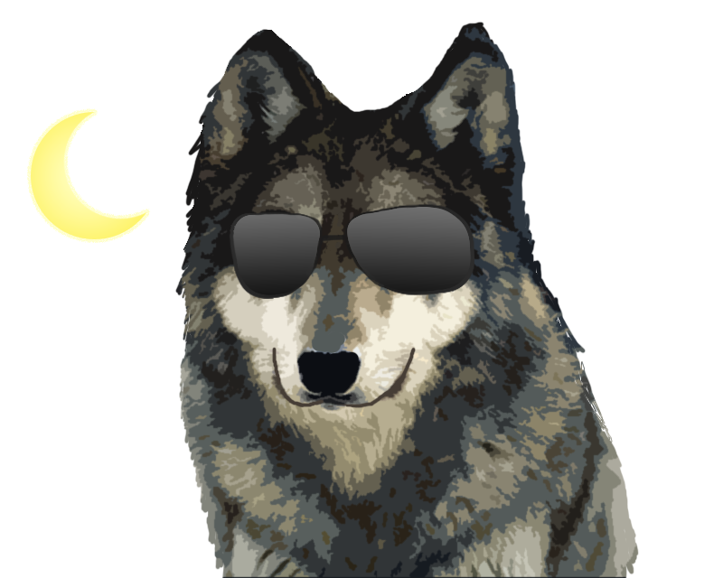
Anyways, Here's Version 3 with Fixed Rim distinction and the suggested moon :P


No Caption Provided


Avatar image for jjor64
JJOR64

19700

Forum Posts

417

Wiki Points

0

Followers

Reviews: 3

User Lists: 5

#15  Edited By JJOR64
@TheMustacheHero said:
" @JJOR64 said:
" Where is the is Luchadeer at?  :-P  Just something about the sun glasses that doesn't look right.  If looks like you just photoshoped them in. "
Then I've done my job, they're supposed to look photoshopped.
Anyways, Here's Version 3 with Fixed Rim distinction and the suggested moon :P


No Caption Provided
"
Well, if it's supposed to like like that then. job well done.  Looks awesome.
Avatar image for baba2
baba2

276

Forum Posts

48

Wiki Points

0

Followers

Reviews: 0

User Lists: 1

#16  Edited By baba2

I like it. The glasses don't look that tacked on. But then I wouldn't really want them to look real on a wolf.

Avatar image for bruce
Bruce

6238

Forum Posts

145

Wiki Points

0

Followers

Reviews: 3

User Lists: 1

#17  Edited By Bruce
@TheMustacheHero:

I think what he's trying to say is that the glasses on the Wolf make the Wolf look like a Reh-Tard. Although, that could be the point.
Avatar image for themustachehero
TheMustacheHero

6647

Forum Posts

120

Wiki Points

0

Followers

Reviews: 1

User Lists: 0

#18  Edited By TheMustacheHero
@Bruce said:
" @TheMustacheHero: I think what he's trying to say is that the glasses on the Wolf make the Wolf look like a Reh-Tard. Although, that could be the point. "
>:/ I think you're missing the point of his post, aside from that I take offense for calling my design retarded.
If you're not going to help and actually say something that has meaning behind it I suggest you don't post at all. I'm looking for critics not douchebags.
Avatar image for kmdrkul
kmdrkul

3497

Forum Posts

213

Wiki Points

0

Followers

Reviews: 0

User Lists: 0

#19  Edited By kmdrkul

I think either iterations of the shirt look hilarious, especially since the wolf appears to be smiling, but it seems like it might be expensive for them to print... Ryan said to keep the number of colors down and I'm seeing several shades of tans and grays...


EDIT: Sorry, didn't read the last note of your post.  And personally, having a badass crescent moon seems far more "redneck radical-ish" then the blue blurb.

Avatar image for suicrat
Suicrat

3829

Forum Posts

1057

Wiki Points

0

Followers

Reviews: 9

User Lists: 0

#20  Edited By Suicrat
@TheMustacheHero: Too many colours
Avatar image for themustachehero
TheMustacheHero

6647

Forum Posts

120

Wiki Points

0

Followers

Reviews: 1

User Lists: 0

#21  Edited By TheMustacheHero
@Suicrat said:
" @TheMustacheHero: Too many colours "
Are you serious?
Avatar image for discorsi
Discorsi

1390

Forum Posts

3008

Wiki Points

0

Followers

Reviews: 1

User Lists: 6

#22  Edited By Discorsi

because sun glasses make everything cool....

Avatar image for suicrat
Suicrat

3829

Forum Posts

1057

Wiki Points

0

Followers

Reviews: 9

User Lists: 0

#23  Edited By Suicrat

Yes. It needs to be 3 tones or less. That's multitone

Avatar image for themustachehero
TheMustacheHero

6647

Forum Posts

120

Wiki Points

0

Followers

Reviews: 1

User Lists: 0

#24  Edited By TheMustacheHero
@Suicrat said:
" Yes. It needs to be 3 tones or less. That's multitone "
Protip: read the "NOTE" on my original post.
Avatar image for ineedaname
Ineedaname

4276

Forum Posts

410

Wiki Points

0

Followers

Reviews: 3

User Lists: 0

#25  Edited By Ineedaname

If you're looking for reasons why wolves are cool you can take note from:
http://www.birkoph.com/Wolf_tshirt.htm
(read the comments)

And to be constructive having looked at that t-shirt a few times, I feel the glasses need to be reworked, they look a little wonky.
I know the perspective may affect it, but size wise they seem a little of.

Avatar image for suicrat
Suicrat

3829

Forum Posts

1057

Wiki Points

0

Followers

Reviews: 9

User Lists: 0

#26  Edited By Suicrat

Well, if you want to incur the extra cost of the extra tones, feel free.

Avatar image for hatking
hatking

7673

Forum Posts

82

Wiki Points

0

Followers

Reviews: 0

User Lists: 0

#27  Edited By hatking

I got to be honest I think I like blurb better than the moon, either way though it is a pretty funny design, good job.

Avatar image for themustachehero
TheMustacheHero

6647

Forum Posts

120

Wiki Points

0

Followers

Reviews: 1

User Lists: 0

#28  Edited By TheMustacheHero
@Suicrat said:
" Well, if you want to incur the extra cost of the extra tones, feel free. "
You STILL Obviously have NOT read my Original post, THIS IS NOT FOR THE GIANTBOMB TEE SHIRT CONTEST!!!!!
Avatar image for suicrat
Suicrat

3829

Forum Posts

1057

Wiki Points

0

Followers

Reviews: 9

User Lists: 0

#29  Edited By Suicrat
@TheMustacheHero: I did, but you didn't seem to mention that the teeshirt contest was for producing a $50 teeshirt design. You should go to two or three tone, otherwise it won't win the contest, unless it's for some sort of high-end teeshirt maker or some shit....