
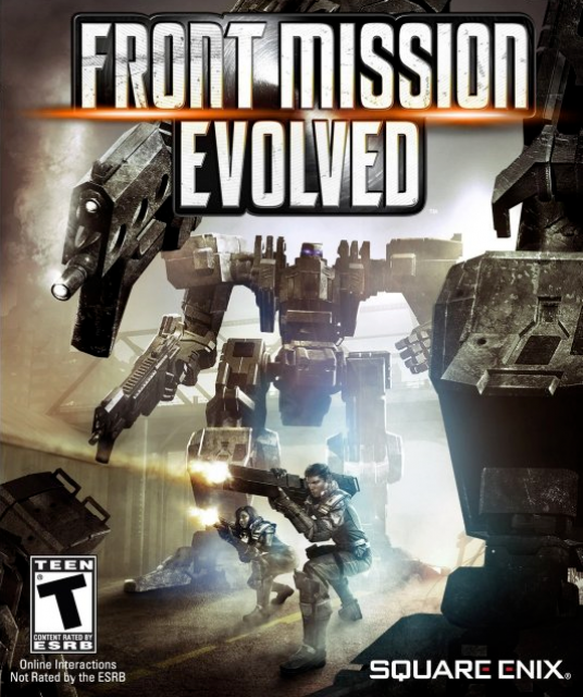
Seeing the box art for front mission evolved this morning made me realise something. The image of the box art didn't register with me at all. I had to re-open my browser and study the image to actually "see" what it depicts.
I did some thinking and I've started wondering whether I've become so inundated with similar images and colour schemes from the slew of similar games this generation, that my mind has started ignoring these images as "noise".
Is there anyone else that feels the same way or is this just a terrible example of box art?

Front Mission Evolved
Game » consists of 9 releases. Released Sep 28, 2010


Log in to comment