Something went wrong. Try again later
    Follow

    Persona

    Franchise »

    Depicting occult practices, fey heroes, and demons crawling out of the woodwork, Persona is Atlus' largest, most successful, and most acclaimed franchise. Beginning as a spinoff of the Shin Megami Tensei franchise, the series developed a sizable following in the West after Persona 3, and expanded into non-JRPG genres after Persona 4.

    The Color Pallets of Persona

    Avatar image for xanadu
    xanadu

    2157

    Forum Posts

    0

    Wiki Points

    0

    Followers

    Reviews: 1

    User Lists: 0

    Edited By xanadu

    The last three main Persona games have all followed similar themes and structure. You go to high school, make some friends, date some people, work a part time job, and casually save the world from some kind of bored or pissed of deity on the weekends. While the core materials that construct a Persona game have been extremely consistent, the presentation of these elements is where we see the most change from game to game. One element of a Persona game that largely changes from each entry to the next is the color pallet. For me, Personas color pallets are substantially effective in altering my overall mood while playing these games and Persona 5 is no exception to that.
    No Caption Provided

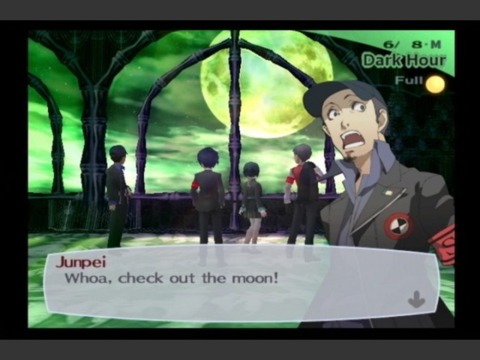
    The murky greens accent the cool blues in Persona 3 in a chilling way. Blue is predominant through out Persona 3 during the day to day life but switches to green when the dark hour strikes. These two colors work well together and the combination of the two creates an eerie and almost longing feeling for me. Persona 3 largely deals with apocalyptic themes as well as death and the acceptance of loss. The decay like shade of the green in the dark hour is in contrast to what regular shades of green normally represent (life, greed, nature). Instead, the green comes off as more of sickness within the world and a representation of the forces behind the dark hour as they become more malevolent and gain momentum towards their apocalyptic goals. Overall the blues and greens of Persona 3 feel good in a calming yet chilling way, I never felt overly stressed while playing. The mood and color pallet of Persona 3 might be my favorite overall, it just has a real cool kinda vibe.
    No Caption Provided

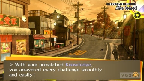
    Ah, good old P4. Remembering my time with Persona 4 invokes similar feelings of remembering past vacations from my childhood. The all encompassing yellow of Persona 4 initially may seem like a strange choice. Yellow is usually great as an accent or trim color but very rarely is the color used predominantly. In P4, it was the perfect color to use. Persona 4 focuses largely on introspective and what it means to truly understand and accept yourself. The weather is almost constantly raining or foggy in the town of Inaba as you play through Persona 4. The predominant yellow is a nice contrast from the constant rain and bleak nature of the weather. Yellow can also be see as an obvious representation of The Sun, it pairs well with the dawning or re-awaking characters like Chie and Yukiko face after tackling their inner demons. I always had such a warm feeling Persona 4, no other game has really made feel quite this way. Persona 4 feels like eating a warm cookie your grandma just made while riding your bike outside on a perfect day. Whenever it is raining or a little gloomy outside, I always feel an urge to hop back into the world of Persona 4 and just hangout for a bit.

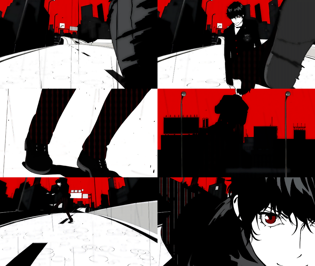
    Persona 5 amps up the series fascination with Western European Religion. The deadly sins play a large role in Persona 5 as well as the way our inner psyche is capable of shaping the real world around us. The color pallet is also pretty hard not to notice...It is a very obvious theme what with the game focusing around "stealing peoples hearts" who are sinful in nature. What is really effective at is being EXTREMELY STRESSFUL to look at. It is no obvious fact that color red is an alarming color that triggers stress-like feelings emotionally. Especially given how a lot of people are feeling overly stressed while playing, it isn't crazy to assume that large amounts of red in this game are not helping. While I really enjoyed my play through of Persona 5, I also felt stressed out almost the entire time playing. For me, the stress largely came from me wanting to max out all confidants and seeing everything I could. But this is how I felt playing Persona 3 and 4 as well. I never felt so increasingly anxious the way I did while playing Persona 5.
    No Caption Provided

    The other two predominant colors seen through out Persona 5 are black and white which really doesn't help down play all the redness in the game. The dark and light shades only further draw attention to all the red throughout this game and there is A LOT of red. Persona 5 more so than its predecessors really digs into its style and color pallets, it does so both at its benefit and cost. Persona 5 is the most stylish game I have played for sure and the style goes a long way to make sitting down to play for 100 hours or so worth it. I just wonder if a different color pallet would have soothed my stress during the time I spent with Persona 5.

    Avatar image for zeik
    Zeik

    5434

    Forum Posts

    2

    Wiki Points

    0

    Followers

    Reviews: 0

    User Lists: 0

    #1  Edited By Zeik

    Interesting read, but I can't say I really agree with the feeling of stress in P5. (At least outside of dungeons, where it's intentionally kinda stressful.) Maxing out all the Confidants in P5 is the least stressful it's ever been. I remember I tried doing a max all S. Links playthrough in P3 once and it practically ruined the game for me, given how strictly I had to follow a guide the whole way through. But in P5 I was able to max them all without even really trying, and I love that. (Playing with a guide constantly at hand to try to make all the "right" decisions is the absolute worst way to experience a Persona game imo. )

    But back to the subject of color, all the red in P5 may be less soothing than the soft blues of P3 or the warm yellows of P4, but I don't think that necessarily equates to stress or anxiety. It felt more like a color of...attitude, I guess? That's probably the wrong word to describe it, but the red coupled with the stylish menus just gave a strong sense of personality to everything. It fit perfectly with the theme of rebellion. It got me more pumped to get shit done than stressed.

    Avatar image for efesell
    Efesell

    7501

    Forum Posts

    0

    Wiki Points

    0

    Followers

    Reviews: 0

    User Lists: 0

    I love the palette in this game, it's a pretty harsh look but it doesn't evoke stress in me it just makes me excited to get shit done.

    Avatar image for themanwithnoplan
    TheManWithNoPlan

    7843

    Forum Posts

    103

    Wiki Points

    0

    Followers

    Reviews: 1

    User Lists: 14

    Persona 5 is super chiiiiillll. If anything the red feels more "evening with a glass of whiskey next to a fire" over "OH GOD, what do I do? There's so little time and I need more guts to ask out teacher".

    Avatar image for busto1299
    Busto1299

    262

    Forum Posts

    0

    Wiki Points

    0

    Followers

    Reviews: 0

    User Lists: 0

    Red has always been my favorite color because it gives off some in your face aggression vibes

    Avatar image for deactivated-63bbfc9f777ec
    deactivated-63bbfc9f777ec

    1424

    Forum Posts

    0

    Wiki Points

    0

    Followers

    Reviews: 0

    User Lists: 0

    I agree about P4 giving off a warm and fuzzy feeling, P3 on the other hand I don't find chill or calming at all, the blues and greens made me feel bummed out and depressed if anything.

    The color palette in P5 feels much bolder and serious and combined with how stylish everything is I think it feels awesome and conveys that the Phantom Thieves are rad.

    Also I never understood why making decisions in games is so stressful to some people.

    Avatar image for xanadu
    xanadu

    2157

    Forum Posts

    0

    Wiki Points

    0

    Followers

    Reviews: 1

    User Lists: 0

    @zeik: I've definitely heard other people say the same thing about the confidants. Somehow for me though I didn't get my social stats up soon enough so I had to play catch up to finish sojiro and other confidants.

    Avatar image for probablytuna
    probablytuna

    5010

    Forum Posts

    0

    Wiki Points

    0

    Followers

    Reviews: 0

    User Lists: 1

    Also I never understood why making decisions in games is so stressful to some people.

    For me, making the decision itself isn't all that stressful, the stress comes from me contemplating how my decision will affect what the outcomes are 10 - 20 hours down the road. Something like choosing to spend time with A over B but then realising hours in that B unlocks a really useful gameplay mechanic that would've made life much easier. This is especially true for Persona games when time is so limited you want to get the most of any given day. Sometimes the thought of having to make a decision pushes me away from the game and I need to take a break, because I don't want to roll back hours of progress if I make what I consider to be the wrong decision.

    Avatar image for zeik
    Zeik

    5434

    Forum Posts

    2

    Wiki Points

    0

    Followers

    Reviews: 0

    User Lists: 0

    @probablytuna: I think this is exactly the mistake too many people make when approaching a Persona game. You shouldn't worry so much about stuff like that. Even if you don't pick the "optimal" choice, it's practically impossible to make a choice that will screw you over in the long run, unless you're obsessed with min/maxing and have to do everything perfectly on your first playthrough. If you realize that B has that useful ability later then you just spend more time with B from that point on to ensure you get that ability soon. You should never feel the need to roll back hours of progress to do something different. (Unless you really screw up and find yourself unable to clear a dungeon before a deadline, but that's very hard to do.)

    The most I've ever done is save and then reload to the previous day if I want to test out a few options. But once I settle on the choice for that day I accept it as set in stone and move on.

    Avatar image for probablytuna
    probablytuna

    5010

    Forum Posts

    0

    Wiki Points

    0

    Followers

    Reviews: 0

    User Lists: 1

    @zeik said:

    You shouldn't worry so much about stuff like that.

    You say that like it's an easy thing to do...

    Avatar image for totsboy
    totsboy

    510

    Forum Posts

    130

    Wiki Points

    0

    Followers

    Reviews: 0

    User Lists: 12

    Very interesting read!

    The Persona 5 palette is my least favorite, but I can't say I feel stressed while playing in general, I only feel stressed when I'm in a dungeon with low SP and can't find a safe room. And even though I try to max the social links, I won't stress over not being able to max all of them, I like to play on my own pace and not worry about it too much.

    Avatar image for gkabooz
    GKabooz

    46

    Forum Posts

    0

    Wiki Points

    0

    Followers

    Reviews: 0

    User Lists: 0

    How bout a follow up with Persona Q's purple and Fire Emblem Tokyo Mirage's green

    Avatar image for olu
    Olu

    98

    Forum Posts

    0

    Wiki Points

    0

    Followers

    Reviews: 0

    User Lists: 1

    No Caption Provided

    Also worth noting that red and black is often assosiated with anarchism movements, anarcho-socialsm in particular. It goes without saying that anarchism and "fight the power" motiff is extremely prevalent in Persona 5. While i'm not sure if it's it's intentional, all-out-attack animations all briefly form the same diagonal flag pattern.

    Avatar image for deactivated-630479c20dfaa
    deactivated-630479c20dfaa

    1683

    Forum Posts

    0

    Wiki Points

    0

    Followers

    Reviews: 0

    User Lists: 0

    I'm glad the game is colored the way it is, it fits the theme and the buzzing uncaring big city that the game takes place in. And no offense, I don't think the game makers care if you feel less at ease, when/if the intended effect was supposed to be something akin to stress. Yes, Persona 4 was lowkey and cozy a lot of the time, I don't think Persona 5 was meant to be. Interesting read regardless, even if I disagree with the closing paragraph.

    Avatar image for burncoat
    burncoat

    560

    Forum Posts

    4

    Wiki Points

    0

    Followers

    Reviews: 0

    User Lists: 0

    It's interesting you focused on the stress inducing aspect of the color red. I found it to be more invigorating and gave off a "call to action" sort of vibe. I'm immediately reminded of "Red and Black" from Les Mis (which is also spoofed as a movie in game) and the intensity those colors give. It helps the theme of rebellion and accentuates the action in fights.

    The only time it was a bit much for me was in Mementos when an entire area is bathed in red. Without the relief of black and white to break it up, it can get monotonous and stressful to look at.

    Avatar image for gaff
    Gaff

    2768

    Forum Posts

    120

    Wiki Points

    0

    Followers

    Reviews: 0

    User Lists: 2

    #15  Edited By Gaff

    @burncoat: Speaking of Mementos, they were the worst with regards to colour palettes. At some point the tunnels get so dark and desaturated that seeing Shadows became impossible without Thief Vision.

    @olu: good catch, I was going to bring this up myself if you hadn't beaten me to it.

    Avatar image for zeik
    Zeik

    5434

    Forum Posts

    2

    Wiki Points

    0

    Followers

    Reviews: 0

    User Lists: 0

    #16  Edited By Zeik

    @gaff: I think that might just be your TV. I never had trouble seeing the shadows in Mementos. I never used Thief Vision in Mementos at all. (Excluding the final section, obviously.)

    Avatar image for xanadu
    xanadu

    2157

    Forum Posts

    0

    Wiki Points

    0

    Followers

    Reviews: 1

    User Lists: 0

    @olu: Ah that is interesting, I did not realize that. Thanks!

    Avatar image for physicalscience
    physicalscience

    334

    Forum Posts

    188

    Wiki Points

    0

    Followers

    Reviews: 0

    User Lists: 0

    I really liked the look of Persona Q. It was an awesome game with some styyyyllleeee

    No Caption Provided
    No Caption Provided

    Avatar image for viking_funeral
    viking_funeral

    2881

    Forum Posts

    57

    Wiki Points

    0

    Followers

    Reviews: 6

    User Lists: 5

    @zeik: Playing the the first time through a Persona with a guide is, well... it feels counter to the spirit of the game. The game asks you to sign a contract to accept the results of your decisions, and I think the most interesting part of the game is seeing where your choices lead. It's a bit unfortunate that there is only one optimal way to play, because that leads to things like the guides for people who simply don't want to play the game more than once and miss out on anything. I understand why people do that, and I don't judge them, but playing blind is so much more in the spirit of the game, I feel.

    Oddly enough, I almost maxed out my S.Links on my first Persona 3 FES playthrough. I had everyone at max except Fuuka and the French exchange student, neither of whom I had any points in. It felt good to get that with some obvious subpar choices, especially early game.

    I also agree with you over the color choice. Red can be a stress color, but it's also a color of action and boldness. That's why red is so common in advertising. I mean, do cans of Coke stress people out? How about Santa? (Granted, both those ideas came from the same marketing department.)

    Avatar image for theht
    TheHT

    15998

    Forum Posts

    1562

    Wiki Points

    0

    Followers

    Reviews: 1

    User Lists: 9

    Persona 5 is super chiiiiillll. If anything the red feels more "evening with a glass of whiskey next to a fire" over "OH GOD, what do I do? There's so little time and I need more guts to ask out teacher".

    Yeah, I get a sort of "bask in the apocalypse" kind of vibe from it. So bit a both I guess, now that I mention it.

    Good read OP! To me P3 looks eerie, P4 looks bizarre, and P5 just looks striking, for better or for worse.

    Avatar image for hammerhead7274
    hammerhead7274

    18

    Forum Posts

    0

    Wiki Points

    0

    Followers

    Reviews: 0

    User Lists: 0

    Nice write up OP. I agree with you on P3's green during the dark hour its shade gives off a very rotting/decay feel to the sections involving it. Persona 4's yellow always gave me a sense of happiness or hope which benefit the games lighter tone than 3 or 5. I like a lot of other people here viewed the intense red of Persona 5 as a call to action or to strengthen the sense of rebellion the game wants you to feel.

    All in all this post got me to think about how three of my favorite games use their colors to visually represent their themes and/or tones through out play, and for that I'm grateful.

    Avatar image for undeadpool
    Undeadpool

    8417

    Forum Posts

    10761

    Wiki Points

    0

    Followers

    Reviews: 20

    User Lists: 18

    @theht said:
    @themanwithnoplan said:

    Persona 5 is super chiiiiillll. If anything the red feels more "evening with a glass of whiskey next to a fire" over "OH GOD, what do I do? There's so little time and I need more guts to ask out teacher".

    Yeah, I get a sort of "bask in the apocalypse" kind of vibe from it. So bit a both I guess, now that I mention it.

    Good read OP! To me P3 looks eerie, P4 looks bizarre, and P5 just looks striking, for better or for worse.

    I definitely get the intensity angle off of it. They rip the masks off in a bloody, gushing mess, even the Evokers weren't THAT horrific. It felt like the game was grabbing me by the sides of the head and going "YOU READY FOR THIS, FUCKER?! THAT LADY'S RIDING A NUCLEAR BIKE, YOU'RE NOT READY FOR THAT!!"

    Avatar image for deactivated-6496404854aee
    deactivated-6496404854aee

    12

    Forum Posts

    0

    Wiki Points

    0

    Followers

    Reviews: 0

    User Lists: 1

    Interesting post! I've always loved the variety in the color palettes of each Persona game, they all have such a distinct vibe. The comments are interesting too because even when color theory suggests that a specific color should mean a specific thing, everyone has their own interpretation!

    Personally, the bright reds of Persona 5 are my favorite. They don't strike me as stressful as much as IN YOUR FACE in an almost gleeful way. It definitely matches the themes of anarchy and unleashing your anger (I also personally dig the aesthetic, I watched the animated trailer about 100 times before it came out). I appreciate the creepy blues and greens of Persona 3, but it's also my *least* favorite to look at. The giant green Tartarus tower gives me the shivers.

    Avatar image for sam_lfcfan
    Sam_lfcfan

    321

    Forum Posts

    74

    Wiki Points

    0

    Followers

    Reviews: 9

    User Lists: 5

    Good post, Xanadu. I don't find the color palette of Persona 5 to be too stressful because the game doesn't adhere to the red and black pattern during gameplay. The opening credits do fit the game's themes well, since most of the story revolves around the depraved thoughts and actions of people dragging society into ruin. Totally agree with you on Persona 4. That game looks like my favorite memories.

    Avatar image for damnboyadvance
    damnboyadvance

    4216

    Forum Posts

    1020

    Wiki Points

    0

    Followers

    Reviews: 20

    User Lists: 4

    #25  Edited By damnboyadvance

    Good post, but I don't buy your stress argument for Persona 5. I enjoyed this game. It was stressful at times, but not any more stressful than the other games were.

    The red in Persona 5 represents boldness. Instead of staying back and letting people walk over you and your friends, you're standing up for yourself and others. Every character that awakens their Persona goes through roughly the same process: they've been letting people walk all over them, but now they've resolved to stand up for themselves, and their Persona awakens! Throughout the game, you're standing up to these villains, stealing their hearts, fighting for change.

    Sure, you have to be bold and fight evil in 3 and 4. But in those games, the idea of standing up for yourself/others isn't as central of a theme as in 5.

    Avatar image for frostyryan
    FrostyRyan

    2936

    Forum Posts

    0

    Wiki Points

    0

    Followers

    Reviews: 0

    User Lists: 0

    Persona 6 will be the green one. It's gotta be.

    This edit will also create new pages on Giant Bomb for:

    Beware, you are proposing to add brand new pages to the wiki along with your edits. Make sure this is what you intended. This will likely increase the time it takes for your changes to go live.

    Comment and Save

    Until you earn 1000 points all your submissions need to be vetted by other Giant Bomb users. This process takes no more than a few hours and we'll send you an email once approved.