Markers II: Where Are All the Dead Space UIs?
By gamer_152 8 Comments
Note: The following article contains mild spoilers for Dead Space 1-3.

Media that is beloved tends to become media that is influential. As a rule, when audiences respond positively to a creation, other creators are going to want to copy it. So, what do we make of a game which is adored for its design but rarely imitated? Dead Space was a horror shooter whose UI delighted even players that weren't interface enthusiasts. What made it so memorable was developer, Visceral Games, ditching the HUD and committing so bravely to diegetic UI: A form of communication in which meters, counters, indicators, and menus are objects or organisms which exist in the narrative.
But few games after Dead Space were crafted in its image. We marvelled at the health bars on the RIG and the physicality of the dismemberment mechanics. Then, the medium reverted right back to pasting heads-up displays and non-diegetic labelling over the screen. This history begs the question, why aren't there more Dead Space UIs? I won't dance around the answer: Dead Space's immersive interface is possible because it was cultivated in a specific cinematic and ludonarrative environment which doesn't exist in many other titles. There are realities to conversing with the player that mean that it's often gruelling or impossible to make a diegetic UI that will be as efficient as a non-diegetic one. In this article, we're going to explore what those realities are, starting with:
Interface Visibility
If you staple your UI elements to characters or objects, then when the player shifts their gaze from those characters or objects, they'll lose track of their metrics. Speaking to your player through a graphical overlay helps stave off this information anaemia. Wherever they look, the data they need will still appear on-screen, which is an extra-large boon in those games where players frequently have to reposition the camera. Dead Space has a crafty workaround for this issue, but not one that you could apply in just any game.

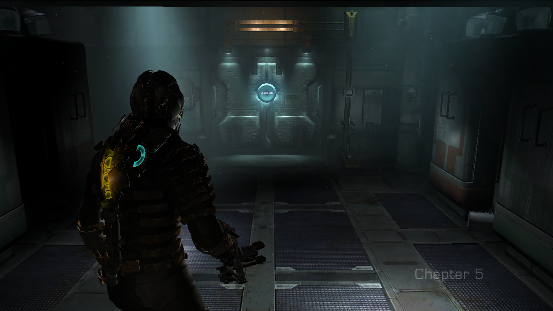
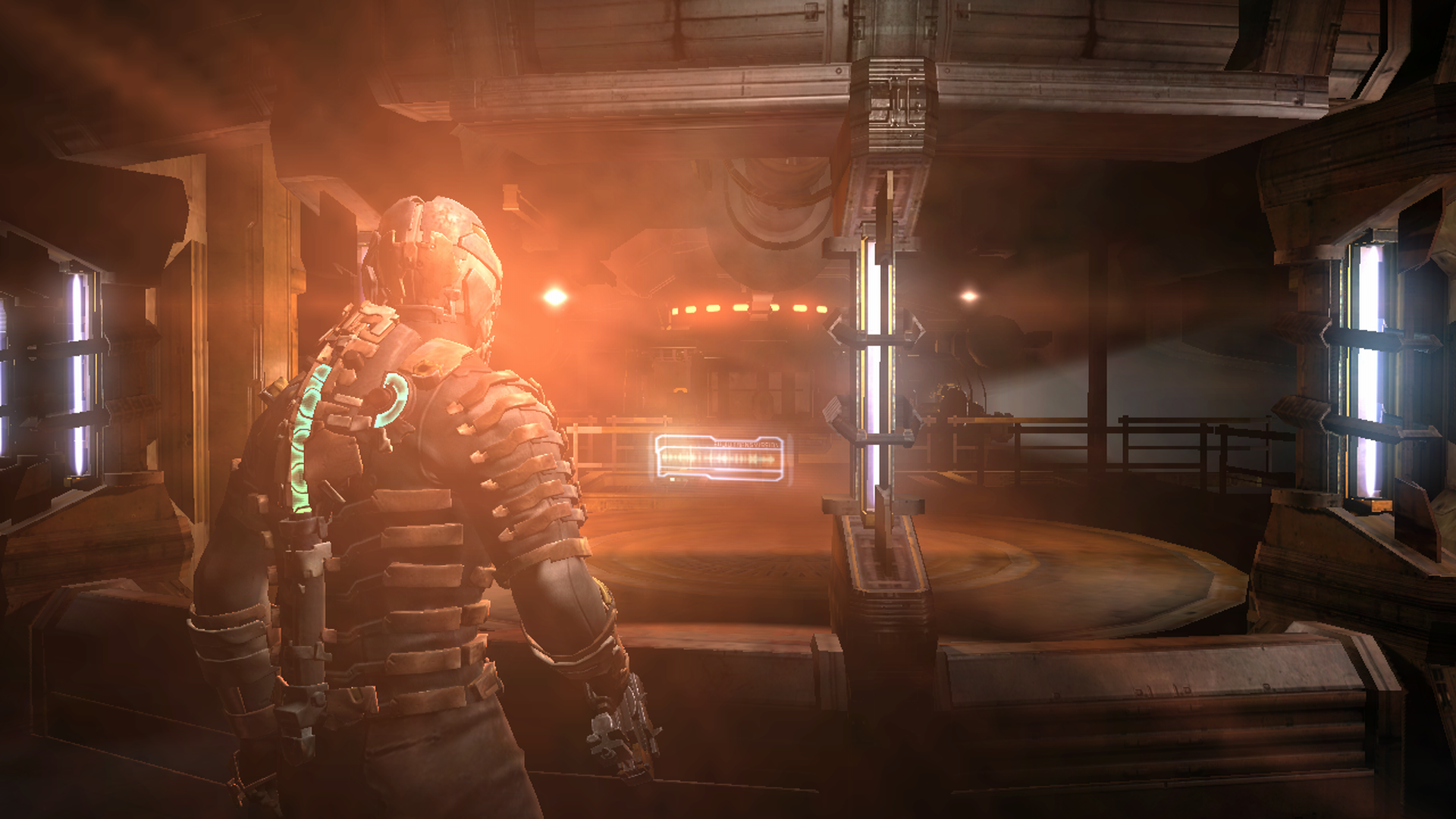
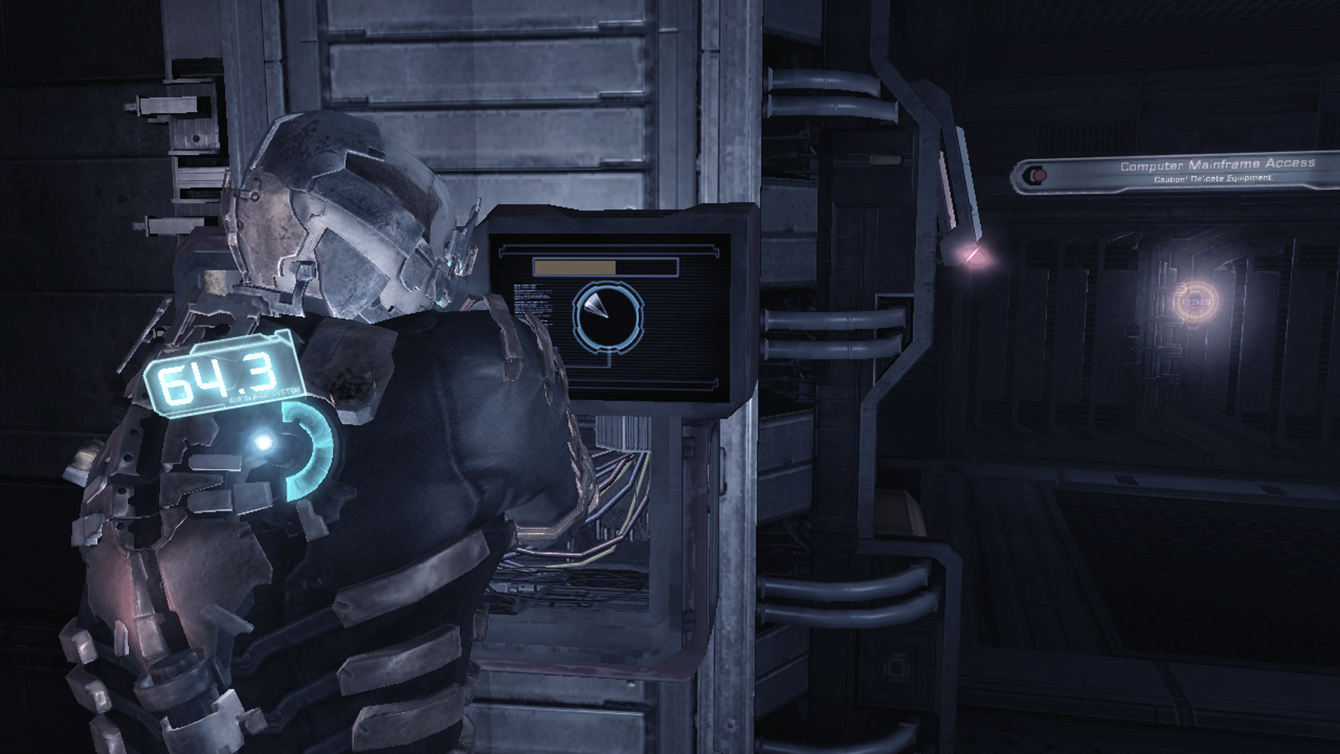
By default, Dead Space's camera fixes on the rear of the protagonist's suit, his back housing all the essential gauges. When you pull up a menu, the camera moves in adjacent to Isaac's head, and the menu appears in front of him as a hologram. When you turn Isaac, the camera rotates the same number of degrees as he does. Therefore, most of the time, you can't stop the camera from aiming at the surrogate HUD. Additionally, your view is severely limited when you change the elevation of your camera, so the large majority of the time, you will keep it pointed straight ahead, at shoulder height. By keeping signage and monsters at roughly the same height, the game ensures we maintain a perspective on most of the environmental and enemy UI.
While, in cinema, the movement of the camera only affects what the audience sees, most video games bind the viewing mechanism to the controls, meaning the camera's physics also determine the audience's tactile experience. Dead Space's stiff, bulky viewing apparatus causes the setting of the Ishimura to feel claustrophobic, leaves the operator open to unexpected ambushes, and emulates stomping around in restrictive, clunky armour. It's a masterful realisation of Dead Space's aesthetic. That said, most video games, even many horrors, don't want the processes of moving and looking around to straightjacket the player.
Computer games usually want a play that's freer or more empowering, and even when they don't, they often refrain from making interactions frustrating or distracting participants with menial chores like camera placement. Plenty of games also include complex geographies, vertical traversal, or agile enemies. These are all characteristics which Dead Space lacks and may require the player to maintain a higher awareness of their surroundings. You've likely played open-world games with activities and collectables peppered all the way to the horizon, platformers where you had to scale towering columns, and multiplayer action games where opponents can sneak up behind you. I'd bet that at no time in those experiences did you wish for a camera with less manoeuvrability. Therefore, designers tend to give the player a tighter grip on camera movement. That's a problem for a sartorial UI like Dead Space's. With a freewheeling camera, you'd make it only too easy for the player to look away from the vital UI elements.
You may also have noticed that our discussion so far has assumed that we're talking about a third-person camera trained on a single character. Try to imagine a first-person Dead Space and a HUD only feels obligatory. If the UI is part of the avatar's costume, then what do you do when the cinematography leaves that costume off-screen? There are examples of diegetic UI elements in first-person perspectives. Trespasser is an adventure which has the player look down at their body to read their health, and games like Firewatch, the Nancy Drew puzzlers, and LA Noire have the player check documents on their person to see maps, objective lists, and dialogue menus, in various combinations.
These diegetic UI panels which obscure the action are a terrific solution in certain circumstances. If the game flows slowly, if the volume of information the developer needs to display is high, and if that data is not something the player needs to access moment-to-moment, it's fine for it to be tucked away in some side-screen. However, we must also consider titles where the user's performance is dependent on them quickly reacting to their surroundings and cases where the player will always want certain data on-deck. Telling the audience to tear their gaze away from the action every time they need the most elemental information can be anything from annoying to ruinous. They should not have to open a menu to get an update on their combo meter or their minimap.
In a title with anything upwards of a moderate pace, it can break up the flow of play, and in a game where the user has a lot of data to keep track of, it can make it less accessible to the user. They're liable to become frustrated, always missing the other piece of the puzzle. They may find themselves endlessly switching back and forth between the "regular" view and these maps, menus, or somatic UIs.

One alternative is having the player character's hands or the tools they're holding hover within the audience's view and manifesting the data on them. The first-person platformer Mirror's Edge has the protagonist's hands and legs pop into shot, allowing us to see when she is running, climbing, sliding, or abseiling. Many first-person titles packed with equipment like Garry's Mod or Farpoint place counters or settings on gadgets in the player's grasp, and it can be a fantastic way of serving up bites of information.
However, the limited screen real-estate assigned to in-hand objects means that they cannot be used as a delivery pipeline for large amounts of information at a time. UI needs space to stretch its legs. Additionally, the location of these UI chunks is hardcoded by the biological fact of where humanoid arms go. With a HUD, the designer can decree that the best place for a particular bar or indicator would be the top-middle or the centre of the frame. With in-hand UI, they have to place these elements wherever the player avatar's arms fall, whether that would be the most suitable location for them or not. As a consequence, almost all games which do embed UI on character's guns or hands also make it so that those parts are supported by non-diegetic UI elsewhere. In other circumstances, it's difficult to reconcile the cinematography with a diegetic UI even in a third-person perspective.
Isaac drags his obedient camera along on a leash, keeping it close behind him in every gore-stained room. Other games, however, want a wider scope for their experience. That could be scope in terms of space or number of elements in play, but whichever way you slice it, you're probably going to need to pull the camera further back. Note how many open-world games use a wide-angle camera which keeps its distance from our avatar so that we can see all sorts of interactables, alternate routes, enemies, and collectables in our immediate vicinity. Remember all the management sims and top-down strategy games in which a camera distant from subjects is necessary for us to fit plenty of buildings or units onto the screen without us constantly trucking it around. Even most third-person shooters retract the camera further from the protagonist than Dead Space does.
When designers leave a gulf between cameras and the characters and objects on which they focus, said characters and objects become small within the frame. Once they are small, there's only so much UI you can pile onto them and expect the player to be able to quickly and easily read. The camera is closer to Isaac in Dead Space than it will be to your bases in Company of Heroes or your blocky warrior in Trove. That is one reason why these other titles supplement what we can see on those bases or characters with UI panels and HUDs.
We can alternately see this dearth of visibility created through models or sprites lacking the detail to host UI elements, especially if those elements are supposed to display granular information like you would with a stamina bar or a money count. In Tecmo Bowl or Samurai Gunn, there is not the number of pixels present on the main characters for them to house even the relatively spartan UI strapped to Isaac's back.
System Complexity

The amount of information that a UI element can host is a consequence of its relative size within the frame; the amount of information the UI must host is a consequence of the game's outward-facing complexity. Every entity in a game carries a set of attributes. For example, the cards in Ooblets carry the attributes of the "Beat Cost" we pay to lay them and the effects they trigger when played. A truck in SpinTires has attributes such as position, velocity, current gear, whether the parking brake is active, and so on.
We don't need to know every attribute of every entity in the system to be able to take reasonable actions regarding those systems. In fact, designers often sculpt an experience as much by what they don't show as what they do. In Dead Space, enemies all have a health value, but the game keeps that number classified. It's more tense and realistic if we don't know how many blasts of our Plasma Cutter it will take to drop a Necromorph.

The AI for these crazed parasites also has many states and figures bumping around in its head to determine their behaviour. But not only would it ruin the mood if the studio displayed those variables; it would be an astronomical volume of data for us to process. There are, however, attributes in Dead Space which we do need to be aware of. E.g. We need to know which limbs are still attached to each Necromorph to have an idea of the moves they can make in play. We need to know how much health and stasis Isaac has left to perform informed resource management.
In terms of input UI, the designer also never wants the player to be able to set every variable in the system. Being able to plug nodes in the tech tree for the telekinesis module lets us play to our strengths as combatants, and it's believable this is something Isaac would do as an engineer. But being able to change the dimensions of Isaac's hitbox could evaporate all difficulty. It would also make us feel like more like we're modding a computer program than finding passage off of a blighted mining craft. Designers generally aim for a balance between the player being in control and being boxed-in. This puts the person in front of the screen in a sweet spot for challenge and keeps the rules of the world intact.

Dead Space is helped on its way to a diegetic UI because it's not overflowing with information the player needs to be aware of. For an entity like Isaac, the developers can skin on a bare-bones interface because he has relatively few attributes: Position, rotation, health, stasis, oxygen, whether he's sprinting, whether his iron sights are up, and that's about it. Isaac's mechanical svelteness means that the UI doesn't have to project much data on him, and with some elegant design, we can read all the vital info from him, quickly. But imagine trying to build a similar UI onto the characters in indie starship organiser Space Haven.
These astronauts have a name, position, six different mood values, and unique levels of friendship with each fellow crewmate. They can also be afflicted with up to six negative mood modifiers, exist in one of five activity states at a time, and may be plagued by any of five detrimental conditions. Even if Space Haven's camera ended up as close to its characters as Dead Space's does to Isaac, how are you going to display all of those stats and statuses on their equipment in a style which feels efficient and organic?

Or think about the weapons in Outer Worlds. They have a name, a manufacturer, a DPS figure, an item level, an associated skill, a damage value, a magazine size, a requisite ammo type, a current ammo count, special effects, mods, a weight, and a sell value. Imagine trying to fit that volume of information onto Isaac's RIG. Think about all the bars and lights and numbers that would have to be clustered into one blister in the middle of the frame. The problem only becomes more daunting when you realise how many of these complex entities exist on one screen of Space Haven, Outer Worlds, or most games with elaborate player-facing systems.
Of course, in-helmet HUDs or holograms could step in here to do the work for us; they're a practical bullhorn for conveying information diegetically, but part of the charm of Dead Space's UI is that it doesn't feel contrived for the purposes of a player. This disease of complexity isn't just a problem of volume either. If we plaster our objects with UI components, the readability of each element may decline. In Dead Space, the UI on Isaac's clothing consists of a crescent (the stasis meter) and a line (the health meter). But more attributes would mean more shapes on him, and try telling several of those apart in a split second out of the corner of your eye. Else, we use the same outlines for multiple UI elements, which also makes them harder to pick out from the pack. We could label them, that's something UIs do, but it's not the most elegant solution, and the labels will take up more screen space and only make it take longer to absorb all of the states and values.

It gets harder still for the player to read a complex or cramped UI if it's stuffed with large numbers displayed with high precision. In Dead Space, there are some granular, underlying figures like our protagonist's health and stasis, but the game surfaces those metrics through a foggy format: colour-coded meters. We'd never be aware of Isaac having 500 health and 100 stasis, but we could tell that he has full HP and roughly a third of his stasis left. We are able to operate on this ambiguous quantification of our resources because the game does not punish us harshly for not micromanaging Isaac's stats. Even when we do slip up and die from paying too little attention to our lifelines, it reinforces Dead Space's horror atmosphere. The same does not hold true for the metrics in many other games.
Think about your mana in DotA 2. Expert players need to know how much they have in the tank down to the single drop and exactly what quantity any ability will use up. DotA is a fiercely competitive game which rewards players for being analytical in their play and punishes them severely for missteps. So, the game needs to display attributes with a specificity which allows for that analysis. It would be unreasonable to expect any DotA player to tell the difference between a mana bar sitting at 380 and one sitting at 390 without the aid of text; the disparity in appearances would otherwise be too subtle. In the roguelike Heavy Bullets, death is permanent, and ammunition is in short supply. For this reason, keeping track of our bullets is a priority. The designers must ensure that the UI cannot ruin runs by being wishy-washy about how many shots we have left; they show the exact number on the HUD.

I'm sure you can think of countless more games where high stakes or precision play mean that the UI has to be detailed. When combined with diegetic design and complex systems, these extremities can easily add up to graphics which do not use screen space efficiently. So, don't expect to see the Crusader Kings or Elite Dangerous UI climbing onto a character's back any time soon. We've also begun to dip into another problem area when it comes to executing diegetic interfaces:
Modes of Expression
Sometimes, it is not possible or desirable to leverage a diegetic interface because the methods of communication that the UI would use wouldn't match the in-universe rules or aesthetics of the entities it's displayed on. In Dead Space, it makes sense that we can see Isaac's vitals reported by his suit because he's a futuristic engineer wearing hazardous environment equipment. Within the narrative, the armour is supposed to report on his physical state. There's also nothing that weird about the diegetic UI of the Necromorphs. We can naturally observe how many intact limbs they have, and we'd expect to be able to do that with any animal. But let's try imagining displaying numbers and states on entities in other genres.

In RPGs like Super Hydlide or Ragnarok Online, the player character is made up of stats like Intelligence, Dexterity, and Luck. But what does it look like to have 48 INT or 21 LUK? Well, nothing. Mental aptitude and fortune are intangible concepts; they don't have an appearance. Storytellers have found shorthands for conveying these traits; a smart character might have glasses and be reading a book, maybe a lucky character has a rabbit's foot on their belt and a four-leaf clover in their hat. And good characterisation typically entails showing how a person's qualities affect their interaction with the world. We might demonstrate that a character is clever by writing them teaching a university class or outwitting a foe. We might inform the audience that a character is lucky by having them win the lottery or miraculously escape pursuers.
Cinematic and narrative language, however, are not optimised for conveying the information that ludic language does. Playing out whole scenes to express a character's traits cannot replace UIs in speed of communication. These more narrative characterisation methods also lack the gradation present in UI elements like counters. They can tell us that a character is generally quick-witted or lucky, but cannot actualise the difference between 15 INT and 16 INT, or indeed, any similar values. It's also easier to imagine expressing such traits for a person than an animal or anything inanimate, and it may be that some features can never be conveyed through physical attributes either. For example, your pug in Nintendogs feeling hungry might lead them to certain behaviour, but their body won't change just because they're hungry.

There is a solution to the above problems, and it's writing futuristic tech into our game which scans characters or objects and conveys facts about them not otherwise apparent. In our time, there's no single gadget to inspect how close a person is to death, but in Dead Space, Isaac's RIG keeps abreast of his physical state and reports a "health" value. We don't have technology which lets us instantly survey an area for any minerals or gases we might want to extract, but the characters in No Man's Sky sure do. But by positing speculative technology as a solution, we also recognise that when a game exists in a genre other than sci-fi, we can't apply these diegetic UI elements. Isaac's health meter and No Man's Sky's surveyor could not exist in games set in the real world, and even modern technological interfaces like phone screens or oxygen gauges would be out of the question for a historical or fantasy title.
In any game which draws from the past, you can impose some degree of era-appropriate diegetic UI. In pirate adventure The Secret of Monkey Island, the sign on the Scumm Bar which says "Scumm Bar" is diegetic UI. Fantasy action-adventure Hellblade: Senua's Sacrifice has a wonderful feature where we can tell how close the protagonist is to permadeath by how much of her body has been taken over by a visible infection. That's also diegetic UI. And maybe if your fantasy game is simple enough or is coming from a steampunk angle, you could make a holistically diegetic experience. But games which are trying to break from aesthetics of modernity or futurism are going to find it almost impossible to display specific values and complex information in modern and futuristic forms.

It's not that we couldn't repackage a sci-fi concept for a fantasy universe; the classic technique is you switch "technology" for "magic". Some people have more of a taste for this transposition than others, but there's no way to put a stamina meter on a horse that will look right to most observers. You can't just take a stat sheet and engrave it in wood in a sparkly font. Incongruity between UI elements and the larger world can be caused by breaking the setting's physical rules. However, it can also occur because the developers are not following the world's design and aesthetic principles.
User interfaces as we know them are dependent on computer technologies, but additionally, a series of abstract design concepts: meters, tickers, and menus developed during the modern era. We only see desktop icons and seven-segment indicators appearing after definite dates in our timeline, so mixing them into universes which take their aesthetics, technologies, and social norms from before those dates creates dissonance. Even forgetting how far we are from the RIG's electronics, the RIG interface wouldn't belong in a quasi-medieval game for the same reason that a microwave oven wouldn't. And the contents of strictly historical games are already dictated by real-world events. You will find minimal diegetic UI in Viking Age Scandanavia or 16th-century Indonesia.

Even in science-fiction games, we can identify areas where diegetic UIs become square pegs in round holes. There are sci-fi titles like I Am Alive where the world is too primitive for advanced interface technology to exist. Then, there are universes where you could imagine bars and dialogue options as the point of contact for some characters and objects, but not others. For example, Star Wars and Star Trek have factions which are focused on scientific development and whose tools would be perfect candidates for diegetic UI, e.g. The Empire or the Federation. But societies like the Klingons and Ewoks are more invested in the tradition and rarely shoulder the most forward-thinking of analytical and communications devices. Consequently, they, their environments, and their tools are less suitable hosts for diegetic interfaces.
Even in the most favourable conditions, many games work with concepts which are non-diegetic, and so, can't be expressed through the UI without breaking the fourth wall. It's not common for "Lives" or "Damage per Second" to be part of most game canons despite being common game mechanics. So, seeing diegetic interfaces acknowledging these ideas would be jarring. Imagine waking up one day and noticing your smartwatch tell you how many "lives" you have left.
It's also worth noting that diegetic UI design is inclined to conflict with accessible UI design. Floating buttons above objects, subtitles, and the magnification of portions of the screen are just some of the essential steps for including disabled gamers. However, because they permit a more vivid perception of objects than "realistic" graphics might allow, they're inherently non-diegetic. You might be able to sneak some of them into your game under the trenchcoat of sci-fi, but it's no guarantee. There'd be no good reason for there to be subtitles behind Isaac, for example.
___
Based on the above, we can tell that diegetic UI elements usually don't do well anywhere that we're trying to convey a lot of information, especially when the player needs pinpoint accuracy on granular metrics. They also don't excel when the developer cannot tightly control the camera and composition of the frame. Diegetic UI is further limited to instances where the interface can express the underlying states of characters or objects, and facilitate input in a way that's appropriate to the objects or characters involved. That usually means ensuring that those states and scores are diegetically extant in the world, and either that they're the kind of thing anyone could see without technological enhancement, or that the technological enhancement that integrates them fits the object they're being displayed on.

That's a lot of talk about what you can't do. When the lion's share of video games resist the implementation of in-world UIs so forcefully, you can see how a non-diegetic UI may present itself as the only reasonable solution. Are you going to burn your time and studio resources on designing an interface which has worked for few to no other games in your class or are you going to use a tried and tested method that countless other creators have relied on? There's no one correct answer to that question, and even non-diegetic interfaces don't construct themselves; there's a tricky art to conversing with your audience.
It's also not that there aren't a fair number of games dabbling with in-world graphics; we'll be cracking open that nut next time. The simple truth is that characters, objects, and viewpoints in the real world and in non-video game media are rarely designed to communicate data about formal systems. So, if you try to use those characters, objects, or viewpoints to signal game states, they'll often come up short. In this article, we have explored reasons that we can't see a lot of direct iterations on a design template that blew many of us away. At the same time, the ubiquity of non-diegetic UIs tells us how fruitful they've been for games as a medium. I love in-world interfaces, but I don't want to overlook a more subtle, but none the less, impressive form of UI design: abstract interfaces.

When we see any creative craft utilised in a game, we're not just looking at the work of the people who developed that one title; we're also looking at the work of every trailblazer before them from which the medium learned. Traditional video game interfaces have been honed over decades to the point where we can get to grips with them often seconds after being introduced and where everything we need to know about live play, we can often deduce from a darting glance. That's no small feat. And most of the time we discover something diegetic UI can't do, we usually also discover something non-diegetic UI is excellent at. Thanks for reading.
8 Comments