What Should Be Different About the Xbox YouTube App
By gamer_152 2 Comments
Perhaps this seems like a bit of a trivial subject, but the way I see it, this is by far the largest and most notable video hosting service there is, putting themselves out on one of the major pieces of video game hardware currently on the market, and yet this app is rather terrible. Now I’m happy that I can watch YouTube videos on my Xbox, and in some ways I’m genuinely appreciative of what Microsoft and YouTube have been able to do here, but this application is at least a small part of what people are paying for when they pay for Xbox LIVE Gold, and that begins to raise questions about whether this is up to scratch for a paid product. You’d also think it’d be beneficial for both parties in this situation to have an application that’s functional for end users, instead of encouraging users to give up and go back to their PCs to watch YouTube videos. So, in a perfect world here are the changes the developers would make to the YouTube app.
Better Input Functionality

The Qwerty keyboard was created in the late 1800s, so you’d think that by now everyone would just kind of have the idea in their head that it was good practise to use it, or at least some variation on it, for text input. For unknown reasons the YouTube app, like other programs on the Xbox, uses a system where you have to scroll from left to right and “a” is at one end of the keypad, while “z” is at the other. Inputting text using any kind of controller is already a rather clunky experience, it doesn’t need an extra layer of clunk on top of it. What’s more the text input controls don’t have a button for space, instead they assign the Y button to close the video search, something that seems to have zero benefit for the functionality of the app. At least somewhat efficient text input has been standard on the Xbox 360 for years and should be part of the interface here. You can use the bumpers to skip along the keyboard, but the app never tells you this, and the bumpers still feel better suited for moving your cursor along the text field, something you don’t seem to be able to do in the YouTube app.
Perhaps it’s one of the bigger asks that could be made, but it would also be nice to see voice support for searching. Again, fumbling through with the D-Pad kind of sucks and using voice support in their console software is the exact kind of thing people paid £130 for when they bought their Kinect.
List the Videos Better
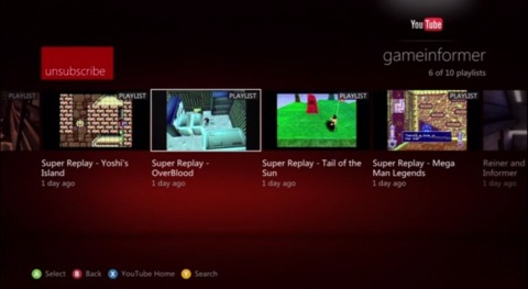
I’m no UI designer but it seems to be that one of the core ideas behind websites like YouTube is that when the user visits the site, they can see the latest content their signed up for immediately laid out in front of them. When the YouTube site gets this largely right, it’s kind of confusing that the YouTube app manages to get this so wrong. When visiting someone’s channel you’re shown a list of the playlists they’ve made, and have to click through to a playlist entitled “All Uploads” to see their videos in chronological order. When I visit someone’s channel I’m very rarely looking for a playlist, I want to see their new videos instantly, and yet that’s a minor issue compared to the real problem with how the app lists its videos.

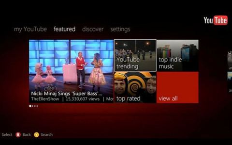
When clicking on a video category or looking at your subscriptions, the app seems content to just display all of the channels within those lists, as opposed to the latest videos from those channels. This means that when checking your subscriptions, unless you’re good at memorising video thumbnails to see when they’ve changed, you’d have to click through to every one of the channels to see whether they have new videos for you. For YouTube themselves it seems a particularly bad idea for them to do this with video categories, given the fact that the people under these categories are YouTube partners and not showcasing their content properly essentially means lost money for YouTube.
When loading one of your playlists you’re also only able to view the first 100 videos in it, and when you load someone else’s playlist, the first 50. There are a lot of channels (like the Giant Bomb channel) which have a whole ton of videos, and essentially cutting out huge chunks of YouTube from the app doesn’t really make sense. People want that content and I see no disadvantage in Microsoft and YouTube giving it to them.
Make Sure the App Works
I don’t know if anyone else has had a similar experience, but in my time of using the app I’ve had five crashes, at least one lock-up, and a day where it could not retrieve any of my channel subscriptions. This is not cool. The app also frequently fails to load videos, but I’ll give the benefit of the doubt and assume it’s on my end. However, that doesn’t excuse the fact that when things do go wrong the application doesn’t have an appropriate way to treat the situation.

As it is, if a list of videos fails to load you’re just left staring at the application background and the YouTube logo, or if you’re lucky the never-ending loading animation. There’s no message telling you the videos didn’t load, in fact the controls disappear entirely from the screen too. Someone who wasn’t rather familiar with computers probably wouldn’t have any idea what was going on. Clicking on a playlist before the app has finished loading in the playlist seems a pretty sure way to cause this particular error and that’s something that people are going to do a lot, you can’t have that just break the app. On some rare occasions I’ve found the program is actually loading videos, but not displaying the loading icon for some reason. This is bad.
If you’re watching a video and your connection has a hiccup you’re little better off. If the video is loading mid-play there’s actually no way to pause it, you have to wait until it’s loaded in and then hit pause, and again, if it can’t load in the video, it won’t tell you, it will just sit there with the loading icon running. People pausing videos and waiting for them to load is something they do fairly often, the program should be able to support that properly. As a side note, if the “loading” or “not loaded” image could not be a dull grey background with an ellipsis over it that’d be nice too. Oh, and when you play a video, then play one of its related videos, there’s really no reason for the app to start playing the first video again when the related video is finished.
I was going to add that the app should support liking or disliking videos in it as well, but that feature actually seems to be in there. The problem is sometimes it appears, sometimes it doesn’t, and I can’t quite work out why it appears on certain occasions and not on others. At any rate it would also be good to have the facility to favourite videos or add them to playlists when you’re watching them.
Duder, It’s Over
YouTube and Microsoft had the opportunity here to bring us an app which was a huge step forward in getting internet-based entertainment into our living rooms, but instead they’ve created what feels like a restricted and watered down version of what is actually a great website. I doubt we’ll see any major overhaul to the app at this point, but if we did I’d have some serious respect for the guys behind it.
-Gamer_152