Something went wrong. Try again later

gbrading

This user has not updated recently.

3317 10581 58 40
Forum Posts Wiki Points Following Followers

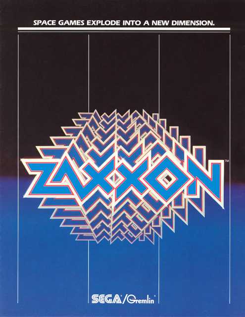
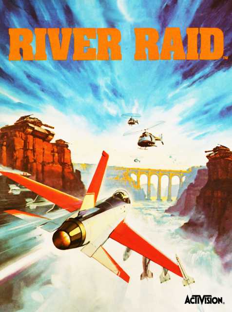
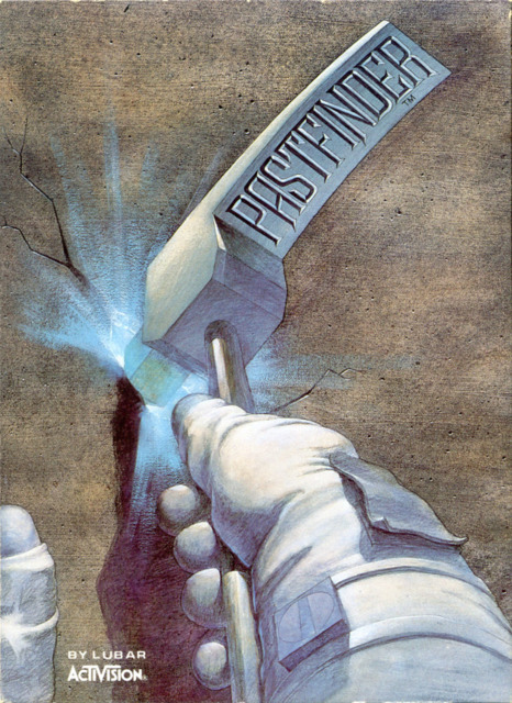
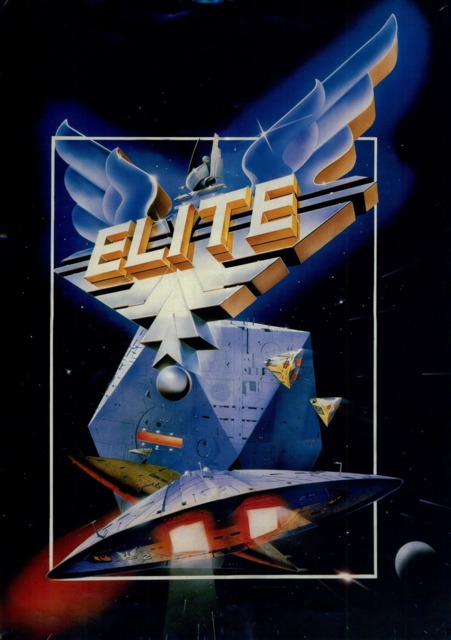
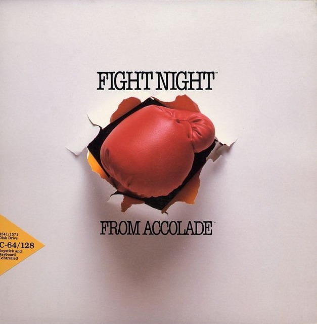
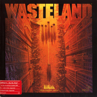
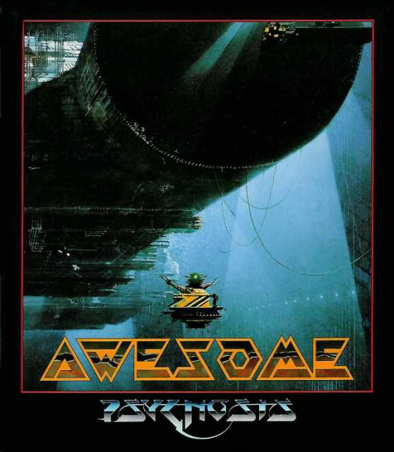
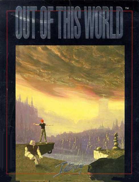
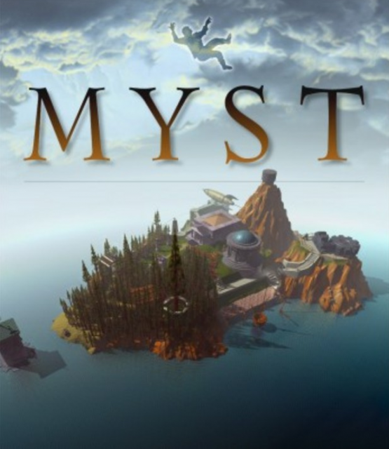
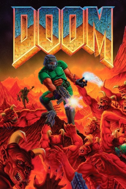
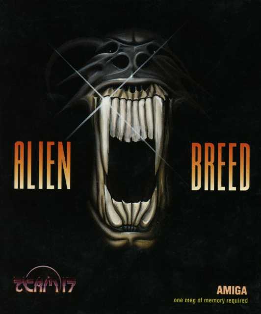
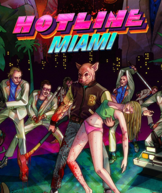
Box Art that is actually "Art"

Let's face it: The days of the box art are numbered. Today, box art is marginalized, left to the last minute, and becoming steadily less important to modern gaming audiences. This list aims to celebrate the very best of box art, solely for its intrinsic artistic value, rather than the game behind it.

This list is a work in progress; I will add additional titles when discovered. Feel free to recommend some in comments.

List items

  • There were some really effective logos in the 1980s, and Zaxxon may take the biscuit as the best of them all. It's bright, bold but minimalist style is instantly recognizable.

  • It seems that nobody has ever played or heard of Vortex for the Apple II, but the box art for it was excellent. A space station is trapped in a swirling vortex of doom!

  • Gorgeous hand painted scene of a fighter jet approaching a helicopter, with a real sense of speed. Perfect hype for a classic game.

  • Bright, vivid colours and a simple, Pop Art style make the box art of Reactor timeless. Jeff Gerstmann has stated that the inspiration for the Giant Bomb logo came from Reactor.

  • A visual metaphor for Pastfinder itself, the box art for this game is magnificent, depicting a hand swinging a pickaxe into a rock-face.

  • While it was later re-released with a more boring box art with just the logo, the original art for Elite is seminal, showing a massive tetrahedron space station and a ship speeding towards it.

  • Accolade's Fight Night has box art anyone will recognize if they ever played Punch-Out!! Nicely miminal, it simply shows a boxing glove coming at you through a wall.

  • Wasteland went on to inspire Fallout, but no game in that series has as good a cover as the original predecessor. Amidst the ruins of civilization, a showdown takes place.

  • An aptly named game for an aptly awesome cover. The cover of Awesome reminds me of Blade Runner's grand style through its industrial, gigantic architecture.

  • Better known to everyone except America as Another World, the iconic cover design is worthy of a Prog Rock album.

  • The cover of Myst shows the whole island you will be exploring and is essentially the game map. A mysterious island awaits, and Myst coveys this immediately.

  • There's a reason this cover is so iconic. It's not just the soldier surrounded by an army of demons or gigantic menacing font hanging in the background; it's the whole picture.

  • Alien Breed's cover is mesmerising and terrifying. The long, horrific teeth remind me of an Emerson, Lake & Palmer album, simply presented on a black background.

  • Limbo is a game entirely in monochrome, so it's fitting the cover is too. A small boy runs through a dark forest towards the light, but will he escape the nightmare?

  • Damacy's cover is intensely whimsical and intensely charming. The ordinary cows in the forefront contrast against the giant ball in the background.

  • This cover more than any other actually belongs in an art gallery. Painted by game designer Fumito Ueda, it instantly paints a vivid picture of the game beneath.

  • Another beautiful Japanese cover, despite Okami's Wii version having the ignominy of having a IGN watermark in it. Amaterasu the wolf leaps across the sky, with a brilliant sun in the background.

  • Hotline Miami's 80's-esque cover brings the soundtrack into my mind immediately. Although quite gruesome, it accurately invokes the singular style of the game.