Something went wrong. Try again later
    Follow

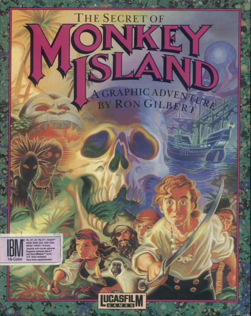
    The Secret of Monkey Island

    Game » consists of 11 releases. Released Oct 31, 1990

    The first game in the legendary Monkey Island series. Guybrush's desire to become a swashbuckling pirate gets him more adventure than he bargained for.

    Gripes with the new art style?

    Avatar image for ikickrocksyo
    ikickrocksyo

    22

    Forum Posts

    0

    Wiki Points

    0

    Followers

    Reviews: 0

    User Lists: 0

    #1  Edited By ikickrocksyo

    Why am I seeing alot of people hating the new art style of the game? I personally played any of the older point and clicks, so maybe the classic artstyle might not appeal to me as much because it wasn't what I grew up on (as I'm a bit younger, the earliest one I remember playing was Kings Quest 6), but the SE edition to be perfectly fine. Of course the animations are a bit....awkward, and Guybrush looks kinda dumb, but I think the updated graphics only help the atmosphere of the game. Specifically when I love switching the graphics on on the bridge in the town, by the Scumm Bar, just to see the difference. The moon all bright and detailed definitely makes that location all the better...

    Avatar image for jjweatherman
    JJWeatherman

    15144

    Forum Posts

    5249

    Wiki Points

    0

    Followers

    Reviews: 10

    User Lists: 18

    #2  Edited By JJWeatherman

    Agreed. Still haven't had the chance to play the game yet but I don't see why anyone would complain. Especially when anyone can just switch back to the old style at any time. Really, how many devs go through the trouble to remake a game and have that kind of functionality these days?

    Avatar image for turbomonkey138
    turbomonkey138

    5288

    Forum Posts

    283

    Wiki Points

    0

    Followers

    Reviews: 0

    User Lists: 1

    #3  Edited By turbomonkey138

    People always hate re makes . They always have and they always will . Just ignore there nerdy comments and enjoy a amazing game .

    Avatar image for jambones
    Jambones

    1726

    Forum Posts

    10015

    Wiki Points

    0

    Followers

    Reviews: 2

    User Lists: 2

    #4  Edited By Jambones

    I dislike the new look to be honest.  But as JJWeatherman said, to add the switch feature in was a stroke of genius. They really know how to attract new players, while keeping grumpy gits like me happy!

    Avatar image for mattyftm
    MattyFTM

    14914

    Forum Posts

    67415

    Wiki Points

    0

    Followers

    Reviews: 4

    User Lists: 11

    #5  Edited By MattyFTM  Moderator

    I love the new art style. It looks awesome.

    Avatar image for ineedaname
    Ineedaname

    4276

    Forum Posts

    410

    Wiki Points

    0

    Followers

    Reviews: 3

    User Lists: 0

    #6  Edited By Ineedaname

    He doesn't look dumb he just looks young =/
    I like how it looks anyways.

    Avatar image for 71ranchero
    71Ranchero

    3421

    Forum Posts

    113

    Wiki Points

    0

    Followers

    Reviews: 0

    User Lists: 6

    #7  Edited By 71Ranchero

    Just a sign of the times. People will find anything to bitch about.

    Avatar image for ikickrocksyo
    ikickrocksyo

    22

    Forum Posts

    0

    Wiki Points

    0

    Followers

    Reviews: 0

    User Lists: 0

    #8  Edited By ikickrocksyo
    @Ineedaname: Even for a young guy his character model looks dumb. I get he's kinda clueless and a wannabe, but I cringe when I see him emoting.

    And yea it kinda sucks that they didn't include the voice over work in the classic version. I hope they do if they remake the sequel.
    Avatar image for cerza
    Cerza

    1678

    Forum Posts

    25

    Wiki Points

    0

    Followers

    Reviews: 15

    User Lists: 4

    #9  Edited By Cerza

    The only thing I don't like about the new art style is that the people look like their carved out of wood, but other than that I am fine with it. The only thing that really bothers me about the game to any great length is that you can't get the new voice work when playing with the classic visuals.

    Avatar image for garnsr
    garnsr

    254

    Forum Posts

    1

    Wiki Points

    0

    Followers

    Reviews: 0

    User Lists: 0

    #10  Edited By garnsr

    The original characters looked more interesting, I think.  I have no real problem withe the art style, but why don't lips move when they use the close-up shots, but the eyebrows move?  And I agree that the voiceover should be on the original, too.

    Avatar image for prok
    Prok

    55

    Forum Posts

    55

    Wiki Points

    0

    Followers

    Reviews: 0

    User Lists: 1

    #11  Edited By Prok

    I think Guybrush looks a bit weird, and perhaps a few other characters - the closeup on Governer Marley is off but Fester Shinetop looks pretty cool. I wouldn't have imagined LeChuck that way but goofy characters like Herman Toothrot pull off the style well.

    Characters looked OK, but the the environment and scenery was amazing. There was a lot of attention to detail that fans of the original could pick up on and everything looked quite vibrant and colourful. It was cool being able to see stairs through the window of the Governors mansion where previously it was just a tint of yellow. Little things like that were fun.

    This edit will also create new pages on Giant Bomb for:

    Beware, you are proposing to add brand new pages to the wiki along with your edits. Make sure this is what you intended. This will likely increase the time it takes for your changes to go live.

    Comment and Save

    Until you earn 1000 points all your submissions need to be vetted by other Giant Bomb users. This process takes no more than a few hours and we'll send you an email once approved.