Xbox 360
Platform »
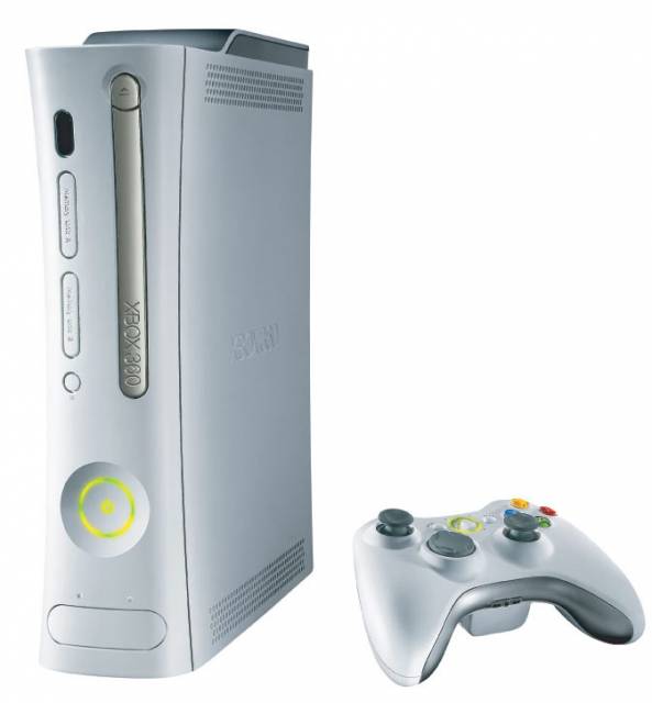
The Xbox 360 is the second game console produced by Microsoft Corporation and is the successor to the original Xbox.
since it's now out , who here hates the new xbox dash?


The game marketplace is cool but the organiaztion of it sucks still. (Was in dash beta.)

I'm not bothered by it whatsoever. It looks more or less exactly the same to me, just with a cleaner, more neutral design scheme. Even if I didn't like it, I still wouldn't care too much. Of the ten or so hours I spend on my 360 every week, the vast majority of that time is spent, y'know, playing video games.


If the overall speed and convenience of using the dash is improved then I will be very happy with the update. The last overhaul I liked to begin with but after the novelty had worn off I'm not actually sure if it was any quicker.
I will say that I still don't like that half of the background theme is obstructed, that said its a minor thing.


Visually painful, I hate squared designs, and I hate simplistic GUIs, I'm waiting for the day when we have overly intricate GUIs like sci-fi movies.
In function it definitely seems better, I just wish the look didn't change.
In fact I loved the original blade design and am still really sad I'll never use it again.


It doesn't take me half a minute to load my game library anymore.
All is well.

It was a long night so I havent updated yet. I'll let you know.
Edit: Ok, I checked it out. It seems pretty cool. I like all the Avatar updates, except the hair, but thats no biggie.
My only real complaint is how everything is now designed around the kinect and it shows. In some ways it reminds me of the WII. I guess the WII's interface was more streamlined so thats not entirely a bad thing really. It also seems like all the little boxes around the interface are bigger, which I dont know why but that annoys me. I guess I just have nit picks.
It seems fine. The netflix update is probably the coolest thing about it.
I'm a little disappointed they still havent made the download history more accessible. Showing the games you've paid for at least in your games collection list, or a link to the download history there would be nice. Or some way to organize that to find a game you want to redownload to play again would be nice. Otherwise, I like it. Its pretty neat.
Edit: Oh forgot to add. The games marketplace I find a little more annoying to navigate now as well.

Much cleaner and more appealing to me, perhaps a little faster in loading/scrolling compared to before.
But as far as how a UI should be designed and function, still pretty terrible in how its organized and makes use of screen space.


"My only complaint is the way the avatars and backgrounds on the My Friends tab move towards and away from the screen while scrolling. It's a bit strange on the eyes. "
Yeah when I first got the dashboard a couple weeks ago, I thought the same thing. But give it two or three days and you really begin to not even notice.

Just read the following article and I think it sums up nicely my feelings about the new dashboard.
"...it feels like my console is trying to impress someone - and that someone isn't me. "
The dashboard looks alright, but you can tell they are trying to appeal to other people in your home who normally don't use the xbox 360. The bright colors and the tutorial on how to navigate the dashboard are dead giveaways to Microsoft's Wii-ification of the xbox strategy. It's really irritating to see Microsoft attempt to re-brand the xbox 360 to a "casual games console." Don't they know that most people already have a Wii?


I hate it to be honest. The new dashboard is visually a step down and it makes absolutely no sense for it to be flat now because you can see less options at any given time. Obviously they decided to make it 2D for Kinect but it annoys me that people who aren't using Kinect have to suffer the new design as a result. And it takes way longer to scroll to end of each block using the bumpers. The new guide looks bloody awful. Seriously, I'm no graphic designer but it looks so unprofessional, and it seems to be less fluid than before. Oh and the dash froze on me twice already.
So yeah, big thumbs down here.


Even though I haven't updated the console yet, I will say I hate it.


I live the new dashboard... jsut one problem I am having....the menu that brings up the updates and downloads is taking forever and a day............

They totally effed with the voice chat. Talked with a friend today and he and I were both amazed when we discovered that it sounded like we were talking through some old telephones or something. Sounds a bit clearer but it's strange.


It seems that more people like it then hate it. I'm really surprised.
To be fair, I don't hate it entirely.
I don't like the obscene amount of white when hitting the xbox botton and, save device selection screen. (the new icons are shitty too forr your devices)
The new achievement icon pop seems funky, i overall dislike all the new sounds. (the kinect tutorial thing is a painful wii rip of music.)
(I play on 2 Tv's 1 HD , 1 SD)
In SD almost everything looks fine minus the theme and, your gamerscore / message notifications, the font is way too damn small.
I've heard a mixed bag on the games library loading time. Mine took a really long time before and, it seems shorter now but, still takes a while.
Overall .. for me it's 70% hate / 30% like
I hope it grows on me
Thanks for the thoughtful discussion everybody.


besides the fact that my xbox has slowed down a little. the search function in netflix is a welcomed change. Also the movement through the menus is a lot smoother and well designed.
Please Log In to post.
This edit will also create new pages on Giant Bomb for:
Beware, you are proposing to add brand new pages to the wiki along with your edits. Make sure this is what you intended. This will likely increase the time it takes for your changes to go live.Comment and Save
Until you earn 1000 points all your submissions need to be vetted by other Giant Bomb users. This process takes no more than a few hours and we'll send you an email once approved.
Log in to comment