
These complaints are weak. The ad space is used for related content to the tab you ate on for all spaces except the bottom corner labeled 'advertisement'. Home mixes them all, games shows new releases and sales, etc. I love having all that stuff surfaced. It's no different than the previous dash. But it wouldn't be a MS release without someone crying over spilt milk... *sigh*
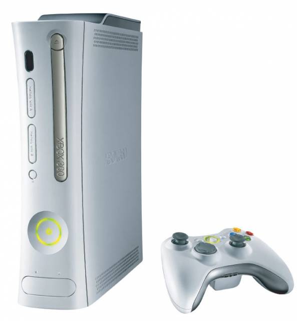
Xbox 360
Platform »
The Xbox 360 is the second game console produced by Microsoft Corporation and is the successor to the original Xbox.
The New Xbox Dashboard is slightly a trainwreck

I don't notice it, I boot up my Xbox and click A to start my game up, done.

The blades do not work in 2011. Everyone goes back to them as the pinnacle of great UI layout but considering where the xbox was and not realizing that 'marketplace' would be a huge deal the iterative changes they've made to the blades to compensate to people buying from the marketplace just made it bad.

So you've never bought anything from Xbox Live Arcade, nor any DLC?I don't notice it, I boot up my Xbox and click A to start my game up, done.
@Pitta said:
These complaints are weak. The ad space is used for related content to the tab you ate on for all spaces except the bottom corner labeled 'advertisement'. Home mixes them all, games shows new releases and sales, etc. I love having all that stuff surfaced. It's no different than the previous dash. But it wouldn't be a MS release without someone crying over spilt milk... *sigh*
But it's not organized, it's all jumbled up and all none of the icons look consistent. Browsing GAF and other sites, there's plenty of people who don't even know what the "Game Type" button does in the game marketplace, because the icon for it doesn't make a lick of sense, and that's the whole dashboard in a nutshell right there.
Things like suggesting new games based on ones you already own is nice. The new dash does make some strides forward, but it also takes some pretty massive ones back, too.

Fuck. It's been a long time since I turned on my 360.
@BlazeHedgehog: Nah, never, I have had DLC come on discs before, but I just hit the xbox button and go that way to type in the code.

I have no issues with the "ads"... the majority of them are all stuff which is on the marketplace or new features. They are things I want the dashboard to be telling me thats available. Should the bottom right ad really be there? Probably no, but its always muted and honestly doesn't bother me either.
I still "enjoy" using the Xbox's marketplace though more then I ever do PSN's

While I agree that the square panels can look a bit cluttered, I don't think, on it's own, that the design is bad.
What's bad is when you compare it to Steam and the XMB; both free, both ad-free, and both with features that the 360 dashboard needs.
Not sure if it means much, but I think the newest UI makes a lot more sense than the previous two. In each panel, the most pertinent options (which are usually your content and the marketplace) are on the left side of the screen. That is where the cursor starts at also, so you don't have to move over all the ads in order to select the appropriate option you want. The new layout also displays much more information on the screen compared to the last two NXEs while also feeling less cluttered.
The mini-guide still stands as the best interface on the 360. It has the functionality of the old Blades but with a minimalist design that is more aesthetically pleasing.
But none of the icons look consistent. None of them are in consistent locations. Sometimes they're stylized to look like system functions, sometimes they're stylized to look like ads, sometimes the sorting option you want is on the left side of the screen, sometimes the exact same sorting icon has been moved to the right side of the screen for absolutely no reason. That is the complete opposite of "making sense".
Think of it this way: part of the "fun" (if you can call it that) of learning an interface is memorizing where everything is so that you can get to what you need strictly by muscle memory alone. Forget about keyboard shortcuts for a minute and consider the difference between watching somebody who knows computers copy/paste a file and watching an old person using the computer for the first time copy/paste that same file. Consistency in interface means that the "copy" and "paste" features are in the same place on all menus, allowing you to quickly and easily identify those options and use them with as little effort as possible.
But imagine you're using Windows and every time you open a menu, all of the features were in a completely different order. Instead of "Undo", "Cut", "Copy", "Paste, "Delete", and "Select All" in that order, the next time you open that menu, it's "Delete", "Paste", "Select All", "Copy", "Undo", "Cut", and for some reason, some (but not all!) of the options are now represented by photographs of scissors, glue, and some random girl doing parkour.
That's what's going on here and it's patently ridiculous.
@Pitta said:
OP - I disagree entirely. I don't personally care about Steam comparisons because I don't pc game anymore for the most part. And ANY version of the Xbox Dash is better than the trash on competing consoles.
It doesn't matter if you play PC games or not and choosing ignorance like that is sort of a dumb counter-argument to what I'm saying. "This turd smells slightly worse than the other piles of crap" isn't exactly the most sound reasoning, either.
@BlazeHedgehog said:
@Andorski said:Not sure if it means much, but I think the newest UI makes a lot more sense than the previous two. In each panel, the most pertinent options (which are usually your content and the marketplace) are on the left side of the screen. That is where the cursor starts at also, so you don't have to move over all the ads in order to select the appropriate option you want. The new layout also displays much more information on the screen compared to the last two NXEs while also feeling less cluttered.
The mini-guide still stands as the best interface on the 360. It has the functionality of the old Blades but with a minimalist design that is more aesthetically pleasing.
But none of the icons look consistent. None of them are in consistent locations. Sometimes they're stylized to look like system functions, sometimes they're stylized to look like ads, sometimes the sorting option you want is on the left side of the screen, sometimes the exact same sorting icon has been moved to the right side of the screen for absolutely no reason. That is the complete opposite of "making sense".
Think of it this way: part of the "fun" (if you can call it that) of learning an interface is memorizing where everything is so that you can get to what you need strictly by muscle memory alone. Forget about keyboard shortcuts for a minute and consider the difference between watching somebody who knows computers copy/paste a file and watching an old person using the computer for the first time copy/paste that same file. Consistency in interface means that the "copy" and "paste" features are in the same place on all menus, allowing you to quickly and easily identify those options and use them with as little effort as possible.
But imagine you're using Windows and every time you open a menu, all of the features were in a completely different order. Instead of "Undo", "Cut", "Copy", "Paste, "Delete", and "Select All" in that order, the next time you open that menu, it's "Delete", "Paste", "Select All", "Copy", "Undo", "Cut", and for some reason, some (but not all!) of the options are now represented by photographs of scissors, glue, and some random girl doing parkour.
That's what's going on here and it's patently ridiculous.
As far as the front end of the UI goes, all the icons look like system functions (as in they are green and contain a symbol rather than a picture of something). In all panels that have a sorting feature, the sorting option is always on the top left (unless there is an app that has the sorting option on the top right; all the apps I have put it top left just like the rest of the UI). In the marketplace is where options to open up sub menus and advertisements can be confused with each other since some options have pictures on them while others are the plain green icon with symbol. It can be befuddling at first, but since they always stay in the same place, then muscle memory will compensate for any visual confusion. Not to mention that all icons, whether it is just a green button with a symbol or a picture that looks like an advertisement, has it's function written at the bottom (e.g. The New Releases icon that is a picture of the 360's power button has "New Releases" written on it; The A to Z icon that is just a green button with A-Z as it's symbol has "A to Z" written on it).
This is where your "Right Click on Windows OS" metaphor is flawed. All options in the marketplace to open up sub-menus stay in the same place. The "Most Popular" sub-menu option for the Add-Ons panel in the Games Marketplace will always be in the top, second-to-the-left position. It's not going to one day move to the bottom left corner. Now, the "A to Z" option in the Movie panel of the Video Marketplace is not in the same position as the "A to Z" option in the Demos panel of the Games Marketplace. That isn't different from how right clicking in Windows works though. Right clicking in this textbox has "Copy" as its fourth option. If I open a .pdf in this browser, then "Copy" is listed as its first option. If I open Microsoft Word and right click, then "Copy" is listed as its second option and has a symbol to the left of it.
All the of system level functions on the dash are ALWAYS in the same place. Arguing with OP is exaushting. New dash is great, and best in class. OP is probably just a tech sperg that crows anytime something changes. I encourage anyone with half a brain to use the thing objectively, and process where things are and how the new design language is read.

The new dash is garbage. It caters to the millions of people who went out a bought a the 360+Kinect bundle so that they could go home and see all the wonderful things MS can offer on the 360. Like the Zune marketplace. And Netflix. And the... Today Show?
Anyways, it just feels like the dashboard has evolved into a bunch of stuff thats... nice to have, but doesnt work nearly as well as it should. MS has made it pretty clear that the 360 now does, "this, this and that and oh yeah, you can play some games". Its great that this system can do a million other things than what it did at launch. But why not let us pick what we want on our home screen? I could go on forever about this so i'll just stop now.


@Pitta said:
OP - I disagree entirely. I don't personally care about Steam comparisons because I don't pc game anymore for the most part. And ANY version of the Xbox Dash is better than the trash on competing consoles.
Sony's current system is leaps and bounds above the 360's garbage menus, and disavowing Steam's interface because you don't care doesn't support your point. It just makes you look ignorant.

RISE FROM YOUR GRAVE!
Anyhow, the "new" dashboard is still awful.
The real issue is that every time Microsoft does anything to update it, everything gets slower and slightly less stable. Booting up my system is starting to take longer and longer, loading netflix or HBO Go is intolerable, and I have had way more crashes since the updates than I used to.
Great stuff.

Yeah, the layout is awful and ugly and a major turn-off, but it's still usable. The real issue here - and one that is completely undeniable - is the multitude of people, myself included, complaining about the long fucking load times. Thirty second long boot time? Sure. All right. Thirty seconds for every fucking menu to load? No, no, that's not good. That indicates a massive flaw in your system, and this is no small issue. And some people have reported menu loading issues of more than thirty seconds, sometimes up to two minutes or more just for quickplay to load. Quickplay, people!
Also, obligatory "old thread" comment.
@believer258 said:
Yeah, the layout is awful and ugly and a major turn-off, but it's still usable. The real issue here - and one that is completely undeniable - is the multitude of people, myself included, complaining about the long fucking load times. Thirty second long boot time? Sure. All right. Thirty seconds for every fucking menu to load? No, no, that's not good. That indicates a massive flaw in your system, and this is no small issue. And some people have reported menu loading issues of more than thirty seconds, sometimes up to two minutes or more just for quickplay to load. Quickplay, people!
Also, obligatory "old thread" comment.
"Quick"play.
Please Log In to post.
This edit will also create new pages on Giant Bomb for:
Beware, you are proposing to add brand new pages to the wiki along with your edits. Make sure this is what you intended. This will likely increase the time it takes for your changes to go live.Comment and Save
Until you earn 1000 points all your submissions need to be vetted by other Giant Bomb users. This process takes no more than a few hours and we'll send you an email once approved.
Log in to comment