Something went wrong. Try again later
    Follow

    Drew Scanlon

    Person » credited in 9 games

    A past contract artist from Backbone Entertainment and former Video Producer at Giant Bomb, Drew ran the West Coast production arm of Giant Bomb along with Jason from 2013 to 2017, whilst also appearing regularly on the Giant Bombcast, in Quick Looks, and in other such video content.

    Introducing Drësca Technologies

    Avatar image for buzz_clik
    buzz_clik

    7590

    Forum Posts

    4259

    Wiki Points

    0

    Followers

    Reviews: 0

    User Lists: 9

    Edited By buzz_clik

    I have a weird problem where I can't stop designing fake team logos for fictional Wipeout titles. I've got a bunch of images on Giant Bomb where I invented a new Wipeout game, Wipeout Buzz, and proceeded to make my own designs for Feisar, Assegai, Piranha et al.

    Not too long after that I started making up new teams and logos for a second bogus title, Wipeout Nuke. This was an even-more-fictional Wipeout game that contained teams based on all the staff of Giant Bomb. Wait, did I say all? Nope, I never made one for Drew, much to my shame.

    But all that has changed now. Ladies and gentleman, allow me to whisk off this silk sheet with a pompous flourish and reveal to you the latest team to join the WM9000 Racing League... Drësca Technologies!

    No Caption Provided

    So why have I made this into a blog? Well, now that I've got a fresh design off the assembly line I thought I'd take this opportunity to let you in on the level of detail/dumb I go to when constructing the branding for these things. While there's no rigid set order to proceedings – sometimes the steps involved are so in flux and overlapping as to be happening all at the same time – in my mind, here's how I think it pretty much goes.

    First up (and sometimes it's kind of in conjunction with the next step) I actually think of a loose back story for the team I'm designing the logo for. This isn't too rich a fiction, but I'll usually think up a team's country of origin, the company's underlying ethos and the face it presents to the world. In real life, Drew's a placid, well-presented dude with some sort of Nordic heritage (I think?) so I wanted to make his team vaugely possibly Swedish-ish with a positive, less cut throat slant to the company. Obviously they want to be the fastest and win, but they're a pretty clean cut bunch who are friends with everyone once they get off the track.

    Next up I need a name, because there's no point noodling about in Illustrator with no basis for your design. I'm a big fan of wordplay – anagrams, acronyms, portmanteaus, you name it – so I'll sit with a pen and pad and scribble down all manner of mangled, mutated words until I'm happy. Fun fact: Backwards, DREW SCANLON is NOLNACS WERD. Oh, werd? Werd, homeboy.
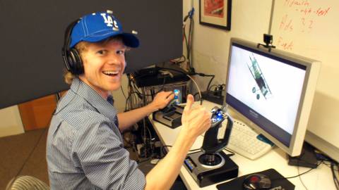
    This man is my muse. WOOK AT HIS HAPPY WIDDLE FACE!
    This man is my muse. WOOK AT HIS HAPPY WIDDLE FACE!

    In the case of Drësca, I feel kinda cheap just taking the first three letters of Drew's first and last names because I did the same with Team Vincar, but it just kinda worked in having that Scandinavian vibe. But Vinny and Drew are kinda inseparable entities in the real life Giant Bomb offices, so there's kind of a link there. Also, because Vinny's also a nice guy, my Vincar backstory actually did have an environmentally aware angle to it, so I guess in the fuzzy fiction I've created for Wipeout Nuke, those two companies might actually have a working relationship or history...

    See, I'm writing Wipeout fan fucking fiction! This is the unnecessary, possibly mentally unhinged stuff that goes into my logos. I hella digress. With the concept in mind that there's a sort-of-but-not Swedish leaning on this whole thing, I popped the dots over the letter 'e' to make it look like a name you might find in an Ikea catalogue. Plus it seemed to fit with that oldschool Designers Republic look that I wanted. I have no idea if I've rendered the word "Drësca" unpronounceable with this addition, but what-the-fuck-evs. Form over function, people!

    So with the team history and name sorted, it's time to start designing the logo. Sometimes I'll create the main hero logo first and that will inform the look and placement of the typeface, other times the reverse is true. For Drësca I designed the letterforms first, so let's start there, shall we?

    Seeing as Drësca's general feel is a globally non-threatening company I wanted to make give things a nice curvilinear look, but not so sleek that it lost its friendliness. This notion actually fit with the fact that there's a particular DR style used in earlier Wipeout games that I hadn't used yet. I won't go too much into wanky detail on this, but suffice to say this typeface didn't take me long to whip up and it turned out looking as I wanted it to. Half the time was spent tweaking the way letters interact with their neighbours. For instance, where the lower parts of the 'e' and the 's' butt up against each other was something I slid back and forth, left and right, until I felt it was right.

    Now we come to an example of the creative processes intersecting and folding back around. Once I'd done the bulk of that design, I felt it needed something more. I then decided to append the word "technologies" as a tip of the cap to Drew doing a lot of the technical behind-the-scenes stuff at Giant Bomb. Also, the two words have a pleasing assonance, which always hits my linguistic erogenous zone.

    With the main text done, it's time to turn my attention to the logo image. Usually, I'll make something that is indicative of something (usually racing and speed, go figure) and tends to be more abstract and suggestive rather than literal. These logos can still be guided by an object I have in mind or, more commonly, a gut feeling about the company I've created.

    This is me trying to figure out the image portion of the logo. Most of my Illustrator WIP files each have dozens of incrementally changing designs.
    This is me trying to figure out the image portion of the logo. Most of my Illustrator WIP files each have dozens of incrementally changing designs.

    In the case of Drësca a lot of elements and discarded ideas went into the final version. Again, it needed to be rounded and approachable. I started out trying to make smiling faces, but that sort of wasn't going anywhere. And at any rate, Drew is more a calm dude so I didn't want the logo to be too enthusiastic. I also wanted to allude to a couple of things while making these original faces. First, I wanted to have three eyes - two for Drew's eyes, and a third eye to represent a camera lens. The other allusion I wanted to make was to the head tracking equipment that Drew, Dave and Vinny have been using in their Flight Club Quick Looks.
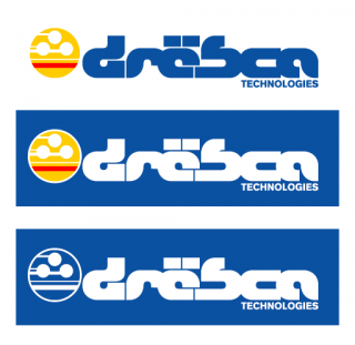
    Various implementations of the final logo.
    Various implementations of the final logo.

    When the face thing wasn't really panning out, I decided to keep the elements and just form them into something more abstract. Still thinking of Drew, I turned the "mouth" of the face from a smiling one to a flat, stoic line (in my mind it was still a mouth, just less obviously so). As soon as a I did that, it looked to me like three white balls hovering over the ground. Perfect for Wipeout! I then added lines to the balls to make it look like they were racing each other from left to right.

    The final thing I did to the entire logo was pick the right colours. I kept the "mouth" in the pictorial element as red, just to give the whole thing a splash of flashy colour, but the other elements I changed to the yellow and blue of the Swedish flag, just to tie things up thematically.

    And that's that! Phew! I've no idea if that was a boring read or not, but this whole process has been something I've wanted to document since I started making these things. And yes, I go through this with every one I do - I've got a different story, country and ethos for all the Wipeout Nuke logos I've made. You don't wanna even know what those ruthless German dudes at SHMKR are like. You'd never look at Brad the same way again.
    Avatar image for buzz_clik
    buzz_clik

    7590

    Forum Posts

    4259

    Wiki Points

    0

    Followers

    Reviews: 0

    User Lists: 9

    #1  Edited By buzz_clik

    I have a weird problem where I can't stop designing fake team logos for fictional Wipeout titles. I've got a bunch of images on Giant Bomb where I invented a new Wipeout game, Wipeout Buzz, and proceeded to make my own designs for Feisar, Assegai, Piranha et al.

    Not too long after that I started making up new teams and logos for a second bogus title, Wipeout Nuke. This was an even-more-fictional Wipeout game that contained teams based on all the staff of Giant Bomb. Wait, did I say all? Nope, I never made one for Drew, much to my shame.

    But all that has changed now. Ladies and gentleman, allow me to whisk off this silk sheet with a pompous flourish and reveal to you the latest team to join the WM9000 Racing League... Drësca Technologies!

    No Caption Provided

    So why have I made this into a blog? Well, now that I've got a fresh design off the assembly line I thought I'd take this opportunity to let you in on the level of detail/dumb I go to when constructing the branding for these things. While there's no rigid set order to proceedings – sometimes the steps involved are so in flux and overlapping as to be happening all at the same time – in my mind, here's how I think it pretty much goes.

    First up (and sometimes it's kind of in conjunction with the next step) I actually think of a loose back story for the team I'm designing the logo for. This isn't too rich a fiction, but I'll usually think up a team's country of origin, the company's underlying ethos and the face it presents to the world. In real life, Drew's a placid, well-presented dude with some sort of Nordic heritage (I think?) so I wanted to make his team vaugely possibly Swedish-ish with a positive, less cut throat slant to the company. Obviously they want to be the fastest and win, but they're a pretty clean cut bunch who are friends with everyone once they get off the track.

    Next up I need a name, because there's no point noodling about in Illustrator with no basis for your design. I'm a big fan of wordplay – anagrams, acronyms, portmanteaus, you name it – so I'll sit with a pen and pad and scribble down all manner of mangled, mutated words until I'm happy. Fun fact: Backwards, DREW SCANLON is NOLNACS WERD. Oh, werd? Werd, homeboy.

    This man is my muse. WOOK AT HIS HAPPY WIDDLE FACE!
    This man is my muse. WOOK AT HIS HAPPY WIDDLE FACE!

    In the case of Drësca, I feel kinda cheap just taking the first three letters of Drew's first and last names because I did the same with Team Vincar, but it just kinda worked in having that Scandinavian vibe. But Vinny and Drew are kinda inseparable entities in the real life Giant Bomb offices, so there's kind of a link there. Also, because Vinny's also a nice guy, my Vincar backstory actually did have an environmentally aware angle to it, so I guess in the fuzzy fiction I've created for Wipeout Nuke, those two companies might actually have a working relationship or history...

    See, I'm writing Wipeout fan fucking fiction! This is the unnecessary, possibly mentally unhinged stuff that goes into my logos. I hella digress. With the concept in mind that there's a sort-of-but-not Swedish leaning on this whole thing, I popped the dots over the letter 'e' to make it look like a name you might find in an Ikea catalogue. Plus it seemed to fit with that oldschool Designers Republic look that I wanted. I have no idea if I've rendered the word "Drësca" unpronounceable with this addition, but what-the-fuck-evs. Form over function, people!

    So with the team history and name sorted, it's time to start designing the logo. Sometimes I'll create the main hero logo first and that will inform the look and placement of the typeface, other times the reverse is true. For Drësca I designed the letterforms first, so let's start there, shall we?

    Seeing as Drësca's general feel is a globally non-threatening company I wanted to make give things a nice curvilinear look, but not so sleek that it lost its friendliness. This notion actually fit with the fact that there's a particular DR style used in earlier Wipeout games that I hadn't used yet. I won't go too much into wanky detail on this, but suffice to say this typeface didn't take me long to whip up and it turned out looking as I wanted it to. Half the time was spent tweaking the way letters interact with their neighbours. For instance, where the lower parts of the 'e' and the 's' butt up against each other was something I slid back and forth, left and right, until I felt it was right.

    Now we come to an example of the creative processes intersecting and folding back around. Once I'd done the bulk of that design, I felt it needed something more. I then decided to append the word "technologies" as a tip of the cap to Drew doing a lot of the technical behind-the-scenes stuff at Giant Bomb. Also, the two words have a pleasing assonance, which always hits my linguistic erogenous zone.

    With the main text done, it's time to turn my attention to the logo image. Usually, I'll make something that is indicative of something (usually racing and speed, go figure) and tends to be more abstract and suggestive rather than literal. These logos can still be guided by an object I have in mind or, more commonly, a gut feeling about the company I've created.

    This is me trying to figure out the image portion of the logo. Most of my Illustrator WIP files each have dozens of incrementally changing designs.
    This is me trying to figure out the image portion of the logo. Most of my Illustrator WIP files each have dozens of incrementally changing designs.

    In the case of Drësca a lot of elements and discarded ideas went into the final version. Again, it needed to be rounded and approachable. I started out trying to make smiling faces, but that sort of wasn't going anywhere. And at any rate, Drew is more a calm dude so I didn't want the logo to be too enthusiastic. I also wanted to allude to a couple of things while making these original faces. First, I wanted to have three eyes - two for Drew's eyes, and a third eye to represent a camera lens. The other allusion I wanted to make was to the head tracking equipment that Drew, Dave and Vinny have been using in their Flight Club Quick Looks.

    Various implementations of the final logo.
    Various implementations of the final logo.

    When the face thing wasn't really panning out, I decided to keep the elements and just form them into something more abstract. Still thinking of Drew, I turned the "mouth" of the face from a smiling one to a flat, stoic line (in my mind it was still a mouth, just less obviously so). As soon as a I did that, it looked to me like three white balls hovering over the ground. Perfect for Wipeout! I then added lines to the balls to make it look like they were racing each other from left to right.

    The final thing I did to the entire logo was pick the right colours. I kept the "mouth" in the pictorial element as red, just to give the whole thing a splash of flashy colour, but the other elements I changed to the yellow and blue of the Swedish flag, just to tie things up thematically.

    And that's that! Phew! I've no idea if that was a boring read or not, but this whole process has been something I've wanted to document since I started making these things. And yes, I go through this with every one I do - I've got a different story, country and ethos for all the Wipeout Nuke logos I've made. You don't wanna even know what those ruthless German dudes at SHMKR are like. You'd never look at Brad the same way again.

    Avatar image for claude
    Claude

    16672

    Forum Posts

    1047

    Wiki Points

    0

    Followers

    Reviews: 2

    User Lists: 18

    #2  Edited By Claude

    To bad people that make fake team logos for Wipeout don't make actual games.

    Avatar image for deactivated-5d7bd9e4bef30
    deactivated-5d7bd9e4bef30

    4741

    Forum Posts

    128

    Wiki Points

    0

    Followers

    Reviews: 0

    User Lists: 0

    That's a fantastic facsimile of some classic Designer's Republic ish

    Avatar image for sarjutherapper
    SarjuTheRapper

    290

    Forum Posts

    0

    Wiki Points

    0

    Followers

    Reviews: 0

    User Lists: 0

    #4  Edited By SarjuTheRapper

    Gee willikers, that's some hobby you got there!

    Avatar image for korosuzo
    Korosuzo

    231

    Forum Posts

    0

    Wiki Points

    0

    Followers

    Reviews: 0

    User Lists: 3

    #5  Edited By Korosuzo

    That's all sorts of awesome. Interesting read as well.

    Avatar image for phatmac
    Phatmac

    5947

    Forum Posts

    1139

    Wiki Points

    0

    Followers

    Reviews: 18

    User Lists: 12

    #6  Edited By Phatmac

    Guess everybody has weird hobbies like this. Good work nonetheless.

    Avatar image for mento
    Mento

    4974

    Forum Posts

    552454

    Wiki Points

    0

    Followers

    Reviews: 39

    User Lists: 212

    #7  Edited By Mento  Moderator

    Seriously cool. You make this stuff look easy, despite the fact graphic designers tend to get paid thousands for stuff like this. What I'm saying is that you should be paid thousands of spacecredits from all these futuristic technological companies who probably have it within their power to whip up a time machine to wire it all back to the present era where it can be appreciated by an as yet uncyborgified buzz_clik.

    I can only surmise that SHMKR is so unscrupulous that much of its workforce either leave the company, find themselves broken or tragically die.

    Avatar image for kortex
    kortex

    572

    Forum Posts

    27

    Wiki Points

    0

    Followers

    Reviews: 0

    User Lists: 0

    #8  Edited By kortex

    Creating fake futuristic racing games is my second favorite hobby.

    Number 1 is this:

    Avatar image for debigulator
    Debigulator

    58

    Forum Posts

    0

    Wiki Points

    0

    Followers

    Reviews: 0

    User Lists: 0

    #9  Edited By Debigulator

    That was a great read. I've always loved your designs, so it was nice to hear the thought process behind one.

    After reading "Vincar" I keep imagining an anthropomorphized car that looks like Vinny.

    Avatar image for mikeeegeee
    mikeeegeee

    1638

    Forum Posts

    8

    Wiki Points

    0

    Followers

    Reviews: 0

    User Lists: 0

    #10  Edited By mikeeegeee

    Excellent read, awesome designs. Thanks for this!

    Avatar image for seriouslynow
    SeriouslyNow

    8504

    Forum Posts

    0

    Wiki Points

    0

    Followers

    Reviews: 0

    User Lists: 1

    #11  Edited By SeriouslyNow
    @Claude said:
    To bad people that make fake team logos for Wipeout don't make actual games.
    That was my first thought too. BK GET YOUR ASS TO MARS!  *or the nearest proper game development studio*
    Avatar image for two_socks
    two_socks

    532

    Forum Posts

    35

    Wiki Points

    0

    Followers

    Reviews: 0

    User Lists: 0

    #12  Edited By two_socks

    this is rad as fuck dude.

    Avatar image for james_giant_peach
    James_Giant_Peach

    756

    Forum Posts

    1114

    Wiki Points

    0

    Followers

    Reviews: 0

    User Lists: 0

    I imagine Vincar being like NightRider, having VInny's soothing voice directing you around the track and providing witty commentary.

    Avatar image for tim_the_corsair
    tim_the_corsair

    3053

    Forum Posts

    0

    Wiki Points

    0

    Followers

    Reviews: 0

    User Lists: 2

    #14  Edited By tim_the_corsair

    Vincar being like NightRider? "Turn left. Turn left! Fucking, WHAT ARE YOU DOING? WHAT THE FUCK ARE YOU DOING? Cunt."

    Avatar image for mnzy
    mnzy

    3047

    Forum Posts

    147

    Wiki Points

    0

    Followers

    Reviews: 0

    User Lists: 0

    #15  Edited By mnzy

    It's Knight Rider, not NightRider, GOSH!

    Avatar image for mnzy
    mnzy

    3047

    Forum Posts

    147

    Wiki Points

    0

    Followers

    Reviews: 0

    User Lists: 0

    #16  Edited By mnzy

    It's Knight Rider, not NightRider, GOSH! 
     
    And this hobby is amazing, I can totally understand why you're fascinated with Wipeout logos.

    Avatar image for ravenlight
    Ravenlight

    8057

    Forum Posts

    12306

    Wiki Points

    0

    Followers

    Reviews: 0

    User Lists: 2

    #17  Edited By Ravenlight

    @buzz_clik:

    Also, the two words have a pleasing assonance, which always hits my linguistic erogenous zone.

    I just wordgasm'd.

    Avatar image for mesoian
    mesoian

    1623

    Forum Posts

    523

    Wiki Points

    0

    Followers

    Reviews: 15

    User Lists: 8

    #18  Edited By mesoian

    @buzz_clik: You should make a syndicate team for this.

    Avatar image for renegadesaint
    RenegadeSaint

    1640

    Forum Posts

    75

    Wiki Points

    0

    Followers

    Reviews: 4

    User Lists: 2

    #19  Edited By RenegadeSaint

    When I create a company, I'm hiring you for some freelance design work. Fantastic blog and logo.

    Avatar image for bollard
    Bollard

    8298

    Forum Posts

    118

    Wiki Points

    0

    Followers

    Reviews: 3

    User Lists: 12

    #20  Edited By Bollard

    @buzz_clik said:

    I have a weird problem where I can't stop designing fake team logos for fictional Wipeout titles.

    Best opening line to a blog ever.

    Avatar image for tebbit
    tebbit

    4659

    Forum Posts

    861

    Wiki Points

    0

    Followers

    Reviews: 3

    User Lists: 6

    #21  Edited By tebbit

    I think I've said this multiple times before but goddamn, buzz_clik

    GOD DAMN.

    I miss the Designers Republic.

    Avatar image for buzz_clik
    buzz_clik

    7590

    Forum Posts

    4259

    Wiki Points

    0

    Followers

    Reviews: 0

    User Lists: 9

    #22  Edited By buzz_clik

    @Tebbit: Heh, you were in my thoughts while I was making this, buddy.

    Avatar image for n7
    N7

    4159

    Forum Posts

    23

    Wiki Points

    0

    Followers

    Reviews: 4

    User Lists: 2

    #23  Edited By N7

    You are a talented man and I think I love you.
     
    But seriously, you make this look waaaaay easy. Fantastic job. It looks like this could be an actual thing. One weird little thing about me is I REALLY like logos. Way more than I should, probably. I mean we're talking Umbrella, FOXHOUND, Fox, N7(As you could probably tell), Cerberus, Alliance Navy. I think logos are really representative of something, because it exudes the concept, the meaning, the visual fragrance in a way that cannot be conveyed in any other form. This is no different.
     
    It's great to see so much thought and meaning can go into something that's, in terms of scale, so small. You see something like this and go "Oh well that's neat', but then you read into it and it turns into this huge journey, almost. It's really great to see, and really great to read about. You should do this type of thing more often. Just go off the deep end and write some shit about it, because as someone who has no talent in terms of art, I have come to respect both it and the artists, and let me tell you my friend, you do very nice work. :)

    Avatar image for buzz_clik
    buzz_clik

    7590

    Forum Posts

    4259

    Wiki Points

    0

    Followers

    Reviews: 0

    User Lists: 9

    #24  Edited By buzz_clik

    @N7: Yeah, logos are (obviously) a thing for me, too. I mean, I like designing bigger pieces with more scope and scale, but there's something about distilling the essence of an idea or a company or an object into a single-serving morsel.

    @N7 said:

    ...the visual fragrance...

    This turn of phrase really made me smile.

    Avatar image for n7
    N7

    4159

    Forum Posts

    23

    Wiki Points

    0

    Followers

    Reviews: 4

    User Lists: 2

    #25  Edited By N7
    @buzz_clik: You just gave me the Back Talking with a Twist of Lime, quest... somehow... Keep up the good work...?
    Avatar image for buzz_clik
    buzz_clik

    7590

    Forum Posts

    4259

    Wiki Points

    0

    Followers

    Reviews: 0

    User Lists: 9

    #26  Edited By buzz_clik

    @N7: Yeah, I do that sometimes. Enjoy your quest fruit! :)

    This edit will also create new pages on Giant Bomb for:

    Beware, you are proposing to add brand new pages to the wiki along with your edits. Make sure this is what you intended. This will likely increase the time it takes for your changes to go live.

    Comment and Save

    Until you earn 1000 points all your submissions need to be vetted by other Giant Bomb users. This process takes no more than a few hours and we'll send you an email once approved.