Something went wrong. Try again later

takua108

This user has not updated recently.

1596 3503 237 200
Forum Posts Wiki Points Following Followers

Games with fantastic menus

I like menus in video games. Like, seriously, you could call me a game menu connoisseur. Menu systems and UI stuff in general is one of the things in games that interests me the most. I'm looking to get into game design with the secret goal of one day being a UI director on a project or something. Too often I play games and it's just, like, "what the hell, why did they make moving between the different items in this menu feel so shitty?"

For me, personally, a game's menu system is a huge factor in deciding how much I like a game. When you turn on the game, the first thing you do is interact with main menu (and possibly a "Press Start" screen before it)%3B this sets the tone for the rest of the game in my eyes. Tim Rogers often talks about "friction" in games, using a variety of silly metaphors and adjectives%3B I think%26nbsp%3BI'm talking about the same thing (but I'm not entirely sure).

Menus are one of those things in games that people don't tend to think about, including the developers. Too often, games will let their menus be clunky and poorly-designed, and it just detracts from the overall experience that the end user has. At least, it does for me%3B I'm no psychologist, but I'm pretty sure that if more games had slicker menu systems, people would enjoy them even more.

This is an incomplete list, as I'm sure there's several that I'm missing, so post a comment below if you know of some games with great menus that I haven't listed here%3B I'll be more than happy to check it out.

List items

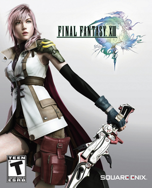
  • I was genuinely surprised by how good the menus in this game look and feel, and, honestly, it was a major selling point. I rented FFXIII on a whim, and if the menus weren't as awesome as they are, I probably wouldn't've ordered a copy of the game for $27 on Amazon later that night. The main menu (not the title screen main menu, but the Y/triangle menu) feels pretty good, but the save game selection menu is maybe the best I've seen. I'm usually a one-save-file kind of guy, but I made another save file just to joyfully transition between the three options whenever I save a game. (The only minor issue I have with the presentation of the menus is that, again on the Y/triangle menu, when you choose a top-level option, it makes this ugly little water-ripple effect on top of the option you chose. It doesn't look good, and it feels weird when every other part of the menu is swift and concise.)

  • The menus in this game are incredible. They do the "each menu item gets a different tone when you select it" thing, and that combined with the snappiness of moving between menu items and screens makes for an excellent overall package.

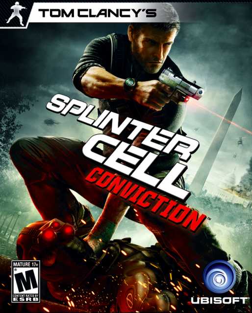
  • Usually my criteria for liking a menu is more or less "snappy, responsive, and doesn't waste your time when you use it." Conviction's main menu wasn't exactly snappy or responsive (but it wasn't too bad, either), but the animation as you progress through the menu options is one of the coolest things I've ever seen a game do.

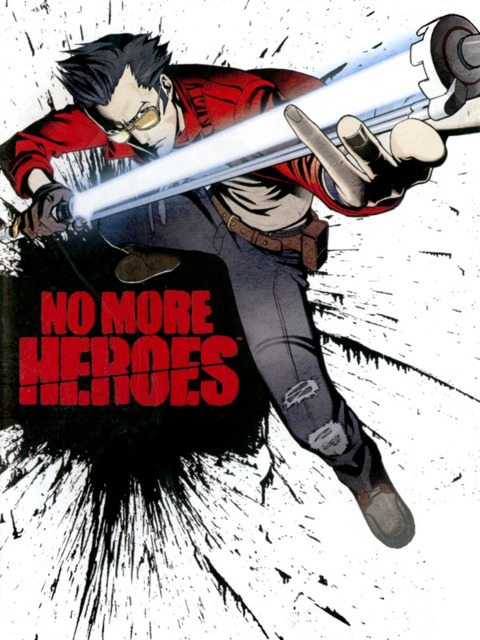
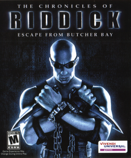
  • Having your title screen be graffiti on the wall behind the toilet where you most recently saved your game (as toilets are save points) (and each toilet is not only unique, but so is the graffiti) is the greatest thing for a video game to have, ever. Also, since your hotel room is more or less a menu, it has the best menu music ever to be featured in a video game.

  • The title screen/main menu is probably the greatest title screen/main menu of any game, ever. Again, not as snappy as it technically could be, but it perfectly fits the slick animation in a very tactile way.

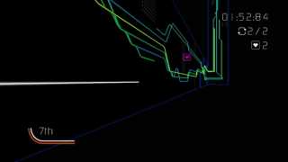
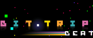
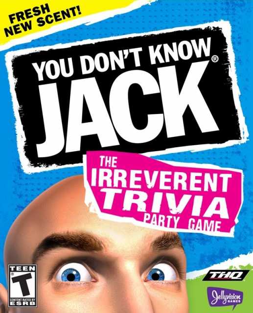
  • Having a menu that, in effect, forces you to learn the game's sole gameplay mechanic is something that I wish I'd've thought of.

  • The in-game menu system ("pause" menu/battle menu thing) feels pretty much perfect. The fact that they re-used the sounds from Golden Sun and The Lost Age is just icing on the cake.

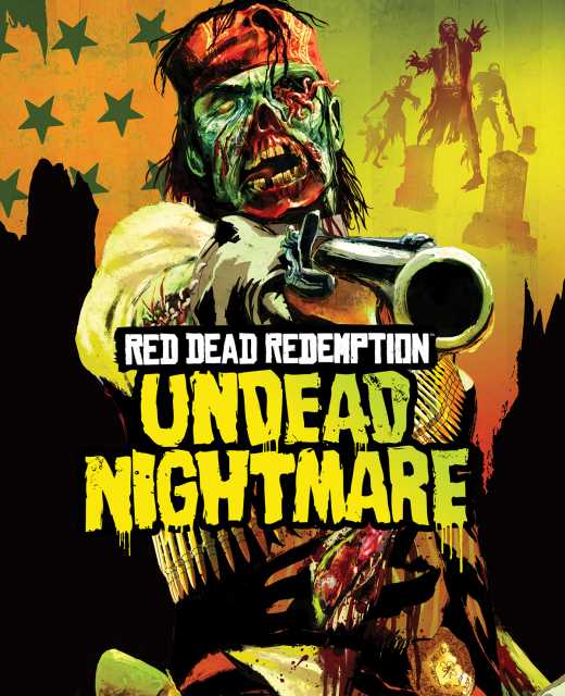
  • Rockstar did something really cool with Undead Nightmare that was probably too subtle for most to see, but I sure as hell noticed it and silently applauded them for it when I first saw it. When you first install the "Undead Nightmare" DLC, you're left wondering how you access the content. You start up Red Dead Redemption, and discover the new "Undead Nightmare" menu item. You select it and press A, expecting the screen to cut to black as a separate executable loads, like when you select "Multiplayer" from the main menu in the recent Call of Duty games. Instead, you see an animated stream of color drip down the screen, and the familiar red, white and black color scheme mutate into a sickly, undead olive, yellow, and black. Then it cuts right to the "loading the game now" screen, just as it would in vanilla Red Dead (only now with a new background, of course). This subtle visual cue lets you know that no, this isn't just some shitty "zombie mode" add-on... it's just as good, if not better than the main campaign. When you bolt shit in via DLC, you expect some degree of jank, some visible seams betraying the fact that this wasn't necessarily planned on being added onto the game%3B Undead Nightmare let you know from the get-go that you were in for a quality experience.

  • The menus in Alan Wake are super minimalist and very snappy. A very subdued choice, but I still really like them.

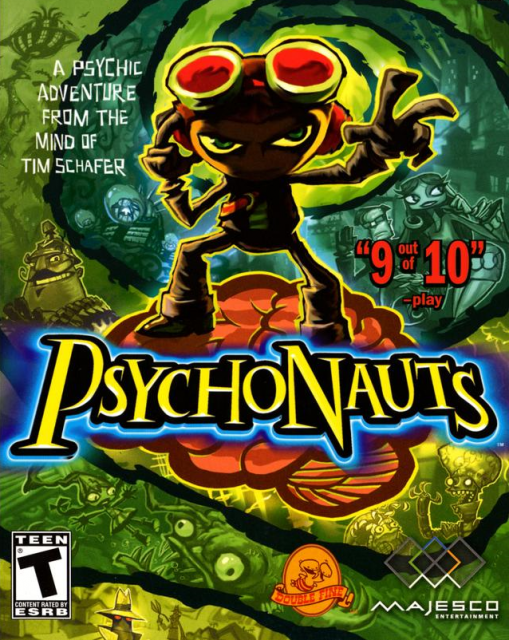
  • I know that other games do the whole "title screen is just gameplay" thing (although I can't list too many off the top of my head), but Psychonauts took that idea and made it really special. Since the human brain and its power is pretty much the game's central theme, what better way to open the game, showing you what kind of crazy shit you're in for than having you control Raz, the main character, as he runs around a pickup truck-sized brain with the game's logo stamped into it using the same sort of local planetoid gravity like in Super Mario Galaxy?

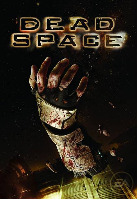
  • A pretty obvious choice here, but the in-game UI stuff is excellent. Navigating your inventory screen actually feels (presumably intentionally) not as smooth or snappy as it could, but it's not horribly clunky and unusable, either%3B just slightly rough enough to keep you on your toes while being surrounded by monsters. The main menu is a bit more sluggish than I'd like, but, again, it's consistent with the in-game UI stuff, so it sorta gets a pass.

  • Going back to menus that just "feel" great... World of Goo definitely has a ton of this. From the way the chapter selection is presented on a silhouetted planetoid (coincidentally the name of my newest band [Silhouetted Planetoid loves you!]), a literal World of Goo, to the slick animation that transitions you from completing a level to the score screen back out to the map screen... it's all pretty good. I just wish it was higher-resolution. :\

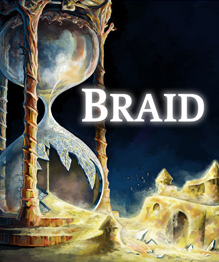
  • Speaking of games that dump you right into gameplay, I hope it's not too far outside of the confines of this list's topic to mention Braid. There's something to be said for a game where you load it up, press Start only to discover that the title screen is actually the first screen of the game, and your character is silhouetted against the background. You press "right" on the stick or d-pad, and your character walks across the screen, past it, and into a house, beginning the game. Brilliant. Who needs pesky menus anyways? (The pause menu is incredibly mediocre, however.)

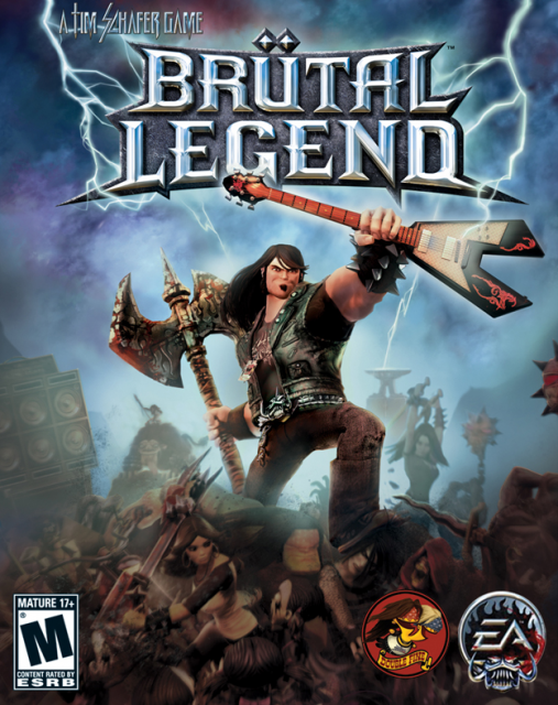
  • The weird, for-no-good-reason-other-than-"it's awesome" "steel Rubix cube-looking thing" main menu may not be much more than just a run-of-the-mill vertical list of items, but damn, is it ever cool to see those cubes morph and spin and rearrange themselves for no real good reason when moving between menu levels.

  • This game has a great menu! It's no Final Fantasy XIII, but everything about the way all of the menus "feel" is certainly well above par.

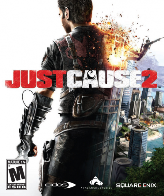
  • The Just Cause 2 menus were alright%3B above average perhaps, but nothing especially great... except for one of the greatest innovations for a game with as many pre-main menu title cards as it has: make 'em each fade in, front and center like you'd expect, one by one, for a very brief period of time before scaling down to sit at the bottom of the title screen. You could even mash A and skip through the animation. A really minor thing to praise a game for, even for this list, but it nevertheless struck me as pretty cool.

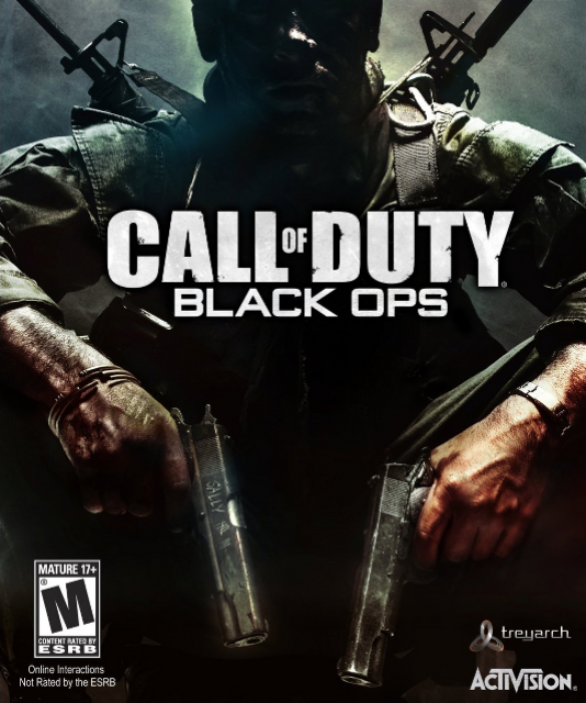
  • Blops has a great main menu with a killer presentation that unfortunately never gets the payoff it really deserves in the single-player campaign. I totally expected/hoped for a semi-fourth-wall-breaking moment where you think you're back at the title screen, but then the menu options burst into number particles and *then* the guy bursts into the door. It does still have fucking /Zork/ hidden in the main menu, so I guess that's pretty cool.

0 Comments