Flaime's Tips and Mini-Guide on Page Formatting
By Tasus 26 Comments
Disclaimer
Nothing in this blog has been confirmed to be “the right thing to do”. It serves as a mere guideline and an insight on how to setup content when wiki editing, based entirely on my experience with Giant Bomb and the little education I’ve received in design and matters of such.Introduction
One of my primary activities here on Giant Bomb is wiki editing. I’m not a person who often adds ton of content to various pages, in terms of words, unless I find the subject rather interesting. However, the way I’ve gotten most of my wiki points is simply by formatting (more reader-friendly) various pages; pages that are messy (visually), chaotic, or poorly constructed. Sure, doing something like this usually, reward you with only 1-5 points, but some pages are really messed up, and if you take your time, you can easily acquire a quite large amount of points. Also, you make the Internet a better place!
With the rapidly increasing user-base on this site, I thought I would make a mini-guide showing you my approach, and maybe give you some tips on how to make your wiki editing look awesome!
Placing Images
Adding images is incredibly easy and gives the pages much needed color and beauty. However, some problems may occur when not placing them correctly.
When images are place incorrectly, they divide a sentence in two, separating a word and making a new paragraph.
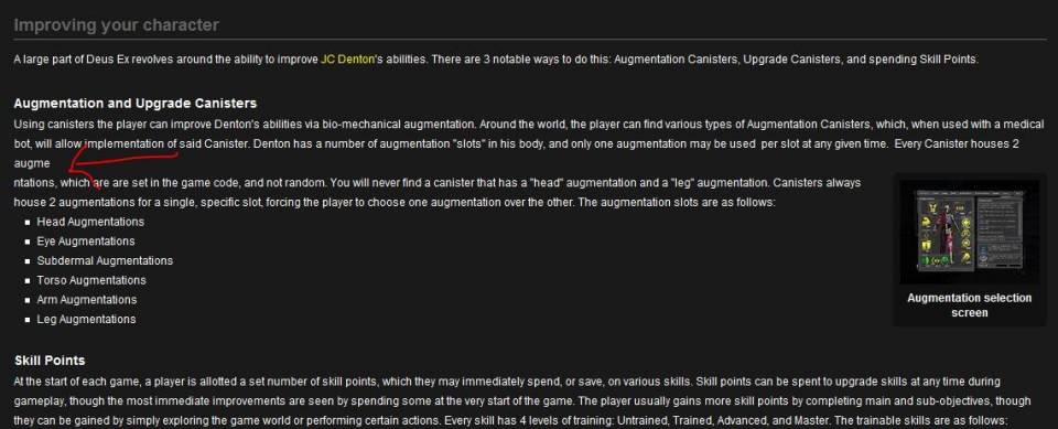
This happens because the image was placed in the spot where the word “augmentations” is now separated.
To avoid this, you have to place the images in the begging or in the end of a header or paragraph.
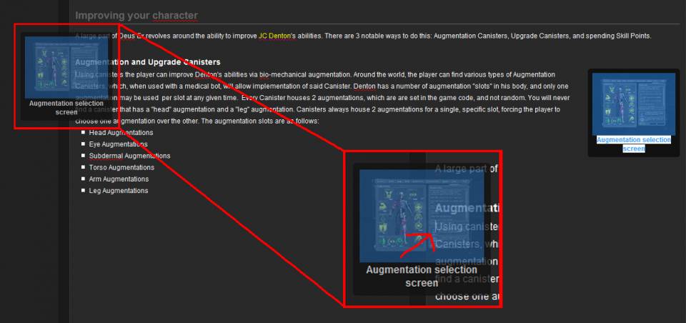
Images Overlapping Header.
One of the most common problems I see on this site is images that cross a H2 (Header 2).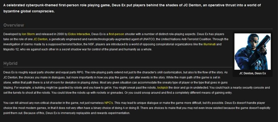
This is often found at the very top of the page, giving the reader a bad first-impression when he visits the page. It makes the page look unprofessional. When talking about problems like this, your browser’ size often plays a big factor. The person who inserted this picture most likely had a smaller browser window, making the page look like this on his/her montitor:
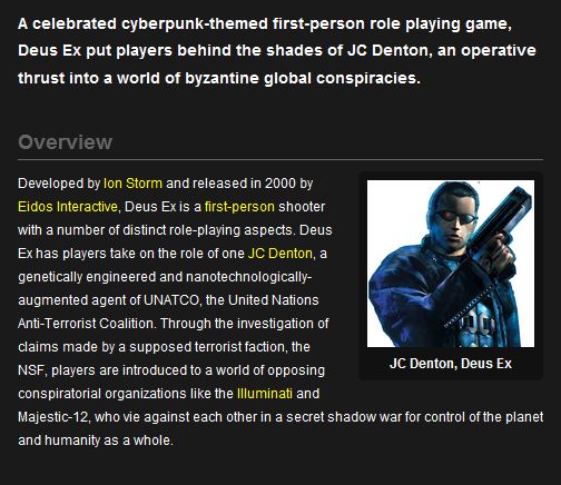
Which is totally acceptable, but the problem occurs when you stretch your browser window. So whenever you are editing, keep in mind that pages may look different for some users.
Luckily, there’s an extremely easy way to avoid this. All you need to do is add a table. Adding tables is probably one of the tools I’ve used the most, as you will probably notice when reading this guide.
- Delete the Column header (select the cell and press the cross in the middle of the two arrows, which you use to add additional columns or rows.)
- DRAG the content into the table. It is very important that you don’t copy or cut anything, especially when you’re dealing with images. Otherwise, you’ll end up with an image that looks like this (see picture to the right) after you submit your changes, and you’ll have to delete it and then find it and add that image again, which sometimes can be a pain.
- Right click anywhere on the table, and select “Borders Off”
Now the problem should’ve been solved. The image will no longer overlap the header.
Images Overflow
Sometimes when a section of a page has too many images, your eyes constantly have to jump whenever there’s a new paragraph, making the entire section intuitive and hard to read. This especially happen when images are aligned to the right, then left, then right, then left and so on. This is a fine method to “spice up” a larger and more heavily text based section of a page, such as the story or larger pages with few, if any, sections. But in this case, it just makes the section look chaotic.
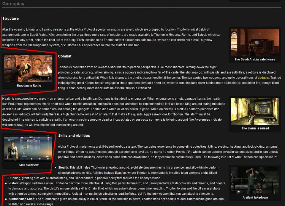
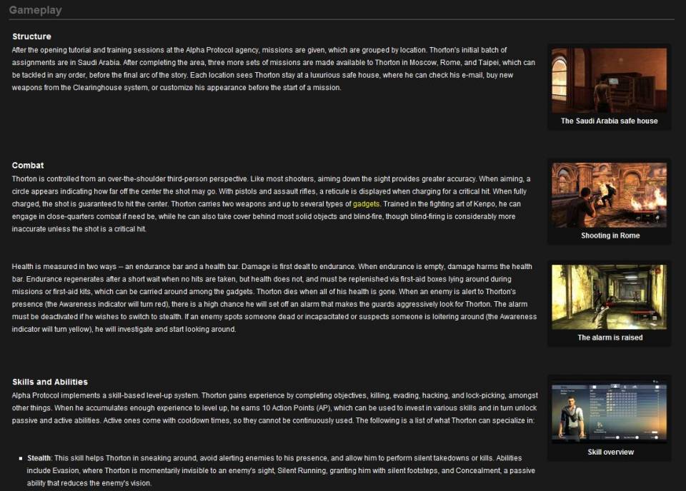
The easiest way to deal with this is obviously to delete some of the images, but in this case, I think they give this section a nice look. So to solve this problem without deleting images we should add some tables.
- Make a 1x1 table for every header, and add a row for every image under that header.
or
- Make a 1xX table with a row for each header.
If using the latter you would probably have to manually add some space between each header and body text, otherwise the paragraphs would be too close to each other.
Once the content has been moved into the tables, align all images to the right side of the page, to avoid the chaotic feel of the page.
Lists
Weapon and vehicle lists are quite common here on Giant Bomb, yet most of them are poorly done and look chaotic.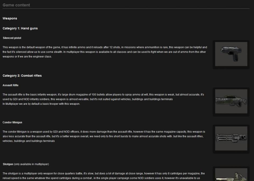
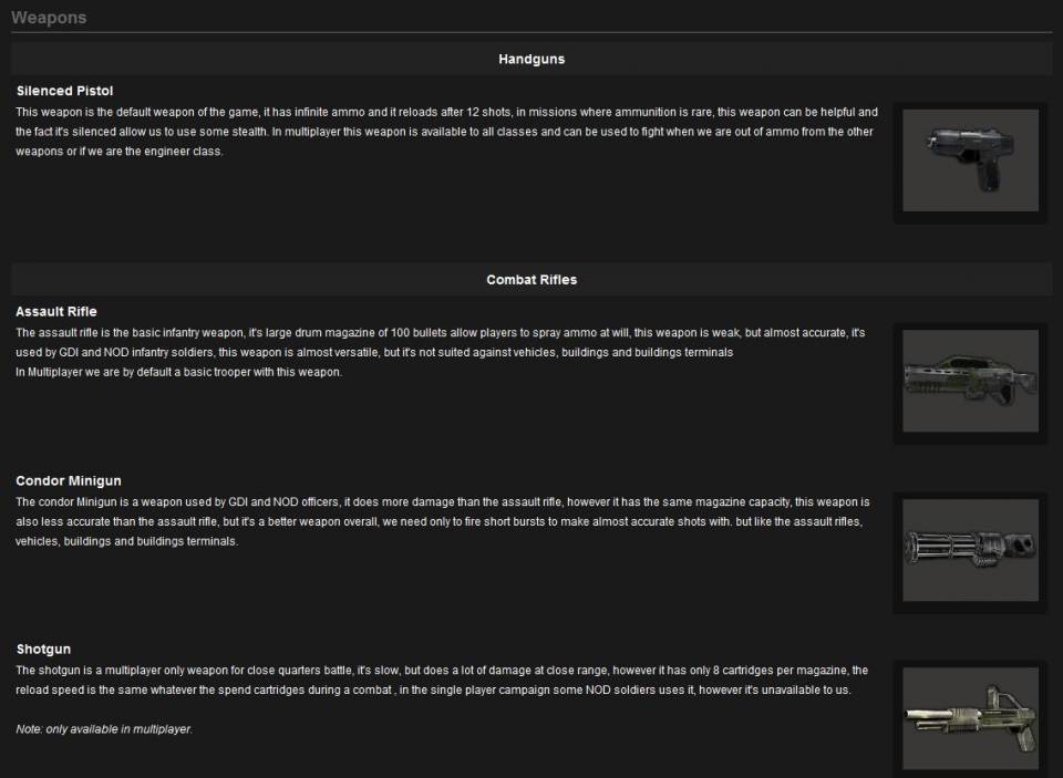
Mess
This last scenario is a good example on how not to make your lists.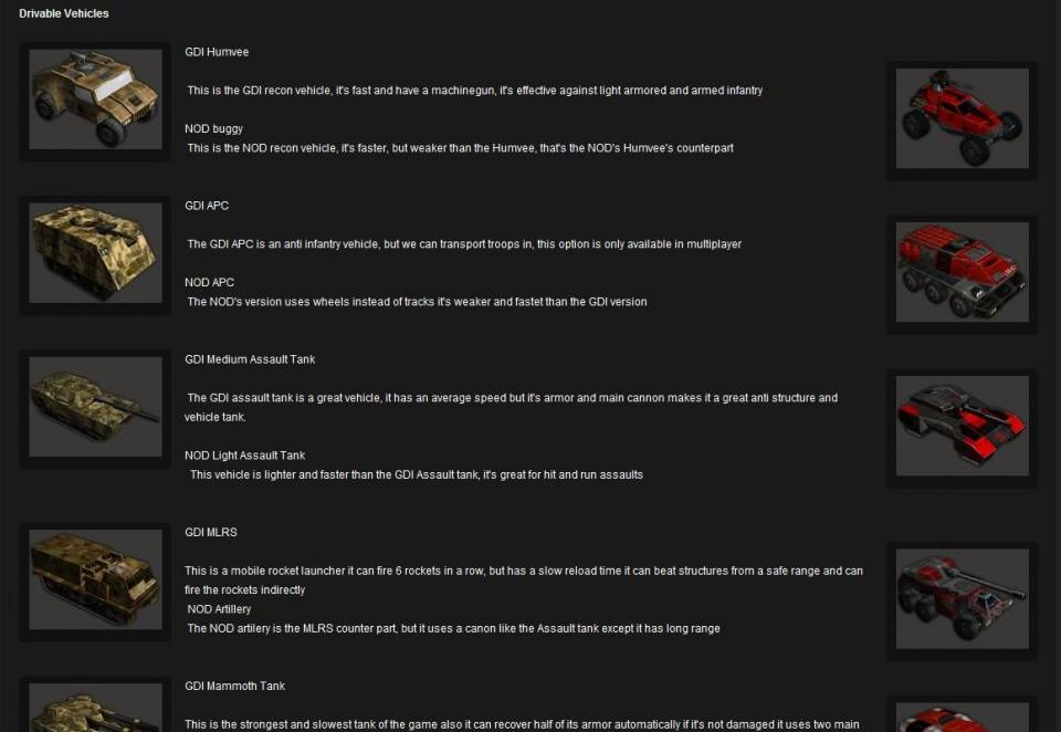
There’s no consistency whatsoever, everything blend together, and, well… no headers. It’s truly chaotic. To finish the design the original editor probably intended to make, a 2x column table can be used here. I usually align the images to the same side, that way the differences between each column becomes more distinct.
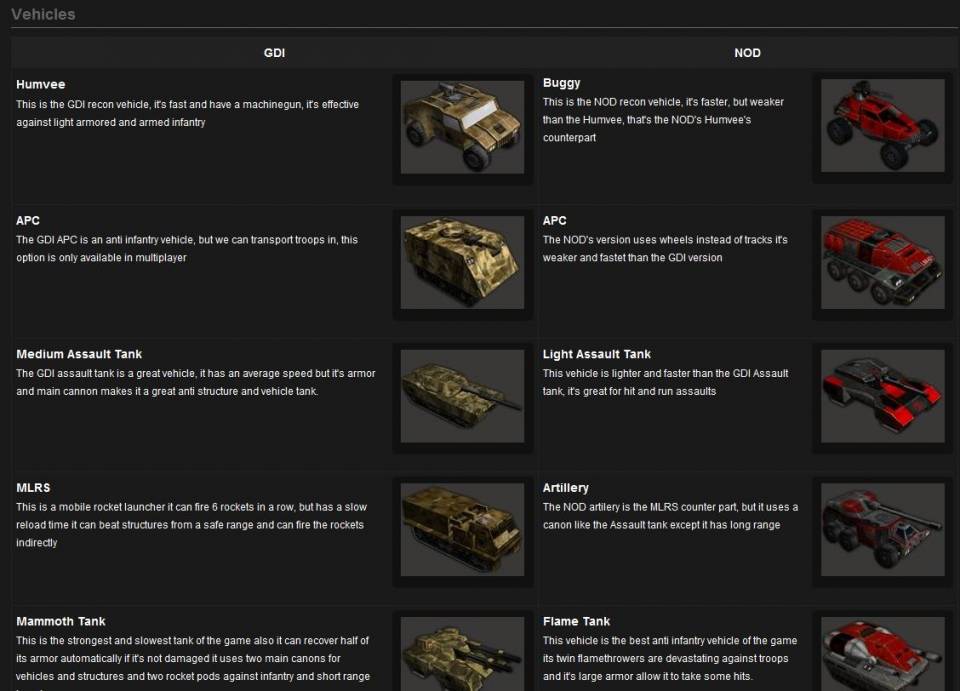
Also, never do this: adding spaces to align your text is a bad idea.
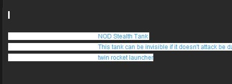
That’s it (for now?), thanks for reading! I hope you’ll make good use of the tips and information I provided. Feel free to share some of your own tips. Do you have easier ways to approach situations like this? Do you think it’s a complete waste of time? Do you think that some of the examples I showed are complete bullshit? Let me know what you think!


Log in to comment