Something went wrong. Try again later
    Follow

    Xbox 360

    Platform »

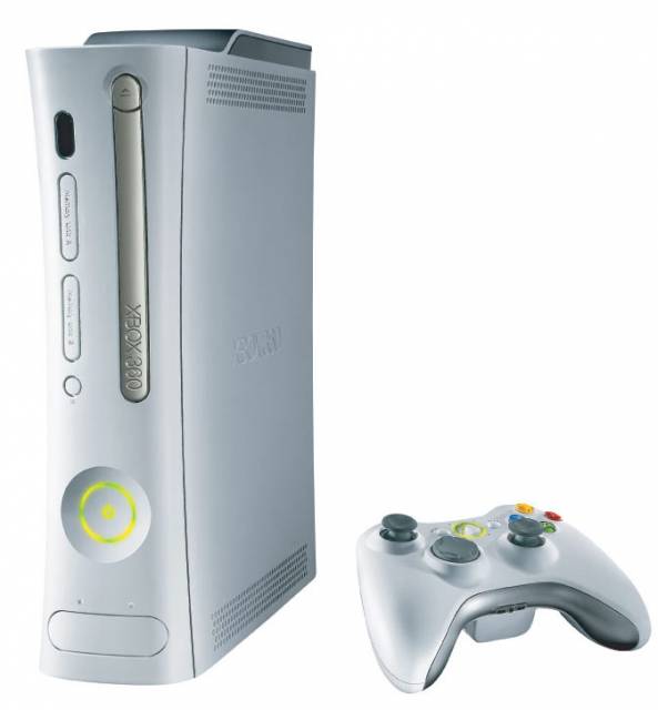
    The Xbox 360 is the second game console produced by Microsoft Corporation and is the successor to the original Xbox.

    New dashboard thoughts

    Avatar image for andymp
    andymp

    257

    Forum Posts

    163

    Wiki Points

    0

    Followers

    Reviews: 2

    User Lists: 4

    Edited By andymp

    After much hype, the dashboard has arrived. Finally. Release day was something of an anti-climax after some kind of issue caused it to be delayed until early evening. In the end, it wasn't really worth the wait, was it?

    I will happily admit to being a fan of the previous dashboard interface, everything was easy to find and navigate through and scrolling through the menus couldn't have been easier. Most things were within easy reach and it was simple to identify new content, new demos, downloads, etc. The focus was on building an interface that was super user friendly and it worked.

    This time, the emphasis has shifted with support for Kinect and interaction with that system being the priority. Fantastic if you want to work your way through the menus using your hands, although how that can be quicker than using a wireless controller I have no idea. Doesn't the "fun" factor get old after the second time of playing around with it? Furthermore, it's cluttered. Menus mixed in among content, click a tile and you have no idea if you will find what you are after inside until you search around, possibly having to click more tiles and so on.

    What about the apps that are still built with the previous interface in mind, Last.fm being one that I came across.

    The first time I loaded up the last dashboard design, I loved it. The first time I loaded this up, I hated it. Maybe, although unlikely, it will grow on me. But I'm not convinced.

    Disclaimer : I own both a PS3 and XBox 360 and I don't like the cross media bar UI design on that either. Maybe I'm just hard to please.
    Avatar image for andymp
    andymp

    257

    Forum Posts

    163

    Wiki Points

    0

    Followers

    Reviews: 2

    User Lists: 4

    #1  Edited By andymp

    After much hype, the dashboard has arrived. Finally. Release day was something of an anti-climax after some kind of issue caused it to be delayed until early evening. In the end, it wasn't really worth the wait, was it?

    I will happily admit to being a fan of the previous dashboard interface, everything was easy to find and navigate through and scrolling through the menus couldn't have been easier. Most things were within easy reach and it was simple to identify new content, new demos, downloads, etc. The focus was on building an interface that was super user friendly and it worked.

    This time, the emphasis has shifted with support for Kinect and interaction with that system being the priority. Fantastic if you want to work your way through the menus using your hands, although how that can be quicker than using a wireless controller I have no idea. Doesn't the "fun" factor get old after the second time of playing around with it? Furthermore, it's cluttered. Menus mixed in among content, click a tile and you have no idea if you will find what you are after inside until you search around, possibly having to click more tiles and so on.

    What about the apps that are still built with the previous interface in mind, Last.fm being one that I came across.

    The first time I loaded up the last dashboard design, I loved it. The first time I loaded this up, I hated it. Maybe, although unlikely, it will grow on me. But I'm not convinced.

    Disclaimer : I own both a PS3 and XBox 360 and I don't like the cross media bar UI design on that either. Maybe I'm just hard to please.

    Avatar image for jetsetwillie
    jetsetwillie

    882

    Forum Posts

    0

    Wiki Points

    0

    Followers

    Reviews: 0

    User Lists: 0

    #2  Edited By jetsetwillie

    im one of those people that complains about any thing new or that changes.

    im always the first to complain like fuck everytime facebook changes. even though i complained about the last change and the one before that and the one before that. i never give myself time to get used to something i just knee jerk hate it.

    but thats just me

    Avatar image for w00ties
    w00ties

    191

    Forum Posts

    5

    Wiki Points

    0

    Followers

    Reviews: 0

    User Lists: 0

    #3  Edited By w00ties

    I didn't know about the impending dashboard release until a few hours before it went live. So I wasn't really anticipating it and as a result was hardly underwhelmed. An update is a good thing in my mind. The old dashboard was getting boring and this was a welcome facelift in my opinion. The rate at which Microsoft is moving into different avenues of digital entertainment started to clutter the dashboard in recent months; you were required to flip through so many tabs. This update looks neat and accessible.

    I usually don't enjoy change all that much. Although this update is one I actually appreciate. Plus, when you boot up your system you start on the 'Play Now' icon - isn't that wonderful?

    Avatar image for deranged_midget
    Deranged

    2022

    Forum Posts

    0

    Wiki Points

    0

    Followers

    Reviews: 10

    User Lists: 5

    #4  Edited By Deranged

    I could really care less since I spend my time actually playing the games and not sitting on the dashboard itself.

    But, I actually don't mind this update. It seems to bring... life to the 360. It feels alive and full.

    Avatar image for nadafinga
    Nadafinga

    1045

    Forum Posts

    36764

    Wiki Points

    0

    Followers

    Reviews: 2

    User Lists: 10

    #5  Edited By Nadafinga

    I think the new interface is loads better than the previous one. Its very similar to the XMB now, which is a good thing. Plugged my Kinect back in after it sat for a few months, and while gesture browsing is still kinda wonky, I like browsing using voice commands.

    Avatar image for andymp
    andymp

    257

    Forum Posts

    163

    Wiki Points

    0

    Followers

    Reviews: 2

    User Lists: 4

    #6  Edited By andymp

    @Nadafinga: Is the voice command responsive? I've read mixed things about that. I don't own Kinect so maybe that is why I'm not feeling the new design.

    Avatar image for afroman269
    Afroman269

    7440

    Forum Posts

    103

    Wiki Points

    0

    Followers

    Reviews: 0

    User Lists: 6

    #7  Edited By Afroman269

    I've been enjoying the new interface since I got in the preview program. It's a lot faster, easier to navigate, and they give more attention to the quickplay feature which is useful. Oh and cloud saves are cool.

    Avatar image for ackbar
    Ackbar

    28

    Forum Posts

    0

    Wiki Points

    0

    Followers

    Reviews: 0

    User Lists: 0

    #8  Edited By Ackbar

    I'm still messing around with it. It feels less personal for some reason. Way to many advertisements . That said I like some of the new features ( cloud save ). Need a few more days\weeks to give it a final judgement .....

    Avatar image for superzamrod
    SuperZamrod

    280

    Forum Posts

    0

    Wiki Points

    0

    Followers

    Reviews: 0

    User Lists: 0

    #9  Edited By SuperZamrod

    It's great.

    Avatar image for humanity
    Humanity

    21858

    Forum Posts

    5738

    Wiki Points

    0

    Followers

    Reviews: 40

    User Lists: 16

    #10  Edited By Humanity

    The biggest problem I have with it is not ads or anything like that but the seemingly under-utilized workspace. The boxes for everything seem kinda small. Why would they not use a menu system that uses 95% of the screen? Right now it's this strip that sits there using maybe half the space on your tv/monitor.

    This translates to inner menus too: when you go to view your achievements you get that small 3x3 grid popup of achievement icons that you can expand to a full list. Before you just scrolled from game to game already showing you a sizable list of achievements that you could further enlarge.

    When you go to social you no longer see what your friends are playing or doing unless you highlight individual avatars.

    Also as much as people complain about the ads I have to agree with that sentiment somewhat in the main page. The play game icon is a tiny box while the largest box is an ad. Whatever, I concede, I'm paying you a yearly fee and you're still showing me ads I'm over it - but at least make the functional areas of the dashboard large with ads sprinkled. Every page theres one big window of seemingly useless value and tiny little windows that actually have content you want to get to.

    I was super excited about it as I'm always positively anxious about updates and seeing "new" things. I liked the previous facelift - thought it looked real slick and had no real issues. This time around I don't want to say I hate it or anything strong like that but I don't think my feelings on it are quite positive.

    Avatar image for mikewrestler5
    Mikewrestler5

    637

    Forum Posts

    42

    Wiki Points

    0

    Followers

    Reviews: 0

    User Lists: 0

    #11  Edited By Mikewrestler5

    I don't like it.

    Avatar image for big_jon
    big_jon

    6533

    Forum Posts

    2539

    Wiki Points

    0

    Followers

    Reviews: 2

    User Lists: 18

    #12  Edited By big_jon

    I actually like it, it's pretty slick, I also think it's less intrusive with adds, and I like that it has a slick UI bieng like my WP7 phones UI.

    Avatar image for wickedfather
    WickedFather

    1694

    Forum Posts

    7

    Wiki Points

    0

    Followers

    Reviews: 0

    User Lists: 0

    #13  Edited By WickedFather

    Speed: good

    You can only see a subset of your friends without presses: bad

    If you're on a different account and set your visibility to offline then change profiles it doesn't stay as offline like the last dash: big mistake, I need to slip in under the radar without stupid privacy settings hampering me. You can sign the other profile out, then set the visibility then sign in but that's another step away from where I want to be.

    Without Kinect the Sky player is still bloody awful and doesn't have a scrub bar.

    Fast logins to other machines means sharing microsoft points is a lot faster so that's great.

    Indie games again seem to have been pushed further out of people's attention. Gits.

    It's got a lot of good but a lot of horrible obstacles and it's annoyances that people remember most.

    Avatar image for raptorsrevenge
    raptorsrevenge

    25

    Forum Posts

    0

    Wiki Points

    0

    Followers

    Reviews: 0

    User Lists: 0

    #14  Edited By raptorsrevenge

    There are things to like and hate about it, but what I believe to be the most discouraging element is that users are clearly no longer #1. (Arguably something that Microsoft has never really prioritized.) Advertisers rule the dashboard. The hierarchical structure of information clearly puts them at the top. Ads were certifiably abundant in the previous dashboard, but this redesign seems more dedicated to that practice. It's disappointing. I like Metro as a design guide, but I think its use and implementation for the 360 has been a misstep. I also don't think advertisers know how to market to my generation or the average gamer. Or at least do it well.

    Dashboard 3.0 Priority

    1.) Advertising

    2.) Media Users

    3.) Gamers

    Avatar image for phish09
    phish09

    1138

    Forum Posts

    0

    Wiki Points

    0

    Followers

    Reviews: 0

    User Lists: 0

    #15  Edited By phish09

    @raptorsrevenge:

    So your argument is that gamers aren't "media users"? I can't get behind all the advertising that MS does on the 360 either, but really, games are a form of media, much like movies, music and tv, and I think it is pretty damn easy to access any of those things using the new dashboard, however, if you want to forgo having to look at anything other than the game you're playing, set your 360 to automatically start up the disc in your drive as soon as it's inserted.

    Avatar image for andymp
    andymp

    257

    Forum Posts

    163

    Wiki Points

    0

    Followers

    Reviews: 2

    User Lists: 4

    #16  Edited By andymp

    @raptorsrevenge: On metro as design guide, also mentioned earlier, it's ideal for a mobile device but it uses far too little of the screen and as you elude to, prioritises the less useful over the more useful.

    Avatar image for raptorsrevenge
    raptorsrevenge

    25

    Forum Posts

    0

    Wiki Points

    0

    Followers

    Reviews: 0

    User Lists: 0

    #17  Edited By raptorsrevenge

    @phish09: I never said that gamers weren't media users or that games weren't media. My argument is that the new dashboard does a poor job at prioritization the gaming experience. Microsoft has been aggressively finding ways to promote the 360 as more than just a box that plays games. This design layout certainly evokes that initiative. Additionally, I didn't comment on the experience of accessing your games with the new dashboard.(positive or negative) I'm not offering an opinion on that part of the experience. But I do believe that games are no longer the main driving force for 360 dashboard, no matter how easy it is to access them.

    "Start up disc" argument doesn't solve any of the UI issues or problems that users get agitated about. I don't think Microsoft wants that to be the experience either. :p

    Avatar image for raptorsrevenge
    raptorsrevenge

    25

    Forum Posts

    0

    Wiki Points

    0

    Followers

    Reviews: 0

    User Lists: 0

    #18  Edited By raptorsrevenge

    @AndyMP: I agree. I've messed with it on a mobile device and it seemed really cool. I was excited to see how that would be implemented with this 360 update. Based on the 360 implementation, you kind of have to wonder what the Windows 8 experience will ultimately be.

    Avatar image for nadafinga
    Nadafinga

    1045

    Forum Posts

    36764

    Wiki Points

    0

    Followers

    Reviews: 2

    User Lists: 10

    #19  Edited By Nadafinga

    @AndyMP said:

    @Nadafinga: Is the voice command responsive? I've read mixed things about that. I don't own Kinect so maybe that is why I'm not feeling the new design.

    Haven't had any problems so far. The whole "You see it, you say it" thing works great.

    Avatar image for ackbar
    Ackbar

    28

    Forum Posts

    0

    Wiki Points

    0

    Followers

    Reviews: 0

    User Lists: 0

    #20  Edited By Ackbar

    @raptorsrevenge: I agree with you, I feel the Home page should be Avatar/games/friends . everything feels misplaced from page to page. just my thoughts...

    Avatar image for charlie_victor_bravo
    charlie_victor_bravo

    1746

    Forum Posts

    4136

    Wiki Points

    0

    Followers

    Reviews: 4

    User Lists: 4

    It bothers me how small everything is and how little of the screen is used. This has added effect making everything seem cramped.

    Also there does not seem to be any new apps for Scandinavian users.

    Avatar image for tr1cky1
    Tr1cky1

    29

    Forum Posts

    0

    Wiki Points

    0

    Followers

    Reviews: 0

    User Lists: 1

    #22  Edited By Tr1cky1

    Does the new kinect integration for the dash mean I should finally stump up the cash and get a kinect for christmas?

    Avatar image for enigma777
    Enigma777

    6285

    Forum Posts

    696

    Wiki Points

    0

    Followers

    Reviews: 0

    User Lists: 8

    #23  Edited By Enigma777
    @Afroman269 said:

    I've been enjoying the new interface since I got in the preview program. It's a lot faster, easier to navigate, and they give more attention to the quickplay feature which is useful. Oh and cloud saves are cool.

    For once, this guy knows what he's talking about. 
     
    ;)
    Avatar image for samaritan
    Samaritan

    1730

    Forum Posts

    575

    Wiki Points

    0

    Followers

    Reviews: 1

    User Lists: 4

    #24  Edited By Samaritan

    Dashboard defaults to the screen what has your game on it. That's all I need.

    Avatar image for redsox44
    Redsox44

    525

    Forum Posts

    11

    Wiki Points

    0

    Followers

    Reviews: 0

    User Lists: 2

    #25  Edited By Redsox44

    I've been in the preview for a couple weeks and I really like it. Only problems I have is the apps dont seem too great. But Zune and Netflix still work fine and that's really all I need.

    Avatar image for samfo
    samfo

    1680

    Forum Posts

    1126

    Wiki Points

    0

    Followers

    Reviews: 0

    User Lists: 5

    #26  Edited By samfo

    I like it, looks snappy and classy. Ads don't bother me, but i wish they were not there. Makes the system look a little less 'kiddy'.

    Avatar image for privateirontfu
    PrivateIronTFU

    3858

    Forum Posts

    2

    Wiki Points

    0

    Followers

    Reviews: 0

    User Lists: 3

    #27  Edited By PrivateIronTFU

    Cloud saves make the update totally worth it, in my opinion.

    I still don't understand why Microsoft's first party games won't let you transfer your saves, though. Total bullshit.

    Avatar image for dagbiker
    Dagbiker

    7057

    Forum Posts

    1019

    Wiki Points

    0

    Followers

    Reviews: 0

    User Lists: 16

    #28  Edited By Dagbiker

    I dont know, I think they could have mabey played an unskipable ad every time I log on or if there so straped for cash then up the monthly fee

    Avatar image for alecofthewest
    AlecOfTheWest

    293

    Forum Posts

    0

    Wiki Points

    0

    Followers

    Reviews: 0

    User Lists: 0

    #29  Edited By AlecOfTheWest

    I don't like it. I'm sure the "too many ads" arguement has already been stated numerous times, so I won't go into that. I just wish there was some sort of customization option for the placement of the tabs and boxes; I don't mind an ad on the home tab, I just don't want it to be the massive box right buttfuck in the middle of the screen. Give me the option to move stuff around a little bit.

    Avatar image for andymp
    andymp

    257

    Forum Posts

    163

    Wiki Points

    0

    Followers

    Reviews: 2

    User Lists: 4

    #30  Edited By andymp

    @Dagbiker: The ads aren't there because they are strapped for cash. This is Microsoft. They put them there because they can and it's just another source of revenue. On top of everything else.

    Avatar image for andymp
    andymp

    257

    Forum Posts

    163

    Wiki Points

    0

    Followers

    Reviews: 2

    User Lists: 4

    #31  Edited By andymp

    @AlecOfTheWest said:

    I don't like it. I'm sure the "too many ads" arguement has already been stated numerous times, so I won't go into that. I just wish there was some sort of customization option for the placement of the tabs and boxes; I don't mind an ad on the home tab, I just don't want it to be the massive box right buttfuck in the middle of the screen. Give me the option to move stuff around a little bit.

    This was the first thing I thought of after loading it up. Why not let me customize the position of the "panels" to suit me? I also had this idea that at some stage they would increase the 100 maximum on the friends list but they haven't ever touched that since day 1.

    This edit will also create new pages on Giant Bomb for:

    Beware, you are proposing to add brand new pages to the wiki along with your edits. Make sure this is what you intended. This will likely increase the time it takes for your changes to go live.

    Comment and Save

    Until you earn 1000 points all your submissions need to be vetted by other Giant Bomb users. This process takes no more than a few hours and we'll send you an email once approved.