Someone Should Really Fix the Layout of the Live Page On Mobile

Avatar image for rongalaxy
RonGalaxy

4937

Forum Posts

48

Wiki Points

0

Followers

Reviews: 1

User Lists: 1

#1  Edited By RonGalaxy
No Caption Provided

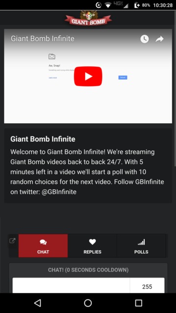
This is what the mobile Live player page has looked like for as long as I can remember. 1/2 of the screen filled with useless text and buttons that can't be hidden. It makes watching live shows and reading chat at the same time impossible. I do almost all of my browsing and video watching (not counting movies and TV shows) on my phone, so switching to something else isn't likely. If this was fixed, there's no doubt in my mind I would watch way more live content than I do now (which is almost never ATM). If you need to know device details, I'm on a Moto Z Droid using standard chrome. Everything is updated.

Avatar image for brainscratch
BrainScratch

2077

Forum Posts

0

Wiki Points

0

Followers

Reviews: 0

User Lists: 0

I like to watch Giant Bomb TV Infinite on my phone once in a while and I have the exact same complaints. The worst part is that on iPhone you can't watch the video and scroll down to read the chat since it will stop the video. I guess this is a problem with watching Youtube videos on Safari so I'm not sure if the GB Engineers can fix that part, but the live page layout could use a bit of a redesign anyway.