Help me get started with digital painting (Photoshop)

Avatar image for armaan8014
armaan8014

6325

Forum Posts

2847

Wiki Points

0

Followers

Reviews: 11

User Lists: 17

#1  Edited By armaan8014

So I just got my birthday gift delivered today (yay), a Genius Pensketch A4 size drawing tablet. SO now I can finally get down to some serious digital drawing.
 
The problem is, I'm pretty confused when it comes to the color part. One of the problems is, my paintings end up looking blurry and washed out. Another thing is that i'm not really sure how to use the coloring tools and in what way should I use them. The sketching part is pretty alright, so lets not discuss that here.  I just have trouble creating sharp, nicely detailed drawings with realistic light effects and such.
 
I just started with this tutorial to learn stuff, but I feel that the guy who did the tutorial itself didn't really teach properly as to what he was doing (he just kept skipping steps without explanation)
I'd be grateful if you could check out that tutorial and tell me whether its him or whether Its just that I suck :/ (check page 2) http://photoshoptutorials.ws/photoshop-tutorials/drawing/painting-a-fantasy-warrior-in-photoshop/Page-1.html 
 

Also I can't seem to get the smooth long strokes that he has in his base sketch. Me lines are more jagged and shorter. 
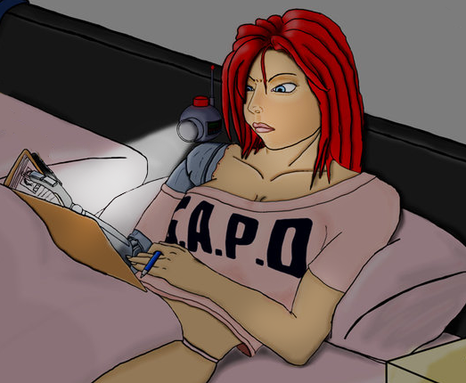
What I am currently stuck at: 
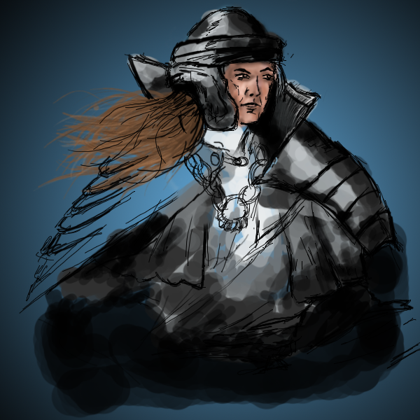
No Caption Provided


So how should I go about it? And which brushes do you usually use when you start out with your base sketch? Any obvious things that beginners do wrong? Any good tutorials?
 
Id appreciate all and any help :) Its really important that I improve.
 
Thanks
Avatar image for mcghee
McGhee

6128

Forum Posts

0

Wiki Points

0

Followers

Reviews: 0

User Lists: 2

#2  Edited By McGhee

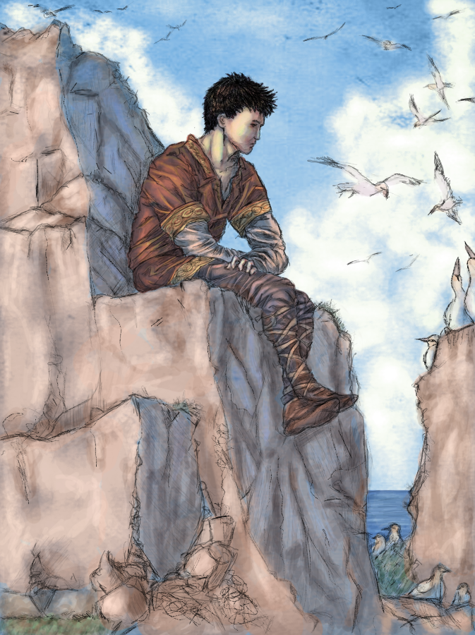
@armaan8014: It doesn't look like you're using shape dynamics very much. So maybe that will help some. My technique was to lay down a mid tone, high light, then shadow in solid places like you would see in an anime. Then I would use the smudge tool to blend those together some. Then I would go back and select some of those blended colors and use those to paint in a bit more. Using the smudge tool and shape dynamics and some really low opacity brush strokes will make it look less blurry. As for the base sketch, I always did that on paper then scanned the lines in. I don't draw or paint much anymore, but here are the best two I ever did. These are from five or six years ago.

No Caption Provided

Notice the wood branch in the first picture and the purple rubber in the second as an example of what I'm talking about when using the smudge tool.

I've never been anything close to an expert, but I hope this helps.

No Caption Provided
Avatar image for armaan8014
armaan8014

6325

Forum Posts

2847

Wiki Points

0

Followers

Reviews: 11

User Lists: 17

#3  Edited By armaan8014
@McGhee_the_Insomniac said:

@armaan8014: It doesn't look like you're using shape dynamics very much.

Yeah I don't really know how to use that to my benefit, any advice?
 
@McGhee_the_Insomniac said:

My technique was to lay down a mid tone, high light, then shadow in solid places like you would see in an anime. Then I would use the smudge tool to blend those together some. Then I would go back and select some of those blended colors and use those to paint in a bit more. Using the smudge tool and shape dynamics and some really low opacity brush strokes will make it look less blurry.


Ah thanks! Thats exactly what I wanted to know! Plus the branch made it clearer.
 All I kept doing was mixing low opacity paints with each other, even highlights and shadows. And I didn't smudge. So the highlights and shadows should be 100% opaque and then smudged? 
 
Also, how did you get the background to look distant without losing details? And the clouds (sorry for so many questions I just wanna learn as much as possible :P)
Avatar image for mcghee
McGhee

6128

Forum Posts

0

Wiki Points

0

Followers

Reviews: 0

User Lists: 2

#4  Edited By McGhee

@armaan8014 said:

@McGhee_the_Insomniac said:

@armaan8014: It doesn't look like you're using shape dynamics very much.

Yeah I don't really know how to use that to my benefit, any advice?

@McGhee_the_Insomniac said:

My technique was to lay down a mid tone, high light, then shadow in solid places like you would see in an anime. Then I would use the smudge tool to blend those together some. Then I would go back and select some of those blended colors and use those to paint in a bit more. Using the smudge tool and shape dynamics and some really low opacity brush strokes will make it look less blurry.

Ah thanks! Thats exactly what I wanted to know! Plus the branch made it clearer. All I kept doing was mixing low opacity paints with each other, even highlights and shadows. And I didn't smudge. So the highlights and shadows should be 100% opaque and then smudged? Also, how did you get the background to look distant without losing details? And the clouds (sorry for so many questions I just wanna learn as much as possible :P)

Yeah, check it now and see if the second pick is there. Do you know what I'm saying when I say shape dynamics? I don't know what version of Photoshop you're using, but in mine, CS, if you look over to the right you should see a tab that says "brushes". Click on it and you'll see a bunch of unchecked boxes. All of these will do different things with your tablet. If you click "shape dynamics" it will make it so that the harder you push down with your pen, the thicker the brushstroke gets.

And yes, I lay down solid colors in the rough position where they should fall depending on where the light source is, then I use the smudge and brushes with less opacity, like %20. The background trees were made with a mix of brushes, one that looks like grass and another that is just a splotchy kind of pattern. You just have to experiment. The clouds were done using "scattering" combined with "shape dynamics" under the brush tab.

Avatar image for armaan8014
armaan8014

6325

Forum Posts

2847

Wiki Points

0

Followers

Reviews: 11

User Lists: 17

#5  Edited By armaan8014
@McGhee_the_Insomniac: Yeah I had used shape dynamics for the above painting, thats why the hair came out pretty alright. But I didn't check out all the options under it, so I'll experiment more with it now.
 And thanks for the smudging advice, I think that's gonna make a big difference now. 
 
Thanks, I'll experiment and see what other problems I come across :)
Avatar image for mcghee
McGhee

6128

Forum Posts

0

Wiki Points

0

Followers

Reviews: 0

User Lists: 2

#6  Edited By McGhee

@armaan8014: No problem. My knowledge is limited, but I'll answer any questions as best as I can.

Avatar image for armaan8014
armaan8014

6325

Forum Posts

2847

Wiki Points

0

Followers

Reviews: 11

User Lists: 17

#7  Edited By armaan8014

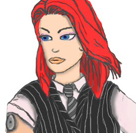
Heres what I was able to do following a tutorial:
 

No Caption Provided
Any more tips would be welcome!
Avatar image for akrid
Akrid

1397

Forum Posts

0

Wiki Points

0

Followers

Reviews: 0

User Lists: 2

#8  Edited By Akrid
I'm glad you went ahead and got the tablet. You've already got some pretty good looking stuff going! 
 
A couple tips from someone who is absolutely abysmal at drawing:  
  
 Use lots of reference when you're drawing. For example, If you're drawing some metal, look up different types of metal. It'll really help. Otherwise you'll be set in your own ideas and won't be able to progress. The thing is, you may think you know what metal looks like, but you don't. Taking a look at it will help you suss out the fine details, even if you're going for a un-realistic style. 
 
If you're trying to get away from that sketchy style and more to a tidier, refined version, I know that Mike Krahulik, the PA artist, sketches a basic form and then 'inks' it with a very carefully drawn line with a custom brush with some kind of shape dynamics on it. And the Awkward Zombie artist goes so far as to draw vector lines and warp them in to the shape of her sketch. Not sure if either of those are what you're looking for though. Just do whatever it takes to get a nice line, no matter how arduous it may be. 
 
Most importantly, try and find opportunities to watch other artists that you admire work and learn through example. There are some that livestream it, and there are also learning resources you can buy that may help you along.
Avatar image for hitmanagent47
HitmanAgent47

8553

Forum Posts

25

Wiki Points

0

Followers

Reviews: 0

User Lists: 2

#9  Edited By HitmanAgent47
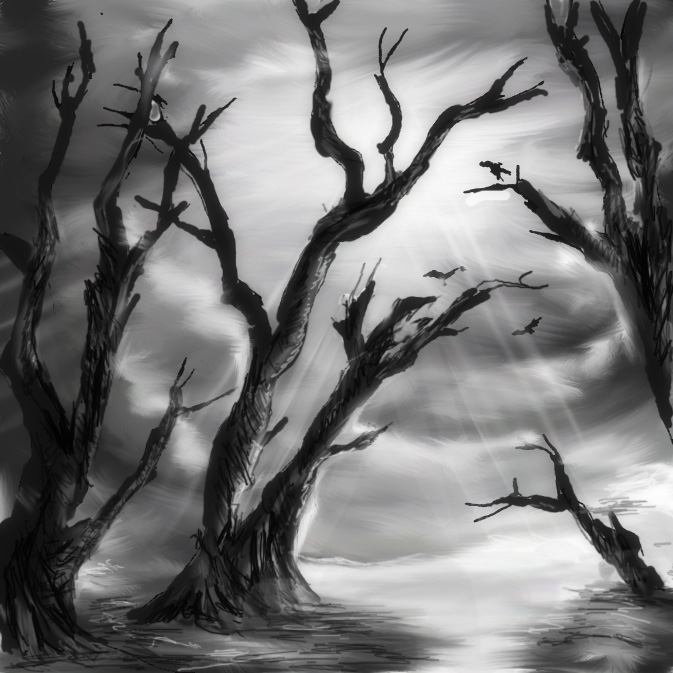
@armaan8014 said: Easy, from here, you put another layer like brown on the trees or blue for water. You lower the opacity and you should see though it like water color. Alot of ppl create concept art this way. This grey scale stage is the stage before that.

Heres what I was able to do following a tutorial:
 

No Caption Provided
Any more tips would be welcome!
Avatar image for shockd
ShockD

2487

Forum Posts

16743

Wiki Points

0

Followers

Reviews: 0

User Lists: 0

#10  Edited By ShockD

I just realized how much I actually suck at PS by looking at your creations ^^

Avatar image for armaan8014
armaan8014

6325

Forum Posts

2847

Wiki Points

0

Followers

Reviews: 11

User Lists: 17

#11  Edited By armaan8014
@Akrid: Yeah Im glad I got it as well :D This sure is a lot of fun!
And thanks for the tips, I'll look up the artists you mentioned
 
@HitmanAgent47
Yeah actually I've never been able to do a grayscale version either, that tutorial really helped out. Cool, I'll try adding colors, thanks.
Any tips regarding my first post? Any ideas on what tools will make my work better? I've heard about the selecting and then shading technique, what exactly is that?
 
@antikorper
Really? I suck too, I just followed some good tutorials :D
Avatar image for hitmanagent47
HitmanAgent47

8553

Forum Posts

25

Wiki Points

0

Followers

Reviews: 0

User Lists: 2

#12  Edited By HitmanAgent47
Avatar image for sin4profit
Sin4profit

3505

Forum Posts

1621

Wiki Points

0

Followers

Reviews: 37

User Lists: 2

#13  Edited By Sin4profit

The trick to sharp contrasts in your coloring is to use the freehand lasso selection tool to create masks around areas you're working on. It's the same thing air brush artists are doing when they use frisket masking. So if you study their technique it works about the same in Photoshop.

Avatar image for iam3green
iam3green

14368

Forum Posts

350

Wiki Points

0

Followers

Reviews: 0

User Lists: 0

#14  Edited By iam3green

i suggest you either get illustrator or use illustrator for drawing.  i guess just draw around and play with filters. 
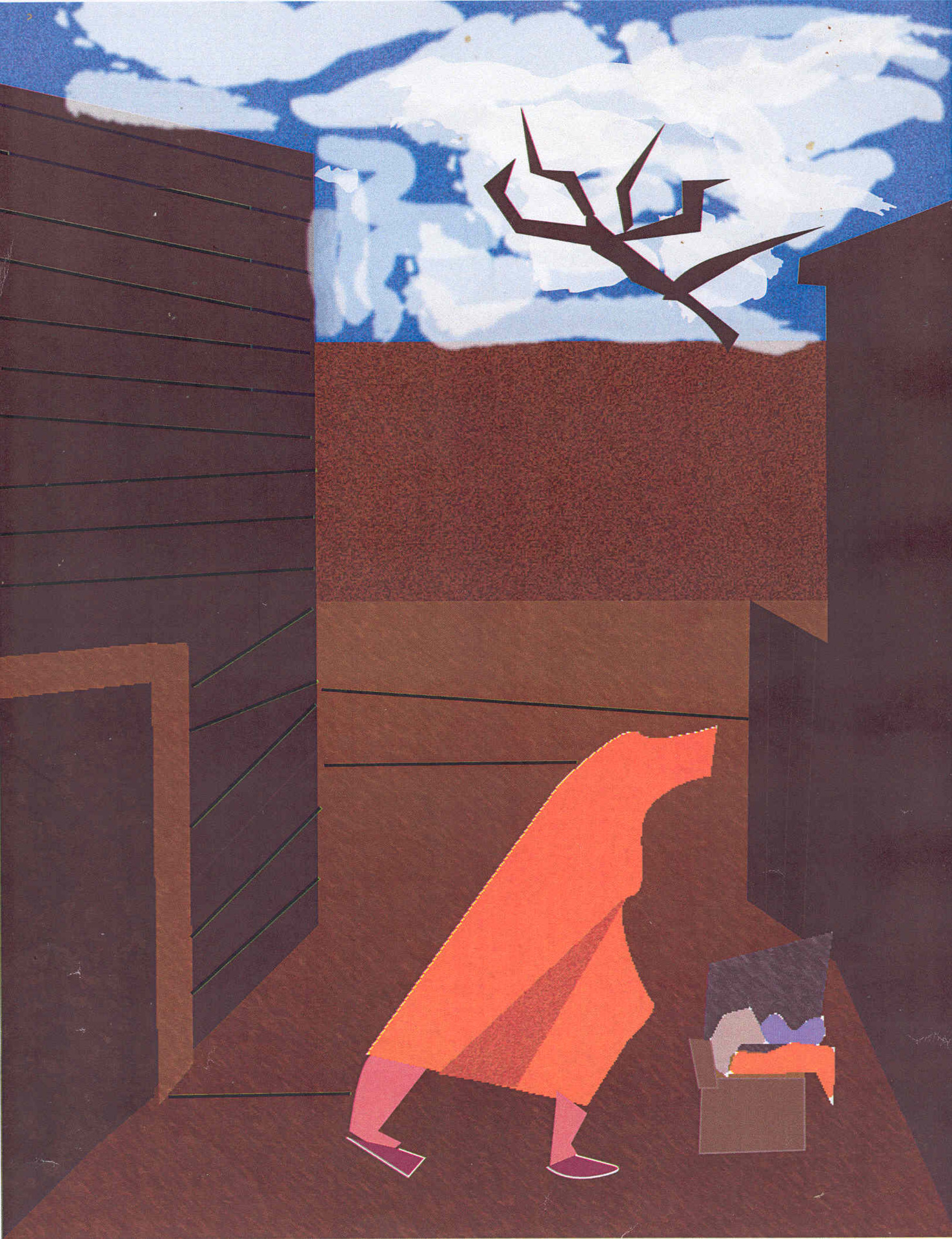
 here is something that i made with illustrator a couple of years ago at school. it's jacob lawerence- wash day.

No Caption Provided
 
 
     nice on the tablet. i have been thinking of getting one myself. i think it would make things go a lot better than using a mouse.
Avatar image for hitmanagent47
HitmanAgent47

8553

Forum Posts

25

Wiki Points

0

Followers

Reviews: 0

User Lists: 2

#15  Edited By HitmanAgent47

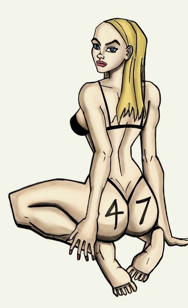
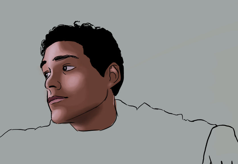
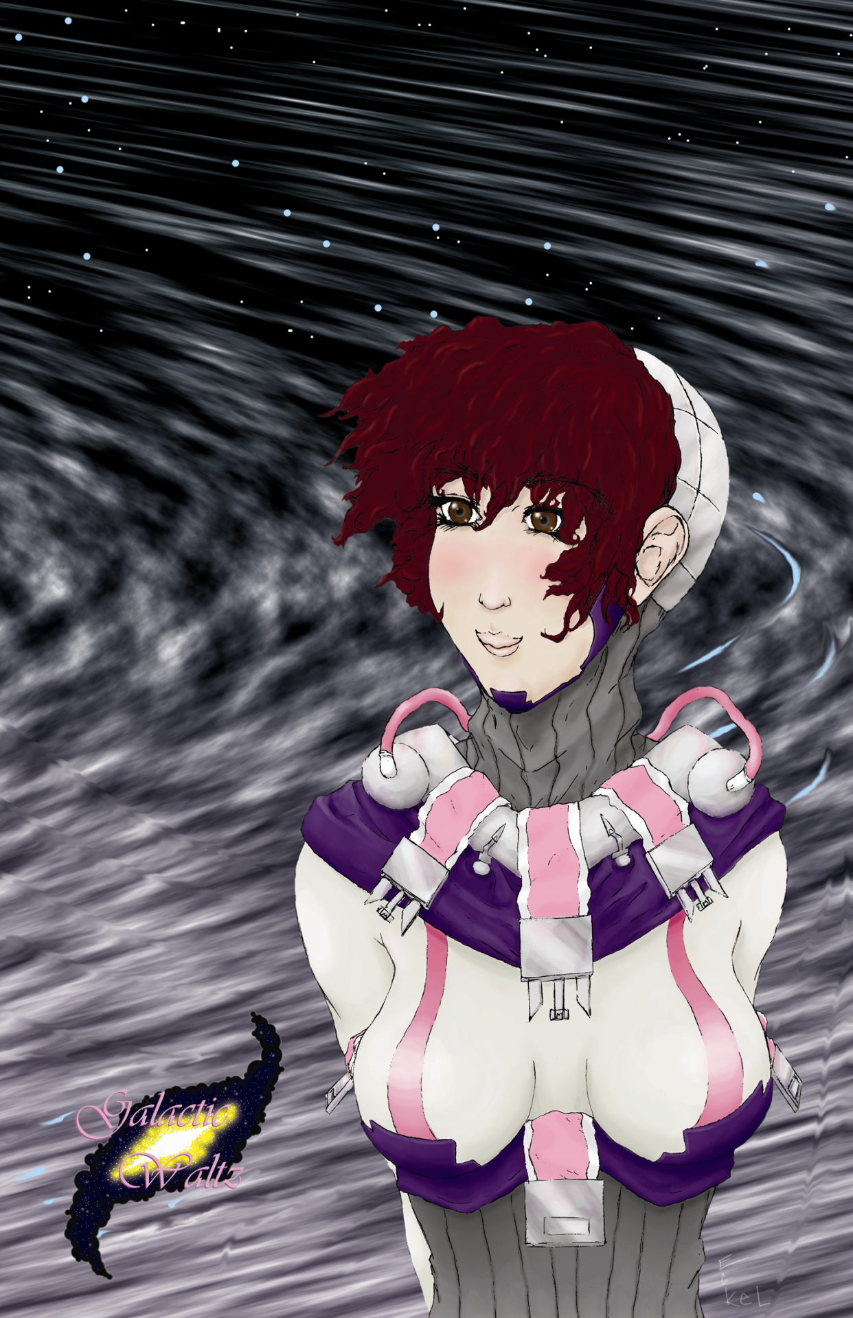
So we can post our own art here? Well I colored this with a tablet, not the best but most of my other artwork has terrible coloring. I tried to use greys to create the shape, would of made her more shiny now with more reflective light in hindsight, but i'm too lazy to. 
 

Avatar image for bestusernameever
BestUsernameEver

5026

Forum Posts

347

Wiki Points

0

Followers

Reviews: 0

User Lists: 0

#16  Edited By BestUsernameEver

when it comes to painting, I never use something digital. That style is always done best with water, texture, and depth that only real materials can truly support.  I have yet to see a painting art style done on a computer that has wowed me...

Avatar image for ryanwho
ryanwho

12011

Forum Posts

-1

Wiki Points

0

Followers

Reviews: 0

User Lists: 0

#17  Edited By ryanwho

I have pretty good luck just painting in the whole thing in black and white then adding color to it later. You can just set black and white as the pallete and switch back and forth between them (hotkey is x) and just layer and layer until its fully shaded. Just treat it like a real painting. Then when you need to color, make a new layer and set the layer property to "color". You get a pretty vibrant look that way, but not terribly realistic: 
  
 
For a realistic look in the color, I'll do a new couple of layers set to "multiply" and that normally creates a bit more depth  and color desaturation in the shadow portions. That's a bit more advanced, though. But for realistic shading its essential. The other option is good because you just lay the color on the color layer so that's a good spot to start. Just shade in black and white, and color with a layer set 'color'. So you've got that forest picture you just made in black and white, I'd try adding color to that with a color layer and see how it looks.

Avatar image for armaan8014
armaan8014

6325

Forum Posts

2847

Wiki Points

0

Followers

Reviews: 11

User Lists: 17

#18  Edited By armaan8014
@HitmanAgent47 said:
Well i'm not an expert at coloring, it's one of the things i'm studying now. I admit it's my weakness and holding back my art. Look at this guy's youtube channel, it should explain how to do this stuff. There is so much info.
 
http://www.youtube.com/user/idrawgirls?blend=1&ob=5

 
Yep id seen some of his vids earlier but had forgotten about it. ll go through it now.
 
@HitmanAgent47 said:

 
I like the 47 on her ass.


@Sin4profit
I think you'd posted that pic before and had given me the same advice along with it, but I never got around to using that on my own. So is it to just simply create a lasso mask around the area you're working on or does it need to be done on even highlights and shades? Anywhere a tutorial that explains this? Maybe the tutorial you used to do that awesome drawing?
 
@ryanwho
Wow you are SO sexy! (I mean your work) The second one is super detailed looking and mind blowing. How long did that one take?
@ryanwho said:

  For a realistic look in the color, I'll do a new couple of layers set to "multiply" and that normally creates a bit more depth  and color desaturation in the shadow portions.

new couple of layers of what? Color layers? and do you mean duplicate the color layers and set the copies as multiply or something else?
 

 Just shade in black and white, and color with a layer set 'color'. So you've got that forest picture you just made in black and white, I'd try adding color to that with a color layer and see how it looks.

Yep Im gonna be trying that out, thanks :)
Avatar image for mowgers
mowgers

427

Forum Posts

40

Wiki Points

0

Followers

Reviews: 1

User Lists: 3

#19  Edited By mowgers

If I may offer my two bits:

No Caption Provided
No Caption Provided

I tend to use a brush with the opacity and flow jitter set to 'pen pressure' and get in real close If I need to, alternating shape dynamics on and off depending on the surface I'm colouring. I'll also tweak the whole image on the fly using adjustment layers. I'm not claiming to be the best by any stretch, but I know I'm a lot better than I used to be and I learnt the techniques I use from reading a bunch of tutorials and practicing. Really I can't offer much more advice than that, practice a lot and don't be afraid to get in real close if you need to apply detail. It really does help to have solid traditional art skills too, a tablet is as much a tool as a paintbrush or a pencil, it's not a magic wand. Use photo reference, do little studies and sketches and work, work, work at it.

Avatar image for phatseejay
PhatSeeJay

3331

Forum Posts

9727

Wiki Points

0

Followers

Reviews: 5

User Lists: 17

#20  Edited By PhatSeeJay
Redheads are awesome.

Been so fucking long since I drew, and then my Wacom pen broke, out of warranty I might add, so I'm still struggling to get a new pad. Them things are expensive when your income equals zero. :P

But I tend to stick to drawing stick figures in the poses I want, and then I just start drawing lines around them until I feel I have the shape right. If it looks good in B&W, then it's good enough, and coloring is more the icing on the cake.

When playing with shading and colors, I tend to play with opacity and the color properties. I tend to learn ONE new things with each picture I draw. Look up something I want to learn, and make that image the one I'll practice it on. Don't learn fifteen times at once. Pictures can be remade and improved, so keep it simple and take one thing at the time.

A lot of layers, and not being afraid to do something "bad" and learn from it. The more pieces you do, the more you learn and improve from. Below is the same character, but one of my first digital drawings/paintings.

No Caption Provided
Avatar image for sin4profit
Sin4profit

3505

Forum Posts

1621

Wiki Points

0

Followers

Reviews: 37

User Lists: 2

#21  Edited By Sin4profit
Avatar image for sweep
sweep

10887

Forum Posts

3660

Wiki Points

0

Followers

Reviews: 4

User Lists: 14

#22  Edited By sweep  Moderator

Layers, dude. Create a new layer for all your sketchy lines, then make it slightly translucent once you are done. Then create another layer over the top and use a much bolder sharper brush to trace over the top. You might want to create several different layers and use different brushes in each one for different parts of the image. The added benefit of using different layers is that if you don't like it you can just scrap the layer and start again.

The penny arcade guys sometimes live-stream their work, I'm sure if you were to check youtube you could see how they do it, or at the very least find some similar stuff.

Avatar image for zimbodk
ZimboDK

863

Forum Posts

20

Wiki Points

0

Followers

Reviews: 1

User Lists: 2

#23  Edited By ZimboDK

@Sweep said:

The penny arcade guys sometimes live-stream their work, I'm sure if you were to check youtube you could see how they do it.

And then cry because you realize just how damn good and fast Mike (Gabe) is compared to you.

The Penny Arcade Ustream page

Avatar image for scrawnto
Scrawnto

2558

Forum Posts

83

Wiki Points

0

Followers

Reviews: 0

User Lists: 2

#24  Edited By Scrawnto

@ZimboDK said:

@Sweep said:

The penny arcade guys sometimes live-stream their work, I'm sure if you were to check youtube you could see how they do it.

And then cry because you realize just how damn good and fast Mike (Gabe) is compared to you.

The Penny Arcade Ustream page

No joke. That guy is so damn good. I used to watch the hell out of those livestreams. Because of my colorblindness, I pretty much don't do anything in color. Most of my stuff is monochrome. The only piece I ever did in color that was worth a damn is the drawing I did of Steve that is now part of the Lemon Lens intro.

No Caption Provided

Usually when I try to color my drawings it goes all wrong. I will say that it helps to use the eyedropper tool on the partially blended bits a lot to keep the blend more consistent. You should also really try to think of the subject like it had depth. Pay attention the planes of the object. In my drawing here, you can see how all of the front facing planes of Steve's face have more or less the same shade. You might also start the background with a medium shade of a color appropriate to the lighting you want. It helps you keep the final piece from being too washed out or too dark.

Avatar image for soap
Soap

3774

Forum Posts

1811

Wiki Points

0

Followers

Reviews: 9

User Lists: 29

#25  Edited By Soap

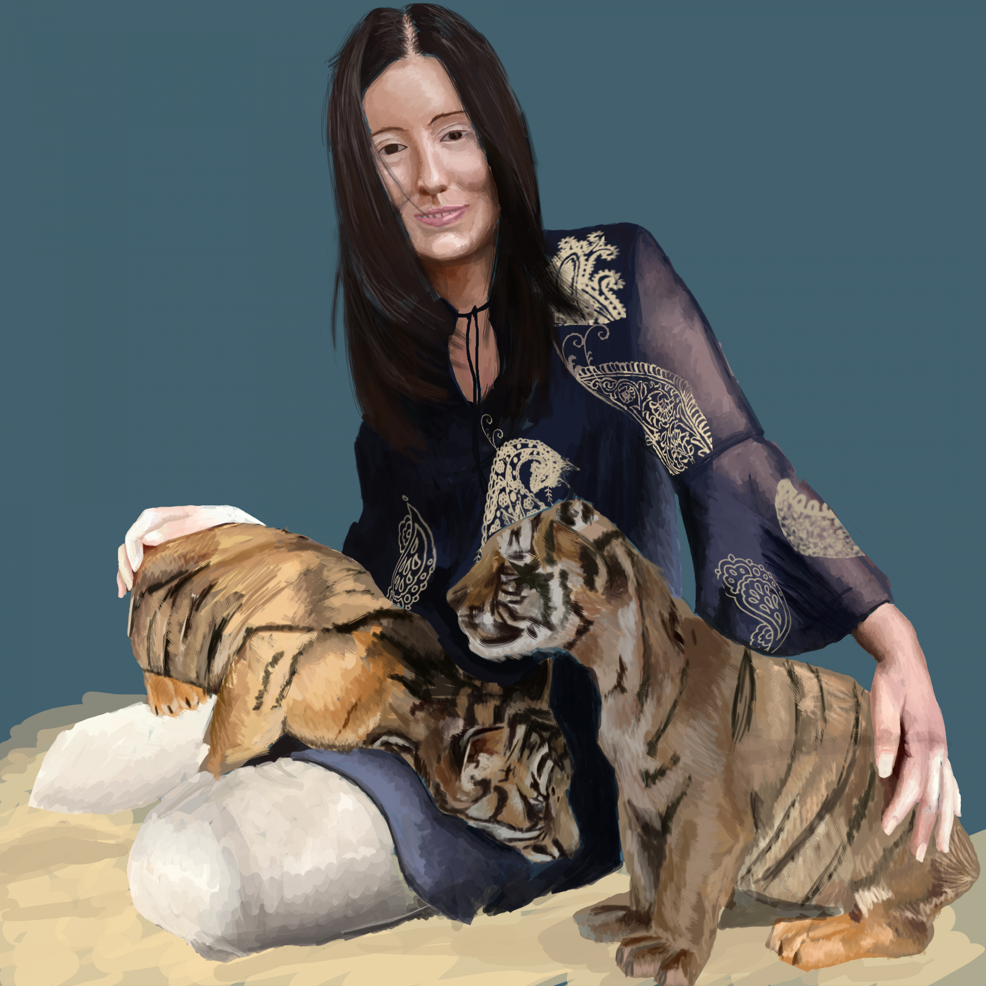
First of all I want to apologize for the obscene size of the pictures that I've put up here but still, here they are.

My tips would be to work large, if your computer can handle it and with a high pixels per inch count. I usually work with 72 but have heard of people going up to around 300. Also you should look into getting some custom brushes, avoid the obvious things like fire stamps and such but simply a different set of unique brushes that give a more scratchy look or something can be really useful. Never use dodge and burn for your highlights and shadowing.

My final bit of advice would be to paint different things, differently. It sounds really obvious but for almost as long as I've been using my tablet I've used the same technique for everything regardless of if it's skin, metal, cloth e.t.c and it just doesn't work.

I hope some of this stuff has been useful for you, I'm not exactly pro at using a tablet myself but it's always nice to get some help from others I guess.

Good luck and happy drawing!

While we are showing off some of our own work as well I guess...
This was a huge project that almost killed my comp, not happy with it anymore.
No Caption Provided
Avatar image for armaan8014
armaan8014

6325

Forum Posts

2847

Wiki Points

0

Followers

Reviews: 11

User Lists: 17

#26  Edited By armaan8014
@ZimboDK said:

@Sweep said:

The penny arcade guys sometimes live-stream their work, I'm sure if you were to check youtube you could see how they do it.

And then cry because you realize just how damn good and fast Mike (Gabe) is compared to you.

The Penny Arcade Ustream page

ah thanks for the link!
 
 
@Soap
Woah! your work's seriously incredible!
and you said:

Never use dodge and burn for your highlights and shadowing.

I've heard a lot of people say that. Why is it so? I used it for the drawing below, but only as it was in the tutorial that I followed. What should the tool be used for then?
 
Here's the pic:   

@McGhee_the_Insomniac: @HitmanAgent47: @Sin4profit: @Akrid
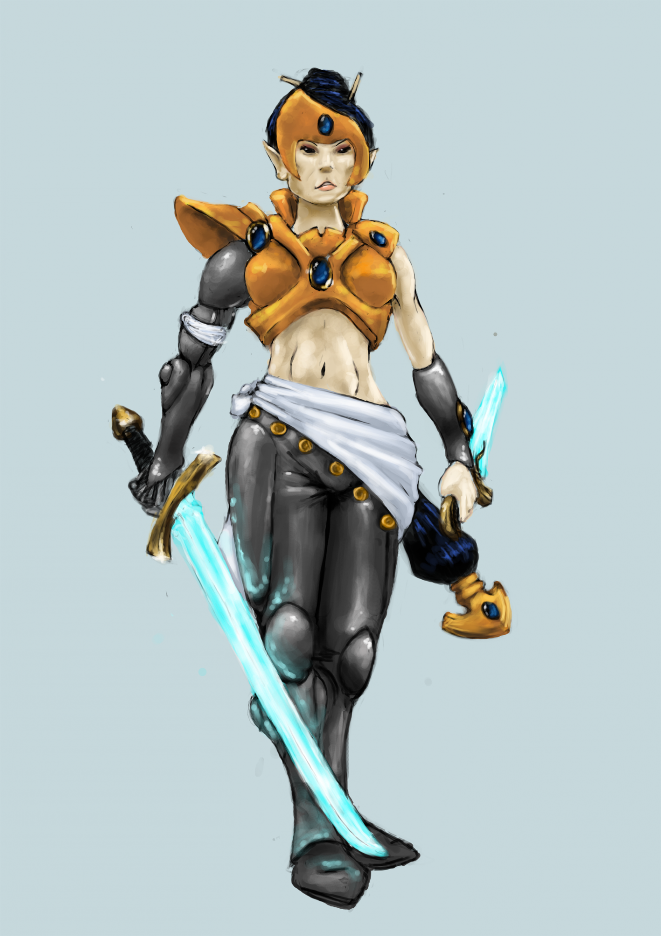
 Here's what I was able to do with your advice and another tutorial. I think Ill get a hang of it now :) 
 
No Caption Provided
Avatar image for armaan8014
armaan8014

6325

Forum Posts

2847

Wiki Points

0

Followers

Reviews: 11

User Lists: 17

#27  Edited By armaan8014
Avatar image for hitmanagent47
HitmanAgent47

8553

Forum Posts

25

Wiki Points

0

Followers

Reviews: 0

User Lists: 2

#28  Edited By HitmanAgent47

Lol, that's like a lot better than before.

Avatar image for armaan8014
armaan8014

6325

Forum Posts

2847

Wiki Points

0

Followers

Reviews: 11

User Lists: 17

#29  Edited By armaan8014
@HitmanAgent47: hehe thank you :D Gotta keep working but atleast Im on the right track now :)
Avatar image for soap
Soap

3774

Forum Posts

1811

Wiki Points

0

Followers

Reviews: 9

User Lists: 29

#30  Edited By Soap

@armaan8014: You've improved a lot already, keep it up!

And with the dodge and burn I don't think it's an avoid at all costs thing, but over using it especially for shadows and highlights can look really bad.

Avatar image for mcghee
McGhee

6128

Forum Posts

0

Wiki Points

0

Followers

Reviews: 0

User Lists: 2

#31  Edited By McGhee

@armaan8014:

Damn, huge improvement already. That's really great stuff.