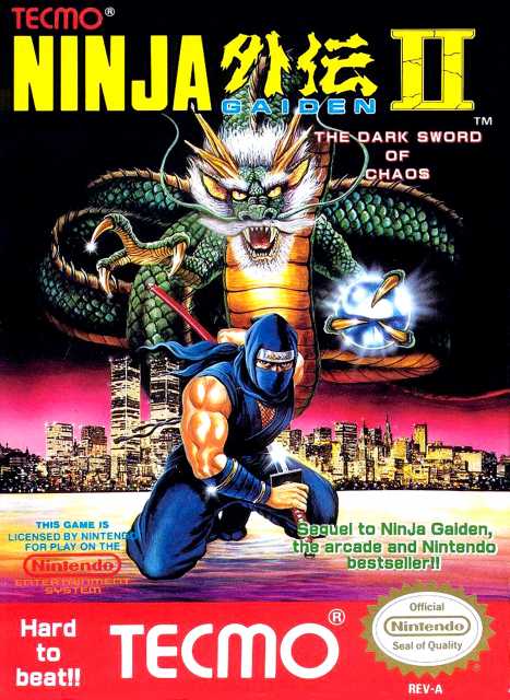
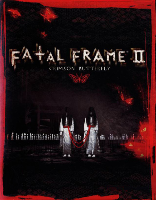
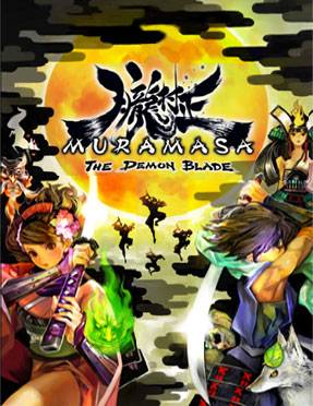
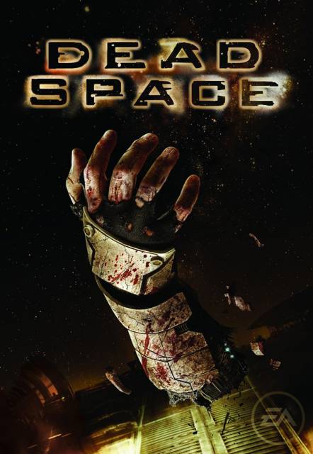
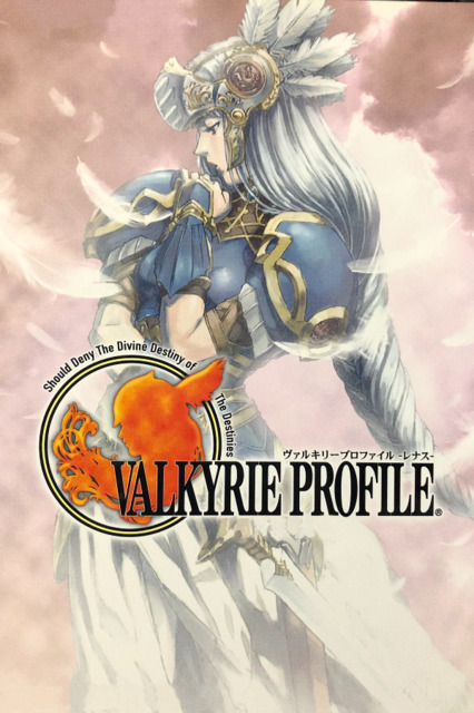
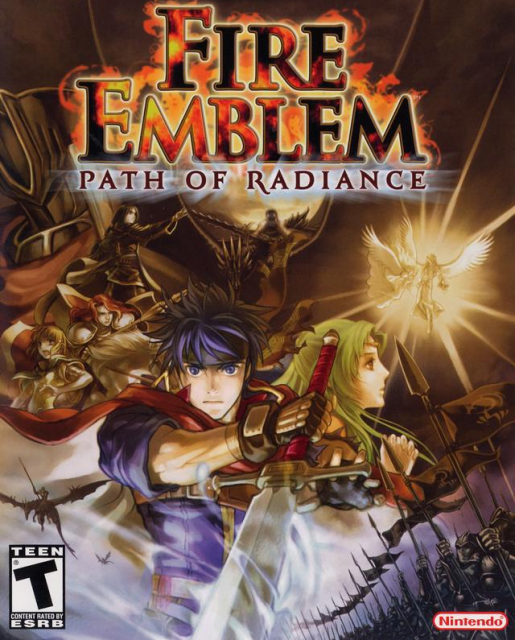
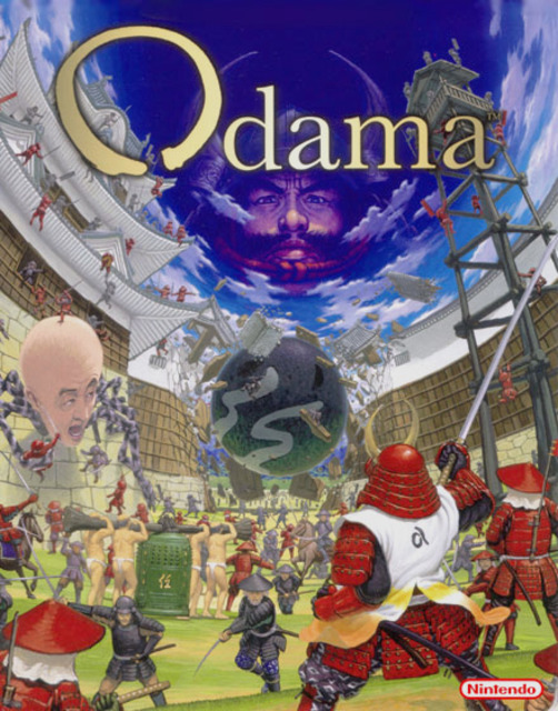
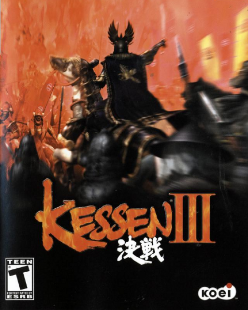
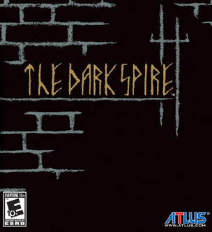
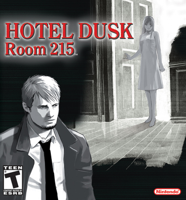
Something went wrong. Try again later

Hailinel

I wrote this little thing (it's not actually a little thing): http://www.giantbomb.com/profile/hailinel/blog/lightning-returns-wha...

25785 219681 175 480
Forum Posts Wiki Points Following Followers

Favorite Cover Art

In selling a game, box art can sometimes make all the difference. While there have been notable disasters over the years, covers so dreadful that they scare small children and cause fainting spells in those with weak constitutions, I decided to focus on the positive for this list. These are games featuring cover art that I find particularly eye-catching in a good way.

As an additional note, as I am an American, this list is focused on the North American cover art unless the game was never officially released in North America.

List items

  • An old classic. The use of color, particularly with the city skyline against the night sky, is a striking image.

  • Fatal Frame II's cover is, in a word, creepy, and it escalates to disturbing if you look at it for long enough.

  • A beautiful use of color that perfectly evoke's the game's art style.

  • Effective punctuation to the game's atmosphere of dread. Also, the severed arm is part of Dead Space canon. Who did it belong to? I'm not telling!

  • The cover art for the original Playstation version of Valkyrie Profile is much more simple and elegant than that of the PSP remake.

  • The Fire Emblem series has a history of covers featuring numerous characters from the games. This is one of the best.

  • OH MY GOD WHAT IS GOING ON HERE?!

  • This cover really evokes the idea of leading an army into the fray. I really like the detail and use of color in it.

  • The simple design of the cover for The Dark Spire harkens back to the early computer RPGs that the game was designed to evoke.

  • Another cover that emphasizes simplicity, it focuses on the two characters most central to the game's story.