Post-Redesign Development & Design Priorities

  • 435 results
  • 1
  • ...
  • 3
  • 4
  • 5
  • 6
  • 7
  • ...
  • 9
Avatar image for liquidsaiyan3
LiquidSaiyan3

630

Forum Posts

1473

Wiki Points

0

Followers

Reviews: 0

User Lists: 13

Not sure if this falls under "drawer animations", but I didn't see this issue mentioned in a quick glance over this thread.

In the mobile version of the site, bringing out the navigation menu (top-right icon) takes a number of seconds to fully draw as it has this slow slide-down animation that displays all the menu options. This seems to only happen on Firefox (both Android and Win10)

Avatar image for wemmick
wemmick

138

Forum Posts

48

Wiki Points

0

Followers

Reviews: 0

User Lists: 2

Avatar image for wemmick
wemmick

138

Forum Posts

48

Wiki Points

0

Followers

Reviews: 0

User Lists: 2

Avatar image for dotdissent
Dotdissent

13

Forum Posts

0

Wiki Points

0

Followers

Reviews: 0

User Lists: 0

I just really want to say that I love this design so much. Keep up the amazing work, team :D

Avatar image for the_nubster
The_Nubster

5058

Forum Posts

21

Wiki Points

0

Followers

Reviews: 3

User Lists: 1

Integrated decks! Looks great. Are there any plans to make note of who posted it, as well?

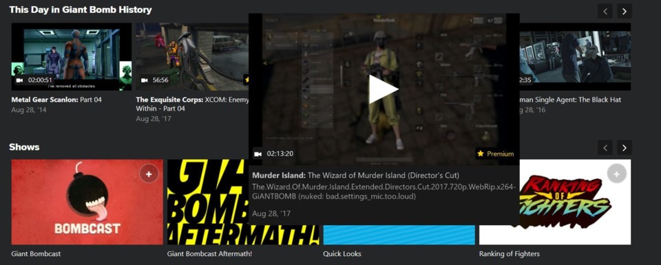
Also, I noticed that one of the panels for Murder Island expands much more than any others when hovered over. Checked all of the others in the On This Day carousel.

No Caption Provided

Avatar image for avantegardener
avantegardener

2491

Forum Posts

165

Wiki Points

0

Followers

Reviews: 0

User Lists: 11

Well done guys, appreciate all the hard work done so far!

Avatar image for therealturk
TheRealTurk

1412

Forum Posts

0

Wiki Points

0

Followers

Reviews: 0

User Lists: 0

For the sake of my eyes, please revert the . . . fuschia? . . . color on the text. It's really bad. It is extremely difficult to read, particularly on small type. It's particularly jarring on the front page, since some links remain white until you hover over them and others are just colored all the time. Looks messy.

Avatar image for brian_
brian_

1277

Forum Posts

12560

Wiki Points

0

Followers

Reviews: 0

User Lists: 4

#209  Edited By brian_

Yeah. The new color is giving me eye pain.

EDIT: For whatever reason, I'm finding the new color to be less bothersome without my glasses on. Still bothersome. Just less immediate.

Avatar image for brainscratch
BrainScratch

2077

Forum Posts

0

Wiki Points

0

Followers

Reviews: 0

User Lists: 0

#210  Edited By BrainScratch

I appreciate the return of more color to the site and finally being able to know what's linked text and what's underlined text, but I feel like a softer red would fit Giant Bomb better and would hurt our eyes way less than this weird neon magenta.

I also think part of the reason of why this is hurting our eyes isn't just about the color but also about the font.

edit: also, why is the Twitter box on the homepage bigger? It looks really ugly to have a long vertical box that goes way further down than the horizontal box right next to it, not to mention how it makes scrolling longer.

Avatar image for casepb
Casepb

1008

Forum Posts

0

Wiki Points

0

Followers

Reviews: 0

User Lists: 0

I also am having some real issues with this red text. It's not very pleasant on the eyes.

Avatar image for the_nubster
The_Nubster

5058

Forum Posts

21

Wiki Points

0

Followers

Reviews: 3

User Lists: 1

#212  Edited By The_Nubster

I hate to be that guy, since I was asking for more red, but this doesn't look great. I would have been happy with red underlines and a little more pizazz on the "Show More" areas of the carousels. The small forum and comment text in red is super hard on the eyes.

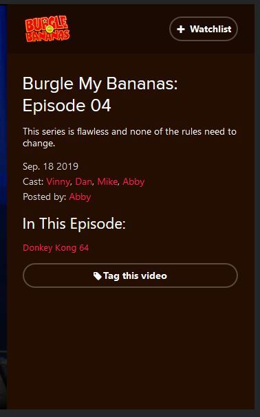
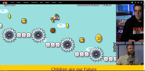
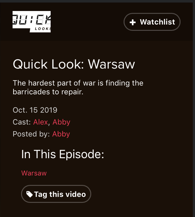
Edit: Sorry I double-hate to be that guy, but the new colour just seems dropped into place with no regard to the design around it. With names on forums and comments, the font seems to be a different size, too, unless that's just a weird effect of the text being more difficult to read now. But I pulled some screenshots from a few places on the site, and in all cases, the rest text looks bizzarely out-of-place. The original plan was just to use the BmB as an example but in uploading that, I found more places taht didn't look great. I appreciate that the request for more colour was heard, but it doesn't feel like it was implemented properly.

No Caption Provided
No Caption Provided
No Caption Provided

Avatar image for icemaz
Icemaz

12

Forum Posts

13

Wiki Points

0

Followers

Reviews: 0

User Lists: 0

Yeah I'm having some issues with reading the new text colour. For accessibility reasons, it would be great to have something which has a greater contrast to the dark background.

Avatar image for cettu
cettu

125

Forum Posts

5940

Wiki Points

0

Followers

Reviews: 0

User Lists: 0

Thank you so much for bringing the color back!!!

Personally I'm loving the red you used, but I wouldn't be against darkening it a bit, if it's really bothering a lot of users.

Avatar image for deactivated-6373f6c34cbfb
deactivated-6373f6c34cbfb

86

Forum Posts

0

Wiki Points

0

Followers

Reviews: 0

User Lists: 0

I also think the red could be improved. I really like that more color was added, but I think something more like this would be better:

I found #ff5254 to work well for the link color. All I did was eyedrop the giant bomb logo and make the red color a little lighter and desaturated. This helps improve the accessibilty score of the text contrast, and the less saturation makes it easier to read to me.

And then for the buttons, I used #ce2528 from eyedroping the giantbomb logo and making the red darker. The darker color here works nicely because there is white text on top of it.

Not only would these colors help with legibility, they also match the hue of the red from the Giant Bomb logo much better than the hot pink.

Avatar image for onemanarmyy
Onemanarmyy

6406

Forum Posts

432

Wiki Points

0

Followers

Reviews: 2

User Lists: 0

#216  Edited By Onemanarmyy

i am... hmmm.. I like that a reddish colour has returned but.. Isn't this worse than the original color you got rid of? Does this pass the accessibility tests that the original red didn't pass? I feel like an asshole because i do want red back, but i'm just surprised that this color apparently is better than the original one.

Edit: I do quite like the red on black. The red button with white text on it (Save modifications for example) is the one time that it hurts my eyes a bit.

Avatar image for mostman
mostman

387

Forum Posts

5

Wiki Points

0

Followers

Reviews: 0

User Lists: 3

#217  Edited By mostman

I think...I like it? There’s some specific places where it flat out doesn’t work (see Nubster’s shots above) - but it looks hot in most places.

It looks especially good on a phone with a nice display. Furthering my theory that this entire redesign was done with a “mobile first” mentality.

Avatar image for theuprightman
theuprightman

350

Forum Posts

55

Wiki Points

0

Followers

Reviews: 0

User Lists: 0

Loving the pink

Avatar image for ascara89
Ascara89

146

Forum Posts

0

Wiki Points

0

Followers

Reviews: 0

User Lists: 0

I'd like to add to the list of people finding the red/pink a bit difficult to read

Avatar image for therealturk
TheRealTurk

1412

Forum Posts

0

Wiki Points

0

Followers

Reviews: 0

User Lists: 0

@mostman said:

I think...I like it? There’s some specific places where it flat out doesn’t work (see Nubster’s shots above) - but it looks hot in most places.

It looks especially good on a phone with a nice display. Furthering my theory that this entire redesign was done with a “mobile first” mentality.

I really hope this isn't the case. I cannot imagine using this site on a mobile device. Of course, maybe I'm wrong and am just a dinosaur for preferring desktop. If there is some "mobile first" philosophy behind the redesign, I would hope it is based is actual usage data to back that up, as opposed to mobile design merely being the "hot" thing these days.

Design standards should yield to the users, not the other way around.

Avatar image for function404
function404

26

Forum Posts

0

Wiki Points

0

Followers

Reviews: 0

User Lists: 0

#222  Edited By function404

I dig the hitman2 red/pink, but it is a little bright on the two monitors I've tried it on with Dark Mode (I can't seem to find Light Mode anymore and I don't know if it's still available). Looks better on my phone, so that could just be my screens/bad eyesight being the issue.

Avatar image for function404
function404

26

Forum Posts

0

Wiki Points

0

Followers

Reviews: 0

User Lists: 0

#223  Edited By function404

While watching the Deadly Premonition ER, I had been tagging Jeff, Vinny, Ryan, and Brad into their appropriate videos. Once I see one video has had the tags approved, I go check the others to see if I missed anything.

I noticed that for BR-11 https://www.giantbomb.com/shows/endurance-run-deadly-premonition-part-br-11/2970-15221/free-video that Brad's tag is there, but Ryan's isn't. When I click "Add Tags" his name is there (for what I assume is a pending tag at the moment) along with Brad and the game's tag in the Existing Tags. I'm assuming it's still pending, but all the tags regardless of being approved or not are there aside from the poster, of course. (I'm also wondering if this was an oversight in terms of approval or if there is some bug, but like I said I believe it's former).

That said, instead of having the tags the user(s) have submitted in the Add Tags pop up with the already approved tags (the Existing Tags), I think having something like

Pending Tags: [USER SUBMITTED TAG], [USER SUBMITTED TAG]

in a greyed out font or some stylistic way to tell it hasn't been approved yet in a line below it. I believe this would be helpful for those users that want to help in categorizing the content, which overall helps the site. It's not a major deal, but it'd be a nice UI thing.

Keep up the good work!
Avatar image for brainscratch
BrainScratch

2077

Forum Posts

0

Wiki Points

0

Followers

Reviews: 0

User Lists: 0

Is the new embiggen fully implemented or still being tested? I'm super happy for the return of embiggen, but right now it's not working as the old embiggen used to work. The old embiggen made the video around the size of YouTube's large player, which was perfect, but this new embiggen is making videos bigger than the browser window which makes it pretty much unusable.

Avatar image for the_nubster
The_Nubster

5058

Forum Posts

21

Wiki Points

0

Followers

Reviews: 3

User Lists: 1

Avatar image for ascara89
Ascara89

146

Forum Posts

0

Wiki Points

0

Followers

Reviews: 0

User Lists: 0

Same for me now that I've tried it

Avatar image for hardtarget
Hardtarget

389

Forum Posts

0

Wiki Points

0

Followers

Reviews: 0

User Lists: 14

Is the new embiggen fully implemented or still being tested? I'm super happy for the return of embiggen, but right now it's not working as the old embiggen used to work. The old embiggen made the video around the size of YouTube's large player, which was perfect, but this new embiggen is making videos bigger than the browser window which makes it pretty much unusable.

yup, same issue for me. also it only seems to work with youtube vids but not with the GB player :(

Avatar image for jbick89
jbick89

273

Forum Posts

7

Wiki Points

0

Followers

Reviews: 0

User Lists: 0

#229  Edited By jbick89
No Caption Provided

I'm also seeing embiggen being too bigg. Win10, Chrome 77.0.3865.90, 1080p monitor. Here's a screenshot, you can see the video is cut off at the top by the site's menu bar and at the bottom by the Windows taskbar.

I was an avid Embiggen user and I am excited to see its return!

Avatar image for brainscratch
BrainScratch

2077

Forum Posts

0

Wiki Points

0

Followers

Reviews: 0

User Lists: 0

So is there any plans to fix the unreadable neon pink accents and the unusable embiggen video player or will it all just stay broken?

Avatar image for the_nubster
The_Nubster

5058

Forum Posts

21

Wiki Points

0

Followers

Reviews: 3

User Lists: 1

#231  Edited By The_Nubster

I'm noticing that forum posts and comments now don't say "posted by" anymore. The way the names are now just floating there without any design elements to separate them from the body of the post looks extremely weird.

Edit: and the timestamp is now down below, beside "Reply" and "Quote." What is the logic behind moving it down there and leaving the header so barren?

Avatar image for wacomole
Wacomole

1194

Forum Posts

681

Wiki Points

0

Followers

Reviews: 0

User Lists: 2

#233  Edited By Wacomole

I'm noticing that forum posts and comments now don't say "posted by" anymore. The way the names are now just floating there without any design elements to separate them from the body of the post looks extremely weird.

Edit: and the timestamp is now down below, beside "Reply" and "Quote." What is the logic behind moving it down there and leaving the header so barren?

Also...sometimes the forum post timestamps don't show up anywhere at all, top or bottom. [on latest Firefox/Win10]

Avatar image for brainscratch
BrainScratch

2077

Forum Posts

0

Wiki Points

0

Followers

Reviews: 0

User Lists: 0

The previous logo for Quick Looks with the clock inside the bomb was perfect and fitted the overall redesign of the QL logo and website nicely in a coherent way. So why was it replaced with this super weird new logo with lines on places where clocks don't put lines, cropped on the sides, and just harder to read overall?

No Caption Provided

I know these logos for each show are almost more of passion projects than the actual focus on the site's development, but to me it just seems weird to spend time and effort getting rid of what was a perfect logo.

Avatar image for theadmin
TheAdmin

1062

Forum Posts

6686

Wiki Points

0

Followers

Reviews: 5

User Lists: 8

it just seems weird to spend time and effort getting rid of what was a perfect logo.

Welcome to this era of giant bomb development. Unnecessary logo changes? check! Make a consistent user experience? No thanks!

Avatar image for therealturk
TheRealTurk

1412

Forum Posts

0

Wiki Points

0

Followers

Reviews: 0

User Lists: 0

@theadmin said:
@johnymyko said:

it just seems weird to spend time and effort getting rid of what was a perfect logo.

Welcome to this era of giant bomb development. Unnecessary logo changes? check! Make a consistent user experience? No thanks!

On a somewhat unrelated note, I notice that the Twitter feed now stretches about 12 lines further than it did, leading to a huge amount of dead grey space at the bottom of the main page since the "Latest from the Community" box isn't sized to keep pace. Because the thing everyone was clamoring for was more Twitter.

This is going to come across as aggressive, which it isn't intended to be*, but would it absolutely ruin their day to test some of this stuff before putting it out? It isn't like a lot of these things are particularly hard to nail down bugs or weird one offs - you can look at the page and immediately tell that it isn't right. That stuff slipping through makes things come off as extremely unprofessional. And not a good "It's Friday" kind of unprofessional. More like a "we just don't care at all" kind of unprofessional.

*(O.K., it's a little bit intentional)

Avatar image for the_nubster
The_Nubster

5058

Forum Posts

21

Wiki Points

0

Followers

Reviews: 3

User Lists: 1

@therealturk: This has been my issue with much of the site redesign-redesign. Every change that's implemented is almost immediately noticeable, and negatively so (save for the decks, those are great and I hope they're expanded upon). I know that they're working on this stuff for 8+ hours per day, but surely there is someone whose nose isn't always in this stuff who can look at it and give a thumbs up or thumb down. My worst-case scenario is that they're on some sort of "X changes/month" quota and are forced to push this stuff out, or that they're working in an environment where they can't properly test these changes without implementing them live.

I've been here since the first site design, and never before this one has it been so problematic and in such a long-running way. So much personality and flair was lost with this design and almost every new feature designed to bring it up to parity with the old ones come with its own whole host of problems, and then those attempted fixes always have problems associated as well. Like, just being real, it's a bummer. It's a legitimate bummer.

Avatar image for the_nubster
The_Nubster

5058

Forum Posts

21

Wiki Points

0

Followers

Reviews: 3

User Lists: 1

#240  Edited By The_Nubster

Digging the orange. I'd be happy for it to stay long-term. I mentioned in another thread that it looks like my foobar2000 setup, so I'm right at home.

Avatar image for the_nubster
The_Nubster

5058

Forum Posts

21

Wiki Points

0

Followers

Reviews: 3

User Lists: 1

Noticed last night that the video player sits nicely on a high-res monitor now. Looks good!

Avatar image for liquiddragon
liquiddragon

4314

Forum Posts

978

Wiki Points

0

Followers

Reviews: 2

User Lists: 19

#244  Edited By liquiddragon

I think this was a thing before the new site but when I go to a comment section, sometimes the comment box is at the bottom of the page and sometimes it’s above the comments. Why does this happen? It’s annoying to have to go to all the way down the page to post, especially when a lot of ppl have already commented. Either way, it’d be cool if it was consistent.

Avatar image for theadmin
TheAdmin

1062

Forum Posts

6686

Wiki Points

0

Followers

Reviews: 5

User Lists: 8

@wemmick The new header is so much better and looks great!

Two things I'd love to see happen is to make the mouse area larger on the 3 profile buttons next to the search. They're very thin and it means the menu disappears a lot as I try to move to it. The other would be to move the search dropdown, when search is open, to the other side where my mouse is already - then I would have the X and the dropdown near each other.

Avatar image for sombre
sombre

2242

Forum Posts

34

Wiki Points

0

Followers

Reviews: 0

User Lists: 4

Please could you put the "This day in Giant Bomb History" in chronological order?

Avatar image for schindigg
schindigg

308

Forum Posts

0

Wiki Points

0

Followers

Reviews: 0

User Lists: 0

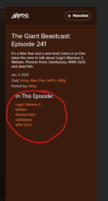
Something I would love to see would be a change to the "in this episode" section of the video banner. Maybe make it a spoiler link or a "click to show more" link instead of just showing the whole list. Its nice to be surprised sometimes about whats in a video like UPF or other live stream, I can't be the only person who would enjoy this little change.

No Caption Provided
Avatar image for the_nubster
The_Nubster

5058

Forum Posts

21

Wiki Points

0

Followers

Reviews: 3

User Lists: 1

@schindigg: @sombre:

+1 to these ideas. Both features are great but with a tweak they could be absolutely perfect.

Avatar image for jamin
jamin

496

Forum Posts

2

Wiki Points

0

Followers

Reviews: 1

User Lists: 4

#250  Edited By jamin

It has been a year since the redesign. One thing I still wish it had was the comment count # on the thumbnail. It really helps me out with limited time to watch GB these days to skim the videos and maybe watch something I may have missed.