Something went wrong. Try again later
    Follow

    The Walking Dead

    Game » consists of 41 releases. Released Nov 21, 2012

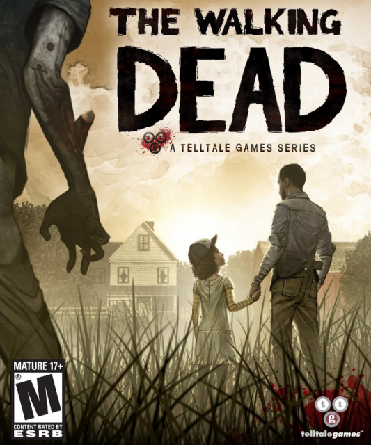
    Presenting an original story in the same franchise as the comic book series of the same name, The Walking Dead is a five-part adventure game from Telltale that follows the story of a convicted murderer, his guardianship over a young girl, and his co-operation with a roaming group of survivors in a zombie apocalypse.

    Standard or Minimal UI?

    Avatar image for waxdart
    waxdart

    20

    Forum Posts

    0

    Wiki Points

    0

    Followers

    Reviews: 0

    User Lists: 0

    #1  Edited By waxdart

    Curious how people played out on this choice. After having played through the entirety of this episode, I'm a little disappointed how much information Telltale decided to expose in their "Standard" UI display. What this appears to do is call out in capital letters what the impacts of your choices are, as well as framing the Big Decision Moments.

    The outcome of that, I thought, was to ultimately break immersion in a way counter to the aims of the series, the game & the story and much more transparently "gamified" everything around you. Found it was much better to be left paranoid and wondering what I said would resonate with people—which then ultimately makes you pay more attention to the way characters actually talk, animate etc. Additionally, not having a GIANT LETTERS "Save <This Character> or <This Character>" really telegraphs the fact that you have to choose, that you couldn't do both etc. Why not instead leave the player with the lingering doubt about your decisions?

    It's hand-holdy in a UI-design sense and I get why they do it, but for anyone who hasn't played, I'd recommend trying it without all the hints on, in Minimal. Opinions?
    Avatar image for jillsandwich
    jillsandwich

    807

    Forum Posts

    1054

    Wiki Points

    0

    Followers

    Reviews: 1

    User Lists: 5

    #2  Edited By jillsandwich

    I'm not sure about the super obvious big decision stuff you're talking about, although I think I remember seeing something along those lines at the last Big Decision moment at the end. I did however, tun off the markers over all the interact-able things....except for the puzzle for getting past the zombies at the Motel. I had to turn that stuff off to figure out what the hell I was supposed to do(I'm not a very observant person).

    Avatar image for hbkdx12
    hbkdx12

    800

    Forum Posts

    0

    Wiki Points

    0

    Followers

    Reviews: 0

    User Lists: 1

    #3  Edited By hbkdx12

    Yeah its as lil counter intuitive. I used the standard interface because im generally not big on point and click adventure games and i hate when there's one thing i need to interact with to advance but can't find it and then after 20 minutes of feeling like you looked everywhere you end up all the more annoyed when you actually do interact with the thing because it was right there in your face the entire time. 
     
    If there were an option to see what objects you can interact with without having the description and impact of your choices in the upper left hand corner, that would be great. 
     
    That being said, most of the time what's written there is somewhat vague (i.e he will remember what you said) and you can generally tell by the succeeding dialogue/animation how someone felt about something you said or did so it's not too bad

    Avatar image for tennmuerti
    Tennmuerti

    9465

    Forum Posts

    1

    Wiki Points

    0

    Followers

    Reviews: 1

    User Lists: 7

    #4  Edited By Tennmuerti

    I started with the minimal UI as people have reccomended.
    But halfway through I switched on "detect selectables" it reduces the pixel hunting but does it in a nice way of only highlighting the stuff close to your cursor not on the entire screen.

    If there were an option to see what objects you can interact with without having the description and impact of your choices in the upper left hand corner, that would be great.  

    @hbkdx12: I'm not sure about the console versions but this option is definately on the PC, it's exactly what i mention turning on above.
    Avatar image for cutyoface
    cutyoface

    582

    Forum Posts

    0

    Wiki Points

    0

    Followers

    Reviews: 1

    User Lists: 2

    #5  Edited By cutyoface

    I started with the standard UI but i found it to be way too easy so i changed it halfway through.

    Avatar image for rampageassassin
    RampageAssassin

    438

    Forum Posts

    13

    Wiki Points

    0

    Followers

    Reviews: 0

    User Lists: 4

    #6  Edited By RampageAssassin

    Go minimal even though I had to change to standard when I got stuck looking for items.

    Avatar image for captainobvious
    CaptainObvious

    2993

    Forum Posts

    2

    Wiki Points

    0

    Followers

    Reviews: 0

    User Lists: 2

    #7  Edited By CaptainObvious

    I don't have the patience to do pixel hunting, so I go standard.

    Avatar image for rolyatkcinmai
    Rolyatkcinmai

    2763

    Forum Posts

    16308

    Wiki Points

    0

    Followers

    Reviews: 0

    User Lists: 5

    #8  Edited By Rolyatkcinmai

    Played on standard and left it that way the whole way through. I didn't have any issue with it.

    Avatar image for hbkdx12
    hbkdx12

    800

    Forum Posts

    0

    Wiki Points

    0

    Followers

    Reviews: 0

    User Lists: 1

    #9  Edited By hbkdx12
    @Tennmuerti: That sucks (for me) 
     
    I have it on PS3 and it's all (standard UI) or nothing (Minimal UI)
    Avatar image for geurge
    Geurge

    119

    Forum Posts

    0

    Wiki Points

    0

    Followers

    Reviews: 0

    User Lists: 2

    #10  Edited By Geurge

    Went with minimal, there wasn't too much pixel hunting with the cursor being so big. Only time I got stuck was looking for the keys and that was because they weren't in the store.

    Also, looking for a way to get the brick, it looked like it was easily in reach but I couldn't work out how to get to it.

    Avatar image for timfreilly
    TimFReilly

    104

    Forum Posts

    0

    Wiki Points

    0

    Followers

    Reviews: 1

    User Lists: 1

    #11  Edited By TimFReilly

    Went with minimal and haven't had pixel hunting problems.

    Avatar image for pezen
    Pezen

    2585

    Forum Posts

    14

    Wiki Points

    0

    Followers

    Reviews: 0

    User Lists: 0

    #12  Edited By Pezen

    Minimal the entire way through. As noted earlier, the drug store key/brick thing did take some extra effort to figure out but other than that I liked the lack of things on screen. Made it all much more immersive.

    Avatar image for probablytuna
    probablytuna

    5010

    Forum Posts

    0

    Wiki Points

    0

    Followers

    Reviews: 0

    User Lists: 1

    #13  Edited By probablytuna

    I chose minimal UI because I didn't want information to be shown outright, as stated in the Bombcast about major decisions having greater effects and what not. Also, I liked how they let you use both gamepad and mouse. I was moving Lee with the analog stick and looking around with the mouse. The best of both worlds.

    Avatar image for shookems
    Shookems

    479

    Forum Posts

    0

    Wiki Points

    0

    Followers

    Reviews: 0

    User Lists: 0

    #14  Edited By Shookems

    Personally I don't really enjoy the pixel hunt in adventure games. Show me what I can click on and let me figure it out from there. I'm here for the story, and as soon as the game becomes a stagnant click fest I lose interest.

    Avatar image for grillbar
    Grillbar

    2079

    Forum Posts

    310

    Wiki Points

    0

    Followers

    Reviews: 0

    User Lists: 1

    #15  Edited By Grillbar

    standard since i really only cared about the story and not the pixel hunting part of it

    Avatar image for deactivated-5b8316ffae7ad
    deactivated-5b8316ffae7ad

    826

    Forum Posts

    230

    Wiki Points

    0

    Followers

    Reviews: 1

    User Lists: 1

    Sometimes minimal UI can ruin the immersion because in situations when the time is dire and short, you hunting around for clues is unrealistic.

    Avatar image for sickvisionz
    sickVisionz

    1307

    Forum Posts

    39

    Wiki Points

    0

    Followers

    Reviews: 1

    User Lists: 4

    #17  Edited By sickVisionz

    The menu lets you customize what does and doesn't pop up. I turned off the stuff that tells you what the results of your conversation were, but I kept on the little pop ups that tell you that you can click on things. I'm playing this more like an interactive movie/comic rather than a game. Not having those pop ups could lead to frustrating situations for me that I don't want to be bothered with.

    Avatar image for zaccheus
    zaccheus

    2140

    Forum Posts

    36

    Wiki Points

    0

    Followers

    Reviews: 0

    User Lists: 5

    #18  Edited By zaccheus

    I'm not a big adventure gamer and wanted to make it as easy as possible to enjoy the story. The conversation result stuff was instantly super off putting to me, but luckily you can just turn that off. All in all an excellent experience.

    Avatar image for deactivated-5e49e9175da37
    deactivated-5e49e9175da37

    10812

    Forum Posts

    782

    Wiki Points

    0

    Followers

    Reviews: 0

    User Lists: 14

    I think it's amusing that people think the conversation stuff was 'spoiling' the game.

    This edit will also create new pages on Giant Bomb for:

    Beware, you are proposing to add brand new pages to the wiki along with your edits. Make sure this is what you intended. This will likely increase the time it takes for your changes to go live.

    Comment and Save

    Until you earn 1000 points all your submissions need to be vetted by other Giant Bomb users. This process takes no more than a few hours and we'll send you an email once approved.