Follow

VVVVVV

Game » consists of 6 releases. First released on Jan 10, 2010

VVVVVV, pronounced "the letter V six times", is an indie 2D puzzle platformer developed by Terry Cavanagh, in which players, rather than jumping, invert their own gravity to cover gaps and avoid obstacles.

VVVVVV Poster

#1 Edited by Azteck (7330 posts) - 2 years, 2 months ago

Hiya guys. 
 
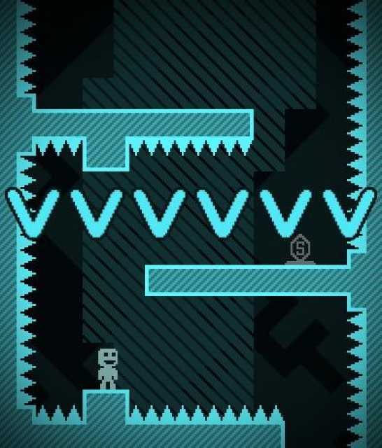
I recently re-did my room, with new paint on the walls and new floor, the whole thing. With it, obviously, came some new furniture and now I have a really good looking dresser, completely black which works really well in my room. However the wall behind it feels rather empty, so I decided to take a stab at putting something there. I ransacked my mind, and scanned the internet for some inspiration for what game I could use, and ended up on VVVVVV. I really like the minimalistic, and pretty bare bones approach to graphics the game has, everything I want in a poster. I fiddled around in Photoshop and eventually ended up on this:  
 

 EDIT #1

  Made the text bolder and added a copyright, as well as altered some of the shading.


What do you guys think? The original size is 47x67cm, which is about 19x26 inches (give or take). If you have any feedback, feel free to share 
 
Hopefully I'll make two more of two other games and put them next to each other. We'll see what I do. But that's all for now.
#2 Posted by Animasta (12764 posts) - 2 years, 2 months ago

That's dope, I can tell you that; be interested to see once you get it all up there.

#3 Posted by MB (9884 posts) - 2 years, 2 months ago

Print it out the size you want, glue it to your wall, then use a razor blade to cut out a stencil and paint that thing up there.

Moderator
#4 Posted by Icicle7x3 (891 posts) - 2 years, 2 months ago

I feel the VVVVVV should be on top.

#5 Posted by TeflonBilly (4722 posts) - 2 years, 2 months ago
#6 Posted by GlenTennis (3128 posts) - 2 years, 2 months ago

That's really cool.

#7 Posted by Harbinger_Of_Hippos (224 posts) - 2 years, 2 months ago

It's like totes rad and gnarly and junk, brocipher!
But seriously, put it on the wall.

#8 Posted by JJOR64 (18123 posts) - 2 years, 2 months ago

I still need to get this game.

#9 Posted by Bloodgraiv3 (2679 posts) - 2 years, 2 months ago

Thats really awesome. 
#10 Posted by Manhattan_Project (1903 posts) - 2 years, 2 months ago
@Icicle7x3 said:
" I feel the VVVVVV should be on top. "
Yep.  
 
Still awesome.
#11 Posted by TooWalrus (11815 posts) - 2 years, 2 months ago

Love it, the color scheme is great, the placement of the dude and the logo is perfect, I'd hang that on my room, if it wasn't already cluttered.

#12 Posted by Rudeboy217 (1726 posts) - 2 years, 2 months ago

Really cool, man. I dig it.

#13 Posted by Gamer_152 (13243 posts) - 2 years, 2 months ago

Very nice, like you say the minimalism really gives it a great look.

Moderator
#14 Posted by BeachThunder (8871 posts) - 2 years, 2 months ago
@Icicle7x3 said:
" I feel the VVVVVV should be on top. "
Yes, he's falling through the spikes o_o
 
Also, seems kind of silly not to keep the pixels in tact.
#15 Posted by Scribbly (402 posts) - 2 years, 2 months ago

Love it, I'd be interested to see what you design for the other ones!

#16 Edited by Azteck (7330 posts) - 2 years, 2 months ago

Thanks for all the nice comments, guys

 I'll make sure to keep you posted with future posters, and this one when it eventually comes up on my wall.
 
@BeachThunder
said:

Also, seems kind of silly not to keep the pixels in tact. "

I chose to do that because, while I love pixel art and have created a ton of it, when you start creating at sizes as big as that, clearly defined pixels actually make it look worse. At least in my opinion. I decided to go the middle-route and keep the  pixels somewhat intact, while still making it more.. round, I suppose. 
#17 Posted by carlthenimrod (1538 posts) - 2 years, 2 months ago

The more I look at it, the more it looks like a bunny to me.

Online
#18 Posted by Chavtheworld (4123 posts) - 2 years, 2 months ago

Looks really nice, but I think the VVVVVV should be bolder. Looks really skinny compared to the dude above. Oh and you should blatantly go down to a proper photo printing place and get it printed on canvas (actually wait that'd be too expensive... just get it on some nice paper then.)

#19 Posted by dudeglove (6253 posts) - 2 years, 2 months ago

Install a black light while you're at it and the effect will be complete.

#20 Posted by Damodar (731 posts) - 2 years, 2 months ago

It's a great idea and looks really cool, but I feel like the VVVVVV needs to be bigger and should be made of blocky pixels too perhaps.

#21 Posted by Tordah (2369 posts) - 2 years, 2 months ago

That's really cool. I'd hang that on my wall if given the choice.

#22 Posted by AhmadMetallic (18957 posts) - 2 years, 2 months ago

iLike

#23 Edited by Azteck (7330 posts) - 2 years, 2 months ago
@Chavtheworld said:

" Looks really nice, but I think the VVVVVV should be bolder. Looks really skinny compared to the dude above. Oh and you should blatantly go down to a proper photo printing place and get it printed on canvas (actually wait that'd be too expensive... just get it on some nice paper then.) "

I actually know of a service that does pretty nice prints at a reasonable price, question is if they do sizes that big.I'm glad I found a frame too, so I'll be ordering 3 of those. And I'll try and see how it looks with bolder text on the bottom, thanks for the comment.
#24 Edited by Azteck (7330 posts) - 2 years, 2 months ago

Sorry for the double post but I made some changes, namely the text. Chose another font and made it bolder, as suggested by @Chavtheworld, and added a copyright watermark to it. I think it worked out quite nicely.  


Any suggestions for what game I should try to make an adaptation for next? I was thinking Minecraft but I can't really think of what the poster would contain.
#25 Posted by zudthespud (3204 posts) - 2 years, 2 months ago

I really like the VVVVVV aesthetic, I have the little paper cutouts around my room. That poster is really neat. 
 
I have no idea what you could do for a minecraft poster. I think any game with a really iconic logo or icon would look great if done well, like this VVVVVV poster. Things like the Gran Turismo logo come to mind.

#26 Posted by Rockanomics (1150 posts) - 2 years, 2 months ago
@Azteck: Well it'd be a bit of work but I think the obvious answer for Minecraft would just be a cross section of the world with the word Minecraft mined out... hrm, maybe I can upstage you. If only I had decent editing software.
#27 Posted by Azteck (7330 posts) - 2 years, 2 months ago
@zudthespud said:
" I really like the VVVVVV aesthetic, I have the little paper cutouts around my room. That poster is really neat.  I have no idea what you could do for a minecraft poster. I think any game with a really iconic logo or icon would look great if done well, like this VVVVVV poster. Things like the Gran Turismo logo come to mind. "
I could probably make a GT one, although I've never played any of the games so I wouldn't have a lot of imagination for what to do with it. But as you said, anything with an iconic symbol would work well, given some work. 
 
I'd love to do a Halo one for myself, as I love the franchise, but nothing that can be made very minimalistic comes to mind unfortunately. I'll have to look around my shelf for games I love.
#28 Posted by Slaker117 (4831 posts) - 2 years, 2 months ago
@Azteck said:

"I'd love to do a Halo one for myself, as I love the franchise, but nothing that can be made very minimalistic comes to mind unfortunately. I'll have to look around my shelf for games I love. "

I was actually just going to suggest that as I love Halo as well. As for the minimalistic spin I was thinking of having the ring world as a flat color being viewed at an angle to exaggerate the curvature against the black of space. I know that's fairly vague, I have a picture of it in my head, but can't convey it succinctly. I hope you get the gist of it though, and if you like it you can do your own take of it.
 
Nice work by the way.
#29 Posted by Slaker117 (4831 posts) - 2 years, 2 months ago
@Azteck:  Wait, aren't there supposed to only be six "v"s? You have seven. Or am I missing something?
#30 Posted by Azteck (7330 posts) - 2 years, 2 months ago
@Rockanomics said:
" @Azteck: Well it'd be a bit of work but I think the obvious answer for Minecraft would just be a cross section of the world with the word Minecraft mined out... hrm, maybe I can upstage you. If only I had decent editing software. "
Hmm, interesting idea. I'll fiddle around a bit and see what I get.
#31 Posted by kalmis (1511 posts) - 2 years, 2 months ago

Really like it, but then again I like anything VVVVVV related

#32 Edited by Azteck (7330 posts) - 2 years, 2 months ago
@Slaker117: Yeah, I realized that when I looked at again and changed it, I felt really stupid when I realized it. Should update it here on GB so people aren't confused.  
 
As for your idea, I think I understand what you mean, sort of like seeing a ring in this angle? Not.. that ring, obviously, but you get the idea.
#33 Posted by zudthespud (3204 posts) - 2 years, 2 months ago

I just noticed there are 7 V's in your poster, there should only be 6.

#34 Posted by Azteck (7330 posts) - 2 years, 2 months ago
@zudthespud said:
" I just noticed there are 7 V's in your poster, there should only be 6. "
Yeah, noticed it too. Should be changed now.
#35 Posted by Slaker117 (4831 posts) - 2 years, 2 months ago
@Azteck:  Heh, don't feel bad, it's really easy to confuse. I stared at it for like a minute after I noticed to make sure I wasn't counting wrong and make myself look dumb.
 
And for the Halo idea, I was thinking of bringing the view closer in on a surface as to make the curses look really weird and have parts of the ring bleed off the page. Not too close in, like how it looks standing on it in game, but somewhat similar it how it starts really wide and gets long and narrow, just showing more of the whole structure and not as extreme.
#36 Posted by Azteck (7330 posts) - 2 years, 2 months ago
@Slaker117: 
Something like that, with the edges changing size because of depth, though obviously in higher quality? (as for the edges bleeding out of the picture, I could try but making it look good in a frame could be hard. I'll try)
#37 Edited by Slaker117 (4831 posts) - 2 years, 2 months ago

Yeah something like that. I tried to do a few quick and dirty mock ups as well but can't get the scaling to look right. I'll post them if I ever get them done, but I have somewhere to be right now.
 
As for the bleed, I can understand not wanting to do that, I just have a stylistic preference for not having things fully in frame for some reason. Don't let me direct what you want to do, it was simply an idea. :)

#38 Posted by Azteck (7330 posts) - 2 years, 2 months ago
@Slaker117 said:
" Yeah something like that. I tried to do a few quick and dirty mock ups as well but can't get the scaling to look right. I'll post them if I ever get them done, but I have somewhere to be right now.  As for the bleed, I can understand not wanting to do that, I just have a stylistic preference for not having things fully in frame for some reason. Don't let me direct what you want to do, it was simply an idea. :) "
I fully get that, I do it a lot when I do photography , it's a common stylistic decision.
#39 Posted by Cirdain (2659 posts) - 2 years, 2 months ago

shadow.... bit of dislike to the shadow.

#40 Posted by Synthballs (2188 posts) - 2 years, 2 months ago

I think you need to make this smaller for a phone background.

#41 Posted by Azteck (7330 posts) - 2 years, 2 months ago
@Synthballs said:
" I think you need to make this smaller for a phone background. "
Name a size and I'll provide. I think iPhones (4 at least) use 940x640. Should probably suffice for other phones as well.
#42 Posted by Nasar7 (2098 posts) - 2 years, 2 months ago

I think it would look better without the 'VVVVVV' at all. But then I do like minimalism.

#43 Posted by Synthballs (2188 posts) - 2 years, 2 months ago
@Azteck that should do fine.
#44 Posted by Azteck (7330 posts) - 2 years, 2 months ago
#45 Posted by Yanngc33 (4472 posts) - 2 years, 2 months ago

I want

#46 Posted by waldfield (4 posts) - 2 years, 1 month ago

I would for sure pay to have that on a tshirt

#47 Posted by waldfield (4 posts) - 2 years, 1 month ago

Hey wait a minute.

Copyright?

Do you feel weird copyrighting an image that is itself 90% copyrighted by someone else?

#48 Posted by Romination (2730 posts) - 2 years, 1 month ago
Please Log In

This edit will also create new pages on Giant Bomb for:

Beware, you are proposing to add brand new pages to the wiki along with your edits. Make sure this is what you intended. This will likely increase the time it takes for your changes to go live.

Comment and Save

Until you earn 1000 points all your submissions need to be vetted by other Giant Bomb users. This process takes no more than a few hours and we'll send you an email once approved.

Use your keyboard!

  • ESC