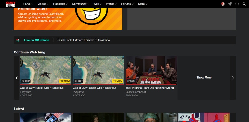
@theadmin: There is a carousel(la) for the latest Quick Looks on the homepage - does that help?
Giant Bomb New Site Feedback
This topic is locked from further discussion.
I hated the redesign at first, but I really wanted to give feedback why. On mobile the site looks great but on desktop, at 1440, I still don't like it.
- Font weights on desktop chrome do not feel right. Can't articulate it right now.
- Linespacing/height padding between linebreaks and elements looks bad, and muddles a lot of text/links. Especially in the drop downs.
- White links... I don't understand why this change was made.
- Top bar aligning left on desktop sucks especially at high resolutions. There's so much wasted space.
- Styling on the carousels makes them blend with the rest of the page too much. Conversely, the scrolling buttons are huge and obtrusive.
- The prominence given to shows over core content is insane. if I want quicklooks I have to go to videos > shows > quicklooks and even then it isn't sorted chronologically. The carousel on the home page isn't an adequate solution.
- Forums feel like they don't exist since they don't have placement on the home page and that is how I interacted with them mostly.
- General lack of polish across visual elements on the site, especially the drop downs.
- Samples in the drop downs should populate according to resolution width as it looks barren on widescreen.
@wemmick: not really. That only shows 4 at a time. It's a better user experience to just go to YouTube and go to the Quick Look Playlist. https://www.youtube.com/playlist?list=PL3C137F169D51B3FC - which is a shame because since this is the website where that content is created it should give a better experience than YouTube.
@theadmin: Ah, I see, so you're looking for a way to look through a large number of episodes at a glance. On the video page for any Quick Look (similar to the playlist page on YT) you can do that in the More Episodes section by switching the view to carousel. We could show more episodes in the list there - does that get to what you're looking for?
Can there be a place that just shows all premium content chronologically on a carousel or a grid? Likewise, an option that just shows all Features?
I think the video thumbnails looks really bad when blown up on the front page. I'm on a 1440p 25" monitor, so I imagine they would look even worse on a bigger 4K screen. Is there a way to have a higher resolution image as the thumbnail rather than a video frame?
Apologies if this has been mentioned a bunch before, but there are too many posts to read through at this point.
Another thing while I remember, the text for posts in notifications is all in bold. Presumably a bug?
Can there be a place that just shows all premium content chronologically on a carousel or a grid? Likewise, an option that just shows all Features?
Chronological viewing is a problem for me, too. Need to see it that way so I can catch up.
@khessed said:
I'd like to "delete" a video from my 'continue watching' list, so that it doesn't get too cluttered with stuff I don't finish.
Same!
@redhook347: This is in QA - coming soon!
@wemmick: It's not about the number of items in the carousel. It's that the user experience is not nearly as good as it once was. So here's a list of questions that need be asked to the UX team:
- Why does it take so many clicks and scrolls to get to the latest quick looks?
- Why does the order of quick looks start on the earlier ones instead of the latest?
- Why is "Strange Brigade" the video that is presented when I click the link for the QL shows page, it's not the latest?
- Why are newer videos in the carousel to the right instead of to the left?
- Why are the videos not in chronological order, latest being first, for grid view?
- Why is it when I switch to grid view does it start on me on page 7?
- When I click the drop down to switch pages, why can I only go up to 5 and down to 9?
- Why were the descriptions, who posted it, and timestamps removed?
Now go here: https://web.archive.org/web/20180829220021/https://www.giantbomb.com/shows/quick-looks/
- The title and video description are presented even if the video is playing
- The video thumbnails are in chronological order, latest first.
- The video thumbnails show comment count (bug in the current version)
- The video thumbnails show the length of the video (missing in the new version)
- The thumbnails have the title, who posted it, and description (only title in new version)
- The pagination clearly shows which page I'm on, how many results there are total, and let's me jump to the end if needed. (This is more intuitive that new version).
- I'm able to pin the video and continue browsing while watching the video (removed in new version)
- I can "embiggen" the video (removed in new version)
This is what I'm talking about when I say the user experience is not as good. All of these things contributed to making watching videos and browsing the site feel good.
Just got to this new fancy site and just from the jump I'm already so happy! REALLY appreciate the block that includes upcoming live stream schedule. Before it was such a pain to figure out I just skipped them.Will probably have more feedback later but for now... good job all :)
Haven't read through all of the pages here so apologies if this has already been brought up.
There's no longer a way (as far as I can tell) to get from a video to its associated game page. So if I am here:
https://www.giantbomb.com/videos/hitman-double-agents-the-broker/2300-11480/
I can't then get easily get to the Hitman page to see other videos that involve this game. Previously, there was a direct link from the video player page to the game's videos page.
Also if you do now go to a game's video page (e.g. https://www.giantbomb.com/hitman/3030-45150/videos/?page=2), it looks like all of the video titles have had the showname stripped, which makes this page a bit confusing to scan over. There's a lot of titles like "94 - Squad" or "03/11/2016".
@alistercat: @theadmin: Totally agree.
I could see this being useful for mobile but I don't like it all on desktop. Browsing through videos is so much harder, and the front page is kinda bad. 90% of the front page is an image for the most recent content, I have to scroll down to get shown the three latest pieces of content, then down further to get four videos each from different categories like continue watching, latest, etc. On the old front page I don't have to move at all to have four pieces of latest content shown to me, the upcoming schedule on one side and a big list of newest content continuing down the page.
Some of the features are neat like the toggles on the podcasts but grid view is way more useful on a computer than carousel. There's too much mobile orientated design when viewing on a desktop.
Can there be a place that just shows all premium content chronologically on a carousel or a grid? Likewise, an option that just shows all Features?
I would also love this. My biggest problem so far is that it's just impossible to navigate to some old videos that don't have show pages. I also liked scrolling back a certain amount on the videos and watching everything from a certain era and sorting all chronologically was the best way for me to do that. I don't care if it's a random PC game or a TNT or a QL I just want to watch stuff from say 2011 and now there's no easy way to do that. A big show page of all premium or features broken up by years like the other shows would be great.
@theadmin: I was originally addressing your questions in post #609 which was about how to find the latest Quick Look. You posted an elaborate number of steps to get there, but seemingly skipped the ability to see the latest Quick Look in the first slot in the Quick Look carousel on the homepage. Indeed, some of the issues you brought up are clunky and are things we are working on, but it doesn't seem to me to be hard to find the latest Quick Look right now, unless perhaps I'm misunderstanding.
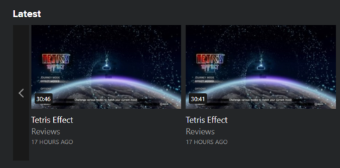
Hey guys, not sure if this was brought up or not but I'm seeing the Tetris Effect review twice on the Latest carousel. One for the video link and one for the audio. If possible, could you consolidate into one link? Perhaps even adding a hover link-effect...like the left-half of the thumbnail opens the video, and the right-half opens the audio version. With some transparent hover graphics or something.
Anyways, you guys did an awesome job and I'm really digging the new look so far! Cheers!
How about acknowledging that many people plain and simple hate the redesign and would love nothing more than to go back to the old design? Is this criticism even being taken into consideration? No amount of updates or tweaks is going to fix it. Giant Bomb used to have a beautiful website and now we have a huge blocky mess.
@redhook347: This is in QA - coming soon!
Excellent! Next up you need reacji in the forums so I can put a ? right next to your message ?.
I know it was mentioned earlier, but a link back to a game's wiki page from each associated video would really be beneficial. It was an element of the previous site design that I used often.
I’m not theadmin but I thought I’d try my hand at following your advice that the latest Quick Look was listed on the main page. (Even though my instinct is to tap on “Videos” up above which I’ll get into after the “experiment.”)
So I made a new tab and scrolled down, found the Quick Look show card, nice a bright blue, can’t miss it, and tapped on that. This brought me to a Quick Look for Extinction and a list of Quick Looks from mid March. So I added Quick Looks as a show to my Watch List and went back to the main page to find my Watch List. Bam, there was the newest Quick Look (Fallout 76 at the time) in my Watch List and tapping it there lead to the Quick Look video with more recent Quick Looks listed after it. Okay!
I went back to the main page to remove the Quick Look show from my Watch List and, now that I knew that Fallout 76 was the most recent one, noticed a carousel of new Quick Looks right above my Watch List! I guess I was scanning and looking at the titles of videos and missed the, now very obvious, sandwich of “quick looks” headers and footers above and below the names? The videos all seem to have had “Quick Look:” stripped from their name by design so I guess my bad due to this change.
As mentioned above, I went back and tried to use the main “Videos“ menu item and had the same odd result with the Quick Looks show item under Shows where it was all Quick Looks from mid March again!
I hope all this is useful to you all in some way. I felt a little stupid missing the Main Page carousel for Quick Looks although it would have been highly unlikely that I’d start my search for the latest Quick Looks there and not the top menu, personally. Left to my own devices I probably would have thought all the “mid March” stuff from the menu Videos->Shows page was a “new site bug” and just stopped there and waited patiently for a fix. I doubt I would have tried adding the Quick Look show to my Watch List either if I wasn’t in QA mode.
While I’m here just going to echo the other complaints about changes to descriptions/decks with their peekaboo behaviour and loss of author info, etc. With videos seemingly having their titles truncated or hidden as a matter of course it can be hard for things like “gbe/gbw Playdate” to be sorted mentally at a glance. If I come back to the site after a few days and have a plethora of content to pick and choose from I usually prioritize my watching by my personal favorites first which I used this info for. Don’t get me wrong, I’ll watch it all eventually! I can’t even simply start and stop a handful of vids because that clogs up my “continue watching” thing, let alone that is a pain in the ass way to hanlde the problem.
Thanks for coming to the forums to talk us through all this!
@theadmin: I was originally addressing your questions in post #609 which was about how to find the latest Quick Look. You posted an elaborate number of steps to get there, but seemingly skipped the ability to see the latest Quick Look in the first slot in the Quick Look carousel on the homepage. Indeed, some of the issues you brought up are clunky and are things we are working on, but it doesn't seem to me to be hard to find the latest Quick Look right now, unless perhaps I'm misunderstanding.
@wemmick: The reason I outlined all the number of steps to get to the latest quick looks wasn't because I didn't scroll down on the homepage. I want to make sure you (and dev team) were aware that if a user attempts to find the latest quick looks through the videos page that is what the experience is now. I want to make sure the development team understands that this is just one of the many issues that makes the user experience not as good as it was previously.
honestly, I'm most confused why beta.giantbomb.com wasn't used to do user testing with obviously willing participants of the community to find and address these issues before going live.
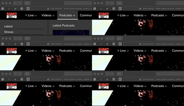
The mouse over menu bar is frustrating and nauseating from animation flashing.
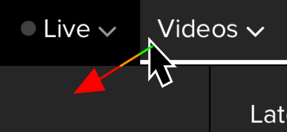
- When I pull my cursor away from the menu to an item in the newly visible sub-menu, if I just barely clip the corner of the next item in the top menu, the sub menu animates to the next menu item, invalidating the location I was seeking to click, and confusing me as to why the screen just blinked at me (the transition animation).

- When I mouse over an item, and then move to another item, the transition animation is jarring, and makes me feel like I've done something wrong.
Warning: flashing animation:
This should probably be broken into two separate animations to be less rough:
1. Animating the initial sub menu opening
2. Switching between different sub menus without flashing the screen.
Dimming the page behind the menus should happen with some graduation, and should be retained between top-level item changes so as not to flash or flicker the screen. You might use a dark layer in-between the menu and page content that you change the opacity gradually, and only if the mouse has exited the menu system by some distance.
The watchlist section of Videos should have both the current show listing as well as an aggregated list of individual episodes.
Maybe the show list should display with that list's active "watch next" episode similar to how Apple TV and other services have a list of the next episode to watch of a given show.
2 things that bug me (one which has carried over from the old site). Maybe these have been posted already, and if they have they bear repeating. ?
- Quotes on the forum still don't have a link to the original message. It's nice to be able to easily get context of anything not included in the quote, or to the posts leading up to it.
- I'm not seeing where on say, the Quick Look for Fallout 76, I can see what other content there is for the game. Other videos? Reviews? Forum posts? I've got to go and do an actual search for the game to see all the available related content.
I wonder why there are only 2 latest podcasts on display in the dropdown menu when there's so much empty space on the side. There's room for like 5-6 podcasts up there. You could display all the podcasts in a week if you wanted to. That would actually be pretty cool i think. There's no reason why the community & words drop down menu's can feature 4 content pieces, but the videos & podcast drop down menu's only feature 2. It's not too busy, given that the entire site gets blackened out as you focus on this one bar.
Yeah, the general cleanliness of the site brings with it an emptiness of the above italized/bolded. A small Wiki box and a full search textbox would work wonders. Plus, I hate hate HATE losing functionality like this. Tech should move forward, not backwards. *throws brick at Apple*
Then there's the other flaw I pointed out earlier: carousels of no use clogging the page, often with algorithm flaws:

It's like that the majority of the time, with finished videos, duplicates, or even an unwatched video in it and it has real estate priority above better ones such as Latest (which is vital as to get what Latest brings,you'd have to subscribe to all or most shows defeating the purpose or go to the video tab defeating the goal of the front page in this redesign, as the top of the page only has the four latest offerings), or This Day in Giant Bomb History, which has the neat "trip down memory lane" bit that Infinity brings.
Do arrange this better or give us the means to do so, as the latest redesign is rather nifty outside of this.
That's one down! GG, guys!
@lanerobertlane: Yup, I get it, but I think as folks poke around a little and see that there's a carousel of the latest Quick Looks available directly on the homepage, maybe they won't resort to using the nav right away?
@soulmanim3: Yes! This is on the roadmap.
Yup. I've noticed this too. It does it for Bombcast material too since that also has both audio and video formats. Should try to condense these to a single tile in the carousel, or at the very least, denote which one is podcast and which one is video in the title.
I'm not going through 14 pages to see if this was discussed, so sorry if it was already.
Overall I extremely dislike the new UX. Seems like it heavily prioritizes mobile over desktop. It looks god awful on my 27" 4K monitor. It's like all of the bad parts of every iteration of the Xbox One UI mashed into one thing. Tons of overly large blocks, extreme amounts of negative space, and an unnecessary amount of clicking/scrolling.
My specific problem lies with video watching, as that's really the only thing I do on the site these days. What the fuck happened to the Continue Watching feature? If it still exists, it's completely hidden and it's awful. Add it to the Video tab ASAP. The "My watchlist" is a poor substitution, if that was the intent. The red progress bar on watched videos seems to be gone. And in general the player page for a video seems either broken, or very poorly designed. Why is the description half floating off to the left? It makes no sense. The previous design for videos was LIGHTYEARS BETTER.
EDIT
Wait, there's an autoplay next video thing AND IT CAN'T BE TURNED OFF?! WHO'S GENIUS IDEA WAS THAT?
@falconer: There is a "Continue Watching" carousel on the homepage - scroll down a touch and you'll see it. We'll add it to the Videos door too, though.
The autoplay at the end of a video should be pausable - is that not working for you? If you do it once, it should remember that setting.
not scrolled this in a good number of days so idk if anyone else mentioned it but quick looks show page isn't updating properly which kinda defeats the purpose of having it. which is a shame since it was one thing i found cool with this redesign ( even tho you have to scroll pretty far down the shows page to get to them . honestly i liked the idea of this redesign initally but the more i use it the more i really just don't like it. it doesn't function well and its a pain to use, i'm really not sure why it didn't stay in beta longer.
upon farther inspection i realized the newest quick looks on the quick looks page in grid view ( i'll always prefer grid) are on the NEXT page that i wouldn't have noticed if i didn't scroll all the way to the bottom n see it after scratching my head ..who in there right mind would have the newest stuff pop up on a following page on a site like this and not the first at the top left to right ...poor design? or a weird bug ...either way its something that shouldn't be how it is.
Also now that i think about it its been this way for at lest a week or better if i had to guess , i was doped up after having a surgery last week n i kept looking for new videos the same way and just thought it was me being all foggy from the pain killers n left over anesthesia that was making it happen ..so ...thats a thing
There don't seem to be download buttons for some of the premium videos on the website. Is this normal?
This video is an example:
https://www.giantbomb.com/videos/kill-busey-vol-1-and-2/2300-11458/
I've been wondering the same thing! I've noticed a lot of older content doesn't have a direct download any more. So far I've only encountered it with Premium stuff; for instance, part one of the Hitman Hokkaido video (which is not Premium content) has a direct download, but part two does not.
I've been trying to watch Beast in the East and it's been a giant PITA. The autoplay feature does not work for me (loading indicator just spins on the video after finishing), and the carousel does not match the video that you are watching (usually defaulting back to either the start of the carousel, or the end). And trying to figure out where I left off watching yesterday is impossible, so I just click into videos until I find one that I don't remember watching yesterday.
I'd love even just a simple "Watched" icon on a video, or bring back the bar under the video showing your saved position, so you know you have at least been in that video before.
Add to that, it seems like GOTY content is just... completely missing from any sort of curation. There is no show or way to reach GOTY videos without searching specifically for the video title. I had to search for Hitman, and go into related videos to find Hitsmas.
Please Log In to post.


Log in to comment