Giant Bomb New Site Feedback

This topic is locked from further discussion.

Avatar image for vdortizo
vdortizo

319

Forum Posts

0

Wiki Points

0

Followers

Reviews: 0

User Lists: 1

#751  Edited By vdortizo

@gkhanis right, the newest featured content could do with a 50% decrease in height. Also there is some empty space at the bottom of the carrousels which seems like wasted space; I mentioned it in another thread but: what if the height of the carrousel was the same as the thumbnails (the thumbnails would become the background of the CTAs) and the title/length of the video was floating over the thumbnail, that big play "button" that appears when you hover over the thumbnail is misleading since it seems to imply that by clicking we would start playing video (in a modal or something) but it's just a link, so it gives more importance to the thumbnail than I believe it should have.

EDIT: Also it would be great if you could just set up a Trello board or something, because I feel really bad for the guy(s) that have to read this thread to identify issues.

Avatar image for knowledgebase
knowledgebase

9

Forum Posts

6

Wiki Points

0

Followers

Reviews: 0

User Lists: 0

I miss the related content on video pages. I was able to quickly jump to the related page for the game, concept or developer pages related to what ever i was watching. The flow of moving around the site is gone. I just get a carousel general categories.

Avatar image for turboman
turboman

10064

Forum Posts

19

Wiki Points

0

Followers

Reviews: 23

User Lists: 11

Community section on the front page should be changed back to the most recent posts (or make it most recent blogs). I would do it where the left box is your "featured post/blog of the week" and then the right section be a list of the most recent content.

I find it off putting that the only things featured right now for the most part is blogs/posts from the moderators of the site.

Avatar image for vhdblood
vhdblood

89

Forum Posts

0

Wiki Points

0

Followers

Reviews: 0

User Lists: 0

Not sure if it's been asked for, but I'd like to see a playback speed feature in the video player. I like to watch stuff on 1.5x or 2x speed when going through old content or things I've seen already. I use it all the time on Youtube and other players. Thanks for the awesome updates!

Avatar image for wemmick
wemmick

138

Forum Posts

48

Wiki Points

0

Followers

Reviews: 0

User Lists: 2

@unknown450: This is available now - just pause the video when you get to the end, and it won't autoplay the next one.

Avatar image for wemmick
wemmick

138

Forum Posts

48

Wiki Points

0

Followers

Reviews: 0

User Lists: 2

Avatar image for nezza
Nezza

409

Forum Posts

0

Wiki Points

0

Followers

Reviews: 0

User Lists: 10

@wemmick: Clicking pause on a video is in no way the same as not having autoplay. One requires user action to prevent a video playing, the other does not.

Avatar image for stinky51012
stinky51012

238

Forum Posts

3

Wiki Points

0

Followers

Reviews: 0

User Lists: 1

#758  Edited By stinky51012

1. Turn off auto play of next video

2. Have a user-saved playlist/queue for individual pieces of content (subscribing to a whole show is excessive)

3. Bring the old logo back

4. Double click mouse or press "F" to go full screen on the Giantbomb player videos (usually only Premium videos, fine on the YouTube player)

Avatar image for deactivated-63e25d72b6044
deactivated-63e25d72b6044

200

Forum Posts

0

Wiki Points

0

Followers

Reviews: 0

User Lists: 0

Bring the forum back to main Page.

Avatar image for unknown450
Unknown450

31

Forum Posts

0

Wiki Points

0

Followers

Reviews: 0

User Lists: 0

@nezza said:

@wemmick: Clicking pause on a video is in no way the same as not having autoplay. One requires user action to prevent a video playing, the other does not.

^^^This, sometimes I'm doing other things away from my keyboard when I'm watching/listening to vids, so I'm not always right there when the vid ends. Or I might be tabbed out of the window with my headphones on and next vid plays and can get loud.

For the most part I love the new site, but autoplay has always been a thing i dislike.

Avatar image for sessh
Sessh

3499

Forum Posts

12278

Wiki Points

0

Followers

Reviews: 1

User Lists: 8

@wemmick: This is supposed to prevent future autoplay from happening right? Doesn't wptk for me currently.

Avatar image for stalefishies
stalefishies

488

Forum Posts

39

Wiki Points

0

Followers

Reviews: 0

User Lists: 0

#762  Edited By stalefishies

@i_speel_my_dreenk said:
3. Weird date thing?

Maybe this is one of the lingering CMS migration issues you guys mentioned on the Devcast, but on the 8-4 Play carousel, some of the dates are proper fucked:

Time paradox!
Time paradox!

Came here to report what looks like the same bug: videos from October 20th say 'X hours ago' and those from October 19th say 'yesterday' - and similarly for videos in September, though I didn't go back further.

I'm guessing that when the site checks a date to see if it's recent, it only checks the numeric value of the day, and not whether it has the same the month or year.

Avatar image for darknimesis
Darknimesis

1

Forum Posts

0

Wiki Points

0

Followers

Reviews: 0

User Lists: 0

Every time I try to download the giant bomb pod cast on my phone or on my pc It plays a error message and it doesn't even play all of it. For some reason the beast cast download feature works fine. please fix.

Avatar image for ildon
ildon

756

Forum Posts

469

Wiki Points

0

Followers

Reviews: 0

User Lists: 2

So I was able to see what appear to be show notes for the Alex Navarro drumming for Extra Life 2017 video, which have a link to the forum thread with the playlist, but I was not able to select the text or click on the text to visit the forum post at all. This is Firefox 63.0.3, Windows 10. Link: https://www.giantbomb.com/shows/extra-life-2017-alex-navarro/2970-11736

I ended up using the "inspect element" feature on Firefox and traversing the DOM to get to the link, but obviously that's not great UX.

Avatar image for carkoon
carkoon

4

Forum Posts

0

Wiki Points

0

Followers

Reviews: 0

User Lists: 0

#765  Edited By carkoon

I noticed that some videos that had a series currently don't have a home under a show (such as Backflips and Bioforge).

Perhaps I overlooked them somewhere; if so, please let me know what show they are listed under!

Avatar image for onemanarmyy
Onemanarmyy

6406

Forum Posts

432

Wiki Points

0

Followers

Reviews: 2

User Lists: 0

#767  Edited By Onemanarmyy

Some good changes have happened over the last week. Goodjob people!

- The one conceptual thing that still irks me about the frontpage is the Shows carroussel. Deciding to which shows you want to subscribe is not a daily decision people have to make over & over. It's the kind of thing you set up once or twice and adjust whenever a new show appears. To have a whole portion of the frontpage dedicated to the shows just feels a bit much. Especially when there's already a dedicated shows menu in the topbar. It's the difference between letting people know that that functionality is there to be used & reminding them over and over that they could subscribe to this show they have no interest in. I'd much rather have new accounts being steered to the /videos/shows part of the site to subscribe, or even a subscriptions dropdown menu that has all the shows listed with an on/off toggle next to them. Or have the carroussel function like the 'continue watching' carroussel where it just dissapears from the frontpage when you have subscribed to all the shows already. Or only make it show up when new shows pop up or something.

- There are 2 items in the 'latest' menu for the bombcast. Seeing that one of them has a 5 min shorter duration, i assume the difference is that one item refers to the premium version and one to the free version. But since they take you to the same combined bombcast page, it doesn't matter and should probably be reduced to 1 item. Or at least add a premium tag to the item that directs to the premium bombcast (eventhough both links are the same)

- With the redesign we have gained all these video carroussels with titles that tell you why they are there. Yet we still have the same 4 featured boxes (1 main image + 3 right underneath it) from the previous design. Are these 3 boxes still necessary now that the latest carroussel is right below that and contains the same videos? The one item that adds value is the 'black friday sale' article. Wouldn't it be more valuable to exclusively have items from the words category on display here instead of videos? Those don't have a dedicated frontpage presence right now, while the videos have a serious duplication issue already.

- The latest forum discussion box on the frontpage was a valued part (see Q4) of the frontpage and adds functionality to the frontpage.

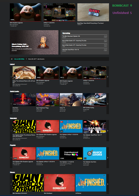
- Right now i have 5 items for the bombcast on the frontpage (4 mr mime faces & 1 bombcast image) and 4 items for Unfinished: Artifact (3 game images and 1 unfinished show image). On top of that i also have a Bombcast & Unfinished show on the frontpage. This means that there are 11 Items on the frontpage that take me to the same 2 contentpieces. Without adjusting any carroussels! Without having a 'continued watching' carroussel going! That seems like a problem to me. The largest issue of the previous design was having 4 different bombcast items on the frontpage. After the redesign, we now have the bombcast duplicated 6 times on the frontpage, and other videos have a similar duplication problem.

No Caption Provided

Avatar image for endsofinvention
EndsOfInvention

239

Forum Posts

0

Wiki Points

0

Followers

Reviews: 0

User Lists: 0

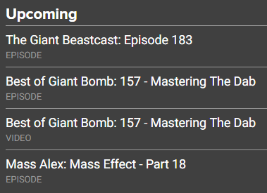
Apologies if this has already been brought up, but the Upcoming panel currently shows a duplicated Best Of episode:

No Caption Provided

Avatar image for sessh
Sessh

3499

Forum Posts

12278

Wiki Points

0

Followers

Reviews: 1

User Lists: 8

#769  Edited By Sessh

@wemmick Bug: Both versions of this weeks podcast only feature the download link for the video version.

edit: Okay, I missed the buttons to switch. But now that I am at the podcast version, if I want to switch back it just sarts playing the audio file instead. So there's still a bug here.

Avatar image for wemmick
wemmick

138

Forum Posts

48

Wiki Points

0

Followers

Reviews: 0

User Lists: 2

Avatar image for wemmick
wemmick

138

Forum Posts

48

Wiki Points

0

Followers

Reviews: 0

User Lists: 2

@carkoon: Many older videos are still being converted to the new Shows structure - we're getting there!

Avatar image for wemmick
wemmick

138

Forum Posts

48

Wiki Points

0

Followers

Reviews: 0

User Lists: 2

Avatar image for schrodngrsfalco
SchrodngrsFalco

4618

Forum Posts

454

Wiki Points

0

Followers

Reviews: 1

User Lists: 7

@nezza said:

The roll-overs, man the roll overs. First you've somehow managed to make them infuriatingly slow to activate, yet still make them flash quickly enough that you think you're on the verge of a fit. Also, the one place that a carousel may be genuinely welcome and you don't use one, and again so much wasted space.

Came in here to say something about this but not as harshly. I'm not particularly a fan of each dropdown menu going through it's opening animation when moving from one dropdown to another. It would neat if the dropdown stayed down and just changed to the new one you mouse over.

So, if you hover over "Videos," and the menu drops down, then you move your mouse to the right to hover over "Podcasts," instead of the Video dropdown menu immediately disappearing only for the Podcast menu to going through it's opening animation, the content of the menu should just change.

Avatar image for eloj
eloj

753

Forum Posts

761

Wiki Points

0

Followers

Reviews: 0

User Lists: 7

#774  Edited By eloj

I get that this isn't a thing you would think of, but with all this work going into the site, maybe we could finally get access to a real date-time format for representing absolute dates? No, I don't mean Swatch Internet Time. I mean not having to suffer under MM/DDisms, 12-hour clock times and all that old-empire weirdness.

Avatar image for pedroteixeira
PedroTeixeira

26

Forum Posts

0

Wiki Points

0

Followers

Reviews: 0

User Lists: 0

Clicking on a video in a carousel still loads a page with the "free-video" suffix in the URL to me. After that, when I click on the "Play" button on this new page the video is not loaded.

I can solve this issue on my own my removing the suffix from the URL and reloading the page.

Avatar image for deadstar
Deadstar

1003

Forum Posts

22

Wiki Points

0

Followers

Reviews: 0

User Lists: 0

#776  Edited By Deadstar

How do I get to the main page for a game from a video? You used to be able to click the game name to go to the game page showing all the videos for that game.

Avatar image for swordstruck
swordstruck

124

Forum Posts

0

Wiki Points

0

Followers

Reviews: 0

User Lists: 0

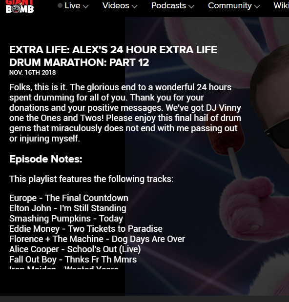
Probably been posted several times already but lengthy show notes get cut off. It's pretty bad for the Extra Life drum streams:

No Caption Provided

Avatar image for roundlay
Roundlay

1

Forum Posts

0

Wiki Points

0

Followers

Reviews: 0

User Lists: 0

#778  Edited By Roundlay

The new design is a nightmare. Please rethink the direction you're taking the site.

Avatar image for sarcasticmudcrab
SarcasticMudcrab

552

Forum Posts

0

Wiki Points

0

Followers

Reviews: 0

User Lists: 0

I'm finding it hard to watch through old videos in order, or should I say time consuming to find the video I want. I was currently watching UPF right back from the beggining, about 20 in and now the site has changed and it's just a bit of a mess to get back to specific old content. The solution would be better sorting oprtions so I could just set to 'oldest first'. Sorry if that's currently possible I can't see it.

Absolutly love the this day in GB history feature!

Be much better if to remove some and/or make customizable the categories on the front page, as they are it results in multiple versions of the same video.

Keep at it you'll get there!

Avatar image for nameless2000
Nameless2000

118

Forum Posts

195

Wiki Points

0

Followers

Reviews: 0

User Lists: 1

Pressing the left or right arrow keys during a video lets you go back or forward 5 seconds. It'd be handy if you could do the same thing during a podcast!

Avatar image for stinky51012
stinky51012

238

Forum Posts

3

Wiki Points

0

Followers

Reviews: 0

User Lists: 1

1. Bring back the ability to go to the game's page from a video (that info section on the right on the old site was great)

2. Search is too hidden in the corner

3. The site redesign seem like it was made by people who spent too much time looking at it hyper-critically without taking a step back and applying common sense (no offense)

Avatar image for cptbedlam
CptBedlam

4612

Forum Posts

7

Wiki Points

0

Followers

Reviews: 0

User Lists: 0

1. I'll echo the requests to bring back the link to the game page on a video. What was the idea behind the decision to remove that link (also the other game related pages like forums etc)? Common sense, anyone? It is now super tedious to move to the game page when I just want to look up the release date or something. In fact, I went to google since it was quicker.

2. How do I quote a post now? I just see reply and flag buttons.

3. The page of the current Beastcast is messed up. I cannot click the download link. Others have the same issue it seems. Please fix, crew!

Avatar image for archimedes83
archimedes83

233

Forum Posts

0

Wiki Points

0

Followers

Reviews: 0

User Lists: 0

On giantbomb infinite the audio cue to notify the watcher of a vote is always at 100% volume even when the video audio is turned down. My system audio is down and is still super fucking loud.

Avatar image for cyberspacecat
cyberspacecat

480

Forum Posts

0

Wiki Points

0

Followers

Reviews: 0

User Lists: 0

Can't report a user or their comment via the new site layout, this bot for example has been spamming videos.

Avatar image for pickassoreborn
pickassoreborn

767

Forum Posts

2319

Wiki Points

0

Followers

Reviews: 5

User Lists: 6

#785  Edited By pickassoreborn

@stinky51012 said:

2. Search is too hidden in the corner

Holy crap. Only just realised the search was there when you pointed it out. OG Giant Bomb had the search as a main focal point. I don't know why it's been hidden there for the redesign.

Edit - that massive splash image on the main page is the largest button I've ever seen in my experience with websites (designing/using). Holy crap again.

Avatar image for kaosmachina
KaosMachina

7

Forum Posts

0

Wiki Points

0

Followers

Reviews: 0

User Lists: 0

Yeah, I'm gonna echo that comment that something needs to be done about videos with longer descriptions- perhaps some kind of box underneath with the full description and link list would ultimately be best, since there's just... now completely lost stuff and it's painfully unintuitive to get to video descriptions with the new site design.

Avatar image for forcen
Forcen

2746

Forum Posts

29709

Wiki Points

0

Followers

Reviews: 1

User Lists: 31

#787  Edited By Forcen

It turns out that you can navigate the video with the arrow keys even when not fullscreen, it's just way more particular where you click the video to unpause it. If you click the big play button on a paused video to unpause it then you can't navigate using the keyboard afterwards but if you click the lower part of the video (under the progress bar) to unpause then you can...

EDIT: found another bug, you can't click links in video notes in this video: https://www.giantbomb.com/shows/extra-life-2015-jason-part-01/2970-12828/free-video

Avatar image for kmg90
kmg90

514

Forum Posts

2705

Wiki Points

0

Followers

Reviews: 1

User Lists: 8

#788  Edited By kmg90

The whole navbar is a nightmare

What is up with the choice of placement on the pop out menus?

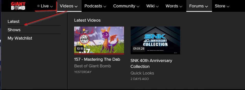
moving the mouse between the navbar and the navbar menu content leaves an annoying experience of the navbar disappearing because the cursor hits 1-2 pixels over the live tab.

No Caption Provided

Also is the plan to make it when you hover/click the links in the pop out menus change the content to right?

Because it's incredibly useless at the moment.

The shows UI is a disaster, I literally had to use Bing to get to the Die Another Friday Episode 2 because it doesn't appear in the Die Another Friday category!

I'd rather use UWP (Windows Store and Xbox) Giant Bomb Video Player as it's not a nightmare to navigate and the videos show up properly.

Avatar image for pickassoreborn
pickassoreborn

767

Forum Posts

2319

Wiki Points

0

Followers

Reviews: 5

User Lists: 6

Navbar question - that pause between highlighting the option you want and the drawer menus being displayed - is that an intentional animation delay or is there some kind of server call being made? If it's the former, might want to look into removing that delay to make the menus feel a bit more responsive.

Avatar image for giggs
Giggs

8

Forum Posts

0

Wiki Points

0

Followers

Reviews: 0

User Lists: 0

My use case for mobile is only ever to download podcasts and the redesign has made most of the process a bit frustrating.

I like that there's a page on the site that's basically for the "podcast feed" through Latest, so I can have one tab that stays "open" forever and I can branch off and download podcasts from a central point from now on. This is pretty great. Thinking back I'm pretty sure there was a Latest page on the previous version of the site that I never considered using this way. Whoops.

The frustrating parts are as follows:

  • Clicking on a Bombcast in the podcast feed takes me to the video page. The first time, it took me a good 5-10 minutes to figure out that it needed to be switched to the podcast and how to switch to it. I don't believe that the podcast feed should ever default to a video page, or at least, the video version of that page. If it's configurable to change versions of the target page based on the previous page that could be a solution.
  • Until this very moment I thought the audio podcast pages autoplayed by default, but now I realize that it plays because when I attempt to tap "More Options" it acts as though I'm clicking on the play button. Clicking most anywhere acts as if I'm clicking on the play button. That's a bug, whew, I was going to get all academic about autoplay for nothing! (Android, v6)
  • If the default page is going to be the video version of the podcast then maybe there should be a download option for audio on the video page. I'm guessing the reason there are separate pages in the first place for audio and video is that the pages are somewhat generated based on CMS content or archetypal pages or whatever, but yeah, it makes it feel like the website is trying to deny me the ability to download the podcast.
  • Generally there are too many clicks to go from selecting a podcast on the feed to having the file locally. I believe there should only be two clicks, 1) To select the podcast from Latest and 2) "Smashing" download. I get the concept of hiding away buttons that are not the most common things like the RSS feed or iTunes, but I do not consider Download to be of the same ilk. To listen to a podcast has only two options, download or play-in-browser. Clicking on the RSS Feed button is something no one will likely have to do more than once so it makes sense, and iTunes is similar so it will almost never be necessary for most users, but downloading is as mentioned before the second of two options but is hidden by default.

Otherwise, I like where the redesign could take this site, especially after the nitpickier things are dealt with. The carousels remind me of the Apple TV interface for Youtube which I think is very inefficient and lacking in readability, feels extremely dated, and they're also redundant by showing the same few thumbnails multiple times in 300 pixels of vertical space. It also feels strange because Giant Bomb is not Youtube and cannot compete with Youtube, so I don't understand why emulating it is worthwhile. If all anyone wants from the site is the videos, Youtube will likely always be the easier option. This site should focus on everything else, the community, the forums, written reviews, etc. Honestly, the best suggestion I've seen in this thread for carousels is the Steam-like tabbed menu which would solve nearly all problems people seem to have with the carousel. It would eliminate redundancy by only having one selection shown at a time, it would make better use of space by having the set area defined instead of multiplied with tons of arbitrary and messily ill-defined negative spaces, and it could even provide extra information that is otherwise not shown like the date or start of the deck or whatever its called.

A hybrid version could be really good too. Having one carousel with selectable tabs on top effectively solves all the same problems.

This Day in Giant Bomb is very cool. It also makes me feel old which is less cool but unavoidable.

Avatar image for theadmin
TheAdmin

1062

Forum Posts

6686

Wiki Points

0

Followers

Reviews: 5

User Lists: 8

Can we get a response from @danauer and @wcarle please? It would be nice to hear from them that they're listening, some items on the roadmap they plan to both fix and tweak, and so forth. Maybe @rorie can go find them?

Avatar image for lase
lase

66

Forum Posts

0

Wiki Points

0

Followers

Reviews: 0

User Lists: 0

#792  Edited By lase

Some thoughts:

  • It seems like "Live" getting top billing by being the first menu item is counter intuitive. Live shows don't happen that often, and I imagine many users might just go to /chat out of habit.
  • Swap the location of the "Search" icon and the "Live" notification. Could have a little pulsing "Live Now!" Red button on the right.
  • Can I have a "Recently Watched" sub menu under Videos? I don't really want to add whole shows to a watchlist, I just want to easily be able to jump back into the last video I was watching. With GB specializing in long ass videos, I feel like this feature is sorely missing. Going back to continue watching UPF from last week, I've gone to Videos -> Latest -> Latest UPF Episode -> Play button. 4 clicks is way too many to resume watching the last thing I was watching.
  • The entirety of the frontpage being the latest content is nice, but too large. Not to mention, it's audio content multiple days per week. I know folks like to watch the bombcast, but I have to imagine the viewer numbers on that are incredibly low in comparison with other site videos / audio listeners of the podcast.
  • Individual show pages are incredibly unintuitive. I wanted to send a new subscriber a link to Steal My Sunshine. To get to episode 1, I had to change to Grid View (which should be the default), and change the year (???) to 2017. It is also labeled as having 2 seasons. I'm guessing these are the years? If I'm looking for a specific show, I just want a grid of all episodes, in order, with paging if there are too many. The current default that takes the user to the last episode, with comments on THAT episode (when you think you're visiting the show at large) and a small carousel view is just bad UX.

EDIT: Just learned from reading other posts that there is a Continue Watching carousel on the front page. I never realized because it's two full page widths down among 5 other carousels, under a huge image of Majin Bu that of course links to non-visual content.

Avatar image for danauer
danauer

59

Forum Posts

0

Wiki Points

0

Followers

Reviews: 0

User Lists: 0

@theadmin: Don't worry, we're listening. You don't have to page anyone else on the team.

We're reading through a lot of discussions (for example, this one thread has nearly 800 comments while I'm writing this!) and can't respond to every individual comment. Honestly wish we could, but we're hard at work on the site.

Will and I are talking about stuff we're working on and shipping on the Devcast and also tend to give updates on Twitter as well. Here's the links if you're interested:

Devcast

https://www.giantbomb.com/shows/giant-devcast

Twitter

https://twitter.com/danauer

https://twitter.com/will_carle

Avatar image for digital_sin
digital_sin

1896

Forum Posts

5480

Wiki Points

0

Followers

Reviews: 0

User Lists: 3

PLEASE HAVE A SMALLER THUMBNAIL PREVIEW FOR LATEST VIDEOS. THE HUUUUGE THUMNAILS WITH VERY SMALL VIDEO TITLE ABSOLUTELY SUUUUUUCKS. IT IS IMPOSSIBLE TO NAVIGATE AND SCROLL THROUGH THE LIST LIKE THIS. ITS AS ANNOYING AS YOU HAVING TO READ THIS WHOLE MESSAGE IN CAPS LOCK.

Avatar image for digital_sin
digital_sin

1896

Forum Posts

5480

Wiki Points

0

Followers

Reviews: 0

User Lists: 3

#795  Edited By digital_sin
No Caption Provided

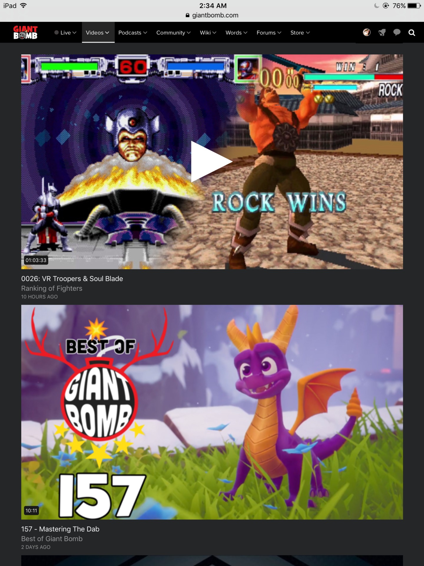
SERIOUSLY? scrolling down TWO VIDEOS AT A TIME IN THIS HUGE LIST :( look at how small everything is and how big those thumbnails are! This is on a retina iPad btw

Avatar image for sweep
sweep

10887

Forum Posts

3660

Wiki Points

0

Followers

Reviews: 4

User Lists: 14

#796 sweep  Moderator

I think the most disappointing thing about this update is that it's a fresh coat of paint and some backend changes that don't address or solve any of the problems with the end-user experience that have existed for years.

- user profiles are still redundant. Following other users serves no purpose in the way people actually use the site, as the user feed you get on your profile is awkward to navigate and for the most part completely ignored. The default should be the activity of the profile owner. The feed of people they follow should be streamlined and placed in a secondary tab. The "about me" section should be beneath their profile picture, and there should be a space for their most recent blog/wiki feed. If you want people to engage with your website you should highlight their work and make it easy to find.

- blogs are still completely neglected. If you don't cross-post your blog to the forum then it might as well not exist, and there's no easy way for readers to look back at the writers other blog posts, so there's little point in making it a blog post at all. Not being able to establish a context or continuity with blog posts discourages people from writing them. Add a "More from this writer" module next to blog posts (even ones posted to the forum) so users can see what else they're posting - the whole point of blogs is continuity, it's not just "longer forum posts".

It seems like stuff has been shuffled around arbitrarily without anyone really considering what the end user experience is or how it can be improved.

Avatar image for digital_sin
digital_sin

1896

Forum Posts

5480

Wiki Points

0

Followers

Reviews: 0

User Lists: 3

I want the old grid style normal sized thumbnails back. the current scroll list is incomprehensibl! The user has to look at this huge thumbnail and try to figure out what the hell is this because the thumbnails may look cool and all but they don't say if this a quick look or feature or what, so we have to go looking for this small tiny text (in comparison to the size of the thumbnail) to get what the hell this is, and then keep scrolling for eternity to get to the next video and see what's next because the thumbnail is so damn big that even a higher than full hd resolution screen can only show two videos at a time! I mean come on!!!!

Avatar image for sicamore
sicamore

110

Forum Posts

0

Wiki Points

0

Followers

Reviews: 0

User Lists: 0

During the upcoming GOTY deliberations, whenever someone on staff will discuss how a game wastes their time, is clunky, changes things unnecessarily, and launches in an unfinished state, I can't help but think about this redesign. I know it's unfair to make that association, but it's gonna be tough listening to this website criticize video games without the irony of it creeping up in my thoughts.

Avatar image for rorie
rorie

7888

Forum Posts

1502

Wiki Points

0

Followers

Reviews: 4

User Lists: 3

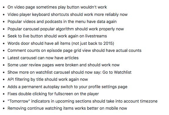
Here are some of the things that the team has been working on:

No Caption Provided

Avatar image for pedroteixeira
PedroTeixeira

26

Forum Posts

0

Wiki Points

0

Followers

Reviews: 0

User Lists: 0

#800  Edited By PedroTeixeira

Just wanted to come here and say thank you for the new fixes, especially for the autoplay choice. Though I wish it was in a more accessible place; if I hadn't read the changelog above I'd not think of going to my profile settings to disable it. A button on the video page would be better.