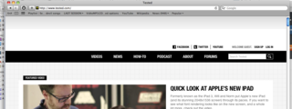
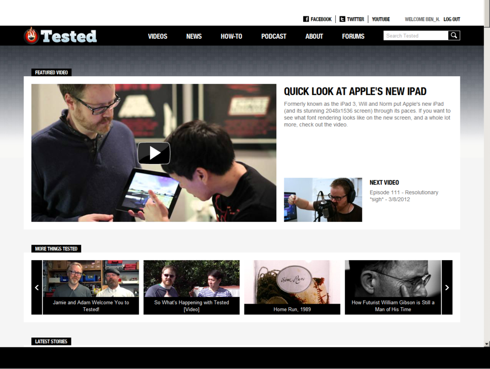
New Tested.com
i didn't visit tested very much, but seeing the changes is really sad. especially seeing things like "Jamie and Adam welcome you to Tested!" and a tweet from Jamie that says "It's official. Adam and I have our own website!" when they should say something more like "Tested welcomes Jamie and Adam!" and "It's official. Adam and I have joined Will and Norm at Tested.com!"
I hate the new branding with JAMIE AND ADAM plastered over everything. I hate them welcoming me to their new website, I hate everything about the header, I hate the big fat text at the side that says JAMIE AND ADAM APPROVED. None of the old site's charm remains. I hate the new color scheme. I hate that Will and Norm are taking the back seat on the front page, even though they've done most of the work creating the content in the first place. I know that whoever's marketing the site knows that Jamie and Adam are the most marketable personalities, with the biggest fan base, and they're simply trying to draw in a larger crowd, but isn't there a less abrasive way of doing this? Do they really need to have JAMIE AND ADAM or the picture of their likenesses plastered on what feels like every inch of screen space? Can't they just have a picture of them (with Will and Norm) at the top, and their twitter feeds (along with Will and Norm's) on the side? I think that would be enough for anyone to get it. And it wouldn't infuriate everyone that knows the blood, sweat and tears that Will and Norm put behind the site over the years.
Man. I wasn't really all that interested in the subject matter that Will and Norm would cover, but I certainly adored their personalities and the site design. Now, it just seems kind of gross and bothersome. Also, no more blogs/profiles/what have you? Or are they coming in some sort of future site update?
I don't know what's up over there, but as a long time Whiskey user and an occasional forum lurker, that site just looks bleak, both in design and in it's future.
What I think about it? Well, its cool they get to work with the guys of Mythbusters. Everything else beyond that simple fact has been an abomination.
@lancer75 said:
I hate the new branding with JAMIE AND ADAM plastered over everything. I hate them welcoming me to their new website, I hate everything about the header, I hate the big fat text at the side that says JAMIE AND ADAM APPROVED. None of the old site's charm remains. I hate the new color scheme. I hate that Will and Norm are taking the back seat on the front page, even though they've done most of the work creating the content in the first place. I know that whoever's marketing the site knows that Jamie and Adam are the most marketable personalities, with the biggest fan base, and they're simply trying to draw in a larger crowd, but isn't there a less abrasive way of doing this? Do they really need to have JAMIE AND ADAM or the picture of their likenesses plastered on what feels like every inch of screen space? Can't they just have a picture of them (with Will and Norm) at the top, and their twitter feeds (along with Will and Norm's) on the side? I think that would be enough for anyone to get it. And it wouldn't infuriate everyone that knows the blood, sweat and tears that Will and Norm put behind the site over the years.
Everything you've said is pretty well everything.
i like it enouh so far exspt th jamie and adm plastering, ifvwill nd norms faces and names were up at the top along side adam and jamie i would be much happier
ehh it seems that nothing will change the site will still remain predominately a ipad, cellphone review site *like the 7 billion others out there* with a few coffee segments with a few other weird sciency things what I liked about the site when I joined when it was first created was Will taking stuff apart which he hasn't done in a very very long time.
I like Jamie and Adam but frankly mythbusters has sucked since about the second season when they polluted the show with the moronic 3 Tory,Kari, and Grant they brought nothing too the show except very annoying personalities the show stopped being about testing myths and more about stupid pop culture crap as well as well known facts that they wanted to parade around as myths.
I have no problem with the new layout and if Jamie/Adam put their faces on the front so be it. It can only benefit our buddies Will/Norm...the way I see it is that those guys now have way more funding and way more clout/exposure. Tested will be fine and i'm totally excited to see how it goes.
Yeah I haven't visited Tested in months because it turned into a smart phone website, so while I really like Norm & Will from the Giant Bomb videos, I really don't care for them or their website. They used to review phones and tablets, now they're adding articles about random things to the equation.. I'm sorry tested.com kinda sucks.ehh it seems that nothing will change the site will still remain predominately a ipad, cellphone review site *like the 7 billion others out there* with a few coffee segments with a few other weird sciency things what I liked about the site when I joined when it was first created was Will taking stuff apart which he hasn't done in a very very long time.
Please Log In to post.


Log in to comment